Bootstrap 4 Grid System
Bootstrap 4 Grid System
The bootstrap 4 grid system is used to create a responsive website layout. The bootstrap 4 offers a mobile-first flexbox grid system that allows you to divide the viewport or screen into 12 columns. It also provides predefined Bootstrap grid classes that help to make a grid very quickly for devices such as cell phones, tablets, laptops, etc.
The bootstrap 4 grid system also arranges the columns and the content inside the column automatically according to the screen size.
Grid Classes
- .col-* = This class is used to create grid layout (columns) on extra small devices having screen width less than 576 px.
- .col-sm-* = This class is used to create grid layout (columns) on small devices having screen width equal to or greater than 576 px.
- .col-md-* = This class is used to create grid layout (columns) on medium devices having screen width equal to or greater than 768 px.
- .col-lg-* = This class is used to create grid layout (columns) on large devices having screen width equal to or greater than 992 px.
- .col-xl-* = This class is used to create grid layout (columns) on extra-large devices having screen width equal to or greater than 1200 px.
Grid System Rules
- The rows should be placed inside the .container class for fixed width or .container-fluid class for full width to provide proper alignment or padding to the content.
- Use .row class to make a group of columns.
- All the content must be placed in the columns only. The columns are the immediate children of row.
- The .row class and .col-sm/md/lg-* class are used to create a quick grid layout. Where, * = 1 to 12.
- The columns create a gap between column content through padding. That padding acts as an offset in rows for the first and last column by providing a negative margin to the rows.
- To create a grid column, you need to specify the number of columns you want to create.
- The column widths are always specified in percentage.
- The main difference between the bootstrap 3 and bootstrap 4 is that Bootstrap 4 uses flexbox instead of floats that are used in bootstrap 3.
Basic Structure of Bootstrap 4 Grid System
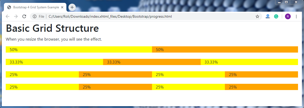
<!DOCTYPE html>
<html lang="en">
<head>
  <title>Bootstrap 4 Grid System Example</title>
  <meta charset="utf-8">
  <meta name="viewport" content="width=device-width, initial-scale=1">
  <link rel="stylesheet" href="https://maxcdn.bootstrapcdn.com/bootstrap/4.4.1/css/bootstrap.min.css">
  <link rel="stylesheet" href="https://use.fontawesome.com/releases/v5.6.3/css/all.css" integrity="sha384-UHRtZLI+pbxtHCWp1t77Bi1L4ZtiqrqD80Kn4Z8NTSRyMA2Fd33n5dQ8lWUE00s/" crossorigin="anonymous">
  <script src="https://ajax.googleapis.com/ajax/libs/jquery/3.5.1/jquery.min.js"></script>
  <script src="https://cdnjs.cloudflare.com/ajax/libs/popper.js/1.16.0/umd/popper.min.js"></script>
  <script src="https://maxcdn.bootstrapcdn.com/bootstrap/4.4.1/js/bootstrap.min.js"></script>
  </head>
<body><div class="container-fluid">
  <h1>Basic Grid Structure</h1>
  <p>When you resize the browser, you will see the effect.</p>
  <div class="container-fluid">
    <!-- Control the column width, and how they should appear on different devices -->
    <div class="row">
      <div class="col-sm-6" style="background-color:yellow;">50%</div>
      <div class="col-sm-6" style="background-color:orange;">50%</div>
    </div>
    <br>
    <div class="row">
      <div class="col-sm-4" style="background-color:yellow;">33.33%</div>
      <div class="col-sm-4" style="background-color:orange;">33.33%</div>
      <div class="col-sm-4" style="background-color:yellow;">33.33%</div>
    </div>
    <br>
    <!-- Or let Bootstrap automatically handle the layout -->
    <div class="row">
      <div class="col-sm" style="background-color:yellow;">25%</div>
      <div class="col-sm" style="background-color:orange;">25%</div>
      <div class="col-sm" style="background-color:yellow;">25%</div>
      <div class="col-sm" style="background-color:orange;">25%</div>
    </div>
    <br>
    <div class="row">
      <div class="col" style="background-color:yellow;">25%</div>
      <div class="col" style="background-color:orange;">25%</div>
      <div class="col" style="background-color:yellow;">25%</div>
      <div class="col" style="background-color:orange;">25%</div>
    </div>
  </div>
</div>
</body>
</html>
Output:
Grid Options
| Extra Small (<576px) | Small (>=576px) | Medium (>=768px) | Large (>=992px) | Extra Large (>=1200px) | |
| Class prefix | .col- | .col-sm- | .col-md- | .col-lg- | .col-xl- |
| Grid Behaviour | Always Horizontal | Collapsed to start, horizontal above breakpoints | Collapsed to start, horizontal above breakpoints | Collapsed to start, horizontal above breakpoints | Collapsed to start, horizontal above breakpoints |
| Container Width | None (auto) | 540px | 720px | 960px | 1140px |
| Suitable for | Portrait phones | Landscape phones | Tablets | Laptops | Laptops and Desktops |
| # of columns | 12 | 12 | 12 | 12 | 12 |
| Gutter with | 30px (15px on both sides of column) | 30px (15px on both sides of column) | 30px (15px on both sides of column) | 30px (15px on both sides of column) | 30px (15px on both sides of column) |
| Nestable | Yes | Yes | Yes | Yes | Yes |
| Offsets | Yes | Yes | Yes | Yes | Yes |
| Column Ordering | Yes | Yes | Yes | Yes | Yes |