Bootstrap Tables
We can create different types of responsive and awesome bootstrap table like: striped , border etc.
Bootstrap Basic Table
We can create a basic bootstrap table by using its class .table. It has light padding and horizontal divider.

Example
<div class="container">
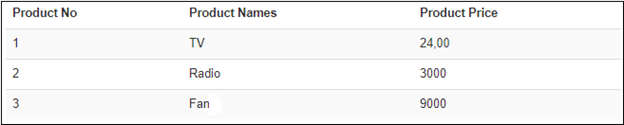
<h2>Striped Rows</h2>
<p>The .table-striped class adds zebra-stripes to a table:</p>
<table class="table table-striped">
<thead>
<tr>
<th>Product No</th>
<th>Product Names</th>
<th>Product Price</th>
</tr>
</thead>
<tbody>
<tr>
<td>1</td>
<td>TV</td>
<td>24,00</td>
</tr>
<tr>
<td>2</td>
<td>Radio</td>
<td>3000</td>
</tr>
<tr>
<td>3</td>
<td>Fan</td>
<td>9000</td>
</tr>
</tbody>
</table>
</div>
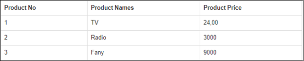
Bootstrap Border Table
We can create bootstrap border table by using its class .table-bordered.
Example: <table class="table table-bordered">
Bootstrap Striped Row Table
We can create bootstrap striped row table by using its class .zebra-stripes.
Example: <table class="table table-bordered">
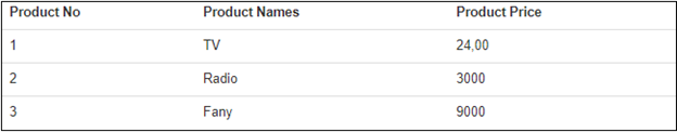
Bootstrap Hover Rows Table
We can create bootstrap hover table by using its class .table –hover. When we will use it then the row will automatically selected.
Example: <table class="table table-hover">

Bootstrap Condensed Table
We can create a compact table by cutting cell padding in half, we have to use its class .table-condensed.
Example: <table class="table table-condensed">
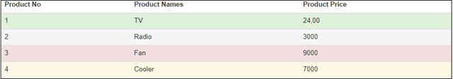
Bootstrap Contextual classes:
In Bootstrap, Contextual classes are used to color the table row or table cells.
There are various contextual classes given below in the table.
| Class | Description |
|---|---|
| .active | It is used to apply the hover color to the table row or table cell. |
| .success | It is used to indicate a successful or positive action. |
| .info | It is used to indicate a neutral informative change or action. |
| .warning | It is used to specify a warning that might need attention. |
| .danger | It is used to indicate a dangerous or potentially negative action. |
Example:
<div class="container">
  <h2>Striped Rows</h2>
  <p>The Contextual classes can be used with: .active, .success, .info, .warning, and .danger.</p>
  <table class="table">
    <thead>
<tr><th>Product No</th><th>Product Names</th><th>Product Price</th></tr>
    </thead>
    <tbody>
<tr class="success"><td>1</td><td>TV</td><td>24,00</td></tr>
<tr class="active"><td>2</td><td>Radio</td><td>3000</td></tr>
<tr class="danger"><td>3</td><td>Fan</td><td>9000</td></tr>
<tr class="warning"><td>4</td> <td>Cooler</td><td>7000</td></tr>
    </tbody>
  </table>
</div>
Bootstrap Responsive Tables
In Bootstrap, We can create responsive tables by using its class .tables-responsive. We can check the responsive table, by resizing it horizontally.
Example:
<div class="table-responsive">
  <table class="table">
    ...
  </table>
</div>