CSS Pagination
CSS Pagination
The pagination in CSS is an advantageous approach for indexing of a website’s distinct pages over the homepage. When our site contains multiple pages, we must insert a few pagination sorts to every page.
Some of the essential types of pagination are discussed as below:
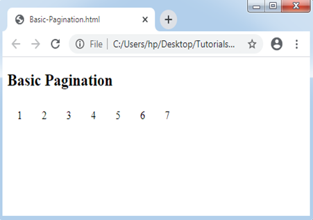
Basic Pagination
It is simple pagination. We must apply the pagination class to the <ul> element for attaining this pagination.
Consider the below example:
Example:
<!DOCTYPE html>
<html>
<head><meta http-equiv="Content-Type" content="text/html; charset=windows-1252">
<style>
ul.pagination
{
display: inline-block;
padding: 0;
margin: 0;
}
ul.pagination li {display: inline;}
ul.pagination li a
{
color: black;
float: left;
padding: 8px 16px;
text-decoration: none;
}
</style>
</head>
<body>
<h2>Basic Pagination</h2>
<ul class="pagination">
<li><a href="#">1</a></li>
<li><a class="active" href="#">2</a></li>
<li><a href="#">3</a></li>
<li><a href="#">4</a></li>
<li><a href="#">5</a></li>
<li><a href="#">6</a></li>
<li><a href="#">7</a></li>
</ul>
</body>
</html>
Output:
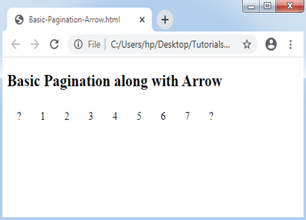
Basic Pagination and Arrow
It is applied if we have multiple pages. It provides the facility to utilize the arrow for the next and previous pages.
Consider the below example:
Example:
<!DOCTYPE html>
<html>
<head>
<style>
ul.pagination
{
display: inline-block;
padding: 0;
margin: 0;
}
ul.pagination li {display: inline;}
ul.pagination li a
{
color: black;
float: left;
padding: 8px 16px;
text-decoration: none;
}
</style>
</head>
<body>
<h2>Basic Pagination along with Arrow</h2>
<ul class="pagination">
<li><a href="#">?</a></li>
<li><a href="#">1</a></li>
<li><a class="active" href="#">2</a></li>
<li><a href="#">3</a></li>
<li><a href="#">4</a></li>
<li><a href="#">5</a></li>
<li><a href="#">6</a></li>
<li><a href="#">7</a></li>
<li><a href="#">?</a></li>
</ul>
</body>
</html>
Output:
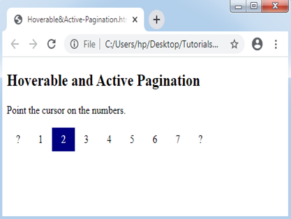
Hoverable Pagination and Current/Active link
It is applied if we wish to highlight or change any current page of all the page-link when we point the cursor over them.
Consider the below example:
Example:
<!DOCTYPE html>
<html>
<head>
<style>
ul.pagination
{
display: inline-block;
padding: 0;
margin: 0;
}
ul.pagination li {display: inline;}
ul.pagination li a
{
color: black;
float: left;
padding: 8px 16px;
text-decoration: none;
}
ul.pagination li a.active
{
background-color: navy;
color: white;
}
ul.pagination li a:hover:not(.active) {background-color: lightblue;}
</style>
</head>
<body>
<h2> Hoverable and Active Pagination </h2>
<p> Point the cursor on the numbers.</p>
<ul class="pagination">
<li><a href="#">?</a></li>
<li><a href="#">1</a></li>
<li><a class="active" href="#">2</a></li>
<li><a href="#">3</a></li>
<li><a href="#">4</a></li>
<li><a href="#">5</a></li>
<li><a href="#">6</a></li>
<li><a href="#">7</a></li>
<li><a href="#">?</a></li>
</ul>
</body>
</html>
Output:
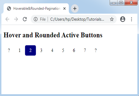
Hoverable and Rounded Active Pagination
This pagination allows us to apply the property border-radius to get rounded “hover” and “next” button.
Consider the below example:
Example:
<!DOCTYPE html>
<html>
<head>
<style>
ul.pagination
{
display: inline-block;
padding: 0;
margin: 0;
}
ul.pagination li {display: inline;}
ul.pagination li a
{
color: black;
float: left;
padding: 8px 16px;
text-decoration: none;
border-radius: 5px;
}
ul.pagination li a.active
{
background-color: navy;
color: white;
border-radius: 5px;
}
ul.pagination li a:hover:not(.active) {background-color: lightblue;}
</style>
</head>
<body>
<h2> Hover and  Rounded Active Buttons </h2>
<ul class="pagination">
<li><a href="#">?</a></li>
<li><a href="#">1</a></li>
<li><a class="active" href="#">2</a></li>
<li><a href="#">3</a></li>
<li><a href="#">4</a></li>
<li><a href="#">5</a></li>
<li><a href="#">6</a></li>
<li><a href="#">7</a></li>
<li><a href="#">?</a></li>
</ul>
</body>
</html>
Output:
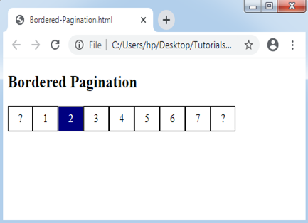
Bordered Pagination
We apply the CSS border attribute to include the borders to this pagination.
Consider the below example:
Example:
<!DOCTYPE html>
<html>
<head>
<style>
ul.pagination
{
display: inline-block;
padding: 0;
margin: 0;
}
ul.pagination li {display: inline;}
ul.pagination li a
{
color: black;
float: left;
padding: 8px 16px;
text-decoration: none;
border: 1px solid black;
}
ul.pagination li a.active
{
background-color: navy;
color: white;
border: 1px solid grey;
}
ul.pagination li a:hover:not(.active) {background-color: lightblue;}
</style>
</head>
<body>
<h2> Bordered Pagination </h2>
<ul class="pagination">
<li><a href="#">?</a></li>
<li><a href="#">1</a></li>
<li><a class="active" href="#">2</a></li>
<li><a href="#">3</a></li>
<li><a href="#">4</a></li>
<li><a href="#">5</a></li>
<li><a href="#">6</a></li>
<li><a href="#">7</a></li>
<li><a href="#">?</a></li>
</ul>
</body>
</html>
Output:
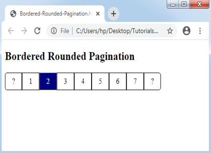
Bordered Rounded Pagination
This technique allows us to apply the rounded borders to the last and first link of the pagination.
Consider the below example:
Example:
<!DOCTYPE html>
<html>
<head>
<style>
ul.pagination
{
display: inline-block;
padding: 0;
margin: 0;
}
ul.pagination li {display: inline;}
ul.pagination li a
{
color: black;
float: left;
padding: 8px 16px;
text-decoration: none;
border: 1px solid black;
}
.pagination li:first-child a
{
border-top-left-radius: 5px;
border-bottom-left-radius: 5px;
}
.pagination li:last-child a
{
border-top-right-radius: 5px;
border-bottom-right-radius: 5px;
}
ul.pagination li a.active
{
background-color: navy;
color: white;
border: 1px solid grey;
}
ul.pagination li a:hover:not(.active) {background-color: lightblue;}
</style>
</head>
<body>
<h2> Bordered Rounded Pagination </h2>
<ul class="pagination">
<li><a href="#">?</a></li>
<li><a href="#">1</a></li>
<li><a class="active" href="#">2</a></li>
<li><a href="#">3</a></li>
<li><a href="#">4</a></li>
<li><a href="#">5</a></li>
<li><a href="#">6</a></li>
<li><a href="#">7</a></li>
<li><a href="#">?</a></li>
</ul>
</body>
</html>
Output:
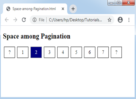
Space among Pagination
The margin attribute is applied to get a space among the links inside the pagination.
Consider the below example:
Example:
<!DOCTYPE html>
<html>
<head>
<style>
ul.pagination
{
display: inline-block;
padding: 0;
margin: 0;
}
ul.pagination li {display: inline;}
ul.pagination li a
{
color: black;
float: left;
padding: 8px 16px;
text-decoration: none;
border: 1px solid black;
margin: 0 4px;
}
ul.pagination li a.active
{
background-color: navy;
color: white;
border: 1px solid grey;
}
ul.pagination li a:hover:not(.active) {background-color: lightblue;}
</style>
</head>
<body>
<h2> Space among Pagination </h2>
<ul class="pagination">
<li><a href="#">?</a></li>
<li><a href="#">1</a></li>
<li><a class="active" href="#">2</a></li>
<li><a href="#">3</a></li>
<li><a href="#">4</a></li>
<li><a href="#">5</a></li>
<li><a href="#">6</a></li>
<li><a href="#">7</a></li>
<li><a href="#">?</a></li>
</ul>
</body>
</html>
Output:
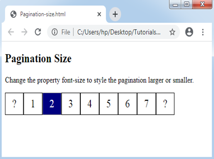
Size of Pagination
We can modify the pagination size with the use of the CSS property font-size.
Consider the below example:
Example:
<!DOCTYPE html>
<html>
<head>
<style>
ul.pagination
{
display: inline-block;
padding: 0;
margin: 0;
}
ul.pagination li {display: inline;}
ul.pagination li a
{
color: black;
float: left;
padding: 8px 16px;
text-decoration: none;
border: 1px solid black;
font-size: 22px;
}
ul.pagination li a.active
{
background-color: navy;
color: white;
border: 1px solid grey;
}
ul.pagination li a:hover:not(.active) {background-color: lightblue;}
</style>
</head>
<body>
<h2>Pagination Size</h2>
<p>Change the property font-size to style the pagination larger or smaller.</p>
<ul class="pagination">
<li><a href="#">?</a></li>
<li><a href="#">1</a></li>
<li><a class="active" href="#">2</a></li>
<li><a href="#">3</a></li>
<li><a href="#">4</a></li>
<li><a href="#">5</a></li>
<li><a href="#">6</a></li>
<li><a href="#">7</a></li>
<li><a href="#">?</a></li>
</ul>
</body>
</html>
Output:
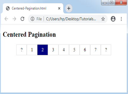
Centered Pagination
We must wrap any container element over it and apply text-align: center property to set the pagination in the center of a page.
Consider the below example:
Example:
<!DOCTYPE html>
<html>
<head>
<style>
ul.pagination
{
    display: inline-block;
    padding: 0;
    margin: 0;
}
ul.pagination li {display: inline;}
ul.pagination li a
{
    color: black;
    float: left;
    padding: 8px 16px;
    text-decoration: none;
    border: 1px solid #ddd;
}
ul.pagination li a.active
{
    background-color: navy;
    color: white;
    border: 1px solid grey;
}
ul.pagination li a:hover:not(.active) {background-color: lightblue;}
div.center {text-align: center;}
</style>
</head>
<body>
<h2> Centered Pagination </h2>
<div class="center">
<ul class="pagination">
    <li><a href="#">?</a></li>
    <li><a href="#">1</a></li>
    <li><a class="active" href="#">2</a></li>
    <li><a href="#">3</a></li>
    <li><a href="#">4</a></li>
    <li><a href="#">5</a></li>
    <li><a href="#">6</a></li>
    <li><a href="#">7</a></li>
    <li><a href="#">?</a></li>
  </ul>
</div>
</body>
</html>
Output:
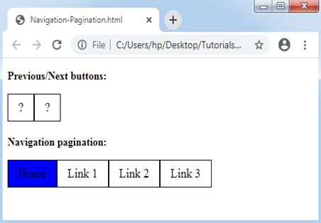
Navigation and Next/Previous Pagination
We can include the pagination for the next/previous button and for navigation also.
Consider the below example:
Example:
<!DOCTYPE html>
<html>
<head>
<style>
ul.pagination
{
    display: inline-block;
    padding: 0;
    margin: 0;
}
ul.pagination li {display: inline;}
ul.pagination li a
{
    color: black;
    float: left;
    padding: 8px 16px;
    text-decoration: none;
    border: 1px solid black;
    font-size: 18px;
}
ul.pagination li a.active
{
    background-color: blue;
    color: black;
    border: 1px solid black;
}
ul.pagination li a:hover:not(.active) {background-color: lightblue;}
</style>
</head>
<body>
<p><strong>Previous/Next buttons:</strong></p>
<ul class="pagination">
  <li><a href="#">?</a></li>
  <li><a href="#">?</a></li>
</ul>
<p><strong>Navigation pagination:</strong></p>
<ul class="pagination">
  <li><a href="#" class="active">Home</a></li>
  <li><a href="#">Link 1</a></li>
  <li><a href="#">Link 2</a></li>
  <li><a href="#">Link 3</a></li>
</ul>
</body>
</html>
Output:
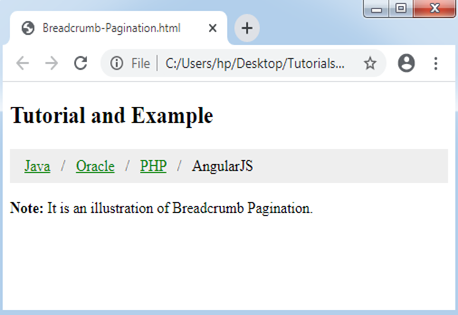
Breadcrumb Pagination
A unique kind of pagination is known as breadcrumb pagination.
Consider the below example:
Example:
<!DOCTYPE html>
<html>
<head>
<style>
ul.breadcrumb
{
    padding: 8px 16px;
    list-style: none;
    background-color: #eee;
}
ul.breadcrumb li {display: inline;}
ul.breadcrumb li+li:before
{
    padding: 8px;
    color: black;
    content: "/\00a0";
}
ul.breadcrumb li a {color: green;}
</style>
</head>
<body>
<h2> Tutorial and Example </h2>
<ul class="breadcrumb">
  <li><a href="#">Java</a></li>
  <li><a href="#">Oracle</a></li>
  <li><a href="#">PHP</a></li>
  <li>AngularJS</li>
</ul>
<p><strong>Note:</strong> It is an illustration of Breadcrumb Pagination.</p>
</body>
</html>
Output: