Flutter Layouts
Flutter Layout: Flutter integrates User Interface layout functionality into the widgets. Flutter provides many widgets such as a row, column, card, center, align, etc. to layout the user interface. Let’s now look deeper into flutter layouts and understand them better.
Types of Flutter Layouts
There are mainly two types of flutter layouts.
- Single child widget
- Multiple child widgets
Single Child Widget
It is a type of widget which has only one child widget in the parent layout widget. There are numerous single child widgets available in flutter, which are very fruitful to the developers. We will learn about each one of them in detail below.
- Container: It is one of the most popular and essential widgets. It is used to store a single child widget and provides some styling properties to it.
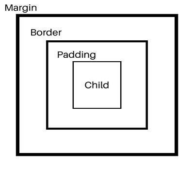
- Padding: It applies some space between the text and content area.
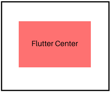
- Center: This widget aligns its content to the center.
- Align: We can align the child widget in it using its alignment property.
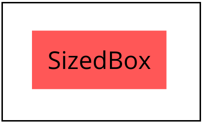
- SizedBox: It is a widget that can be defined as a box of a certain size.
- Aspect Ratio: This widget is used to size its child widget to a certain aspect ratio.
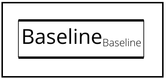
- Baseline: This widget aligns its child’s position according to the baseline.
- ConstrainedBox: This widget is responsible for imposing additional constraints on its child widget.
- CustomSingleChildLayout: This is a widget that accedes the layout of its single child to it entrust.
- Fitted Box: This widget is used to align and reposition its child so as to fit it within itself.
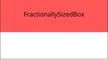
- FractionallySizedBox: This widget resizes its child to a fraction of the total area available.
- IntrinsicHeight and IntrinsicWidth: The widgets that resize their child to the child’s intrinsic height and width are called intrinsicheight and intrinsic width, respectively.
- Limited Box: This widget restricts the size of a box only when it is unconstrained.
- OffStage: This widget lays the child out as if it was in the tree, but without making the child available for hit testing and taking any room in the parent widget.
- OverflowBox: This is a widget that thrust different constraints on its child, allowing the child to overflow the parent.
Multiple Child Widget
The multiple child widgets are a type of widget that has more than one child widget. The layout of these widgets is very special and unique. We are given the comfort of many multiple child widgets in flutter. Let’s move forward and find out more about each one of them.
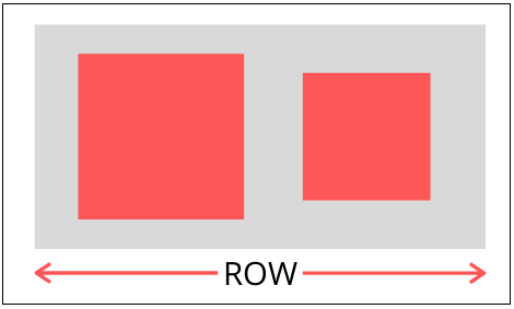
- Row: It shows its child widgets horizontally. This widget is one of the most important widgets of flutter.
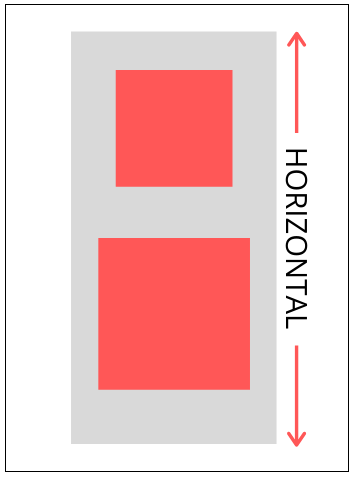
- Column: It shows its child widgets vertically. This widget is also very important in flutter.
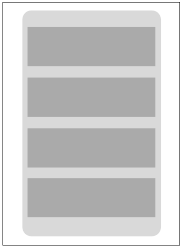
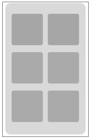
- ListView: This widget is responsible for making a list of children in flutter.
- GridView: This widget is responsible for making a scrollable array of widgets.
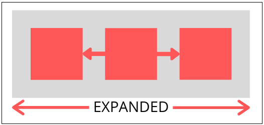
- Expanded: This widget expands its child widgets such as row, column, or flex so as to fill the entire available area in a flutter.
- Table: This widget is responsible for creating a tabular layout for its children.
- Flow: It is a widget that optimizes the layout for repositioning of its children using transformational matrices.
- Stack: The widget that aligns its children relative to its box's edges is called the stack.
Laying out a Widget
Now we will understand how we can layout a widget in flutter. It is not very difficult to layout a widget in flutter. It only involves a few steps.
Step 1: Selecting a layout widget.
We can choose any layout from the various layouts that are available to use by flutter. In the example, we will use a container widget.
Step 2: Creating a visible widget.
We can create an icon widget.
Icon(
  Icons.circle,
  color: Colors.red[500],
),
We can also create a text widget.
Text(‘tutorial and example'),
We will now create an image widget.
Image.asset(
  'images/tutorialandexample.jpg',
 ),
Step 3: Merging visible widget and the layout widget.
As we have learned earlier also, we have two types of flutter layouts.
There are single child widgets and multiple children widgets.
So now, we will merge the container widget and text widget.
Container(
  child: Text(‘Tutorials and Examples'),
),
Step 4: Adding a layout widget to the page.
In flutter, for instantiating and returning a widget, we have a build( ) method which displays the widgets.
Material Apps
The material app uses a scaffold widget. Scaffold widget has a default banner, background color and API, which provides adding drawers, snack bars and bottom sheets. So, we will add a container directly to the body property.
class MyApp extends StatelessWidget {
  @override
  Widget build(BuildContext context) {
    return MaterialApp(
      title: 'Flutter layout demo',
      home: Scaffold(
        appBar: AppBar(
          title: Text(‘Tutorials and Examples'),
        ),
        body: Container(
          child: Text(‘This is a Sample Application'),
        ),
      ),
    );
  }
}
Non-Material Apps
For non-material apps, we will put container widget to the app’s build method.
class MyApp extends StatelessWidget {
  @override
  Widget build(BuildContext context) {
    return Container(
      decoration: BoxDecoration(color: Colors.white),
      child: Center(
        child: Text(
          ‘Tutorials and Examples',
          textDirection: TextDirection.ltr,
          style: TextStyle(
            fontSize: 32,
            color: Colors.black,
          ),
        ),
      ),
    );
  }
}