Ionic Date Time
Ionic Date Time
The DateTime component is used to display an interface that makes it simple for users to select dates and times. Tapping on <ion-datetime> will display a slider up from the bottom of the page. Next, the selector displays scrollable columns that can be used to individually specify values for years, months, days, hours, and minutes. The DateTime component is similar to the original <input type = "datetime-local"> element. However, the Ionic DateTime component makes it easy to display the date and time in a preferred format and manage the date and time values.
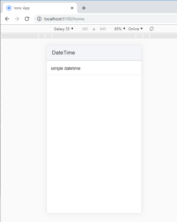
Example: This example shows how you can use the <ion-datetime> component.
  DateTime


  simple datetime
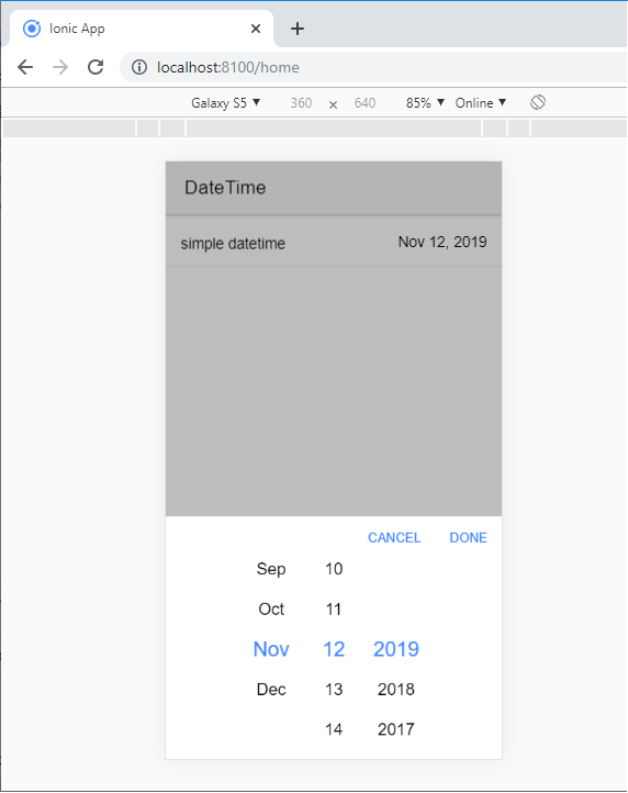
Output: After executing this code, you will get the output, as shown below.
When you click on the simple date time option, you will get the pop-up screen. It shows your current system date and time information. When you select date and time and to finalize it, you click on the Done button.
Display and Picker Formats
The DateTime component shows values in two places. The first is in the <ion-datetime> component, and second in the interface provided at the bottom of the screen. The following table lists all the formats that can be used.
Display Format
The displayFormat input property determines how the date-time value, as formatted text, is printed within the <ion-datatime> component.
Picker Format
The pickerFormat input property specifies which columns to display in the interface, the column order, and the format to use in each column. If pickerFormat input is not provided, it will use the value of diasplayFormat.
Example: This example shows how you can add the displayFormat and pickerFormat attribute inside the <ion-datetime> component.
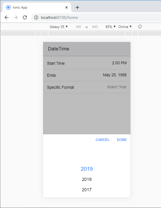
  DateTime


  Start Time


  Ends


  Specific Format
Output: After executing this code, you will get the output, as shown below.
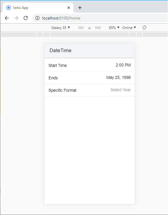
When you click on the Specific Format option, you will get the pop-up screen. Here, you can choose your selective year and finalize it, and you click on the Done button.
Datetime Data
The handling of datetime values within JavaScript or HTML inputs has always been a challenge. Specifically, a JavaScript date object is known to be challenging to parse date and time strings correctly or to format date and time values. Worse, how different browsers and JavaScript versions of date and time strings are analyzed differently, especially by location. Ionic datetime input is designed so the developers can avoid the common pitfalls. It also permits developers to simple format datetime values within the input. It gives the user a simple datetime picker for an excellent user experience.
ISO 8601 Datetime Format
Ionic uses the ISO 8601 date and time format for its value. The value is just a string, instead of using a JavaScript date object. Also, when using the ISO date and time format, it is easier to serialize and pass within JSON objects, and send a uniform format to databases that can be easily analyzed, if necessary.
The ISO format can be used as a simple year, just an hour and a minute, or get more detail in milliseconds and time zones. Any of the ISO setups below can be used, and after the user selects a new value, Ionic will continue to use the same ISO format in which the date and time value is set. The following Datetime table shown below:
| Description | Format | Datetime Value Example |
| Year | YYYY | 1998 |
| Year and Month | YYYY-MM | 1997-15 |
| Complete Date | YYYY-MM-DD | 1998-05-25 |
| Date and Time | YYYY-MM-DDTHH:mm | 1997-04-21T12:26 |
| UTC Timezone | YYYY-MM-DDTHH:mm:ssTZD | 1998-08-04T06:34:46.789Z |
| Timezone Offset | YYYY-MM-DDTHH:mm:ssTZD | 1994-05-16T13:45:52.789+5:00 |
| Hour and Minute | HH:mm | 16:45 |
| Hour, Minute, Second | HH:mm:ss | 14:55:22 |
Max and Min datetimes
Dates do not end in any direction, so there must be at least some ways to restrict the dates that can be selected for the user's choice. By default, the maximum date is at the end of the current year, and the minimum date is from the beginning of the year that was 100 years ago. To customize the minimum and maximum date and time values, you can provide the min and max component inputs, which may make more sense for the application's use case, rather than the default value of the last 100 years.
Example: This example shows the use of the disabled, minimum, and maximum attributes with the <ion-datetime> component.
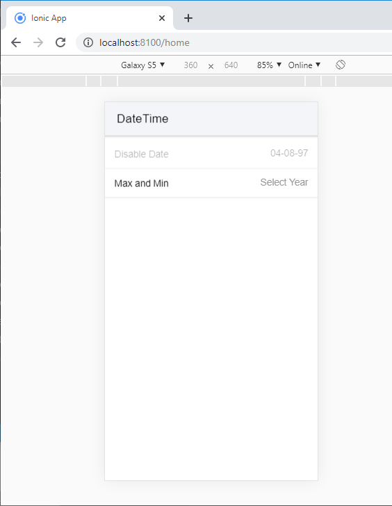
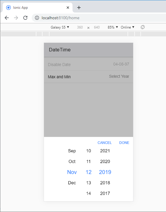
  DateTime


  Disable Date


  Max and Min
Output: After executing this code, you will get the output, as shown below.
When you click on the Max and Min option, you will get the pop-up screen. Here, you can choose your particular datetime and finalize it, and you click on the Done button.
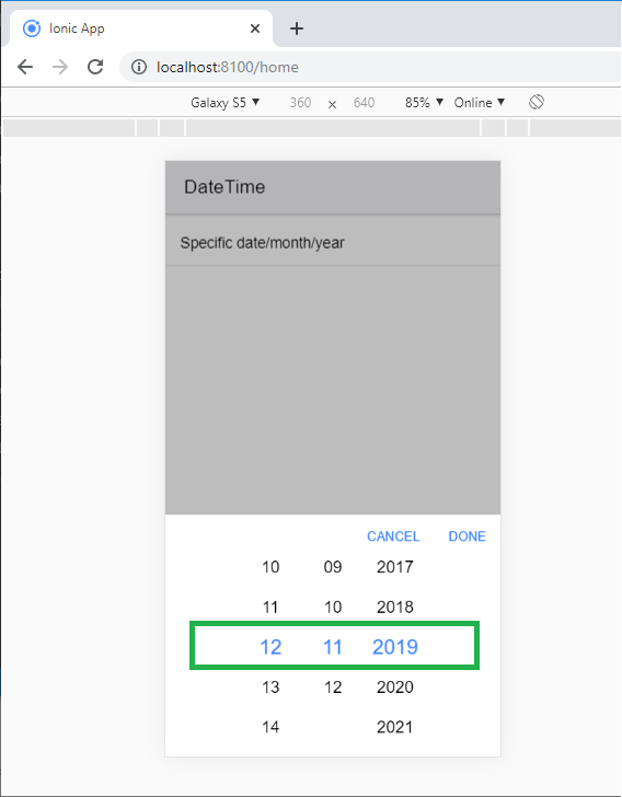
Specific Date/ Month/Year
The <ion-datetime> component also lets you specify a particular date, months, and years by setting the monthValues, dateValues, and yearValues properties.
The following code shows how it can work with <ion-datetime> component.
Example:
  DateTime


  Specific date/month/year
Output: After executing this code, you will get the output, as shown below.