Ionic-fab Button
Ionic-fab Button
The Ionic FABs (Floating Action Buttons) are standard material design compounds. It is a container element that contains one or more fab buttons. They are required to be placed in a fixed position, which means they don’t scroll with the content. Fab is necessary to have one main fab button. They are designed as a circle, which represents a promoted action. It can also contain a fab-list in the button. When you click on the main fab button, it shows many related activities. The fab container can contain various types of fab-list elements with different side values such as top, bottom, left, and right. If you want to have a button list at the top of the main button, then you should use side="top".
It represents the primary action in an ionic application. Fab is not only achieved through the use of a <ion-fab-button>Fab Button</ion-fab-button> component. It’s required to be wrapped with the <ion-fab> element to be fixed over the content. If you are not wrapped FAB Button with <ion-fab> component, then it will behave like a normal button and scrolling with the content. Fab buttons can accept all the colors, and it also has a default size and the mini size. The <ion-fab-button> component is used inside the <ion-fab> component.
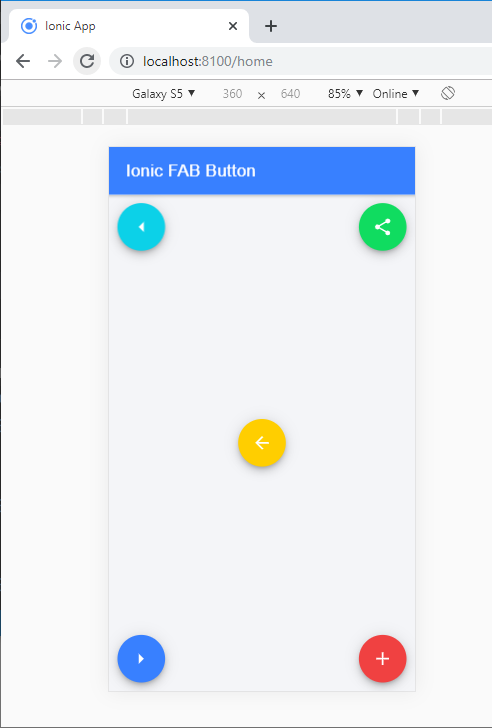
Example: This example helps you to understand how you can use the <ion-fab-button> component in an ionic application. Here you can add the icons and use the different colors for these fab buttons.
Ionic FAB Button
Output: After executing this code, you will get the output, which is shown below. Here, you can create the fab buttons in the ionic application at different positions such as top-start, top-end, bottom-start, bottom-end, and center position.
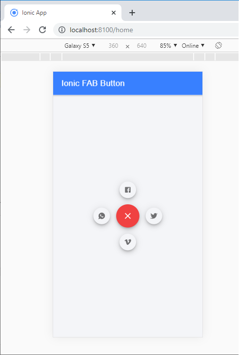
Ion-Fab-list
The ion-fab-list component is a container, which contains multiple fab buttons. This collection of fab buttons includes activities related to the main fab button, and it flung out when you click on the fab button. To determine on which side the button will appear, you can set the side property to 'start', 'end', 'top', and 'bottom'. The <ion-fab-list> component is used inside the <ion-fab-button>.
Example: This example helps you to understand how you can use the ion-fab-list component inside the ion-fab-button. Here, you are going to create a list of various types of fab buttons. The fab buttons have different kinds of icons like as: Share, Instagram, Facebook, Twitter, Whatsapp, Google, and many others. It contains the action related to the main fab button and flung out when you click on the main fab button.
Ionic FAB Button
Output: After executing this code, you will get the output, as shown below.
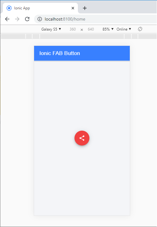
When you click on the share button, you will get the below screen which shows many options.