Ionic Select
The Ion Selection component is similar to the HTML <select> element. However, the Ionic Selection component makes it easy for users to categorize and choose the preferred option or other options. You must use a selection with the <ion-select-option> subitems. If the second option does not receive a value attribute, its text is used as a value.
If the value is set to <ion-select>, the selected option is chosen based on that value. Otherwise, the attribute selected can be used in <ion-select-option>.
The Select components are two types:
- Single-Selection
- Multiple -Selection
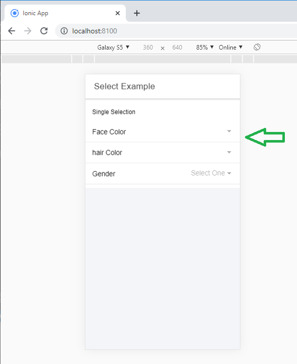
Single-Selection
By default, the single-selection permits the user to select only one option. The alert interface offers users a list of options in the style of a radio button. The Action-sheet interface can only be used with one specific value. If the number of options exceeds 6, you will use the alert interface even if the action-sheet is passed. You receive a component value that specifies an ion-select value for the selected option.
Example: This example shows how you can select the one option from various options.
 Select Example


 Single Selection

 Face Color

 Light
 Fair
 Wheatish
 Dark


 hair Color

 Black
 White
 Brown


 Gender

 Female
 Male
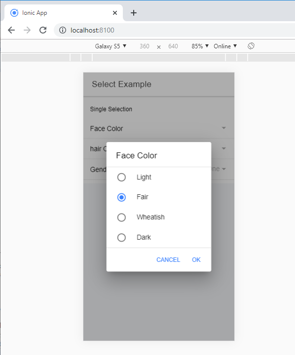
Output: After executing this code, you will get the output, as shown below.
When you can click on the face color option, then it shows various options, and when you select one option, then you can click on the Ok button to finalize the choice.
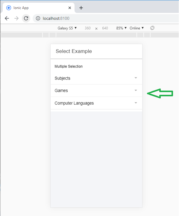
Multiple-Selection
By adding multiple attributes to select, users can choose various options. When several options can be selected, the alert overlay provides users with a list of options in the checkbox style. The value of the selected component receives a set of all values for the options chosen.
Example: This example shows how you can select multiple options at a time.
 Select Example


 Multiple Selection

 Subjects

 Maths
 Science
 Computer
 English
 Civics
 Hindi


 Games

 Cricket
 Hockey
 Badminton
 Tennis
 Bollyball


 Computer Languages

 Android
 Java
 Python
 Angular
 PHP
OuTput: After executing this code, you will get the output, as shown below.
When you can click on the game option, then it shows various options. Here, you can select many options, and then you click on the Ok button to finalize the choice.
Select Buttons
It has two buttons: Cancel and Ok. The text of each button can be customized using the CancelText and okText properties. You can select the button from the given syntax.
...
There is no Ok button in the Action-sheet and popover interfaces, so clicking any of the options would automatically close the overlay. The popover interface does not contain a Cancel button. If you click on the background, then it will close the overlay.
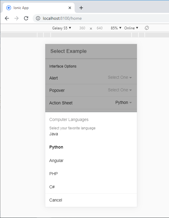
Interface Options
By default, the select component uses the AlertController API to open the options overlay in the alert. The interface can be modified to use the ActionSheetController API or the PopoverController API by transferring the action-sheet or popover to the interface property.
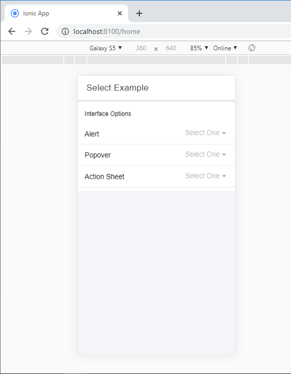
Example: The following example shows how you can make the interface option in the ionic application.
Home.page.html
 Select Example


 Interface Options

 Alert

 Cricket
  Badminton
  Tennis
  Bollyball
  Hockey


  Popover

  Apple
  Banana
  Grapes
  Papaya
  Pineapple


  Action Sheet

 Java
 Python
 Angular
 PHP
 C#
Home.page.ts
import { Component } from '@angular/core';
@Component({
 selector: 'app-home',
 templateUrl: 'home.page.html',
 styleUrls: ['home.page.scss'],
})
export class HomePage {
 customAlertOptions: any = {
 header: 'Games',
 subHeader: 'Select your game',
 message: 'Select your favourite game',
 translucent: true
 };
 customPopoverOptions: any = {
 header: 'Fruites name',
 subHeader: 'Select your Fruite name',
 message: 'Only select your favorite Fruite'
 };
 customActionSheetOptions: any = {
 header: 'Computer Languages',
 subHeader: 'Select your favorite language'
 };
}
Output: After executing this code, you will get the output, as shown below.
When you can click on the action sheet option, then it shows various options. Here, you can select one option to finalize the choice. You can also select the options alert and popover the same as the action sheet.