R Bar Charts
Bar charts represent data in the form of rectangular bars. In R, we can create bar charts using barplot() function. We can supply a matrix or vector to this function. R supports both vertical and horizontal bars in the bar chart.
Syntax:
barplot(H,xlab,ylab,main, names.arg,col)
Here,
H is a vector or matrix of numeric values used in the bar chart
xlab x-axis label
ylab y-axis label
main title of the bar chart
names.arg is a vector of names appearing under each bar
col is the colors for the bars
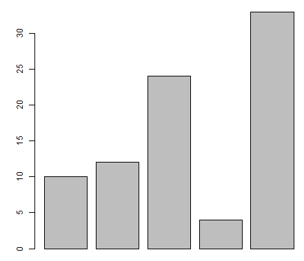
Example 1:
Let's create a simple vertical bar chart using just the input vector and the name of the each bar. The below script will create and save the bar chart in current working directory of R.
# Create the data for the chart
H <- c(10,12,24,4,33)
# Give the chart file a name
png(file = "barchart.png")
# Plot the bar chart
barplot(H)
# Save the file
dev.off()
Output:
Example 2:
Let's create simple horizontal bar chart:
# Create the data for the chart
H <- c(10,12,24,4,33)
# Give the chart file a name
png(file = "barchart_horiz.png")
# Plot the bar chart
barplot(H, horiz=TRUE)
# Save the file
dev.off()
Output:
[caption id="attachment_6921" align="alignleft" width="407"]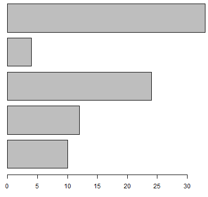 R Bar Charts 2[/caption]
Bar Chart Labels, Title and Colors
We can expand the features of the bar chart can be expanded by adding more parameters.
Example:
# Create the data for the chart
H <- c(67,32,5,45,51)
M <- c("Jan","Feb","Mar","Apr","May")
# Give the chart file a name
png(file = "barchart_months_revenue.png")
# Plot the bar chart
barplot(H,names.arg=M,xlab="Month",ylab="Revenue",col="yellow",
        main="Revenue chart",border="red")
# Save the file
dev.off()
Output:
[caption id="attachment_6922" align="alignleft" width="480"]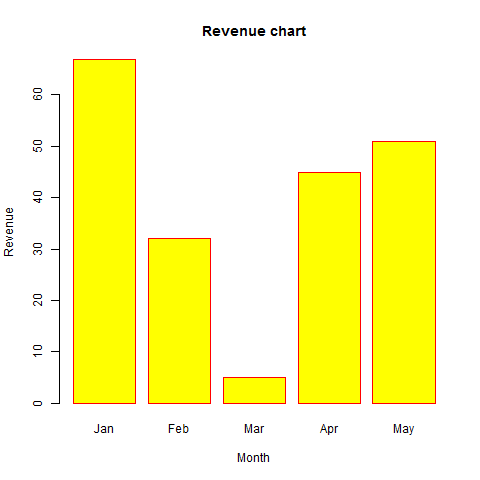 R Bar Charts 3[/caption]
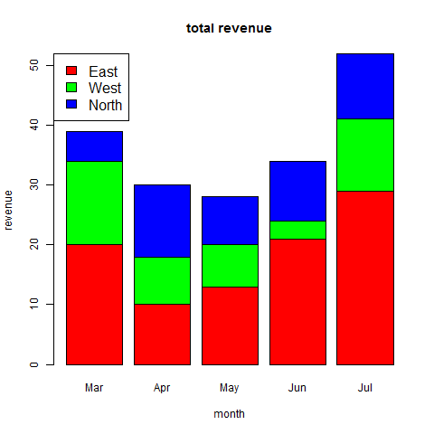
Group Bar Chart and Stacked Bar Chart
We can also create a bar chart with groups and stacks using a matrix as input values. More than two variables are represented as a matrix which is used to create the group bar chart and stacked bar chart.
Example:
# Create the input vectors.
colors = c("Red","green","blue")
months <- c("Mar","Apr","May","Jun","Jul")
regions <- c("East","West","North")
# Create the matrix of the values.
Values <- matrix(c(20, 10, 13, 21,29, 14,8,7,3,12,5,12,8,10,11), nrow = 3, ncol = 5, byrow = TRUE)
# Give the chart file a name
png(file = "barchart_stacked.png")
# Create the bar chart
barplot(Values, main = "total revenue", names.arg = months, xlab = "month", ylab = "revenue", col = colors)
# Add the legend to the chart
legend("topleft", regions, cex = 1.3, fill = colors)
# Save the file
dev.off()
Output:
Plotting Categorical Data
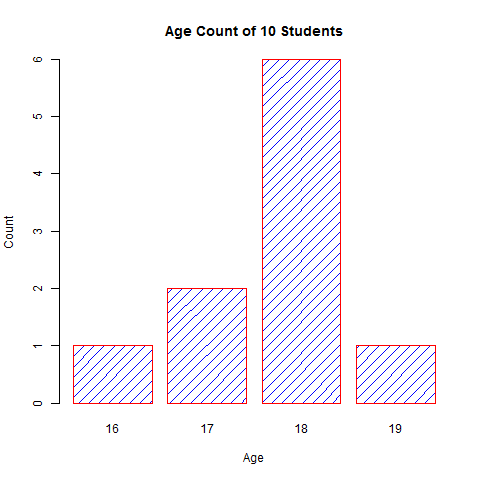
Sometimes we have to plot the count of each item as bar plots from categorical data. For example, here is a vector of the age of 10 college students.
Example:
age <- c(17,18,18,17,18,19,18,16,18,18)
Simply doing barplot(age) will not give us the required plot. It simple plot 10 bars with height equal to the age of the student. But we want to know the number of student in each age category.
This count can be easily found using the table() function, as given below:
table(age)
Output will be:
age
16 17 18 19
1  2  6  1
Now we plot this data which will give our required bar plot. Here, density is used to shade the bars.
png(file = "barchart_age.png")
barplot(table(age),
       main="Age Count of 10 Students",
       xlab="Age",
       ylab="Count",
       border="red",
       col="blue",
       density=10
)
# Save the file
dev.off()
Output: