How to Create Tableau Bar Chart?
In Tableau, different kinds of bar charts can be produced by using dimensions and measures.
A bar chart represents your data in rectangular bars with the measurement of the bar relative to the value of the given variable. It is used to describe the data more efficiently. One can create a bar chart in Tableau software by dragging a dimension on the Row shelf and measure to the Column shelf. Tableau also offers the bar chart option in the Show Me card.
Simple Bar Chart
Bar chart representation is the basic and the most used chart in Tableau. The following steps depict the way to create a simple bar chart:
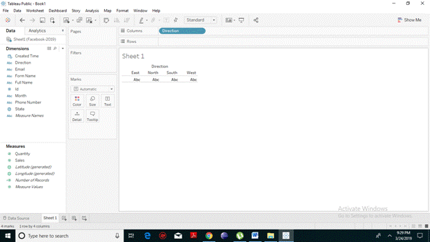
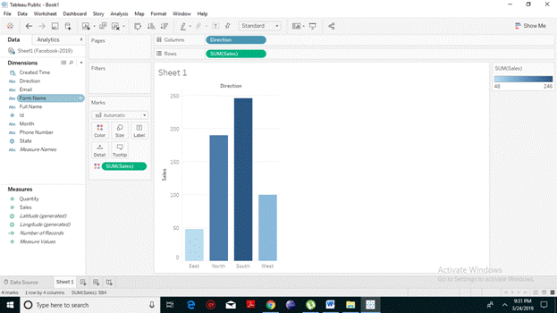
- From the Microsoft Excel option, choose your excel file. Unlike here, we have chosen Facebook 2019 data.
- Choose the dimension, drag it (we have taken direction) to the columns shelf.
- And the measures (we have taken sales) to the rows shelf. It automatically creates a horizontal bar chart as presented in the resulting screenshot.
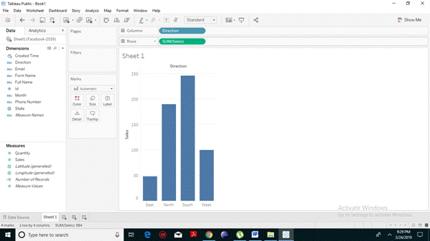
- In case, if it does not generate the bar chart, you can also choose the bar chart from the Show Me pane present on the left to get the above result.
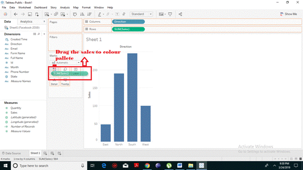
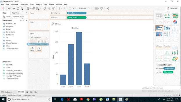
Coloured Bar Chart
According to a psychological study, Human minds are more influenced by colours. So Tableau also allows you to apply colors to the bars based on their ranges.
Bars with different Colour Shades
You can differentiate the bars in accordance with their values. For this drag the measures field (we have taken sales) to the color palette present in the Marks Card.
From the following screenshot, it evident that the longer the bars the darker are the shade and similarly the smaller the bars, the lighter is the shade. It also produces different colored bars for negative values.
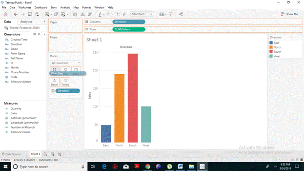
Stacked Bars with Unique Colour
To get unique colour for each bar, drag a dimension field to the color palette present in the Marks Card. Here we have dragged direction field.
From the following screenshot, it’s evident that for each direction (east, west, north, south) we have a uniquely coloured bar.
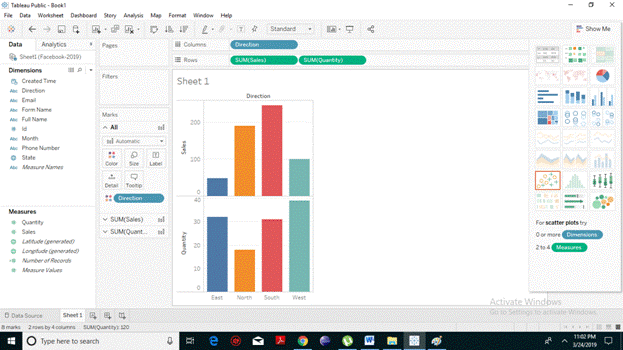
Dual Bar Chart
Tableau allows you to add other measures on the rows shelf to generate a dual bar chart on the same sheet pane.
Drag the measure field (here we have quantity) to the Rows shelf. The following bar chart shows the dual distribution for each segment in each bar. You can also see that the second bar graph represents the same colour for which the first one was arranged.