XAML Tutorial for Beginners
What is XAML?
XAML stands for Extensible Application Markup Language. XAML is a dialect of XML. It is introduced in 2006 along with the first version of Windows Presentation Foundation (WPF) as a way to specify the user interface for windows app. XAML is a general purpose declarative programming language suitable for constructing and initializing objects in a hierarchical relation.- It is case sensitive and strongly typed markup language.
- The elements of XAML are an XML representation of CLR objects.
- It is very easy to create, initialize, and set properties of an object with hierarchical relations
- It is mainly used for designing GUIs, but you can also declare workflow.
- It can be used in different platforms like WPF, Silverlight, and Windows Store App.
- Extension of XAML file is .xaml
Working of XAML
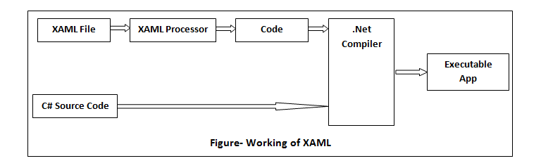 XAML is a declarative language, so there exist two words What and How you want to do. The processor is responsible for the How part. The following figure describes the working of XAML.
- A platform-specific XAML processor interprets .xaml file.
- XAML processor converts the XAML to internal code that describes the UI element.
- The internal code and C# code combined through classes' definition and then .Net compiler builds the app.
Advantages of XAML
- XAML is based on XML
- XAML programmer and designer can work in parallel.
- XAML code is very easy to understand.
- Provide a clear separation between UI (XAML) and UI logic (C#).
- Advanced data binding
Difference between XML and XAML
|
XML |
XAML |
| XML stands for Extensible Markup Language. | XAML stands for Extensible Application Markup Language. |
| All XML documents are not XAML documents. | All XAML documents are valid XML document. |
| XML is markup language. | XAML is declarative application language. |
| XML finds its use primarily in web application. | XAML is used to design controls for windows as well as web applications. |
XAML Development Tools
- Microsoft Visual Studio & Microsoft Expression blend
- WPF Inspector
- Snoop
<Grid xmlns="http://schemas.microsoft.com/winfx/2006/xaml/presentation">
      <Button Content="Start"/>
</Grid>
Attribute syntax Properties of an object can often be expressed as attribute of the object element. The value of an attribute must be enclosed in double quotation marks. For example:
<Grid xmlns="http://schemas.microsoft.com/winfx/2006/xaml/presentation">
      <Circle Fill="Blue"/>
</Grid>
In the above example “Fill” is the attribute. Property Elements Syntax The properties can also be defined as an element when you cannot assign the value within the quotes. This generally starts with the <element.PropertyName> and ends with </element.PropertyName>. Generally, the content of the tag is an object element of the type that the property takes as its value.
<Grid xmlns="http://schemas.microsoft.com/winfx/2006/xaml/presentation">
  <Circle>
    <Circle.Fill>
      <SolidColorBrush Color="Green"/>
    </Circle.Fill>
  </Circle>
</Grid>
In above example, same properties being set as in the previous attribute syntax example, but this time by using property element syntax for all properties of the button. Collection Syntax If a particular property takes a collection type, then items that you declare in markup as child elements within that property's value become part of the collection. In this case, a collection one child object elements are the value being set to the collection property. The following example shows a Grid container that contains one element, a circle.
<Grid xmlns="http://schemas.microsoft.com/winfx/2006/xaml/presentation">
    <Circle/>
</Grid>
Markup Extension These are the dynamic placeholders for attribute values. It resolves the value of a property at runtime. You can derive all markup extension from abstract MarkupExtension class and override its ProvideValue method. There are some built-in markup extensions, but you can write your own. Curly braces { } indicate a markup extension. The built-in markup extensions are:
- Binding- To bind the values of two properties together.
- StaticResource- Resource entry for one-time lookup.
- DynamicResource- Resource entry for auto-updating lookup.
- x: Static- Determine the value of a static property.
- x: Null- It returns null values.
<Grid xmlns="http://schemas.microsoft.com/winfx/2006/xaml/presentation"
            xmlns:x="http://schemas.microsoft.com/winfx/2006/xaml">
    <Grid.Resources>
        <SolidColorBrush x:Key="MyBrush" Color="Gold"/>
          <Style TargetType="Border" x:Key="PageBackground">
               <Setter Property="Background" Value="{StaticResource MyBrush}"/>
          </Style>
    </Grid.Resources>
    <Border Style="{StaticResource PageBackground}" />
</Grid>
XAML Content Property
You can exclude a property element when setting that property in XAML markup and produce a more visible parent/child symbol in the markup. In the below example border specifies a content property of Child. The following two Border elements are treated identically. First border tag takes advantage of the content property syntax and omits the border Child property element. The second one shows border child explicitly.
<Border>
      <TextBox Width="300"/>
</Border>
<!--explicit equivalent-->
<Border>
    <Border.Child>
         <TextBox Width="300"/>
    </Border.Child>
</Border>
Attached Property and Event These are properties that can be randomly attached to any object in the UI hierarchy and allow attaching data that needs to be coupled and stored with those objects. In other words, Attached Properties is a feature that allows developers to extend UI objects with arbitrary features in very powerful ways. The working of attached events is the same as attached properties. All routed events are attached to events in WPF. It enables you to add a handler for a particular event to an arbitrary element rather than to an element that defines or inherits the event. Namespace It defines some specific directives for the XAML elements. The root object elements in a XAML file must specify at least one XML namespace that is used to qualify itself and any child elements. You can declare additional XAML namespaces, but each one must be given a distinct prefix to be used any identifiers from that namespace. Prefix avoids elements name conflict. Namespaces are added to XAML by using the xmlns attribute. By default, there are two namespaces included:
<Page xmlns="http://schemas.microsoft.com/winfx/2006/xaml/presentation"
             xmlns:x=http://schemas.microsoft.com/winfx/2006/xaml>
</Page>
The first namespace refers to the standard WPF namespace. The second namespace refers to the XAML namespace. This is acknowledged by xmlns:x, with the “x” being an alias you can use as a prefix for elements from that namespace. The x: Prefix- Mostly used x: prefixes are as follows:
- x:Key- Sets a unique key for each resource in a resource directory.
- x:Name- It is used mainly to reference elements. When you give an element the x:Name XAML attribute becomes the name of a field that is created in the original code with when XAML is processed, and that field contain a reference to the object.
- x:Null- It is used when you want to specify a null value in XAML.
- x:Class- It specifies the namespace and class name for the class that provides code-behind for a XAML page.
- x:Type- This is used to specify attributes that take Type, For example, Style:TargetType.
| Keyword | Valid As | Meaning |
| x:Array | An element | Represents an array. An x: Array element's children are the elements of the array. It must be used with x:Type to define the type of the array. |
| x:AsyncRecords | Attribute on the root element | Controls the size of asynchronous XAML-loading chunks. |
| x:Arguments | Attribute on or element inside any element | Specifies an argument to be passed to the element’s constructor. |
| x:Boolean | An element | Represents a System.Boolean. |
| x:Byte | A XAML 2009 element | Represents a System.Byte. |
| x:char | A XAML 2009 element | Represents a System.Char. |
| x:Class | Attribute On root element | Defines a class for the root element that drives from the element type, optionally prefix with a namespace. |
| x:ClassAttributes | Attribute on root element and must be used with x:Class | Contains attributes relevant to windows workflow foundation activities. |
| x:Code | Element anywhere in XAML but must be used with x:Class | Embeds procedural code to the inserted into the class specified by x:Class. |
| x:Decimal | A XAML 2009 element | Represents a System.Decimal. |
| x:Double | An element | Represents a System.Double. |
| x:Int16 | A XAML 2009 element | Represents a System.Int16. |
| x:Int32 | An element | Represents a System.Int32. |
| x:Int64 | A XAML 2009 element | Represents a System.Int64. |
| x:TimeSpan | A XAML 2009 element | Represents a System.TimeSpan. |
| x:String | An element | Represents System.String. |
| x:Static | A property element or attribute values | References any static property, field, constant or enum value. |
| x:Single | A XAML 2009 element | Represents System.Single. |
| X:Reference | A property element or attribute value | A reference to a named element. |
| x:Object | A XAML 2009 element | Represents System.Object. |
| x:Null | A property element or attribute value | Represents a null reference. |
Installing Microsoft Visual Studio
Step 1- Download Microsoft Visual Studio from https://visualstudio.microsoft.com/. Step 2- Double click on the downloaded "vs_community__1889277656.1556256227.exe” file. Step 3- Click on Continue. It will start download. Step 4- Customize installation Customize your installation by following steps: (i) Check Universal Windows Platform Development workload. Here we are installing only Windows Platform Development. (ii) Click on Individual Components (optional) You can add more components than a workload installs, you can do so by installing or adding individual components from the Individual components tab. (iii) Install language pack (optional) By default, the installer programs install the windows’ default language. (iv) Choose installation location You can install download cache, shared components, SDKs, and tools to different locations. After choosing locations click on the Install button at bottom right corner. Hello Word Program Step 1- Launch Visual Studio and click on Create a new project. Step 2- Select WPF App (.Net framework) then click on the Next button. Step 3- Write your project name then click on the Create button. This is the application's primary window. It will have a couple of files, but we will focus one of them MainWindow.xaml. You can find following XAML code into it. Visual Studio creates the following XAML code for our window.<Window x:Class="WpfApplication1.MainWindow" xmlns="http://schemas.microsoft.com/winfx/2006/xaml/presentation" xmlns:x="http://schemas.microsoft.com/winfx/2006/xaml" Title="MainWindow" Height="350" Width="525"> <Grid> </Grid> </Window>Step 4- Creating a TextBlock We will add a TextBlock control to the Grid panel, with “Hello, WPF!” text.
<Window x:Class="WpfApplication1.MainWindow"
                 xmlns="http://schemas.microsoft.com/winfx/2006/xaml/presentation"
                 xmlns:x="http://schemas.microsoft.com/winfx/2006/xaml"
                 Title="MyWPF " Height="350" Width="525">
    <Grid>
        <TextBlock HorizontalAlignment="Center" VerticalAlignment="Center" FontSize="50">
            Hello, WPF!
        </TextBlock>
    </Grid>
</Window>
Click on File menu and choose MainWindow.xaml or press ctrl+s. It will look like this Step 5- Debug your program Press F5 or select Debug tab and choose Start Debugging. Step 6- Output