Flutter Widgets
Flutter Widgets
As we have already learnt, flutter heavily relies on widgets for almost everything. Widgets are core building blocks with which you compose rich UI in flutter.
In simpler language, widgets are a special object of dart, which responsible for everything in your flutter code.
Let’s understand them in a more elaborate manner.
Firstly, we will understand the main classification of flutter widgets. We have stateless widgets and stateful widgets.
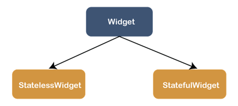
| STATELESS WIDGETS | STATEFUL WIDGETS |
| The widget whose state cannot be modified once they are built are called stateless widgets. They are immutable. | The widgets whose state can be modified even after they are built are called stateful widgets. They are mutable. |
| For example: stateless widgets are used when some information in your application has to be the same always such as contact details, address, menu bars etc. | For example: stateful widgets are used when state of a certain information will keep changing dynamically. In case of YouTube, the number of views will keep changing and so they do not have a fixed state. |
| class MySampleApp extends StatelessWidget { @override Widget build (BuildContext context) { return Container( ); } } | class MySampleApp extends StatefulWidget { @override _MySampleAppState createState( ) => _MySampleAppState( ); } class _MySampleAppState extends State<MySampleApp> { @override Widget build(BuildContext context) { return Container( ); } } |
Let us now understand different widgets and how they work
- AppBar
It is a widget which fixes toolbar at the top. In simpler words, it adds a top up bar.
It has various properties such as actions, actionsIconTheme, backgroundColor, bottom, iconTheme, shape, title, toolbarOpacity and toolbarHeight among the others.
       Widget build(BuildContext context)
{
return Scaffold(
appBar: AppBar(
title: Text(‘My Sample Application'),
), )
}
2. AnimatedWidgetBaseState
It is a base class for widgets with indirect or implicit animation that needs to rebuild their widget tree as the animation runs. It has various properties like animation, context, controller, hashcode etc.
AnimatedWidgetBaseState<T extends ImplicitlyAnimatedWidget>( )
3. Card
The card is a widget which has round corners and elevated shadow. A card can be used to represent some special information. Flutter heavily uses card widgets and it is one of the most important widgets in flutter.
       return Card(
child: Column(
children: [
const ListTile(
leading: Icon(Icons.album, size: 45),
title: Text(‘My Sample Application'),
subtitle: Text(‘This is a sample application’),
),
],
),
);
4. Center
Center widget is used to align everything in its child to the centre. Suppose you want to align your widget card to the centre, you will use center widget for that job.
return Card(
child: Scaffold(
body: Column(
children:[
Center(
child: Text('Logo'),
),
],
),
),
);
5. Column
Column is a widget that is used to exhibit its children in a vertical way. Columns (and rows- which we will discuss later) are most common widgets in flutter and you will be using them a lot in your application.
Column(
children:[
Text(‘My Sample Application'),
Expanded(
child: FittedBox(
fit: BoxFit.contain,
child: JavaTpoint( ),
),
),
],
)
6. Container
A container widget is used to store one or more widgets. A container is like a container which stores many widgets in it. The properties of container are alignment, child, color, decoration, margin, padding and others.
Center(
child: Container(
margin: const EdgeInsets.all(10.0),
color: Colors.red[500],
width: 40.0,
height: 40.0,
),
)
7. DropdownButton
DropDownButton is a widget used to create a dropdown menu. You can select one value from a collection of values. It has properties like dropdownColor, elevation, hint, icon, iconSize among others.
return DropdownButton(
value: dropdownValue,
Text(   ‘My Sample Application',   style: TextStyle(fontWeight: FontWeight.bold),
),
)
8. Expanded
A widget that is used to expand the size of a row, column or flex to cover the entire available space is Expanded widget. Expanded widgets are very useful as they provide properties like child, fit, flex, hashcode etc.
body: Center(
child: Row(
children:[
Expanded(
child: Container(
color: Colors.red,
height: 100,
),
),
9. FlatButton
FlatButton is a button widget which does not have any elevation or colour and the text is also black. FlatButton has a callback function onPressed( ) which gives the functionality to the FlatButton. It has properties such as child, color, disabledColor, height, textColor etc.
FlatButton(
onPressed: ( ) { },
child: Text(     “My Sample App",   ),
)
10. FloatingActionButton
It is a circular button which can have an icon and a text. It also has a callback function onPressed( ) which provides it certain functionality. FloatingActionButton has backgroundColor, child, elevation, shape as its properties.
floatingActionButton: FloatingActionButton(
onPressed: ( ) { },
child: Text(         “My Sample App”,      ),
)
11. Form
Form widgets are used to create an interactive form. It is an integral part of a flutter application. Form has a TextField for collecting data into your form. It also has a child property, apart from that it has onChanged which is called when one form field is changed.
return Form(
key: _formKey,
child: Column(
crossAxisAlignment: CrossAxisAlignment.start,
children: [
TextFormField(
decoration: const InputDecoration(
hintText: 'Enter your email',           ),
validator: (value) {
if (value.isEmpty) {
return 'Please enter some text';
}
return null;
},
),
12. Icon
Icons are the widgets that are used to import icons in your flutter applications. It has IconData, color, size etc as its properties.
Row(
mainAxisAlignment: MainAxisAlignment.spaceAround,
children: const[
Icon(       Icons.favorite,
color: Colors.red,
size: 25.0,
semanticLabel: 'Text to announce in accessibility modes',
),
13. Image
Image widget is responsible for exhibiting different images either directly from web or from your local computer. You can change its alignment, color, fit, height etc using the properties image widget grants.
const Image( image: NetworkImage(‘mysampleapplication.jpg’), )
14. List
List can be defined a collection of objects that have length and index. There are popularly two main types of lists:
- Fixed-length list:
As the name suggests these lists are fixed in length and their lengths are pre-specified in a program.
- Growable list:
The size of the list can vary in this type of list. We do not specify the length of the list.
var fixedList = List.filled(5, 9);
print(fixedList);
var growableList = List.filled(3, 8, growable: true);
growableList.add(100);
print(growableList);
15. MaterialApp
MaterialApp in flutter can be defined as a pre-defined class. It is the main part of the flutter application. We can access various widgets with the help of this class such as Text, AppBar, Scaffold, Flutter SDK, ListView and many others. By using this class, we can create beautiful and powerful applications for flutter.
MaterialApp(
home: Scaffold(
appBar: AppBar(
title: const Text(‘My Sample Application’),
),
),
)
16. Opacity
Opacity is a widget that helps in making its child partial transparent. This widget has various properties like child, hashcode, key, runtimeType, and opacity.
Opacity( opacity: _visible ? 1.0 : 0.0, child: const Text(‘My Sample Application'), )
17. Padding
Padding is a theme related widget which is broadly used in the beautification of your flutter application. You can provide padding to your card or flex for making it look more attractive to the user. Padding has child property also.
const Card(
child: Padding(
padding: EdgeInsets.all(20.0),
 child: Text(‘My Sample Application’),
),
)
18. Radio
With the inclusion of properties like activeColor, value, onChanged, focusColor and hoverColor among others, radio widget is another very helpful widget which is used to select between number of mutually exclusive values. It holds boolean values.
Radio(
value: SampleApplication.flutter,
groupvalue: _application,
onChanged: (SampleApplication value) {
setState(() { _application=value;      });
},
),
19. RaisedButton
Raised button is a material widget whose elevation is increased once it is pressed. The properties it can declare are color, disabledColor, disabledElevation, elevation, onPressed, and many others.
RaisedButton(
onPressed: ( ) { },
child: const Text(
‘My Sample Application',
style: TextStyle(fontSize: 20)
),
),
20. Row
This is a widget that exhibits its children in a horizontal manner. Row is mostly used flutter widget (along with column) and it is super important to your flutter application. It has various properties which are also very useful such as children, crossAxisAlignment, mainAxisAlignment, and many others.
Row(
children:[
Text(‘My Sample Application'),
Expanded(       child: FittedBox(
fit: BoxFit.contain,
child: JavaTpoint( ),
),
),
],
)
21. Scaffold
Scaffold is a class in flutter which has many widgets in it. Scaffold is very crucial in flutter as it gives you a basic framework to implement your designs and layouts. Without scaffold, building a flutter application seems highly improbable. It has properties which are very important to flutter such as appBar, backgroundColor, body, bottomNavigationBar etc.
return Scaffold(
appBar: AppBar(
title: const Text(‘My Sample Application'),
),
22. Slider
Slider as the name itself suggests, is used to make sliding design in your application. There are a range of values in slider and those range can be changed and set by the developer.
return Slider(
value: _currentSliderValue,
min: 0,     max: 10,
divisions: 10,
label: _currentSliderValue.round().toString(),
onChanged: (double value) {
setState(() {
_currentSliderValue = value;
});
},
);
23. Table
Table widget is used to exhibit content in a tabular form. Table widget has border, children, textDirection and many others as its properties.
Table(
children: [
TableRow(
children: [
Text(‘JavaTpoint’),
Text(‘This is a Sample Application’),
]
),
24. Text
The text widgets are used to exhibit texts that are needed in your application. Text widget allows the developers to style their text the way they want. It comes with many properties such as textStyle, textAlign, data etc.
Text(
  'Hello, This is Sample Application',
  textAlign: TextAlign.center,
  style: TextStyle(fontWeight: FontWeight.bold),
)
25. Theme
Flutter theme widget is the most essential part of flutter applications. It has a wide range of colours, fonts, text styles and other features already in built. You can use dark theme, light theme or even colourful theme in flutter using flutter widgets.
MaterialApp(
theme: ThemeData(
brightness: Brightness.light,
primaryColor: Colors.red,
),
);
26. TextField
Text field is basically used for collecting data from the user. It is used in forms more popularly and contains many properties like autocorrect, autofocus, controller, decoration and many others.
TextField(
decoration: InputDecoration(
border: OutlineInputBorder( ),
labelText: ‘My Sample Application’,
),
)
27. Transform
A transform widget is used to transform shape, size, position and orientation of its child widget. It is a very helpful widget for custom shapes and size.
Transform(
  transform: Matrix4.skewY(0.5)..rotateY(3.14 / 12.0),
  child: Container(
    height: 50.0,
    Width: 50.0,
    color: Colors.red,
  ),
)
28. WidgetsApp
This widget is used for wrapping some widgets that are required for an application. WidgetsApp is used by MaterialApp and CupertinoApp to implement some functionality in an application. The properties of this class are: actions, builder, color, home, key, navigatorKey, onGenerateRoute, and many more.
29. Wrap
This widget is used to align the other widgets in either vertical or horizontal way. We already have row and column for that but wrap widget comes into play when rows and columns are not able to fit in those widgets.
Wrap(
spacing: 6.0,
runSpacing: 2.0,
children:[
Text(   'Hello, This is Sample Application',
textAlign: TextAlign.center,
style: TextStyle(fontWeight: FontWeight.bold),
)
]
)