Ionic Input
Ionic Input
Inputs are necessary to collect and process user inputs securely. To be easy for users to communicate, they must follow the process and communication guidelines for each platform. It is a container for an HTML input element with a custom style and additional functionality. It accepts most of the same features as HTML input, but works well on desktops and integrates with the keyboard on mobile devices.
It is intended only for text type inputs, such as "text", "password", "email", "number", "search", "phone" and "URL". It supports all regular text input events, including keyup, keydown, keypress, and more.
Several features can be used to design styles and different input fields, which are listed below.
- Fixed Inline Labels
- Inset Labels
- Floating Labels
- Placeholder Labels
- Inline Label
- Stacked Labels
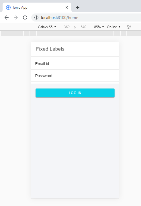
Fixed Inline Labels: Use fixed to place the label on the left side of the input element. When text is input, then the label does not hide. You can also use placeholder text along with a fixed label. You can add the fixed property with <ion-label> component.
Example: This example explains how you can use the fixed inline labels in ionic application.
Fixed Labels


  Email id


  Password


  Log In
Output: After executing this code, you will get the output, as shown below.
Inset Labels: It will fill each input element 100% of the width of its parent elements. Create the input inset by inserting the inset attribute to the <ion-list> element.
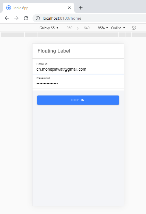
Floating Labels: Floating labels are those labels that animate or float up when the entry is selected. You can add the floating property with the using of <ion-label> component. The following syntax explains how you can use the floating labels in the ionic application.
username
Example:
  Floating Label


  Email id


  Password


  Log In
Output: After executing this code, you will get the output, as shown below.
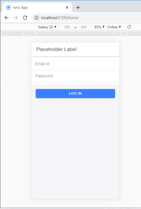
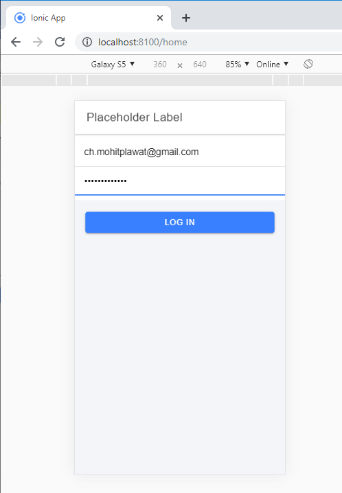
Placeholder Labels: To affect the input's label, you can add the placeholder attribute to an <input> element. The placeholder label is hidden when you entered the text in the input. You can add the placeholder label with the use of <ion-label> element.
Example: This example explains how you can use the placeholder label in the ionic application.
  Placeholder Label


  Log In
Output: After executing this code, you will get the output, as shown below.
When you entered the text, then the placeholder is hidden, as shown below.
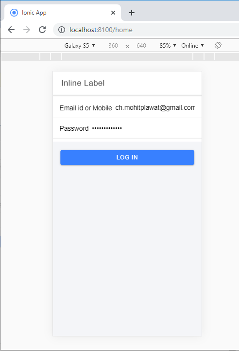
Inline Labels: Without any attribute <ion-label> element is known as Inline Labels. When the text is input, then the label does not hide. You can also use placeholder text along with an Inline label.
Example: This example explains how you can use the inline label in the ionic application.
  Inline Label


  Email id or Mobile No


  Password


  Log In
Output: After executing this code, you will get the output, as shown below.
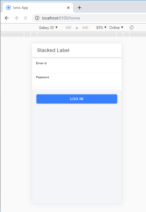
Stacked Labels: It will always show at the top of the input. You can add the stacked attribute by using the <ion-label> element. You can also use placeholder text along with a Stacked label.
Example: This example explains how you can use the stacked label in the ionic application.
  Stacked Label


  Email id


  Password


  Log In
Output: After executing this code, you will get the output, as shown below.
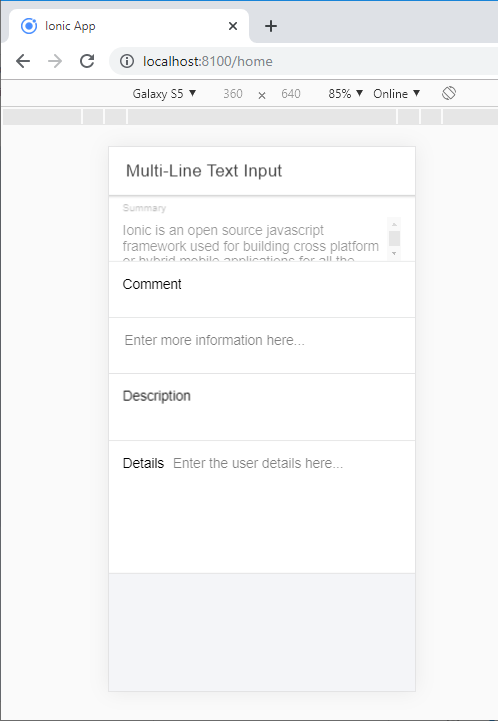
Multi-line text input: The textarea component is used for multi-line text input in the ionic application. You can use the <ion-textarea> component for input text. The native Textarea component represented within the <ion-textarea>. It permits to control the user experience and interactivity of the textarea component that makes it better.
The Ionic Textarea does not support loading its quality from the inner content as opposed to the native Textarea feature. The value of the Textarea must be set in the value attribute.
Besides the Ionic properties, the Textarea element accepts the essential Textarea attributes.
Example: This example explains how you can use the multi-line text input in the ionic application.
  Multi-Line Text Input


  Summary


  Comment


  Description


  Details
Output: After executing this code, you will get the output, as shown below.