Ionic Range
The Range slider lets users choose from a range of values by moving the slider knob. You can accept two knobs, but by default, one-knob controls the range value.
Range labels
You can put down on either side of the range by adding the element slot = "start" or slot = "end". The element should not be an ionic label, which can be added to any element to place it to the left or right of the range.
Minimum and Maximum Values
Minimum and Maximum values can be passed by using the range through the min and max properties, respectively. By default, the range sets for min = 0 and max = 100.
Steps and Snaps
The step property defines the value explanation of the range's value. It may be helpful to set the step when the value is not increments of 1. Setting up the step property will show tick marks on the range for every step. The Snaps property can be configured to automatically move the knob to the closest tick mark based on the step property value.
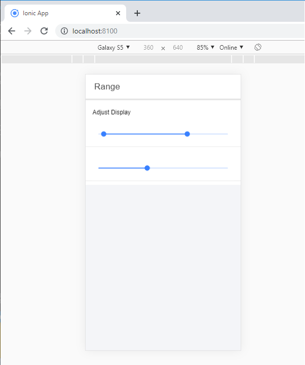
Dual Knobs
If setting the dual knobs property to true on the range component, it will enable two knobs on the range. If the range has two knobs, the value will be an object containing two features, i.e., lower and upper.
The following example shows the ionic range:
Example:
  Range


  Adjust Display
Output: After executing this code, you will get the output, which is shown in the below screenshot.
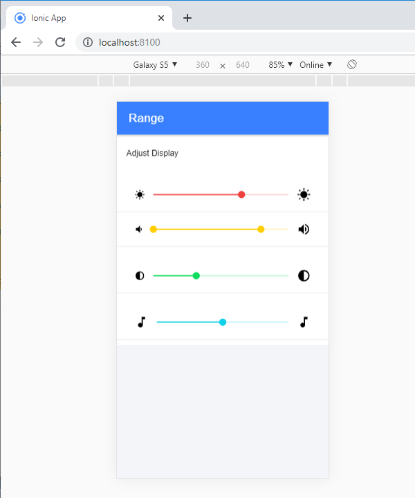
Adding icons to the range
The ionic range will usually need to show the data clearly. You need to add an icon before and after the range input to set them on both sides of the range element.
Example: This example shows how you can add the icons in the range.
  Range


  Adjust Display
Output: After executing this code, you will get the output, which is shown in the below screenshot.
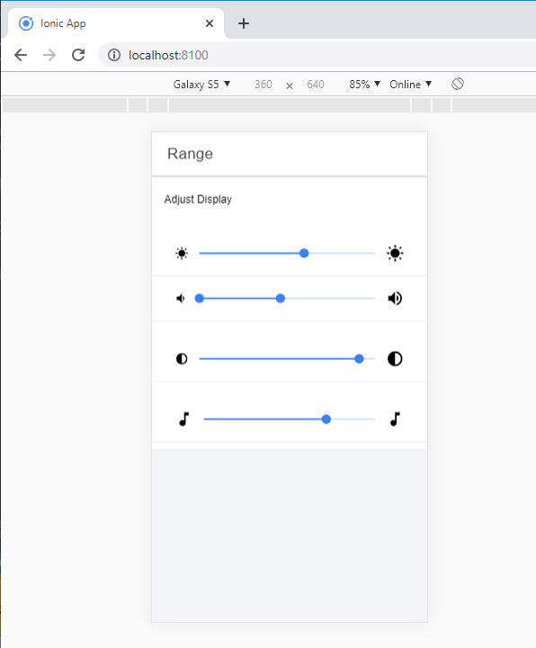
Styling Range
It can style the range by using the color property. The following example shows how to use colors in the ionic range component.
Example:
  Range


  Adjust Display
Output: After executing this code, you will get the output, which is shown in the below screenshot.