Tableau Motion Chart
Motion charts are a type of chart that allows you to visualize in action displaying the changes of your data over time by indicating the movement of data points within the specified changes in the space as well as in the color of the lines. Motion chart helps to view the entire trail of how the data that has evolved over time and not just in a snap of the data. It will help us work and represent the data in a better way. Tableau needs one Measure and one Time Dimension to create a Motion chart.
Creating a Motion Chart
To create a simple Motion Chart, the following are the steps:- Open the Tableau Desktop and connect to your data source.
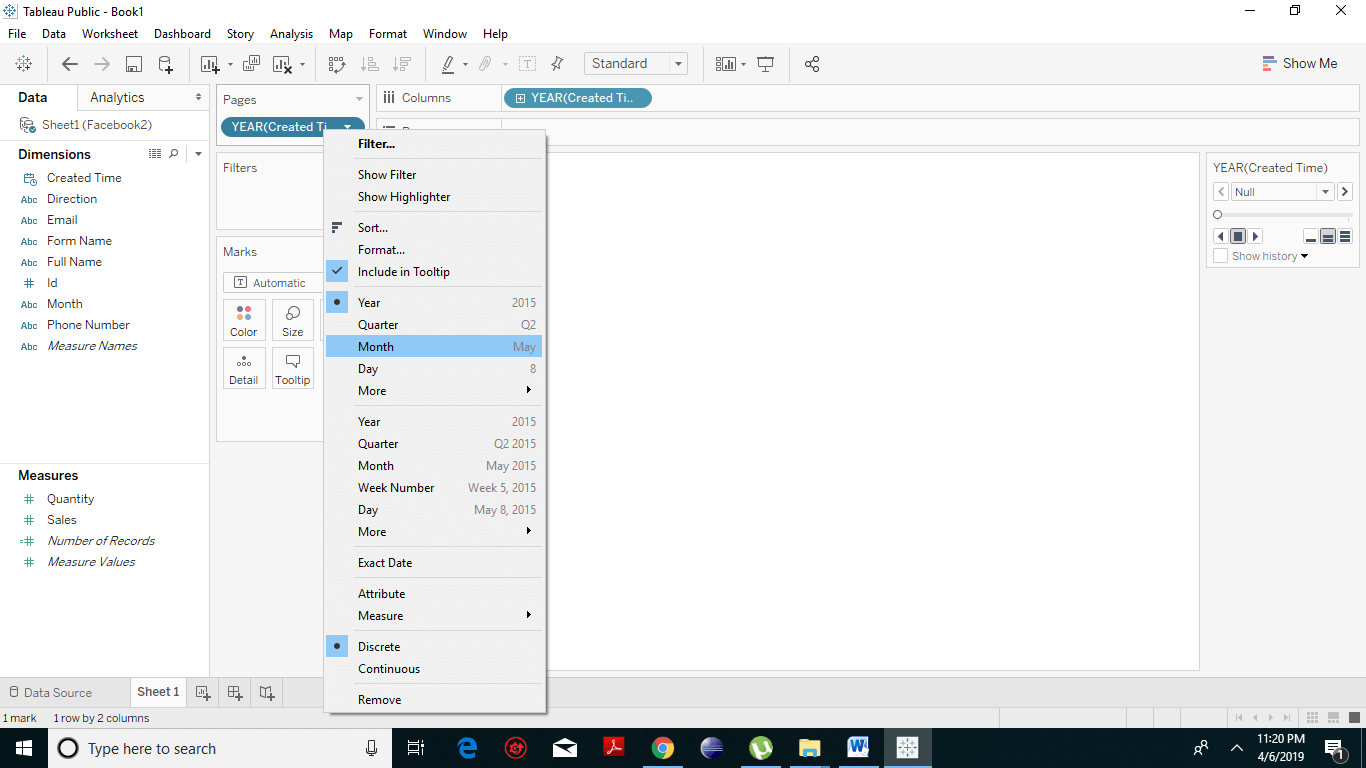
- Drag and drop the Dimension field to the Columns Shelf. Place the same file to the Pages Shelf.
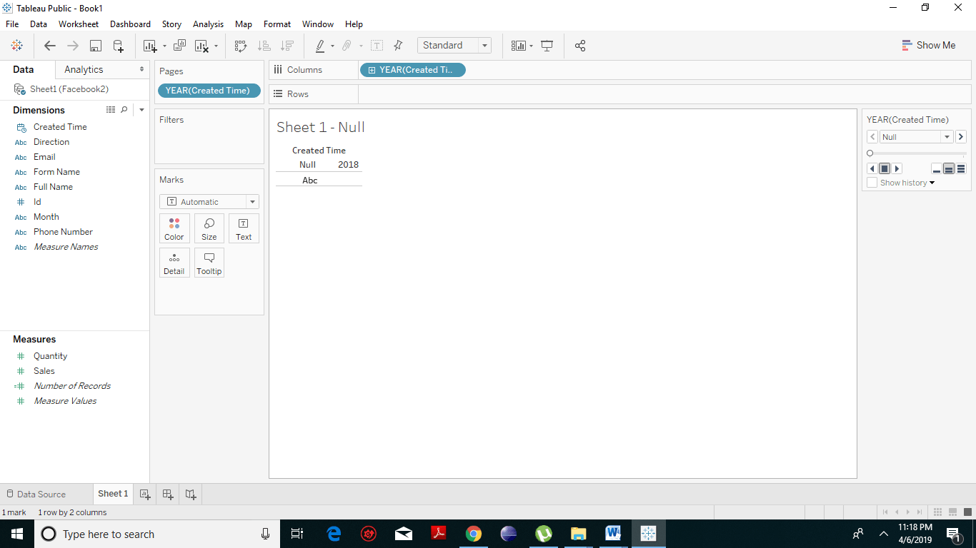
- In the Pages shelf, right-click on the Created Date and choose Month.
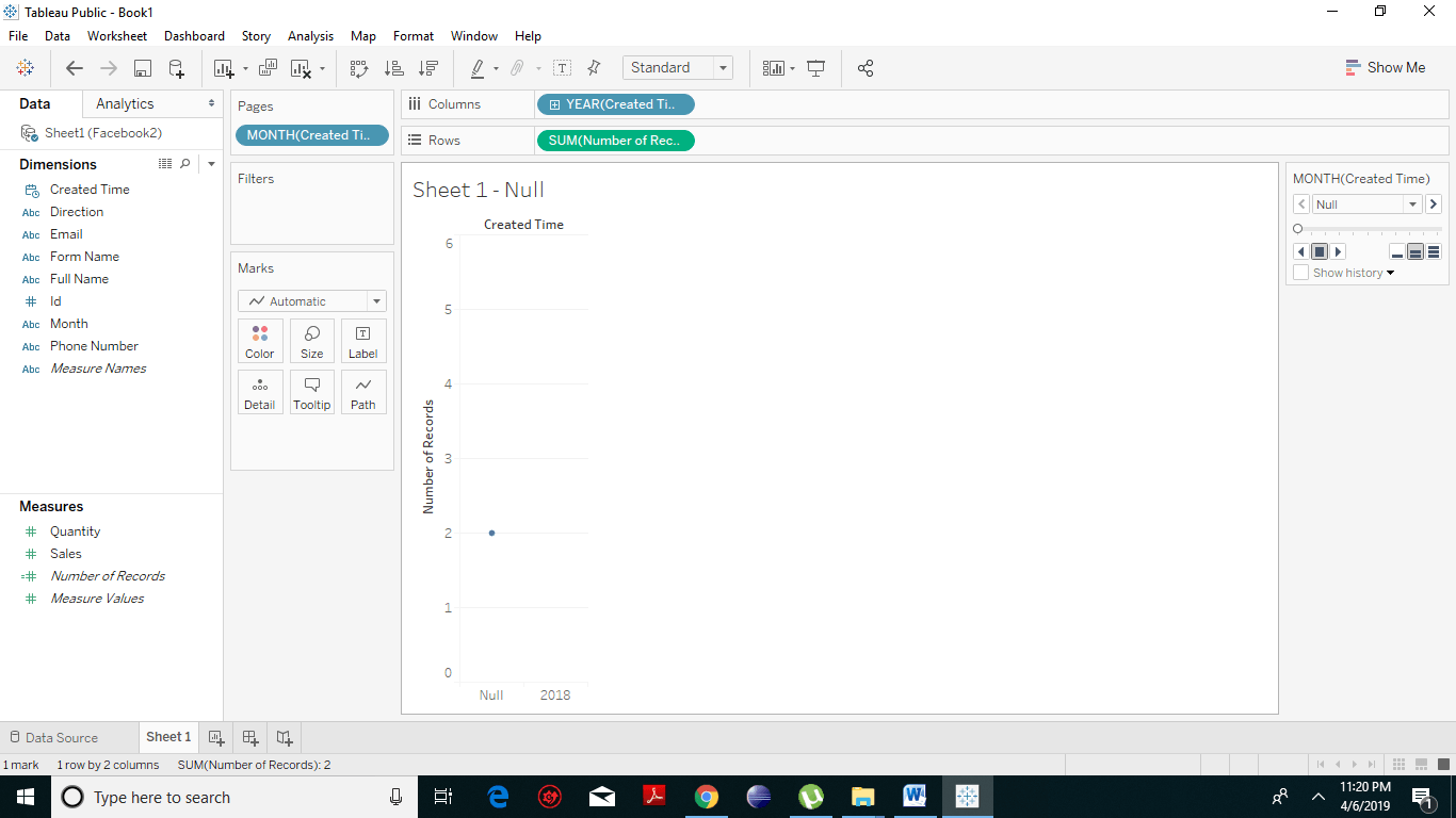
- Then drag the measure (here we have taken Number of Records) to the Rows Shelf. The resulting chart appears.
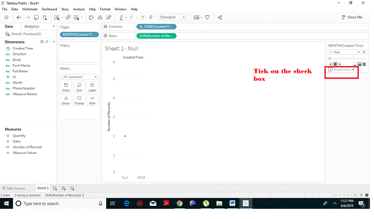
- Put a check mark on the tick box next to Show History to see historically what’s happening.
- Click on the Show History. A dropdown arrow next to it. We want to show all the marks regardless of whether or not they’re in the past. So we select “All”.
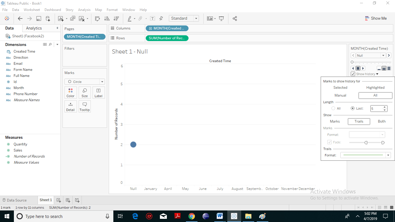
- Then we can also adjust the way, the marks are being displayed so instead of showing the actual mark we can choose a “trail” or we can also select “Both”.
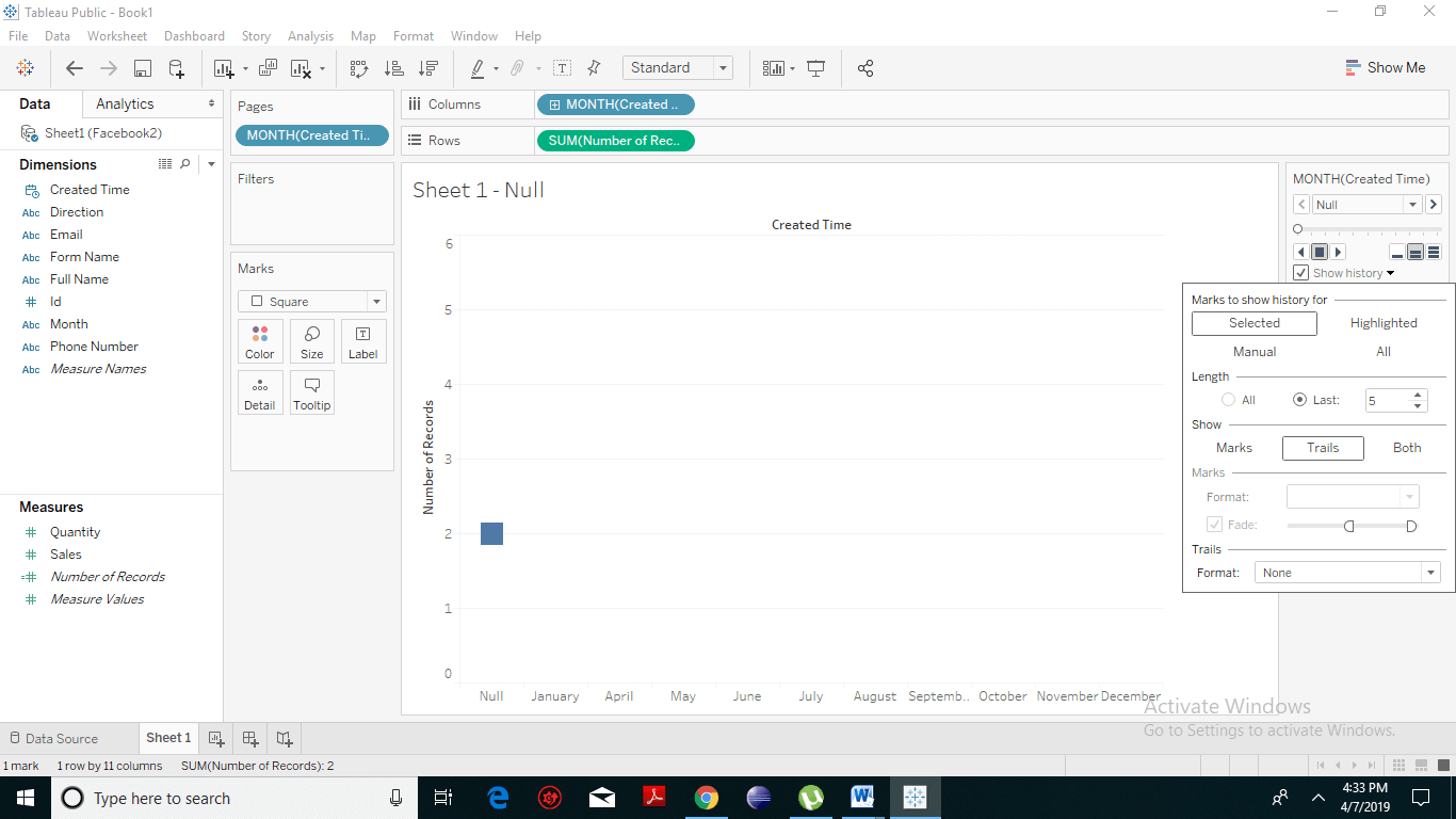
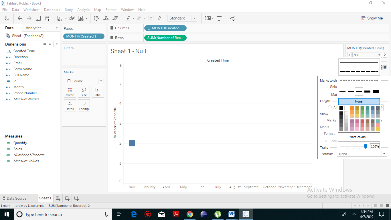
- Selecting “Marks” shows only the points and selecting “Trails” shows only the line. So here, we have selected “Trail” option. In the trail format, you can also change the way the trail is being displayed so let’s change that to be a simple dotted line.
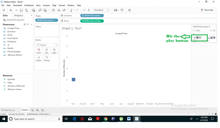
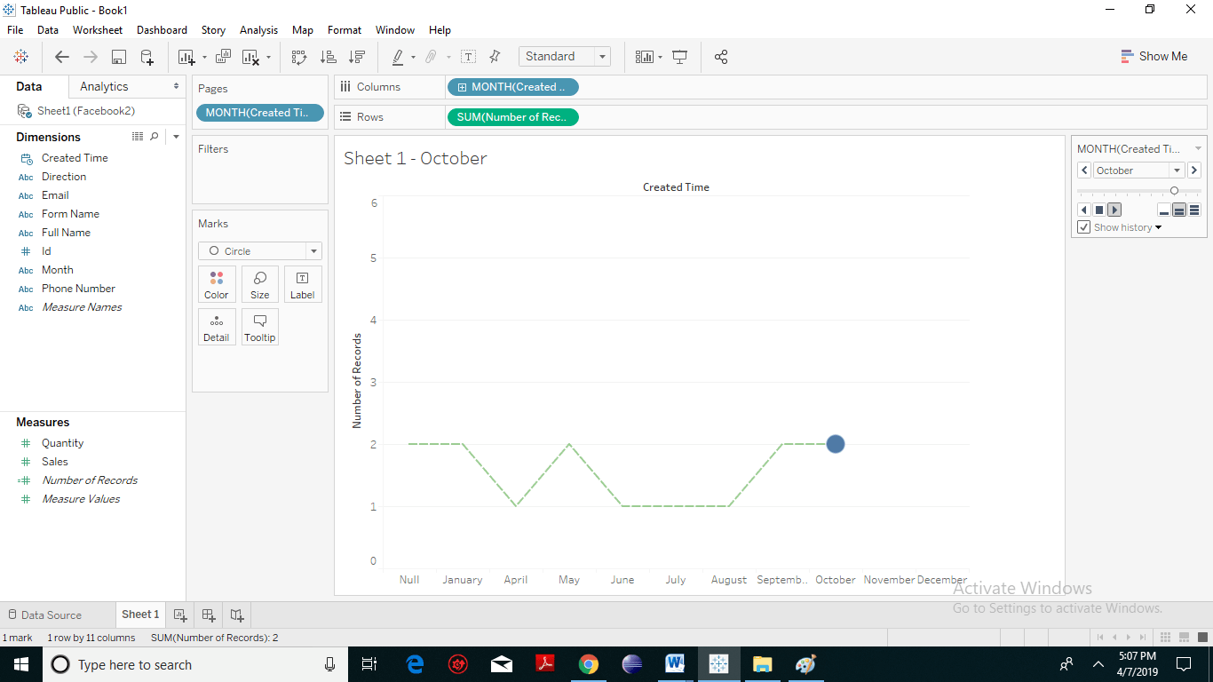
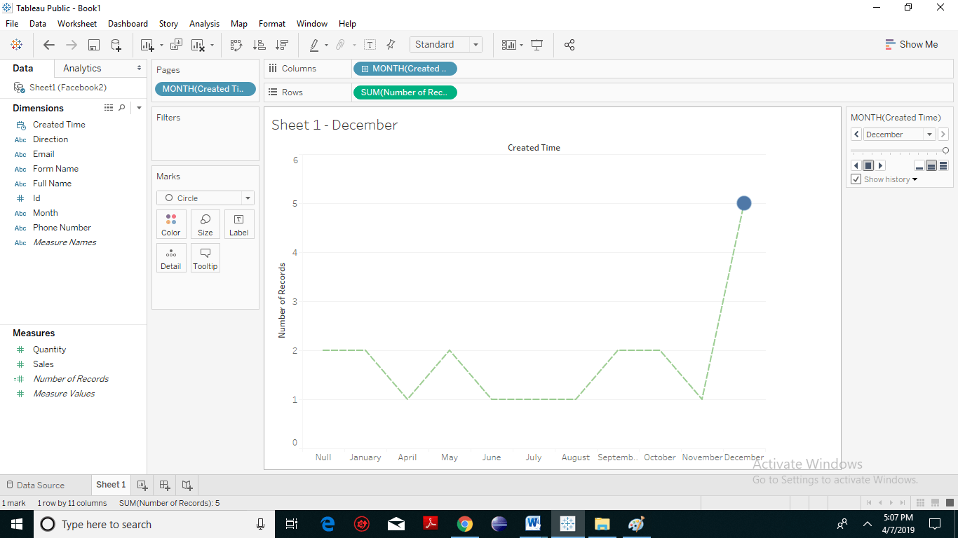
 Hit the Play button. The following chart appears.
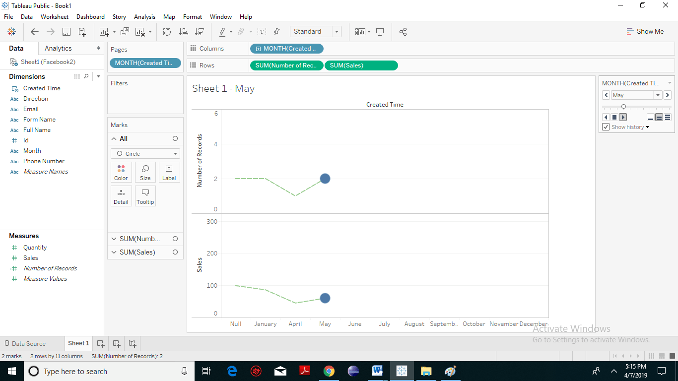
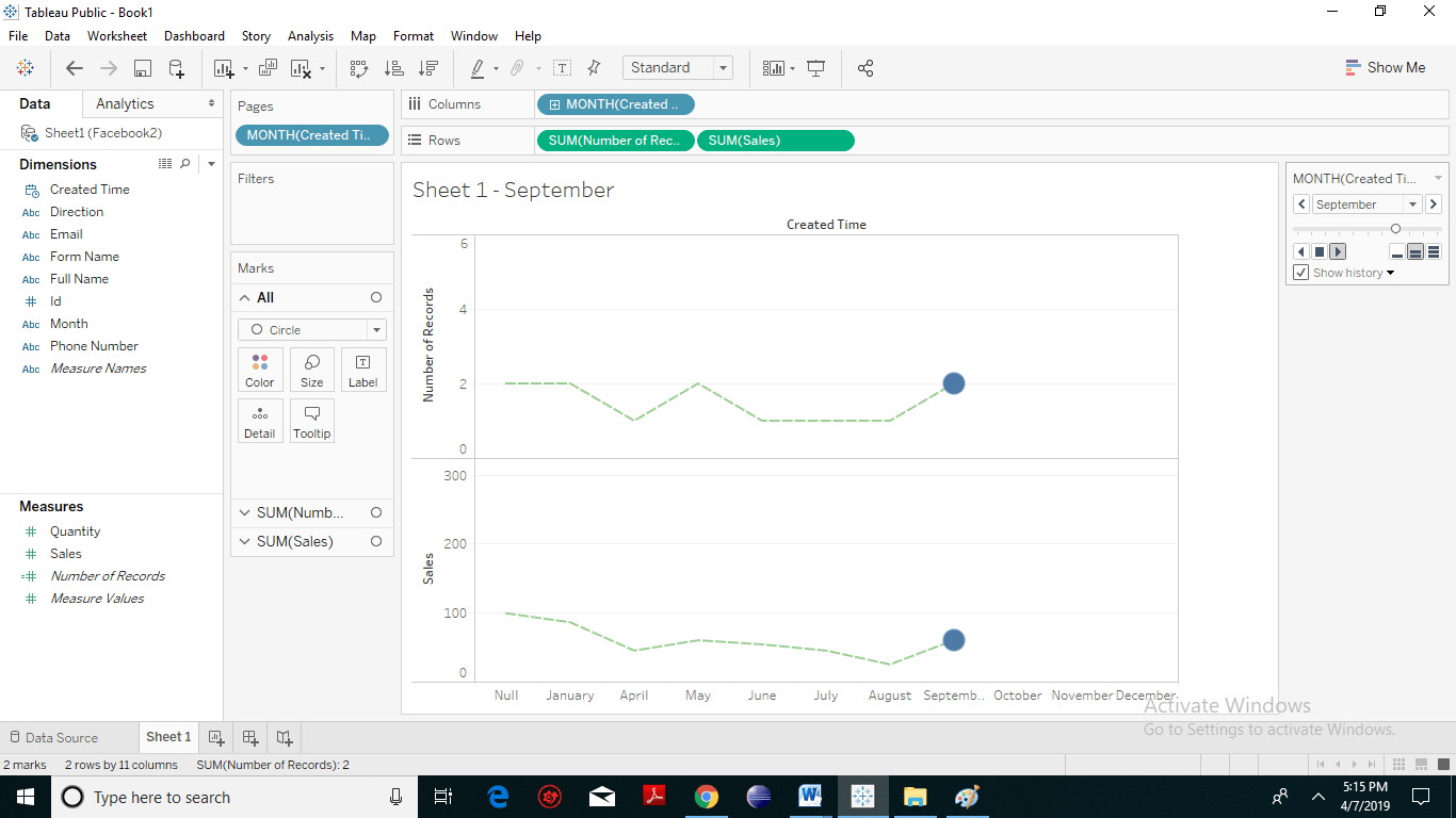
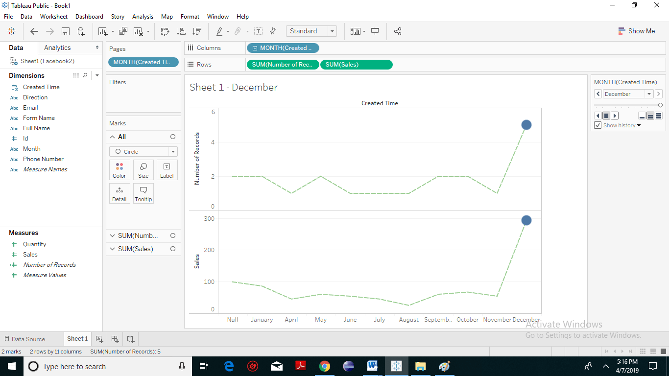
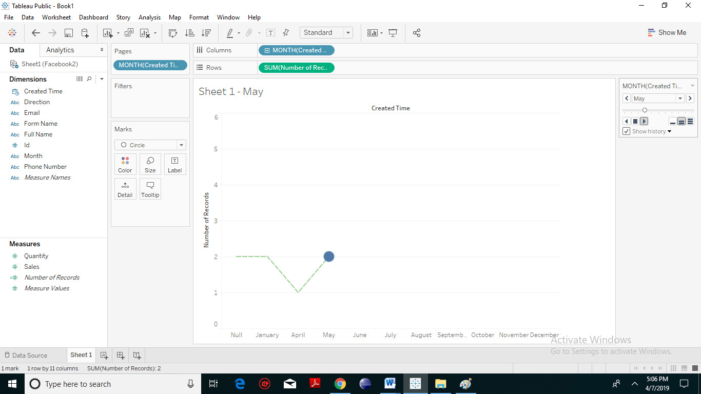
- You can see the motion chart is working in a trial format with dotted line and it’s plotting out on a month-month from January to December basis precisely what went on with that data. You will notice that as the information changes, the recent months get a darker shade of color and the historical data gets a lighter shade of color. The following screenshots represents the path of the Motion Chart:
Two-Dimensional Motion Chart
For creating two-dimensional Motion Chart drag and drop another measure field to the Rows shelf. You will notice two different windows.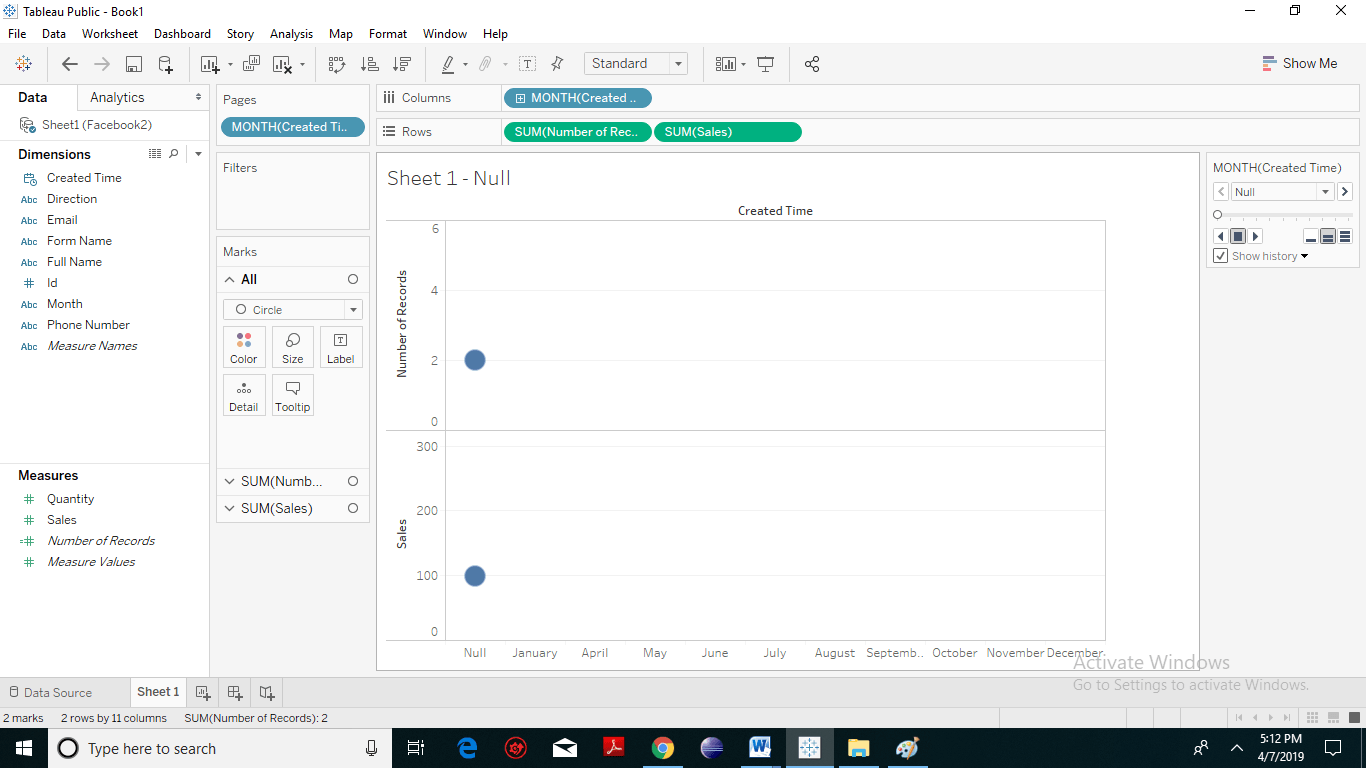 Hit the play button. And you will notice both the motion charts operating simultaneously. The following screenshots represents the path of the two-dimensional Motion Chart