React CSS
What is React CSS
React CSS is used to provide the style to the React applications. The style attribute adds dynamically-computed styles at render time, and it is one of the most used attributes to provide style in React applications. Instead of a CSS string style attribute, it accepts the JavaScript object in CamelCase properties.
There are four ways by which we can provide style to react components; these are listed as follows:
- Inline Styling.
- CSS Stylesheet.
- CSS module.
- Styled components.
- Inline Styling
To provide style to an element by inline style attribute, the value must be an object of JavaScript.
Let’s try to understand by using the following basic example of Inline styling in CSS.
Example:
App.js
import React from 'react';
import ReactDOM from 'react-dom';
class App extends React.Component {
render() {
return (
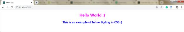
Hello World :)
This is an example of Inline Styling in CSS :)
);
}
}
export default App;
Note: We are using two curly braces in the above example in the following lines:
<h1 style={{color: "Magenta"}}>
<h2 style={{color: "Blue"}}>This happens because, In JSX, the JavaScript expressions should be written in curly braces, and also the objects of JavaScript use curly braces, that's why the above styling is written within the sets of curly braces {{}}.
Output:

camelCase Property Name
As the inline CSS is written inside the JavaScript object, but the properties having two names, like background-color, must be written within the camelCase syntax.
Example:
App.js
import React from 'react';
import ReactDOM from 'react-dom'; class App extends React.Component {
render() {
return (


Hello World :)
Welcome to the tutorialandexample.com :)


)
}
}
export default App;
Output:
Using JavaScript Object
In inline styling, you can also create an object with styling information and can refer to it in the style attribute.
Example:
App.js
import React from 'react';
import ReactDOM from 'react-dom';
class App extends React.Component {
render() {
const styleObject = {
color: "Green",
backgroundColor: "Yellow",
padding: "10px",
fontFamily: "Arial"
};
return (
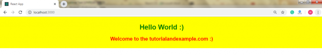
Hello World :)
Welcome to the tutorialandexample.com :)
);
}
}
export default App;
Output:
2. CSS Stylesheet
You can make a separate file to write styling for your react application, and you have to save that file with .css extension. Now, you need to import this file in your application.
Appnew.css
body {
background-color: cyan;
color: blue;
padding: 40px;
font-family: Arial;
text-align: center;
}
App.js
import React from 'react';
import ReactDOM from 'react-dom';
import './Appnew.css';
class App extends React.Component {
render() {
return (
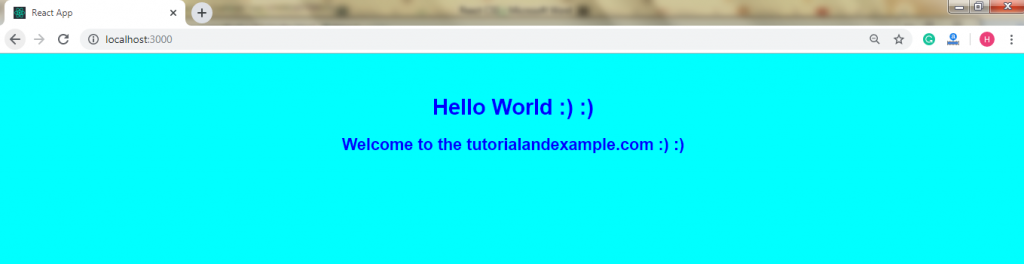
Hello World :) :)
Welcome to the tutorialandexample.com :) :)
);
}
}
export default App;
Index.html
React App
Output:
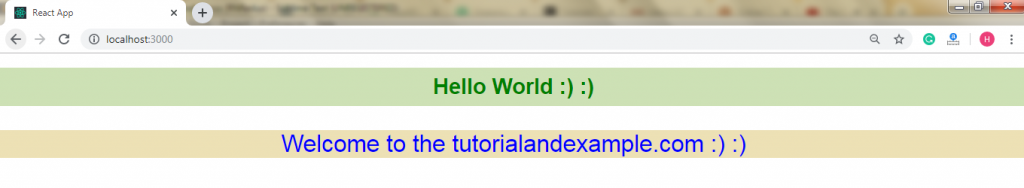
3. CSS Module
It is a different way to add the styles in your react application. It is also a CSS file in which all class names and animation names are scoped locally by default. These modules are convenient for components that are in separate files. It is only used by the component which imports it.
You can create the CSS module by .module.css extension like myModule.module.css name.
Example
App.js
import React from 'react';
 import ReactDOM from 'react-dom';
 import styles from './myModule.module.css';
 class App extends React.Component {
  render() {
  return (

  Hello World :) :)
  Welcome to the tutorialandexample.com :) :)

  );
  }
 }
 export default App;
myModule.module.css
.myfirststyle {
  background-color: #cde1b5;
  color: green;
  padding: 10px;
  font-family: Arial;
  text-align: center;
 }
 .mysecondstyle{
  background-color: #ede1b5;
  color: blue;
  font-family: Arial;
  font-size: 35px;
  text-align: center;
 }
Output:
4. Styled Components
Styled-components are nothing but a library to react. It generally uses enhance CSS to provide style to the React component systems in your application.
The styled-component gives:
- No class name bugs
- Automatic critical CSS
- Easier deletion of CSS
- Painless maintenance
- Simple dynamic styling
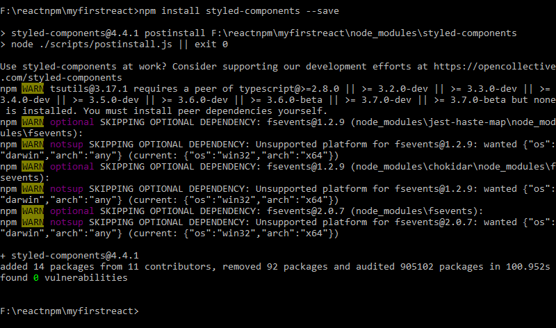
Installation to Styled Components
First, you need to install the styled-components library in your react application by using a single command, which is given below:
npm install styled-components --save
Example:
import React from 'react';
import ReactDOM from 'react-dom';
import styled from 'styled-components';
class App extends React.Component {
render() {
const Div:any = styled.div`
border: 6px dotted lightgreen;
&:hover {
background-color: ${(props:any) => props.hoverColor};
}
`;
const Title = styled.h1`
font-family: calibri;
font-size: 45px;
text-align: center;
color: Green;
`;
const Para = styled.p`
font-size: 25px;
text-align: center;
background-Color: yellow;
color: Red;
`;
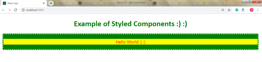
return (
Example of Styled Components :) :)
Hello World :) :)
);
}
}
export default App;
Output:
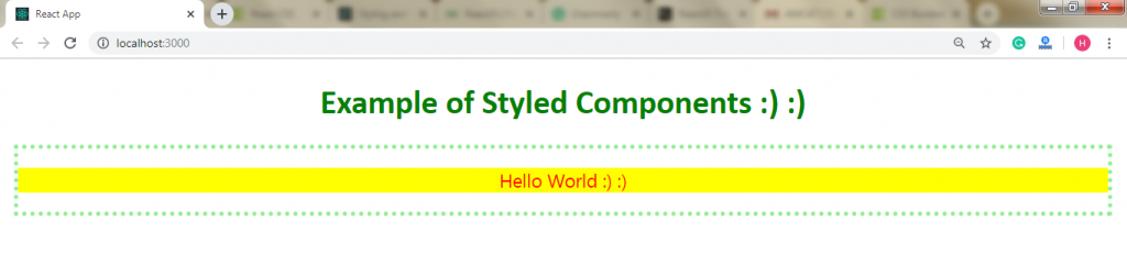
When you move the mouse pointer within the border, the hover gets activated, and the background color within the border will get change. You can understand it by the following image: