Install Matplotlib in the Jupyter Notebook
Matplotlib:
One of the most widely used Python data visualisation libraries is Matplotlib. It is a multi-platform package that creates 2D charts from arrays of data. Making the appropriate imports and preparing some data are all that is required to get started before using the plot() method to begin charting. When you're finished, don't forget to use the show() method to display your plot. NumPy, Python's extension for numerical mathematics, is used by Matplotlib, which is built-in Python. Matplotlib consists of various plots like Histogram, Line, Bar etc.
Jupyter Notebook:
An open-source web tool called the Jupyter Notebook allows us to create and share documents with real-time code, equations, visuals, and text. Data processing and cleansing, data techniques, visualization of data, deep learning, and many more are Jupyter Notebook applications.
Install Matplotlib:
Using pip install Matplotlib Additionally, Matplotlib can be set up by utilising the pip Python package manager. Open a terminal window and run the following commands to install Matplotlib using pip:
Code:
pip install matplotlib
Matplotlib Graphs:
Following are the graphs we can plot in Python using Matplotlib library:
Line Graphs:
The line graph functions as matplotlib's fundamental program. The x-axis- and y-axis are used to create a very basic line graph in the following code.
Code:
import matplotlib.pyplot as p
p.plot([1, 2, 3], [3, 4, 5])
p.xlabel('X Label (Plot )')
p.ylabel('Y Label (Data)')
p.title('Line Graph')
p.show()
Output:
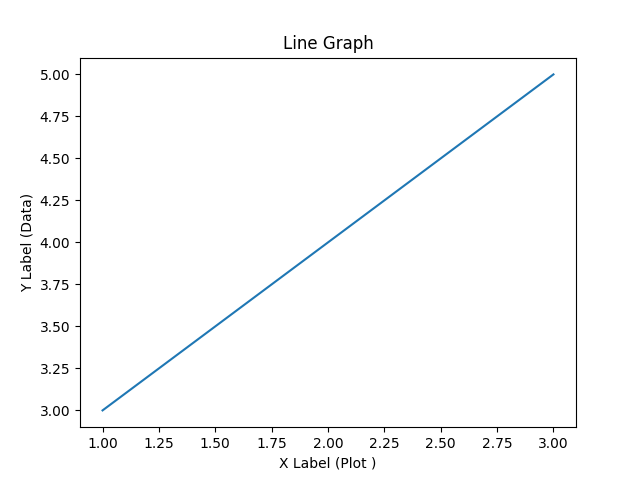
Import matplotlib.pyplot as p is used in the code above to import matplotlib first. To import and alias to p is a frequent practice. We are now able to utilise the. plot() method. Although there are a variety of possible inputs for this function, the most important thing to remember is that it requires an x and a y value. These are data sequences. We just supply two Python lists in this example. X and Y are on the first and second lists, respectively. The length of these sequences should always be the same. We are now prepared to display the plot, which is accomplished using the p. show command ().
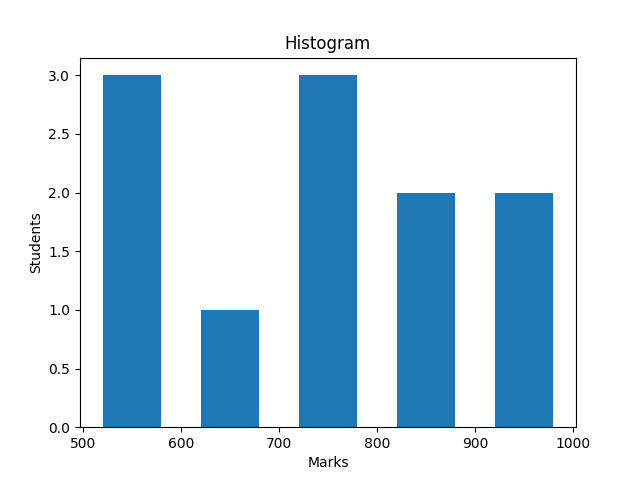
Histogram:
Data distribution can be shown using the histogram. The matplotlib.hist() method can be used to display a histogram. Bins are a feature in a histogram. A bin is a type of graph slot that can store a variety of data.
Code:
import matplotlib.pyplot as p
marks = [531, 813, 574, 658, 815, 775, 745, 749, 523 , 962, 976]
bins = [500, 600, 700, 800, 900, 1000]
p.hist(marks, bins, histtype='bar', rwidth=0.6)
p.xlabel('Marks')
p.ylabel('Students')
p.title('Histogram')
p.show()
Output:
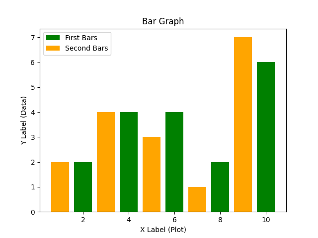
Bar Charts:
Similar to how we did with line graphs, we can use the bar chart to plot many sets of data. Using the x2 and y2 variables, we add a second piece of data with the following code. Furthermore, take note that we now utilised odd values for the first x variable and even numbers for the x2 variable. To prevent the bars from overlapping, we must do this action. This step allows us to align them side by side for comparing purposes.
Code:
import matplotlib.pyplot as p
x =[2, 4, 6, 8, 10]
y = [2, 4, 4, 2, 6]
x2 =  [1, 3, 5, 7, 9]
y2 = [2, 4, 3, 1, 7]
p.bar(x, y, label='First Bars', color='Green')
p.bar(x2, y2, label='Second Bars', color='Orange')
p.xlabel('X Label (Plot)')
p.ylabel('Y Label (Data)')
p.title('Bar Graph')
p.legend()
p.show()
Output:
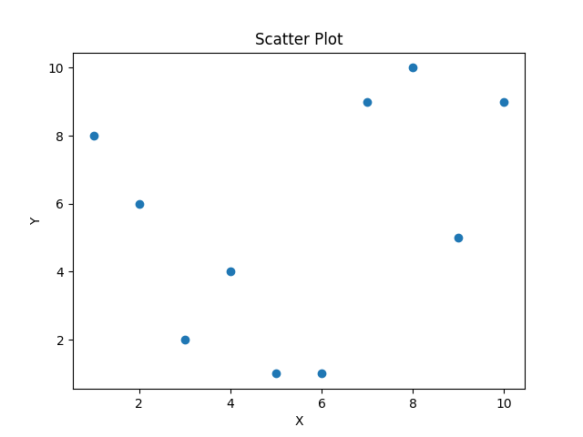
Scatter Plots:
To show how much one variable affects another, data points can be shown on a horizontal and vertical axis using scatter plots. The values of the columns selected on the X and Y axes determine the position of the dot that represents each row in the data table. To create a scatter plot in Matplotlib, use the .scatter() function.
Code:
import matplotlib.pyplot as p
x = [1, 2, 3, 4, 5, 6, 7, 8, 9, 10]
y = [8, 6, 2, 4, 1, 1, 9, 10, 5, 9]
p.scatter(x, y)
p.xlabel('X')
p.ylabel('Y')
p.title('Scatter Plot')
p.show()
Output:
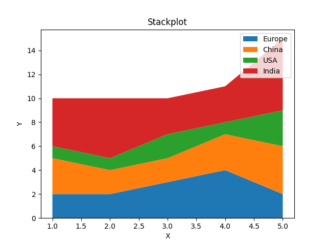
Stack Plots:
When we wish to split down a single data set into its constituent parts or display two or more sets of data on the same set of axes, we utilise stack charts. Typically, the components are distinguished by using different colours. we use the .stackplot() function.
Code:
import matplotlib.pyplot as p
years = [1, 2, 3, 4, 5]
Europe = [2, 2, 3, 4, 2]
China = [3, 2, 2, 3, 4]
USA = [1, 1, 2, 1, 3]
India = [4, 5, 3, 3, 6]
p.stackplot(years, Europe, China, USA, India,
              labels=['Europe','China','USA','India'])
p.xlabel('X')
p.ylabel('Y')
p.title('Stackplot')
p.legend()
p.show()
Output:
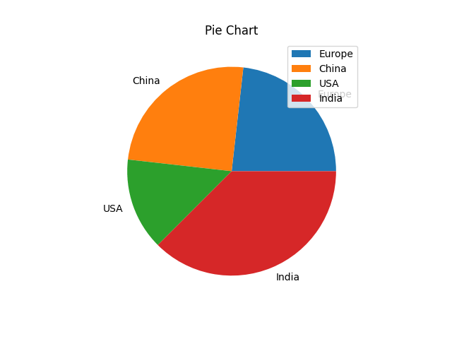
Pie Charts:
The Pie Chart is arguably the simplest and most often used chart style. Pie charts are so named because they resemble genuine pies in appearance. A data point is each piece of the pie. Pie charts are frequently used to show percentage-based statistics. When there are only a few data points to consider, pie charts are excellent. If you have too many, the visualisation loses its usefulness since the pie chart is cut too many times.
Code:
import matplotlib.pyplot as p
years = [1, 2, 3, 4, 5]
Europe = [2, 2, 3, 4, 2]
China = [3, 2, 2, 3, 4]
USA = [1, 1, 2, 1, 3]
India = [4, 5, 3, 3, 6]
slices = [sum(Europe), sum(China), sum(USA), sum(India)]
tasks=['Europe','China','USA','India']
p.pie(slices, labels=tasks)
p.title('Pie Chart')
p.legend()
p.show()
Output: