
Bootstrap 4 List Groups
Bootstrap 4 List Groups
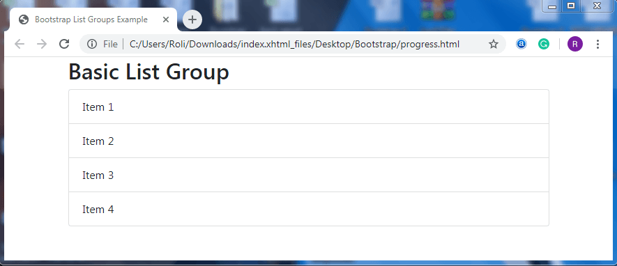
Bootstrap 4 offers List Group component, which is used to display a series of content in an organized way. The most common list group is an unordered list. To create a basic list group,
- Add the .list-group class to the <ul> element to create list.
- Add the .list-group-item to the <li> element to add list items to the list.
Example
<!DOCTYPE html>
 <html lang="en">
 <head>
   <title>Bootstrap List Groups Example</title>
   <meta charset="utf-8">
   <meta name="viewport" content="width=device-width, initial-scale=1">
   <link rel="stylesheet" href="https://maxcdn.bootstrapcdn.com/bootstrap/4.4.1/css/bootstrap.min.css">
 </head>
 <body>
 <div class="container">
   <h2>Basic List Group</h2>
   <ul class="list-group">
     <li class="list-group-item">Item 1</li>
     <li class="list-group-item">Item 2</li>
     <li class="list-group-item">Item 3</li>
     <li class="list-group-item">Item 4</li>
   </ul>
 </div>
 <script src="https://ajax.googleapis.com/ajax/libs/jquery/3.4.1/jquery.min.js"></script>
   <script src="https://cdnjs.cloudflare.com/ajax/libs/popper.js/1.16.0/umd/popper.min.js"></script>
   <script src="https://maxcdn.bootstrapcdn.com/bootstrap/4.4.1/js/bootstrap.min.js"></script>
 </body>
 </html>
Output
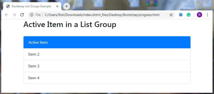
Active State – Bootstrap 4 allows you to highlight your list item to show current active selection. To make list item active, add the .active class to the <li> element. The .active class adds the blue (primary) background color to the active list item.
Example
<!DOCTYPE html>
 <html lang="en">
 <head>
   <title>Bootstrap List Groups Example</title>
   <meta charset="utf-8">
   <meta name="viewport" content="width=device-width, initial-scale=1">
   <link rel="stylesheet" href="https://maxcdn.bootstrapcdn.com/bootstrap/4.4.1/css/bootstrap.min.css">
 </head>
 <body>
 <div class="container">
   <h2>Active Item in a List Group</h2><br>
   <ul class="list-group">
     <li class="list-group-item active">Active Item</li>
     <li class="list-group-item">Item 2</li>
     <li class="list-group-item">Item 3</li>
     <li class="list-group-item">Item 4</li>
   </ul>
 </div>
 <script src="https://ajax.googleapis.com/ajax/libs/jquery/3.4.1/jquery.min.js"></script>
   <script src="https://cdnjs.cloudflare.com/ajax/libs/popper.js/1.16.0/umd/popper.min.js"></script>
   <script src="https://maxcdn.bootstrapcdn.com/bootstrap/4.4.1/js/bootstrap.min.js"></script>
 </body>
 </html>
Output
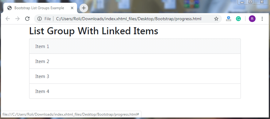
List Group with Linked Items – You can also convert the list items into links. To create a list group with linked item,
- Add the <div> element instead of <ul> element and <a> element instead of <li> element.
- Add .list-group class to the <div> element
- Add .list-group-item class to the <a> element. If you want hover effect when you move cursor on the list item then also add .list-group-item-action class which is totally optional. This class provides gray background color on hover.
Example
<!DOCTYPE html>
 <html lang="en">
 <head>
   <title>Bootstrap List Groups Example</title>
   <meta charset="utf-8">
   <meta name="viewport" content="width=device-width, initial-scale=1">
   <link rel="stylesheet" href="https://maxcdn.bootstrapcdn.com/bootstrap/4.4.1/css/bootstrap.min.css">
 </head>
 <body>
 <div class="container">
   <h2>List Group With Linked Items</h2>
   <div class="list-group">
     <a href="#" class="list-group-item list-group-item-action">Item 1</a>
     <a href="#" class="list-group-item list-group-item-action">Item 2</a>
     <a href="#" class="list-group-item list-group-item-action">Item 3</a>
     <a href="#" class="list-group-item list-group-item-action">Item 4</a>
   </div>
 </div>
 <script src="https://ajax.googleapis.com/ajax/libs/jquery/3.4.1/jquery.min.js"></script>
   <script src="https://cdnjs.cloudflare.com/ajax/libs/popper.js/1.16.0/umd/popper.min.js"></script>
   <script src="https://maxcdn.bootstrapcdn.com/bootstrap/4.4.1/js/bootstrap.min.js"></script>
 </body>
 </html>
Output
Disabled Item – You can also make your list items disabled. The disabled links turns into the light gray color. To create a disabled list item, add .disabled class along with the .list-group-item class to the <a> element.
Note: Some disabled links require custom JavaScript to fully disable their action.
Example
<!DOCTYPE html>
 <html lang="en">
 <head>
   <title>Bootstrap List Groups Example</title>
   <meta charset="utf-8">
   <meta name="viewport" content="width=device-width, initial-scale=1">
   <link rel="stylesheet" href="https://maxcdn.bootstrapcdn.com/bootstrap/4.4.1/css/bootstrap.min.css">
 </head>
 <body>
 <div class="container">
   <h2>List Group With a Disabled Item</h2><br>
   <div class="list-group">
     <a href="#" class="list-group-item disabled">Disabled item</a>
     <a href="#" class="list-group-item disabled">Disabled item</a>
     <a href="#" class="list-group-item">Item 3</a>
     <a href="#" class="list-group-item">Item 4</a>
   </div>
 </div>
 <script src="https://ajax.googleapis.com/ajax/libs/jquery/3.4.1/jquery.min.js"></script>
   <script src="https://cdnjs.cloudflare.com/ajax/libs/popper.js/1.16.0/umd/popper.min.js"></script>
   <script src="https://maxcdn.bootstrapcdn.com/bootstrap/4.4.1/js/bootstrap.min.js"></script>
 </body>
 </html>
Output

Flush/Removed Borders – Bootstrap 4 provides some predefined classes that allows you to remove some border and round corners from the list to represent list group item edge to edge such as cards. To create a Flush/removed border list group, add the .list-group-flush class along with the .list-group class to the <ul> element.
Example
<!DOCTYPE html>
 <html lang="en">
 <head>
   <title>Bootstrap List Groups Example</title>
   <meta charset="utf-8">
   <meta name="viewport" content="width=device-width, initial-scale=1">
   <link rel="stylesheet" href="https://maxcdn.bootstrapcdn.com/bootstrap/4.4.1/css/bootstrap.min.css">
 </head>
 <body>
 <div class="container">
   <h2>Flush / Remove Borders</h2><br>
   <ul class="list-group list-group-flush">
     <li class="list-group-item">Item 1</li>
     <li class="list-group-item">Item 2</li>
     <li class="list-group-item">Item 3</li>
     <li class="list-group-item">Item 4</li>
     <li class="list-group-item">Item 5</li>
   </ul>
 </div>
 <script src="https://ajax.googleapis.com/ajax/libs/jquery/3.4.1/jquery.min.js"></script>
   <script src="https://cdnjs.cloudflare.com/ajax/libs/popper.js/1.16.0/umd/popper.min.js"></script>
   <script src="https://maxcdn.bootstrapcdn.com/bootstrap/4.4.1/js/bootstrap.min.js"></script>
 </body>
 </html>
Output

Horizontal List Groups – The default layout of the list group is in the vertical order. But with the help of bootstrap 4, you can also place the list items horizontal (side by side) instead of vertical order in a list group. To create a horizontal list group,
- Add the .list-group-horizontal class along with the .list-group class to the <ul> element.
- Add .list-group-item class to the <li> element to add list items in a list.
Example
<!DOCTYPE html>
 <html lang="en">
 <head>
   <title>Bootstrap List Groups Example</title>
   <meta charset="utf-8">
   <meta name="viewport" content="width=device-width, initial-scale=1">
   <link rel="stylesheet" href="https://maxcdn.bootstrapcdn.com/bootstrap/4.4.1/css/bootstrap.min.css">
 </head>
 <body>
 <div class="container">
   <h2>Horizontal List Groups</h2><br>
   <ul class="list-group list-group-horizontal">
     <li class="list-group-item">Item 1</li>
     <li class="list-group-item">Item 2</li>
     <li class="list-group-item">Item 3</li>
     <li class="list-group-item">Item 4</li>
     <li class="list-group-item">Item 5</li>
   </ul>
 </div>
 <script src="https://ajax.googleapis.com/ajax/libs/jquery/3.4.1/jquery.min.js"></script>
   <script src="https://cdnjs.cloudflare.com/ajax/libs/popper.js/1.16.0/umd/popper.min.js"></script>
   <script src="https://maxcdn.bootstrapcdn.com/bootstrap/4.4.1/js/bootstrap.min.js"></script>
 </body>
 </html>
Output

Contextual Classes – You can also make your list more stylish and elegant by providing different background colors to the list items with the help of contextual classes. The contextual color classes are:-
- list-group-item-success
- list-group-item-danger
- list-group-item-info
- list-group-item-secondary
- list-group-item-warning
- list-group-item-primary
- list-group-item-dark
- list-group-item-light
You can use any of the mentioned classes above to provide the background color in list items.
To create a list groups with colored background, add contextual color class (.list-group-item-*) along with the .list-group-item to the <li> element.
Example
<!DOCTYPE html>
 <html lang="en">
 <head>
   <title>Bootstrap List Groups Example</title>
   <meta charset="utf-8">
   <meta name="viewport" content="width=device-width, initial-scale=1">
   <link rel="stylesheet" href="https://maxcdn.bootstrapcdn.com/bootstrap/4.4.1/css/bootstrap.min.css">
 </head>
 <body>
 <div class="container">
   <h2>List Group With Contextual Classes</h2><br>
   <ul class="list-group">
     <li class="list-group-item list-group-item-success">Item 1</li>
     <li class="list-group-item list-group-item-secondary">Item 2</li>
     <li class="list-group-item list-group-item-info">Item 3</li>
     <li class="list-group-item list-group-item-warning">Item 4</li>
     <li class="list-group-item list-group-item-danger">Item 5</li>
     <li class="list-group-item list-group-item-primary">Item 6</li>
     <li class="list-group-item list-group-item-dark">Item 7</li>
     <li class="list-group-item list-group-item-light">Item 8</li>
   </ul>
 </div>
 <script src="https://ajax.googleapis.com/ajax/libs/jquery/3.4.1/jquery.min.js"></script>
   <script src="https://cdnjs.cloudflare.com/ajax/libs/popper.js/1.16.0/umd/popper.min.js"></script>
   <script src="https://maxcdn.bootstrapcdn.com/bootstrap/4.4.1/js/bootstrap.min.js"></script>
 </body>
 </html>
Output

Link items with contextual classes – Like colorful list items you can also make colorful links as well. To create link items with contextual classes,
- Add .list-group class to the <div> element.
- Add .list-group-item-action class along with the contextual color (.list-group-item-*) class and .list-group-item class to the <a> element.
Example
<!DOCTYPE html>
 <html lang="en">
 <head>
   <title>Bootstrap List Groups Example</title>
   <meta charset="utf-8">
   <meta name="viewport" content="width=device-width, initial-scale=1">
   <link rel="stylesheet" href="https://maxcdn.bootstrapcdn.com/bootstrap/4.4.1/css/bootstrap.min.css">
 </head>
 <body>
 <div class="container">
   <h2>Linked Items With Contextual Classes</h2><br>
   <div class="list-group">
     <a href="#" class="list-group-item list-group-item-action">Action item</a>
     <a href="#" class="list-group-item list-group-item-action list-group-item-success">Item 1</a>
     <a href="#" class="list-group-item list-group-item-action list-group-item-secondary">Item 2</a>
     <a href="#" class="list-group-item list-group-item-action list-group-item-info">Item 3</a>
     <a href="#" class="list-group-item list-group-item-action list-group-item-warning">Item 4</a>
     <a href="#" class="list-group-item list-group-item-action list-group-item-danger">Item 5</a>
     <a href="#" class="list-group-item list-group-item-action list-group-item-primary">Item 6</a>
     <a href="#" class="list-group-item list-group-item-action list-group-item-dark">Item 7</a>
     <a href="#" class="list-group-item list-group-item-action list-group-item-light">Item 8</a>
   </div>
 </div>
 <script src="https://ajax.googleapis.com/ajax/libs/jquery/3.4.1/jquery.min.js"></script>
   <script src="https://cdnjs.cloudflare.com/ajax/libs/popper.js/1.16.0/umd/popper.min.js"></script>
   <script src="https://maxcdn.bootstrapcdn.com/bootstrap/4.4.1/js/bootstrap.min.js"></script>
 </body>
 </html>
Output

List Group with Badges – Bootstrap 4 allows you to add icons and additional information to the list items to make them more stylish and helpful also. To create a list group with badges,
- Add .list-group class to the <ul> element.
- Add .list-group-item class along with some helper classes such as .d-flex class, .justify-content-between class, and .align-items-center class to the <li> element. The helper classes are used to provide proper alignment to the list items in a list group.
- Add .badge class along with the .badge-primary class and .badge-pill class to the <span> element to add the badges into the list items.
Example
<!DOCTYPE html>
 <html lang="en">
 <head>
   <title>Bootstrap List Groups Example</title>
   <meta charset="utf-8">
   <meta name="viewport" content="width=device-width, initial-scale=1">
   <link rel="stylesheet" href="https://maxcdn.bootstrapcdn.com/bootstrap/4.4.1/css/bootstrap.min.css">
 </head>
 <body>
 <div class="container mt-3">
   <h2>List Group With Badges</h2><br>
   <ul class="list-group">
     <li class="list-group-item d-flex justify-content-between align-items-center">
       Inbox
       <span class="badge badge-primary badge-pill">64</span>
     </li>
     <li class="list-group-item d-flex justify-content-between align-items-center">
       Notifications
       <span class="badge badge-primary badge-pill">45</span>
     </li>
     <li class="list-group-item d-flex justify-content-between align-items-center">
       Messages
       <span class="badge badge-primary badge-pill">39</span>
     </li>
   </ul>
 </div>
 <script src="https://ajax.googleapis.com/ajax/libs/jquery/3.4.1/jquery.min.js"></script>
   <script src="https://cdnjs.cloudflare.com/ajax/libs/popper.js/1.16.0/umd/popper.min.js"></script>
   <script src="https://maxcdn.bootstrapcdn.com/bootstrap/4.4.1/js/bootstrap.min.js"></script>
 </body>
 </html>
Output
