Bootstrap 4 navbar
A navigation navbar or navbar uses in every website to make it more user-friendly. Navigating through the website is easier, and the user can instantly search for the topic of their interest. It is a strong and responsive feature for the web page. The navigation bar is located at the top of the page.
The navbar ( navigation header) constructs with the <nav> element or a <div> tag with the role="navigation" property. To acquire the Bootstrap 4 look, you'll need the ".navbar" class. By default, the navbar fills the entire width of the screen and functions like a Bootstrap 4 flex container.
How does it work?
Before you begin using the navbar, you should be aware of the following:
- Wrapping is required for navbars.
- Use the .navbar-expand-sm|-md|-lg|-xl for responsive collapsing and colour scheme classes,.
- By default, navbars and their contents work in a fluid. Use optional containers to keep their horizontal width to a minimum.
- To modify the spacing and other styles of navbars, use our spacing and flex utility classes.
- Navbars are responsive by default on the web page, but we can easily change this.
- The collapse JavaScript plug-in is responsible for responsive behavior.
- When printing, navbars are by default hidden. Add ".d-print" to the ".navbar" to force them to be printed. See the show utility class for further information.
- Use a <nav> element to ensure accessibility.
- If we use a more generic element like a <div>, add a role="navigation" to each navbar expressly, then it indicates assistive technologies.
Navbar supportive content
Navbars include support for a few sub-components by default. As needed, select from the following options:
| Element of navbar | Description |
| The ".navbar-brand" | Uses for the name of your company, product, or project. |
| The ".navbar-nav" | Uses for full-height and lightweight navigation. (Including support for dropdowns). |
| The ".navbar-toggler" | The class uses our collapse plug-in and other navigation toggling behaviors. |
| The ".form-inline" | Uses for all form controls and actions use. |
| The ".navbar-text" | Uses for adding text strings that are vertically cantered. |
| The ".collapse.navbar-collapse" | Uses for grouping and hiding navbar contents by a parent breakpoint. |
| The ".navbar-expand-md|sm|xl" | Uses for horizontal navbar on web page. |
Basic Bootstrap 4 navbar
The basic bootstrap 4 navbar includes navbar class, navbar item, and navbar link with web page content. This navbar displays horizontally with simple item names. We can choose a light or dark theme for the navbar.
Example
The following example shows basic bootstrap 4 navbar for the web page.
<!DOCTYPE html>

<html lang="en">

<head>

<title> Bootstrap 4 navbar Example </title>

<meta

name = "viewport" content = "width=device-width, initial-scale = 1">

<link rel = "stylesheet" href = "https://cdn.jsdelivr.net/npm/[email protected]/dist/css/bootstrap.min.css">

<script src = "https://cdn.jsdelivr.net/npm/[email protected]/dist/jquery.slim.min.js">

</script>

<script src = "https://cdn.jsdelivr.net/npm/[email protected]/dist/umd/popper.min.js">

</script>

<script src = "https://cdn.jsdelivr.net/npm/[email protected]/dist/js/bootstrap.bundle.min.js">

</script>

</head>

<body>

<div class="container">

<nav class = "navbar navbar-expand-md bg-dark">

<ul class = "navbar-nav" id="links">

<li class = "nav-item" id="link1">

<a class = "nav-link" href="#"> First Link </a>

</li>

<li class = "nav-item" id="link2">

<a class = "nav-link" href="#"> Second Link </a>

</li>

<li class = "nav-item"  id="link3">

<a class = "nav-link" href="#"> Thirds Link </a>

</li>

</ul>

</nav>

<br>

<div class = "container-fluid">

<h3> Basic Bootstrap 4 Navbar Example </h3>

<p> Bootstrap's strong, responsive navigation header or navbar documentation and examples. Bootstrap 4 navbar Includes branding, navigation, and other features, as well as compatibility for our collapse plugin.</p>

</div>

</div>

</body>

</html>
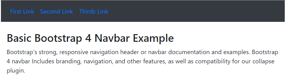
Output
The following image shows the basic navbar of bootstrap version 4.
Contextual navbar with dropdown
The basic bootstrap 4 navbar includes contextual navbar using background classes. We can add the "bg-primary", "bg-primary", "bg-secondary", "bg-dark", "bg-success", and others. The navbar uses dropdown function for space saving and user-friendly header.
Example
The following example uses the "bg-secondary" class with dropdown function for navbar.
<!DOCTYPE html>

<html lang="en">

<head>

<title> Bootstrap 4 navbar Example </title>

<meta charset = "utf-8">

<meta name = "viewport" content="width=device-width, initial-scale=1">

<link rel="stylesheet" href="https://cdn.jsdelivr.net/npm/[email protected]/dist/css/bootstrap.min.css">

<script src = "https://cdn.jsdelivr.net/npm/[email protected]/dist/jquery.slim.min.js">

</script>

<script src = "https://cdn.jsdelivr.net/npm/[email protected]/dist/umd/popper.min.js">

</script>

<script src = "https://cdn.jsdelivr.net/npm/[email protected]/dist/js/bootstrap.bundle.min.js">

</script>

<style>

</style>

</head>

<body>

<div class="container ">

<nav class = "navbar navbar-expand-md bg-secondary navbar-dark">

<ul class = "navbar-nav" id="links">

<li class = "nav-item" id="link1">

<a class = "nav-link" href="#"> First Link </a>

</li>

<li class = "nav-item" id="link2">

<a class = "nav-link" href="#"> Second Link </a>

</li>

<li class = "nav-item dropdown"  id="link3">

<a class = "nav-link dropdown-toggle" href = "#" data-toggle = "dropdown"> More Links </a>

<div class = "dropdown-menu bg-light" style = "border:1px solid black;" >

<a class = "dropdown-item" id = "items" href = "#">Item 1</a>

<a class = "dropdown-item" id="items" href = "#">Item 2</a>

<a class = "dropdown-item" id="items" href = "#">Item 3</a>

</div>

</li>

</ul>

</nav>

<br>

<div class = "container-fluid">

<h3> Bootstrap 4 Navbar Example </h3>

<p> Bootstrap's strong, responsive navigation header or navbar documentation and examples. Bootstrap 4 navbar Includes branding, navigation, and other features, as well as compatibility for our collapse plugin.</p>

</div>

</div>

</body>

</html>
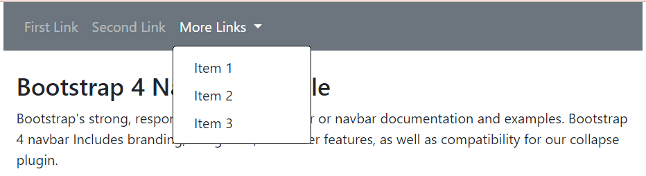
Output
The image displays the output of the secondary navbar with the dropdown function.
Vertical navbar
The basic bootstrap 4 creates a verticle navbar with other functions. If navbar removes or does not use the ".navbar-expand-md|sm|xl" class. The "navbar-item" uses the "active" keyword for the default link.
Example
The following example shows vertical navbar with activate link.
<!DOCTYPE html>

<html lang="en">

<head>

<title> Bootstrap 4 navbar Example </title>

<meta charset = "utf-8">

<meta name = "viewport" content="width=device-width, initial-scale=1">

<link rel="stylesheet" href="https://cdn.jsdelivr.net/npm/[email protected]/dist/css/bootstrap.min.css">

<script src = "https://cdn.jsdelivr.net/npm/[email protected]/dist/jquery.slim.min.js">

</script>

<script src = "https://cdn.jsdelivr.net/npm/[email protected]/dist/umd/popper.min.js">

</script>

<script src = "https://cdn.jsdelivr.net/npm/[email protected]/dist/js/bootstrap.bundle.min.js">

</script>

<style>

#links{

color:white;

}

</style>

</head>

<body>

<div class="container w-50" style="border:1px solid black;">

<nav class = "navbar bg-secondary navbar-dark">

<ul class = "navbar-nav" id="links">

<li class = "nav-item active" id="link1">

<a class = "nav-link" href="#"> First Link </a>

</li>

<li class = "nav-item" id="link2">

<a class = "nav-link" href="#"> Second Link </a>

</li>

<li class = "nav-item dropdown"  id="link3">

<a class = "nav-link dropdown-toggle" href="#" data-toggle="dropdown"> More Links </a>

<div class="dropdown-menu" style="border:1px solid black;">

<a class="dropdown-item" id="items" href="#">Item 1</a>

<a class="dropdown-item" id="items" href="#">Item 2</a>

<a class="dropdown-item" id="items" href="#">Item 3</a>

</div>

</li>

</ul>

</nav>

<br>

<div class = "container-fluid">

<h3> Bootstrap 4 Navbar Example </h3>

<p> Bootstrap's strong, responsive navigation header or navbar documentation and examples.</p>

</div>

</div>

</body>

</html>
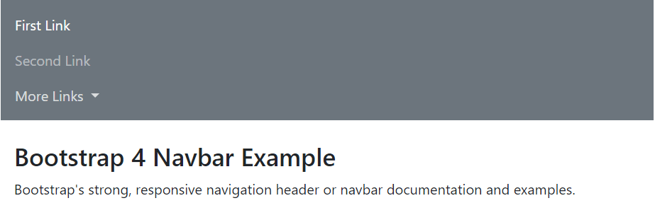
Output
The following image shows the verticle navbar with its link.
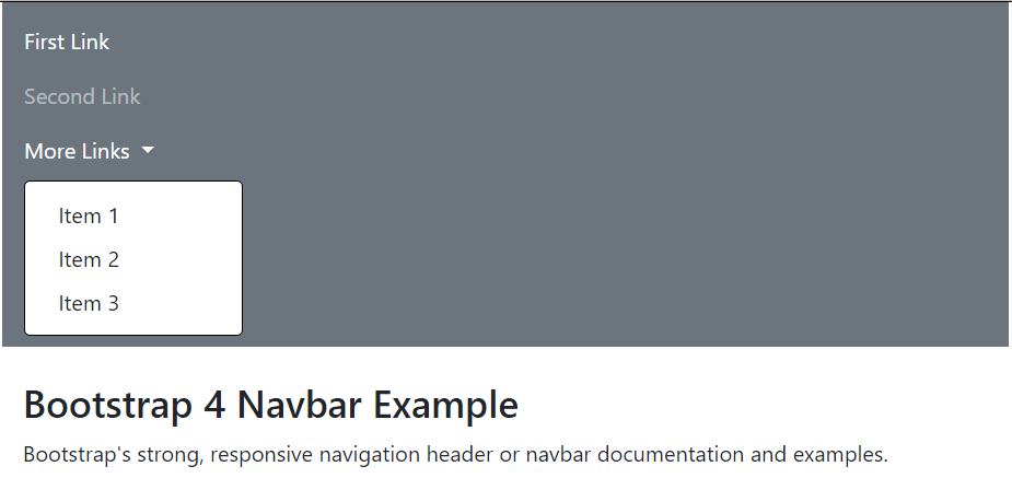
The following image shows the verticle navbar after clicking the dropdown function.
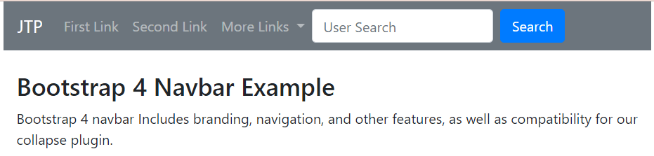
navbar with brand, form, and button
The basic bootstrap4 creates a horizontal navbar with other functions. We can add a logo, search tag, form, and buttons in the available navbar.
Example
<!DOCTYPE html>

<html lang="en">

<head>

<title> Bootstrap 4 navbar Example </title>

<meta charset = "utf-8">

<meta name = "viewport" content="width=device-width, initial-scale=1">

<link rel="stylesheet" href="https://cdn.jsdelivr.net/npm/[email protected]/dist/css/bootstrap.min.css">

<script src = "https://cdn.jsdelivr.net/npm/[email protected]/dist/jquery.slim.min.js">

</script>

<script src = "https://cdn.jsdelivr.net/npm/[email protected]/dist/umd/popper.min.js">

</script>

<script src = "https://cdn.jsdelivr.net/npm/[email protected]/dist/js/bootstrap.bundle.min.js">

</script>

<style>

</style>

</head>

<body>

<div class="container ">

<nav class = "navbar navbar-expand-md bg-secondary navbar-dark">

<a class = "navbar-brand" id = "brand" href="#"> JTP </a>

<ul class = "navbar-nav" id="links">

<li class = "nav-item" id="link1">

<a class = "nav-link" href="#"> First Link </a>

</li>

<li class = "nav-item" id="link2">

<a class = "nav-link" href="#"> Second Link </a>

</li>

<li class = "nav-item dropdown"  id="link3">

<a class = "nav-link dropdown-toggle" href = "#" data-toggle = "dropdown"> More Links </a>

<div class = "dropdown-menu bg-light" style = "border:1px solid black;" >

<a class = "dropdown-item" id = "items" href = "#">Item 1</a>

<a class = "dropdown-item" id="items" href = "#">Item 2</a>

</li>

</ul>

<form class="form-inline" id ="forms" action="">

<input class="form-control mr-sm-2" type="text" name = "search" placeholder="User Search">

<button class="btn btn-primary" type="submit"> Search </button>

</form>

</nav>

<br>

<div class = "container-fluid">

<h3> Bootstrap 4 Navbar Example </h3>

<p> Bootstrap 4 navbar Includes branding, navigation, and other features, as well as compatibility for our collapse plugin.</p>

</div>

</div>

</body>

</html>
Output
Conclusion
The bootstrap 4 navbar gives an attractive, user-friendly, and space-saving header for web pages. The navbar navigates several pages and information with a header line simply and easily. We can add different functionalities and interactive user elements in a proper format.