Bootstrap 4 Card
In Bootstrap 4, a card is a bordered box with padding around its content. It has options for headers, footers, colors, content, etc. The card provides the link, title, image, and text of the content. The card shows form, table, and complicated content systematically. We can create a grid system or group of cards in a single column.
Types of cards
There are numerous types of cards used on web pages. The following table shows the syntax and description of several Bootstrap4 cards.
| Bootstrap4 card | Syntax | Description |
| Basic card | <div class = "card"> <div class = "card-body"> Basic Bootstrap4 Card </div> </div> | The bootstrap 4 shows basic card and its body in web page. |
| Primary card | <div class = "card bg-primary"> <div class = "card-body"> primary Bootstrap4 Card </div> </div> | The card shows in a blue color. It indicates important content for the page. |
| Secondary card | <div class = "card bg-secondary"> <div class = "card-body"> Secondary Bootstrap4 Card </div> </div> | The card shows in a grey color. |
| Success card | <div class = "card bg-success"> <div class = "card-body"> Success Bootstrap4 Card </div> </div> | The card shows in green color. |
| Information card | <div class = "card bg-info"> <div class = "card-body"> Information Bootstrap4 Card </div> </div> | The card shows in a light blue color. |
| Warning card | <div class = "card bg-warning"> <div class = "card-body"> Warning Bootstrap4 Card </div> </div> | The card shows in yellow color. |
| Danger card | <div class = "card bg-danger"> <div class = "card-body"> Danger Bootstrap4 Card </div> </div> | The card shows in a red color |
| Dark card | <div class = "card bg-dark"> <div class = "card-body"> Dark Bootstrap4 Card </div> </div> | The card shows in a dark grey color |
| Light card | <div class = "card bg-light"> <div class = "card-body"> Light Bootstrap4 Card </div> </div> | The card shows in a white or light grey color. |
Contextual Bootstrap4 cards
The contextual cards show their color, format, and texture with classes. The basic card requires card class and card body class. The bootstrap4 card uses the .card class with other contextual classes.
Example
The following example shows different type of the cards.
<!DOCTYPE html>

<html lang="en">

<head>

  <title>Bootstrap4 cards Example</title>

  <meta charset="utf-8">

  <meta name="viewport" content="width=device-width, initial-scale=1">

  <link rel="stylesheet" href="https://cdn.jsdelivr.net/npm/[email protected]/dist/css/bootstrap.min.css">

  <script src="https://cdn.jsdelivr.net/npm/[email protected]/dist/jquery.slim.min.js"></script>

  <script src="https://cdn.jsdelivr.net/npm/[email protected]/dist/umd/popper.min.js"></script>

  <script src="https://cdn.jsdelivr.net/npm/[email protected]/dist/js/bootstrap.bundle.min.js"></script>

</head>

<body>

 <div class="container" id="cards">

<br>

  <div class = "card">

<div class = "card-body text-dark"> Basic Bootstrap4 Card </div>

</div>

<br>

<div class = "card bg-primary">

<div class = "card-body text-white"> primary Bootstrap4 Card </div>

</div>

<br>

<div class = "card bg-secondary">

<div class = "card-body text-white"> Secondary  Bootstrap4 Card </div>

</div>

<br>

<div class = "card bg-success">

<div class = "card-body text-white"> Success Bootstrap4 Card </div>

</div>

<br>

<div class = "card bg-warning">

<div class = "card-body"> Warning Bootstrap4 Card </div>

</div>

<br>

<div class = "card bg-info">

<div class = "card-body"> Information Bootstrap4 Card </div>

</div>

<br>

<div class = "card bg-dark">

<div class = "card-body text-white"> Dark Bootstrap4 Card </div>

</div>

<br>

<div class = "card bg-danger">

<div class = "card-body text-white"> Danger Bootstrap4 Card </div>

</div>

<br>

</div>

</body>

</html>
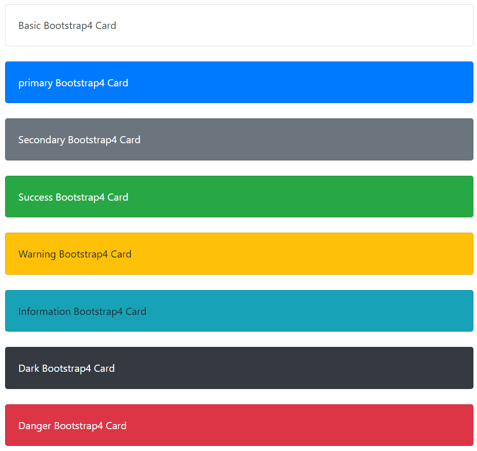
Output
The below image shows the relevant output of the given an example.
Cards Header and Footer
The .card-header and .card-footer classes add a heading and footer to the card, respectively.
| Bootstrap4 card | Syntax | Description |
| Header | <div class = "card-header"> Heading content </div> | The card header provides the heading of the card body. |
| Footer | <div class = "card-footer"> Footer content </div> | The card header provides footer content for the card body. |
Example
The following example shows header and footer of the cards. This example uses light card class with the header and footer.
<!DOCTYPE html>

<html lang="en">

<head>

<title>Bootstrap4 cards Example</title>

<meta charset="utf-8">

<meta name="viewport" content="width=device-width, initial-scale=1">

<link rel="stylesheet" href="https://cdn.jsdelivr.net/npm/[email protected]/dist/css/bootstrap.min.css">

<script src="https://cdn.jsdelivr.net/npm/[email protected]/dist/jquery.slim.min.js"></script>

<script src="https://cdn.jsdelivr.net/npm/[email protected]/dist/umd/popper.min.js"></script>

<script src="https://cdn.jsdelivr.net/npm/[email protected]/dist/js/bootstrap.bundle.min.js"></script>

</head>

<body>

<div class="container" id="cards">

<h4> Hearder and Footer</h4>

<div class = "card bg-light">

<div class = "card-header"> Registration form </div>

<div class = "card-body">

<form>

<div class = "form-group">

<label for = "uId"> User Id:</label>

<input type = "input" class="form-control" placeholder="Enter User Id" id="uId">

</div>

<div class = "form-group">

<label for = "pass"> Password: </label>

<input type = "input" class="form-control" placeholder="Enter User password"    id="pass">

</div>

<input type = "submit" class="btn btn-secondary">

</form>

</div>

<div class="card-footer"> It creates @2022</div>

</div>

<br>

</div>

</body>

</html>
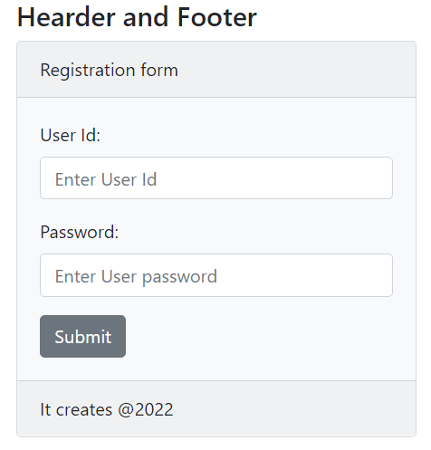
Output
The below image shows the header and footer output of the given an example.
Title, Text, Images, and Links
The bootstrap4 card contains a web page's link, title, image, and text. The following table shows the syntax and description of the card functions.
| Bootstrap4 card | Syntax | Description |
| Title | <h1 class = "card-title"> Content Title </h1> | The card provides the title for the web content. |
| Text | <p class = "card-text"> Content data </p> | The card provides the title for the web content. |
| Image | <img class = "card-img-top" src="path/image.png" alt = "image name"> OR <img class = "card-img-bottom" src="path/image.png" alt = "image name"> | The card contains images either top side or bottom side of the card body. |
| Link | <a href = "javatpoint.com" class = "card-link"> Web page link </a> | The card provides a link to the other web pages. |
Example
The following example shows how to create title, texts, link and image in the cards.
<!DOCTYPE html>

<html lang="en">

<head>

<title>Bootstrap4 cards Example</title>

<meta charset="utf-8">

<meta name="viewport" content="width=device-width, initial-scale=1">

<link rel="stylesheet" href="https://cdn.jsdelivr.net/npm/[email protected]/dist/css/bootstrap.min.css">

<script src="https://cdn.jsdelivr.net/npm/[email protected]/dist/jquery.slim.min.js"></script>

<script src="https://cdn.jsdelivr.net/npm/[email protected]/dist/umd/popper.min.js"></script>

<script src="https://cdn.jsdelivr.net/npm/[email protected]/dist/js/bootstrap.bundle.min.js"></script>

<style>

img{

border:2px solid grey;

}

.container{

width:30%;

height:30%;

}

</style>

</head>

<body>

<br>

<div class="container" id="cards">

<div class = "card">

<div class = "card-body">

<h5 class = "card-title"> Content Title </h5>

<p class = "card-text">

The card contains text, title, image, links and other functions.

</p>

<b> Card link: </b>

<a href = "https://www.javatpoint.com/" class = "card-link"> Web page link </a> <br>

<b> Card image </b> <br>

<img class = "card-img-bottom" src="C:\Users\hp\Pictures\Screenshots\bootstrap_card.png" alt = "Card's Type">

</div>

</div>

</div>

</body>

</html>
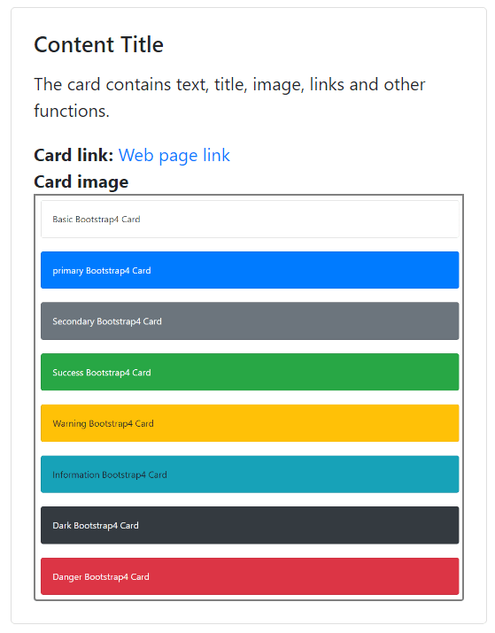
Output
Bootstrap4 Cards column
The .card-columns class includes multiple cards to contain different type of the data.
| Bootstrap4 card | Syntax | Description |
| Card column | <div class = "card-columns"> Heading content </div> | The card columns contain multiple cards. |
Example
The following example shows different type of the cards in single column.
<!DOCTYPE html>

<html lang="en">

<head>

  <title>Bootstrap4 cards Example</title>

  <meta charset="utf-8">

  <meta name="viewport" content="width=device-width, initial-scale=1">

  <link rel="stylesheet" href="https://cdn.jsdelivr.net/npm/[email protected]/dist/css/bootstrap.min.css">

  <script src="https://cdn.jsdelivr.net/npm/[email protected]/dist/jquery.slim.min.js"></script>

  <script src="https://cdn.jsdelivr.net/npm/[email protected]/dist/umd/popper.min.js"></script>

  <script src="https://cdn.jsdelivr.net/npm/[email protected]/dist/js/bootstrap.bundle.min.js"></script>

</head>

<body>

 <div class="container w-50" id="cards">

<div class="card-columns">

  <div class = "card">

<div class = "card-body text-dark"> Basic Bootstrap4 Card </div>

</div>

<div class = "card bg-primary">

<div class = "card-body text-white"> primary Bootstrap4 Card </div>

</div>

<div class = "card bg-secondary">

<div class = "card-body text-white"> Secondary Card </div>

</div>

<div class = "card bg-success">

<div class = "card-body text-white"> Success Bootstrap4 Card </div>

</div>

<div class = "card bg-warning">

<div class = "card-body"> Warning Bootstrap4 Card </div>

</div>

<div class = "card bg-info">

<div class = "card-body"> Information Card </div>

</div>

<div class = "card bg-dark">

<div class = "card-body text-white"> Dark Bootstrap4 Card </div>

</div>

<div class = "card bg-danger">

<div class = "card-body text-white"> Danger Bootstrap4 Card </div>

</div>

<div class = "card bg-light">

<div class = "card-body"> Light Card </div>

</div>

</div>

</div>

</body>

</html>
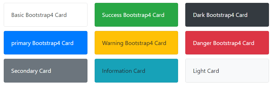
Output
Conclusion
Bootstrap4 card help to display multiple contents and its features easily. The card shows complicated data in a simple format using several classes. The card contains essential user interactive features to make a user-friendly web page.