Bootstrap 4 Toast
Bootstrap 4 Toast
Bootstrap 4 offers a Toast component, which is quite similar to the alert box and pushes notifications. The toast is visible on the screen for a few seconds when any action takes place, such as when a user submits a form. It is a lightweight and easily customizable component. The toast is created with the help of a flexbox that allows you to align and set the position of the Toast as per the choice.
Steps for creating a Toast
- Add the .toast class to the <div> element to create a toast.
- Add the .toast-header class to the <div> element to create a toast header.
- Add the .toast-body class to the <div> element to create a toast body.
Note: It is necessary to initialize the toast with jQuery, for that you need to choose the specific element and call the toast() method.
Example
<!DOCTYPE html>
 <html lang="en">
 <head>
   <title>Bootstrap 4 Toast Example</title>
   <meta charset="utf-8">
   <meta name="viewport" content="width=device-width, initial-scale=1">
   <link rel="stylesheet" href="https://maxcdn.bootstrapcdn.com/bootstrap/4.4.1/css/bootstrap.min.css">
 </head>
 <body>
 <div class="container">
   <h3>Toast</h3><br>
   <button type="button" class="btn btn-primary" id="myBtn">Click Here</button>
   <div class="toast">
     <div class="toast-header">
       Toast Header
     </div>
     <div class="toast-body">
       Hello! This is the toast body.
     </div>
   </div>
 </div>
 <script>
 $(document).ready(function(){
   $("#myBtn").click(function(){
     $('.toast').toast('show');
   });
 });
 </script>
 <script src="https://ajax.googleapis.com/ajax/libs/jquery/3.5.1/jquery.min.js"></script>
   <script src="https://cdnjs.cloudflare.com/ajax/libs/popper.js/1.16.0/umd/popper.min.js"></script>
   <script src="https://maxcdn.bootstrapcdn.com/bootstrap/4.4.1/js/bootstrap.min.js"></script>
 </body>
 </html>
Output
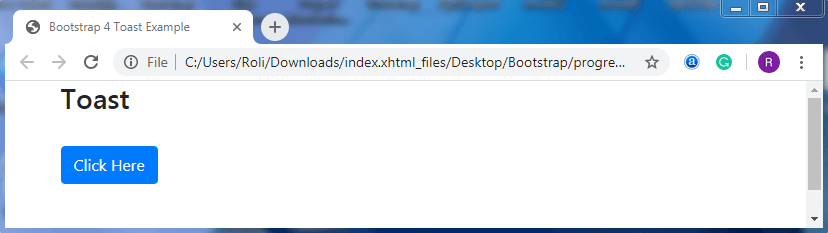
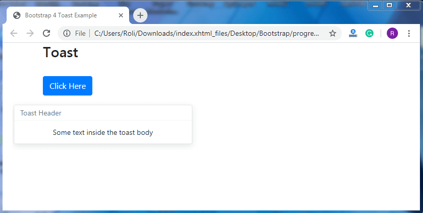
When you click on the Click here button the Output is given below:
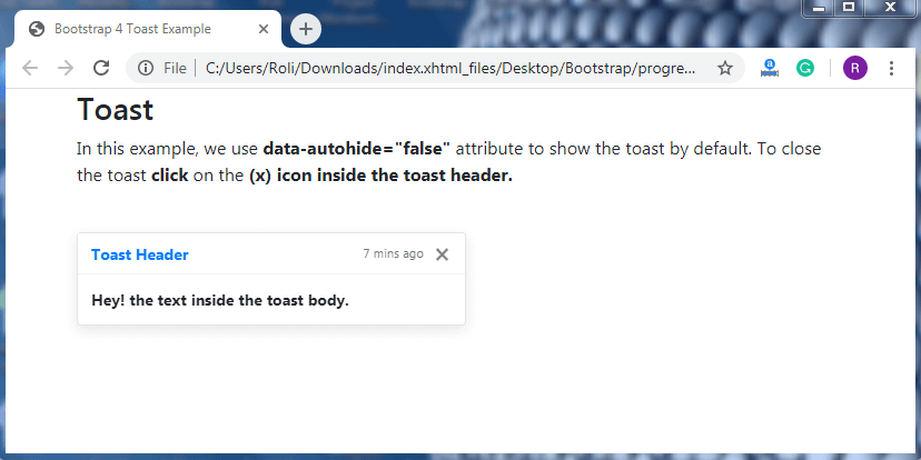
Show and Hide a Toast – By default, the toast is hidden. You have to click on the button first to see the toast. You can also create a toast which is visible by default and disappear when you click on the button. For that add the data-autohide=”false” attribute along with the .toast class to the <div> element.
To close the toast which is by default visible, add the data-dismiss=”toast” attribute to the <button> element
Example
<!DOCTYPE html>
 <html lang="en">
 <head>
   <title>Bootstrap 4 Toast Example</title>
   <meta charset="utf-8">
   <meta name="viewport" content="width=device-width, initial-scale=1">
   <link rel="stylesheet" href="https://maxcdn.bootstrapcdn.com/bootstrap/4.4.1/css/bootstrap.min.css">
   <script src="https://ajax.googleapis.com/ajax/libs/jquery/3.5.1/jquery.min.js"></script>
   <script src="https://cdnjs.cloudflare.com/ajax/libs/popper.js/1.16.0/umd/popper.min.js"></script>
   <script src="https://maxcdn.bootstrapcdn.com/bootstrap/4.4.1/js/bootstrap.min.js"></script>
 </head>
 <body>
 <div class="container">
   <h3>Toast</h3>
   <p>In this example, we use <strong>data-autohide="false"</strong> attribute to show the toast by default. To close the toast <strong>click</strong> on the <strong>(x)</srong> icon inside the toast header.</p>
     <br>
   <div class="toast" data-autohide="false">
     <div class="toast-header">
       <strong class="mr-auto text-primary">Toast Header</strong>
       <small class="text-muted">7 mins ago</small>
       <button type="button" class="ml-2 mb-1 close" data-dismiss="toast">×</button>
     </div>
     <div class="toast-body">
       Hey! the text inside the toast body.
     </div>
   </div>
 </div>
 <script>
 $(document).ready(function(){
   $('.toast').toast('show');
 });
 </script>
 </body>
 </html>
Output
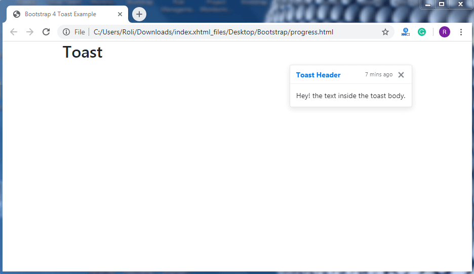
Placement – Bootstrap 4 allows you to set the position of the toast on your own with the help of custom CSS and flexbox property.
Example
<!DOCTYPE html>
 <html lang="en">
 <head>
   <title>Bootstrap 4 Toast Example</title>
   <meta charset="utf-8">
   <meta name="viewport" content="width=device-width, initial-scale=1">
   <link rel="stylesheet" href="https://maxcdn.bootstrapcdn.com/bootstrap/4.4.1/css/bootstrap.min.css">
   <script src="https://ajax.googleapis.com/ajax/libs/jquery/3.5.1/jquery.min.js"></script>
   <script src="https://cdnjs.cloudflare.com/ajax/libs/popper.js/1.16.0/umd/popper.min.js"></script>
   <script src="https://maxcdn.bootstrapcdn.com/bootstrap/4.4.1/js/bootstrap.min.js"></script>
 </head>
 <body>
 <div class="container">
   <h2>Toast</h2>
   <div aria-live="polite" aria-atomic="true" style="position: relative; min-height: 300px;">
   <div class="toast" data-autohide="false" style="position: absolute; top: 0; right: 0;">
     <div class="toast-header">
       <strong class="mr-auto text-primary">Toast Header</strong>
       <small class="text-muted">7 mins ago</small>
       <button type="button" class="ml-2 mb-1 close" data-dismiss="toast">×</button>
     </div>
     <div class="toast-body">
       Hey! the text inside the toast body.
     </div>
   </div>
 </div>
 <script>
 $(document).ready(function(){
   $('.toast').toast('show');
 });
 </script>
 </body>
 </html>
Output