Bootstrap 4 Utilities
Bootstrap 4 Utilities
Bootstrap 4 utilities also known as helper classes that are used to add more style to the components. Utilities are used to make the website or webpage more stylish or elegant. It also makes the responsive elements.
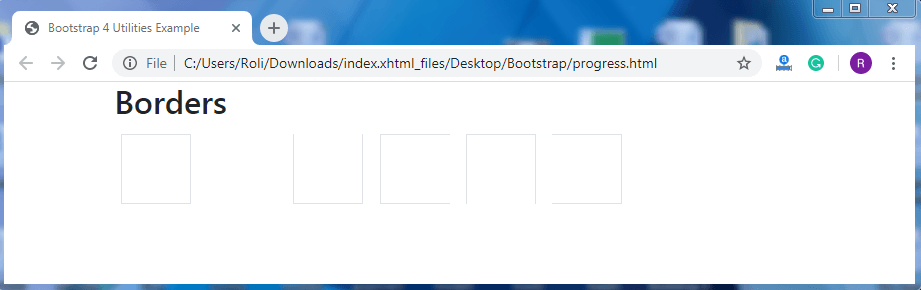
Borders – Borders classes are used to style the border of the elements such as add or remove the border, adjust border-radius, etc.
Example
<!DOCTYPE html>
 <html lang="en">
 <head>
   <title>Bootstrap 4 Utilities Example</title>
   <meta charset="utf-8">
   <meta name="viewport" content="width=device-width, initial-scale=1">
   <link rel="stylesheet" href="https://maxcdn.bootstrapcdn.com/bootstrap/4.4.1/css/bootstrap.min.css">
   <script src="https://ajax.googleapis.com/ajax/libs/jquery/3.5.1/jquery.min.js"></script>
   <script src="https://cdnjs.cloudflare.com/ajax/libs/popper.js/1.16.0/umd/popper.min.js"></script>
   <script src="https://maxcdn.bootstrapcdn.com/bootstrap/4.4.1/js/bootstrap.min.js"></script>
   <style>
   .border {
     display: inline-block;
     width: 70px;
     height: 70px;
     margin: 6px;
   }
   </style>
 </head>
 <body>
 <div class="container">
   <h2>Borders</h2>
   <span class="border"></span>
   <span class="border border-0"></span>
   <span class="border border-top-0"></span>
   <span class="border border-right-0"></span>
   <span class="border border-bottom-0"></span>
   <span class="border border-left-0"></span>
 </div>
 </body>
 </html>
Output
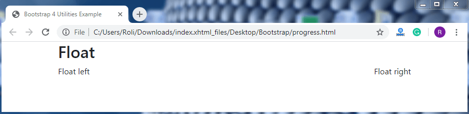
Float and Clearfix – Float class is used to set the position of the element to the left or right. The .float-right class is used to float the element to the right and .float-left class is used to float the element to the left. Clearfix is used to prevent the collapsing between parent and child element. The .clearfix class is used to remove float.
Example
<!DOCTYPE html>
 <html lang="en">
 <head>
   <title>Bootstrap 4 Utilities Example</title>
   <meta charset="utf-8">
   <meta name="viewport" content="width=device-width, initial-scale=1">
   <link rel="stylesheet" href="https://maxcdn.bootstrapcdn.com/bootstrap/4.4.1/css/bootstrap.min.css">
   <script src="https://ajax.googleapis.com/ajax/libs/jquery/3.5.1/jquery.min.js"></script>
   <script src="https://cdnjs.cloudflare.com/ajax/libs/popper.js/1.16.0/umd/popper.min.js"></script>
   <script src="https://maxcdn.bootstrapcdn.com/bootstrap/4.4.1/js/bootstrap.min.js"></script>
 </head>
 <body>
 <div class="container">
   <h2>Float</h2>
   <div class="clearfix">
     <span class="float-left">Float left</span>
     <span class="float-right">Float right</span>
   </div>
 </div>
 </body>
 </html>
Output
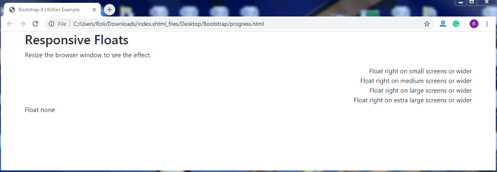
Responsive Float - Bootstrap 4 offers helper classes to float an element to the left or right according to the screen size with responsive behavior. The .float-*-right class is used to float the element to the right. You do not need to add the .float-*-left class because the default position of the element is left of the viewport or screen.
Where, * = sm, md, lg, and xl.
Example
<!DOCTYPE html>
 <html lang="en">
 <head>
   <title>Bootstrap 4 Utilities Example</title>
   <meta charset="utf-8">
   <meta name="viewport" content="width=device-width, initial-scale=1">
   <link rel="stylesheet" href="https://maxcdn.bootstrapcdn.com/bootstrap/4.4.1/css/bootstrap.min.css">
   <script src="https://ajax.googleapis.com/ajax/libs/jquery/3.5.1/jquery.min.js"></script>
   <script src="https://cdnjs.cloudflare.com/ajax/libs/popper.js/1.16.0/umd/popper.min.js"></script>
   <script src="https://maxcdn.bootstrapcdn.com/bootstrap/4.4.1/js/bootstrap.min.js"></script>
 </head>
 <body>
 <div class="container">
   <h2>Responsive Floats</h2>
   <p>Resize the browser window to see the effect.</p>
   <div class="clearfix">
     <div class="float-sm-right">Float right on small screens or wider</div><br>
     <div class="float-md-right">Float right on medium screens or wider</div><br>
     <div class="float-lg-right">Float right on large screens or wider</div><br>
     <div class="float-xl-right">Float right on extra large screens or wider</div><br>
     <div class="float-none">Float none</div>
   </div>
 </div>
 </body>
 </html>
Output
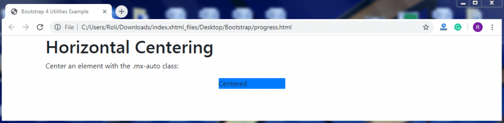
Center align – You can also place your content or element in the center horizontally of the viewport or screen. Add the .mx-auto class to make the content center aligned.
Example
<!DOCTYPE html>
 <html lang="en">
 <head>
   <title>Bootstrap 4 Utilities Example</title>
   <meta charset="utf-8">
   <meta name="viewport" content="width=device-width, initial-scale=1">
   <link rel="stylesheet" href="https://maxcdn.bootstrapcdn.com/bootstrap/4.4.1/css/bootstrap.min.css">
   <script src="https://ajax.googleapis.com/ajax/libs/jquery/3.5.1/jquery.min.js"></script>
   <script src="https://cdnjs.cloudflare.com/ajax/libs/popper.js/1.16.0/umd/popper.min.js"></script>
   <script src="https://maxcdn.bootstrapcdn.com/bootstrap/4.4.1/js/bootstrap.min.js"></script>
 </head>
 <body>
 <div class="container">
   <h1>Horizontal Centering</h1>
   <p>Center an element with the .mx-auto class:</p>
   <div class="mx-auto bg-primary" style="width:150px">Centered</div>
 </div>
 </body>
 </html>
Output
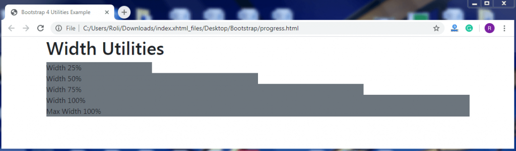
Width – Bootstrap allows you to set the width of the element as per the need. To set the width of the element add .w-* class to the <div> element.
Where, * = 25, 50, 75, 100.
Example
<!DOCTYPE html>
 <html lang="en">
 <head>
   <title>Bootstrap 4 Utilities Example</title>
   <meta charset="utf-8">
   <meta name="viewport" content="width=device-width, initial-scale=1">
   <link rel="stylesheet" href="https://maxcdn.bootstrapcdn.com/bootstrap/4.4.1/css/bootstrap.min.css">
   <script src="https://ajax.googleapis.com/ajax/libs/jquery/3.5.1/jquery.min.js"></script>
   <script src="https://cdnjs.cloudflare.com/ajax/libs/popper.js/1.16.0/umd/popper.min.js"></script>
   <script src="https://maxcdn.bootstrapcdn.com/bootstrap/4.4.1/js/bootstrap.min.js"></script>
 </head>
 <body>
 <div class="container">
   <h1>Width Utilities</h1>
   <div class="w-25 bg-secondary">Width 25%</div>
   <div class="w-50 bg-secondary">Width 50%</div>
   <div class="w-75 bg-secondary">Width 75%</div>
   <div class="w-100 bg-secondary">Width 100%</div>
   <div class="mw-100 bg-secondary">Max Width 100%</div>
 </div>
 </body>
 </html>
Output
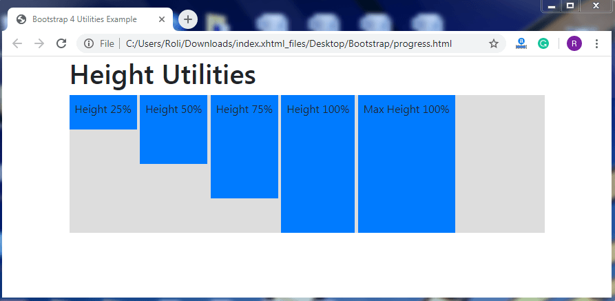
Height – Bootstrap 4 allows you to set the height of the element. To set the height of the element add .h-* class and for max- height add .mh-100 class.
Where, * = 25, 50, 75, 100.
Example
<!DOCTYPE html>
 <html lang="en">
 <head>
   <title>Bootstrap 4 Utilities Example</title>
   <meta charset="utf-8">
   <meta name="viewport" content="width=device-width, initial-scale=1">
   <link rel="stylesheet" href="https://maxcdn.bootstrapcdn.com/bootstrap/4.4.1/css/bootstrap.min.css">
   <script src="https://ajax.googleapis.com/ajax/libs/jquery/3.5.1/jquery.min.js"></script>
   <script src="https://cdnjs.cloudflare.com/ajax/libs/popper.js/1.16.0/umd/popper.min.js"></script>
   <script src="https://maxcdn.bootstrapcdn.com/bootstrap/4.4.1/js/bootstrap.min.js"></script>
 </head>
 <body>
 <div class="container">
   <h1>Height Utilities</h1>
   <div style="height:200px;background-color:#ddd">
     <div class="h-25 d-inline-block p-2 bg-primary">Height 25%</div>
     <div class="h-50 d-inline-block p-2 bg-primary">Height 50%</div>
     <div class="h-75 d-inline-block p-2 bg-primary">Height 75%</div>
     <div class="h-100 d-inline-block p-2 bg-primary">Height 100%</div>
     <div class="mh-100 d-inline-block p-2 bg-primary" style="height:500px">Max Height 100%</div>
   </div>
 </div>
 </body>
 </html>
Output
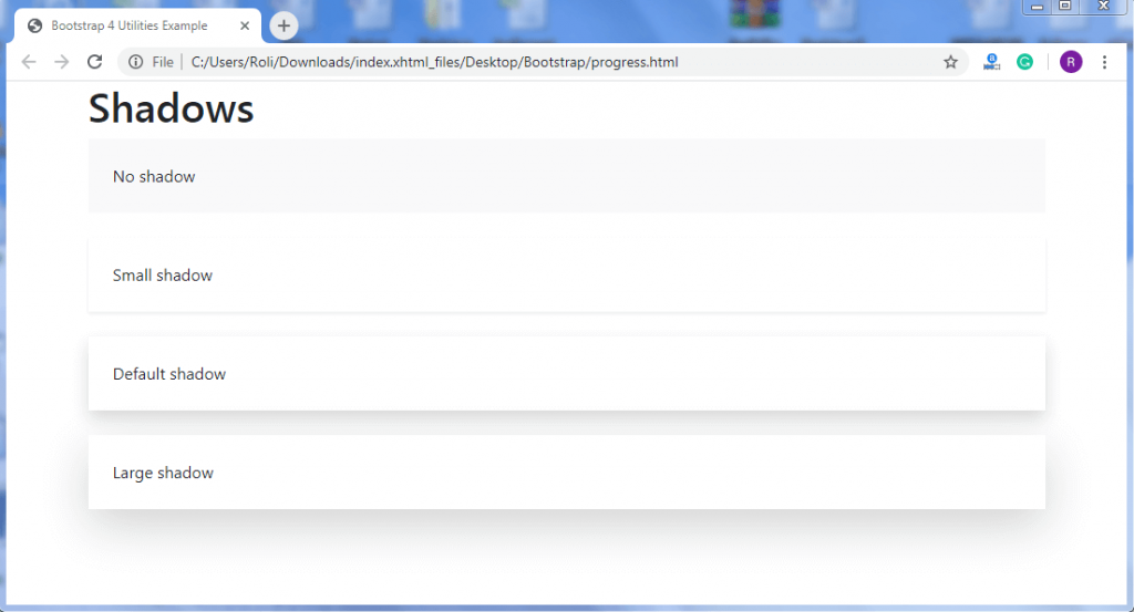
Shadows – Bootstrap 4 allows you to give the shadow effect to the elements. To create the shadow effect, add the .shadow class to the <div> element.
Example
<!DOCTYPE html>
 <html lang="en">
 <head>
   <title>Bootstrap 4 Utilities Example</title>
   <meta charset="utf-8">
   <meta name="viewport" content="width=device-width, initial-scale=1">
   <link rel="stylesheet" href="https://maxcdn.bootstrapcdn.com/bootstrap/4.4.1/css/bootstrap.min.css">
   <script src="https://ajax.googleapis.com/ajax/libs/jquery/3.5.1/jquery.min.js"></script>
   <script src="https://cdnjs.cloudflare.com/ajax/libs/popper.js/1.16.0/umd/popper.min.js"></script>
   <script src="https://maxcdn.bootstrapcdn.com/bootstrap/4.4.1/js/bootstrap.min.js"></script>
 </head>
 <body>
 <div class="container">
   <h1>Shadows</h1>
   <div class="shadow-none p-4 mb-4 bg-light">No shadow</div>
   <div class="shadow-sm p-4 mb-4 bg-white">Small shadow</div>
   <div class="shadow p-4 mb-4 bg-white">Default shadow</div>
   <div class="shadow-lg p-4 mb-4 bg-white">Large shadow</div>
 </div>
 </body>
 </html>
Output
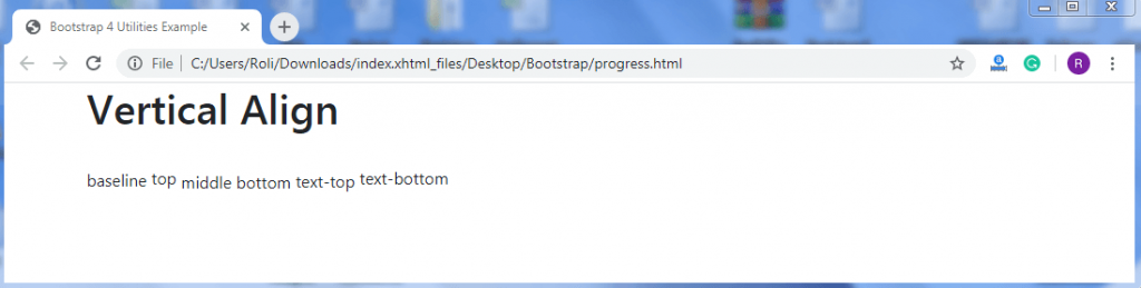
Vertical Align – You can align your content or element vertically or inline. To align the content vertically, add class .align-* to the element.
Where, * = baseline, top, middle, bottom, text-top, text-bottom, etc.
Example
<!DOCTYPE html>
 <html lang="en">
 <head>
   <title>Bootstrap 4 Utilities Example</title>
   <meta charset="utf-8">
   <meta name="viewport" content="width=device-width, initial-scale=1">
   <link rel="stylesheet" href="https://maxcdn.bootstrapcdn.com/bootstrap/4.4.1/css/bootstrap.min.css">
   <script src="https://ajax.googleapis.com/ajax/libs/jquery/3.5.1/jquery.min.js"></script>
   <script src="https://cdnjs.cloudflare.com/ajax/libs/popper.js/1.16.0/umd/popper.min.js"></script>
   <script src="https://maxcdn.bootstrapcdn.com/bootstrap/4.4.1/js/bootstrap.min.js"></script>
 </head>
 <body>
 <div class="container">
   <h1>Vertical Align</h1><br>
   <span class="align-baseline">baseline</span>
   <span class="align-top">top</span>
   <span class="align-middle">middle</span>
   <span class="align-bottom">bottom</span>
   <span class="align-text-top">text-top</span>
   <span class="align-text-bottom">text-bottom</span>
 </div>
 </body>
 </html>
Output
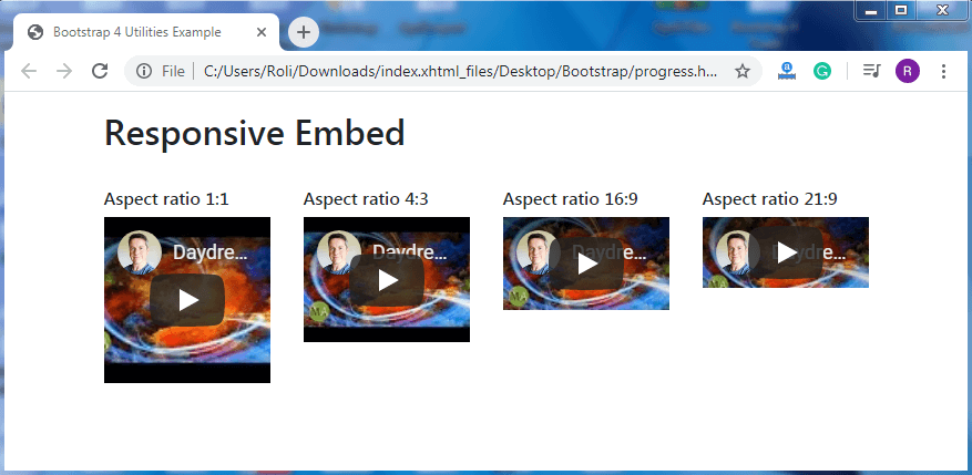
Responsive Embeds – You can add the responsiveness to the videos or images. If you resize the video or images, it will not overlap its parent. The video or image adjusts their width automatically according to the width of the parent.
- To create the responsive embeds, add the .embed-responsive class along with the .embed-responsive-* (* = ratio) to the parent element.
Where, * = 21by9, 16by9, 4by3, and 1by1.
- Add the .embed-responsive-item class to the <iframe> or <video> element.
Example
<!DOCTYPE html>
 <html lang="en">
 <head>
   <title>Bootstrap 4 Utilities Example</title>
   <meta charset="utf-8">
   <meta name="viewport" content="width=device-width, initial-scale=1">
   <link rel="stylesheet" href="https://maxcdn.bootstrapcdn.com/bootstrap/4.4.1/css/bootstrap.min.css">
   <script src="https://ajax.googleapis.com/ajax/libs/jquery/3.5.1/jquery.min.js"></script>
   <script src="https://cdnjs.cloudflare.com/ajax/libs/popper.js/1.16.0/umd/popper.min.js"></script>
   <script src="https://maxcdn.bootstrapcdn.com/bootstrap/4.4.1/js/bootstrap.min.js"></script>
 </head>
 <body>
 <div class="container mt-3">
   <h2>Responsive Embed</h2><br>
   <div class="row">
     <div class="col-md-3">
       <h6>Aspect ratio 1:1</h6>
       <div class="embed-responsive embed-responsive-1by1">
       <iframe class="embed-responsive-item" src="https://www.youtube.com/embed/wTPmrcL47cE"></iframe>
       </div>
     </div>
     <div class="col-md-3">
       <h6>Aspect ratio 4:3</h6>
         <div class="embed-responsive embed-responsive-4by3">
           <iframe class="embed-responsive-item" src="https://www.youtube.com/embed/wTPmrcL47cE"></iframe>
         </div>
     </div>
     <div class="col-md-3">
       <h6>Aspect ratio 16:9</h6>
         <div class="embed-responsive embed-responsive-16by9">
           <iframe class="embed-responsive-item" src="https://www.youtube.com/embed/wTPmrcL47cE"></iframe>
         </div>
     </div>
     <div class="col-md-3">
       <h6>Aspect ratio 21:9</h6>
         <div class="embed-responsive embed-responsive-21by9">
           <iframe class="embed-responsive-item" src="https://www.youtube.com/embed/wTPmrcL47cE"></iframe>
         </div>
     </div>
   </div>
   </div>
 </body>
 </html>
Output
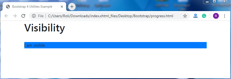
Visibility - Bootstrap 4 provides some classes that help you to make the element visible or invisible. To make the element visible, add .visible class to the <div> element. To make the element invisible, add the .invisible class to the <div> element.
Example
<!DOCTYPE html>
 <html lang="en">
 <head>
   <title>Bootstrap 4 Utilities Example</title>
   <meta charset="utf-8">
   <meta name="viewport" content="width=device-width, initial-scale=1">
   <link rel="stylesheet" href="https://maxcdn.bootstrapcdn.com/bootstrap/4.4.1/css/bootstrap.min.css">
   <script src="https://ajax.googleapis.com/ajax/libs/jquery/3.5.1/jquery.min.js"></script>
   <script src="https://cdnjs.cloudflare.com/ajax/libs/popper.js/1.16.0/umd/popper.min.js"></script>
   <script src="https://maxcdn.bootstrapcdn.com/bootstrap/4.4.1/js/bootstrap.min.js"></script>
 </head>
 <body>
 <div class="container">
   <h1>Visibility</h1><br>
   <div class="visible bg-primary">I am visible</div>
   <div class="invisible bg-primary">I am invisible</div>
 </div>
 </body>
 </html>
Output
Close Icon - The close icon is basically used in the modal or alerts. The default position of the close (‘x’) is right. The × symbol is used to create the actual icon. To create the close icon, add the .close class along with the type=”button” attribute to the <button> element.
Example
<!DOCTYPE html>
 <html lang="en">
 <head>
   <title>Bootstrap 4 Utilities Example</title>
   <meta charset="utf-8">
   <meta name="viewport" content="width=device-width, initial-scale=1">
   <link rel="stylesheet" href="https://maxcdn.bootstrapcdn.com/bootstrap/4.4.1/css/bootstrap.min.css">
   <script src="https://ajax.googleapis.com/ajax/libs/jquery/3.5.1/jquery.min.js"></script>
   <script src="https://cdnjs.cloudflare.com/ajax/libs/popper.js/1.16.0/umd/popper.min.js"></script>
   <script src="https://maxcdn.bootstrapcdn.com/bootstrap/4.4.1/js/bootstrap.min.js"></script>
 </head>
 <body>
 <div class="container">
   <h1>Close Icon</h1>
   <div class="clearfix">
     <button type="button" class="close">×</button>
   </div>
 </div>
 </body>
 </html>
Output
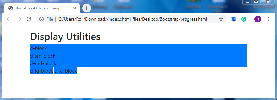
Block Elements – You can also convert an element into the block element. Add the .d-*-block class to control the action of the element (when it acts as a block or when not). To create a block element, add .d-block class to the element.
Example
<!DOCTYPE html>
 <html lang="en">
 <head>
   <title>Bootstrap 4 Utilities Example</title>
   <meta charset="utf-8">
   <meta name="viewport" content="width=device-width, initial-scale=1">
   <link rel="stylesheet" href="https://maxcdn.bootstrapcdn.com/bootstrap/4.4.1/css/bootstrap.min.css">
   <script src="https://ajax.googleapis.com/ajax/libs/jquery/3.5.1/jquery.min.js"></script>
   <script src="https://cdnjs.cloudflare.com/ajax/libs/popper.js/1.16.0/umd/popper.min.js"></script>
   <script src="https://maxcdn.bootstrapcdn.com/bootstrap/4.4.1/js/bootstrap.min.js"></script>
 </head>
 <body>
 <div class="container mt-3">
   <h2>Display Utilities</h2>
   <span class="d-block bg-primary">d-block</span>
   <span class="d-sm-block bg-primary">d-sm-block</span>
   <span class="d-md-block bg-primary">d-md-block</span>
   <span class="d-lg-block bg-primary">d-lg-block</span>
   <span class="d-xl-block bg-primary">d-xl-block</span>
 </div>
 </body>
 </html>
Output