Bubble Chart in R Programming
In this article, we will talk about another type of chart in R programming, i.e., the Bubble chart.
A bubble chart is a type of data visualization chart that helps display multiple bubbles or circles in a 2-dimensional plot, just like a scatter plot.
The bubble chart is mostly used when we have to depict and show the relationship between numeric variables.
We can plot a bubble chart by using the built-in function geom_point() with ggplot2.
Syntax of Bubble chart:
ggplot(data, aes(x, y, size))+geom_point()To plot a bubble chart, at least 3 must be provided to aes(), which are x, y, and size. And the bubble chart will automatically be displayed by ggplot2.
geom_point() is the in-built function.
size refers to one of the attributes based on the value, i.e., the size of bubbles will differ.
Let’s try to create a simple bubble chart.
Example:
CODE:
# Bubble chart
# The first step is to import the ggplot2 library
library(ggplot2)
# Then create data set columns
x <- c(56,23,33,71,68,58,44,72,58,114,29,52,47,39,16,9,80)
y <- c(12,24,34,46,54,63,73,61,78,83,92,134,46,88,57,31,43)
r <- c(1,4,12,7,11,2,3,15,6,39,22,44,75,7,6,40,22)
# Once you are done creating data set columns, we will create a dataframe from the above columns.
data <- data.frame(x, y, r)
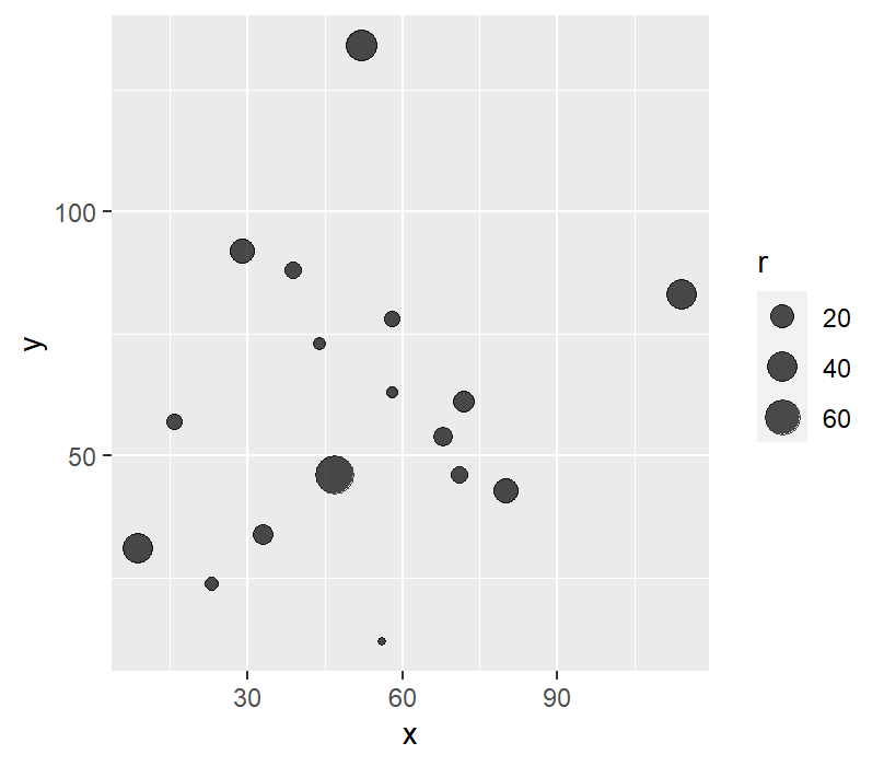
ggplot(data, aes(x = x, y = y,size = r))+ geom_point(alpha = 0.7)
When we try to execute the above code, we get the following result:
OUTPUT:
We can add colors to our bubble chart to differentiate one bubble from another. We can see from the above example that all the bubbles in our chart are of the same color. Hence, it makes the graph very hard to interpret.
Example: In this example, we will add colors to the bubble chart.
CODE:
# Bubble chart with different colors.
# The first step is to import ggplot2 library.
library(ggplot2)
# Then create data set columns
x <- c(56,23,33,71,68,58,44,72,58,114,29,52,47,39,16,9,80)
y <- c(12,24,34,46,54,63,73,61,78,83,92,134,46,88,57,31,43)
r <- c(1,4,12,7,11,2,3,15,6,39,22,44,75,7,6,40,22)
# Adding color
color <- c(rep("color1", 1), rep("color2", 2),
rep("Color3", 3), rep("color4", 4),
rep("color5", 5))
# Once you are done creating data set columns, we will create a dataframe from the above columns.
data <- data.frame(x, y, r, color)
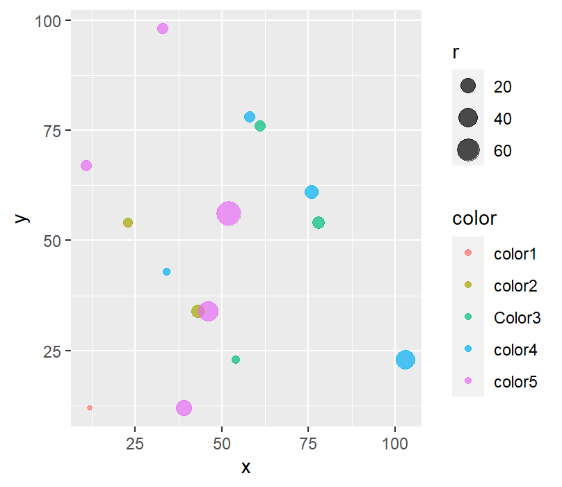
ggplot(data, aes(x = x, y = y,size = r, color=color))+
geom_point(alpha = 0.7)
When we execute the above code, we get following the result:
OUTPUT:
We can customize the color palette. We can change colors with the RColorBrewer palette and scale_color_brewer() of ggplot2.
Syntax of changing color:
Scale_color_brewer(palette=<Palette-Name>)Example: In this example, we can customize the colors of the bubble chart in R programming.
CODE:
# Bubble Chart
#Here, we are creating data set columns
x <- c(56,23,33,71,68,58,44,72,58,114,29,52,47,39,16,9,80)
y <- c(12,24,34,46,54,63,73,61,78,83,92,134,46,88,57,31,43)
r <- c(1,4,12,7,11,2,3,15,6,39,22,44,75,7,6,40,22)
colors <- c(1,2,3,1,2,3,1,1,2,3,1,2,2,3,3)
# Now, we will be creating the dataframe from the above column’s
data <- data.frame(x, y, r, colors)
# importing the ggplot2 library and RColorBrewer library
library(RColorBrewer)
library(ggplot2)
# Now, we will Draw plot
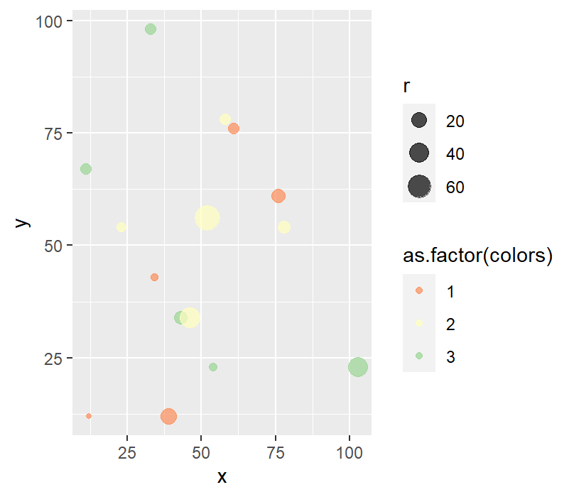
ggplot(data, aes(x = x, y = y,size = r, color=as.factor(colors))) +
geom_point(alpha = 0.7)+ scale_color_brewer(palette="Spectral")
When we execute the above code, we get the following output:
OUTPUT:
Changing Size of Bubble Chart:
To change the size of the bubble chart, we use scale_size(), i.e. giving the range of sizes from the smallest to the biggest bubble.
Syntax:
Scale_size(range=<range-vector)Example: In this example, we will change the size of the bubble chart.
CODE:
# creating the data set columns
x <- c(56,23,33,71,68,58,44,72,58,114,29,52,47,39,16,9,80)
y <- c(12,24,34,46,54,63,73,61,78,83,92,134,46,88,57,31,43)
r <- c(1,4,12,7,11,2,3,15,6,39,22,44,75,7,6,40,22)
color <- c(rep("color1", 1), rep("color2", 2),
rep("Color3", 3), rep("color4", 4),
rep("color5", 5))
sizeRange <- c(2,18)
# Now we are creating the dataframe from the above column’s
data <- data.frame(x, y, r, color)
# importing the ggplot2 library
library(ggplot2)
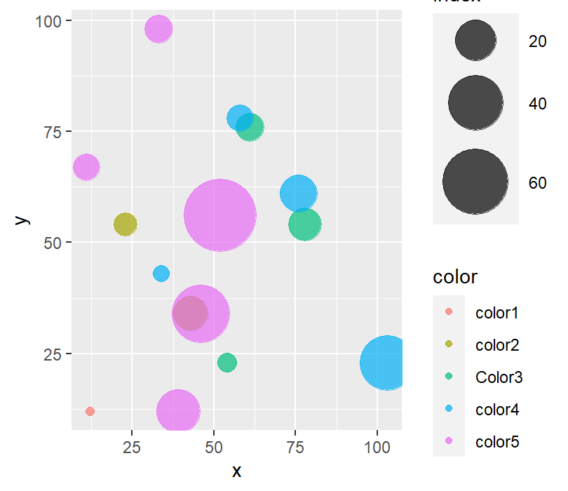
ggplot(data, aes(x = x, y = y,size = r, color=color)) + geom_point(alpha = 0.7)+ scale_size(range = sizeRange, name="index")
When we execute the above code, we get the following output:
OUTPUT
Adding a theme to the bubble chart:
When we want to change the legend function in ggplot2, we can add theme() to our basic ggplot2
Syntax:
theme(legend.position=<desired-position>)Example: Let’s look at an example to have a better understanding.
CODE:
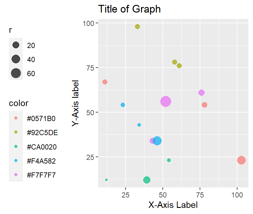
# Here, we are creating data set columns
x <- c(56,23,33,71,68,58,44,72,58,114,29,52,47,39,16,9,80)
y <- c(12,24,34,46,54,63,73,61,78,83,92,134,46,88,57,31,43)
r <- c(1,4,12,7,11,2,3,15,6,39,22,44,75,7,6,40,22)


# Let's import RColorBrewer
library("RColorBrewer")
color <- brewer.pal(n = 5, name = "RdBu")


# Now we will create the dataframe from the above column’s
data <- data.frame(x, y, r, color)


# Let's import the ggplot2 library into our R studio.
library(ggplot2)


ggplot(data, aes(x = x, y = y,size = r, color=color)) +
  geom_point(alpha = 0.7) +
  labs(title= "Title of Graph",y="Y-Axis label", x = "X-Axis Label") +
  theme(legend.position="left")
When we execute the above code, we get the following result.
OUTPUT:
So, this was all about plotting the various types of bubble charts in R programming.