Scatter Plot in R Programming
A Scatter plot is a type of dispersion graph built to represent the various data points of variables. A Scatter plot is also known as a scatter graph or scattergram.
A scatter plot is used to display or show the relationship between two quantitative variables, and it plots one dot for each and every observation.
To plot a scatter plot, we need two vectors of the same length, one for the X-axis and another for the Y-axis.
The X-axis is the horizontal axis, and the y-axis is the vertical axis.
Each data in our dataset appears as a point on the graph. A Scatter plot is created using the plot() function.
Syntax:
This is the syntax of scatter plot:
plot(x, y, main, xlab, ylab, xlim, ylim, axes)Where,
x: data sets (x parameter sets the horizontal coordinates(x-axis))
y: data sets (y parameter sets the vertical coordinates (y-axis))
main: It is the title of our graph
xlab: lab stands for a label, and x stands for horizontal coordinates. This means that xlab is the label for the horizontal axis.
ylab: It is a label for the vertical coordinates.
xlim: lim stands for limit, so xlim means that it is the limits of values for plotting x coordinate.
ylim: lim stands for limit, so ylim means it is the limit of values for plotting the y coordinate.
axes: axes parameters indicate whether both the axes should be drawn on the plot or not
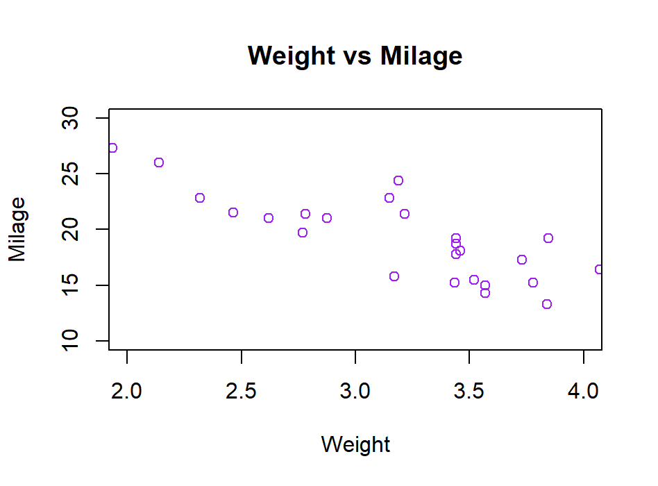
let’s try to plot the simplest scatter plot chart in R.
CODE: This is what our code looks like.
# The first step is to get values i.e., input values
input <- mtcars[, c('wt', 'mpg')]
print(head(input))


# Once we have input values we will start plotting the chart.
# Plotting chart for the cars whose weight is between 2 and 4 and whose mileage is between 10 and 30.


plot(x = input$wt, y = input$mpg,
     xlab = "Weight",
     ylab = "Milage",
     xlim = c(2, 4),
     ylim = c(10, 30),
     col = "purple",
     main = "Weight vs Milage"
)


# Our scatter plot is plotted now.
OUTPUT:
When we execute the above code, we get the result as:
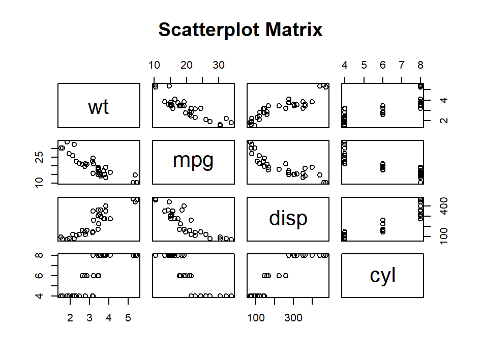
Scatterplot Matrices:
When we have more than 2 variables in our dataset, and we have to find the correlation between one variable versus all other remaining variables, we use the concept of scatterplot matrices.
A Scatter plot is created using the plot() function, and in the same way, scatterplot matrices are plotted using the pairs() function.
Syntax:
pairs(formula, data)Where,
formula: The parameter formula represents the series of variables used in the pairs.
Data: Data represents the dataset from which the variables will be taken.
CODE:
# This is an example of scatterplot matrices.
# Here, we are plotting the matrices between the 4 variables.
# The 4 variables will give us 12 plots. Considering one variable with 3 other variables.
# So. the total number of variables is 4.


pairs(~wt + mpg + disp + cyl, data = mtcars,
      main = "Scatterplot Matrix")
OUTPUT:
This is how our output looks like when we execute the above code in RStudio.
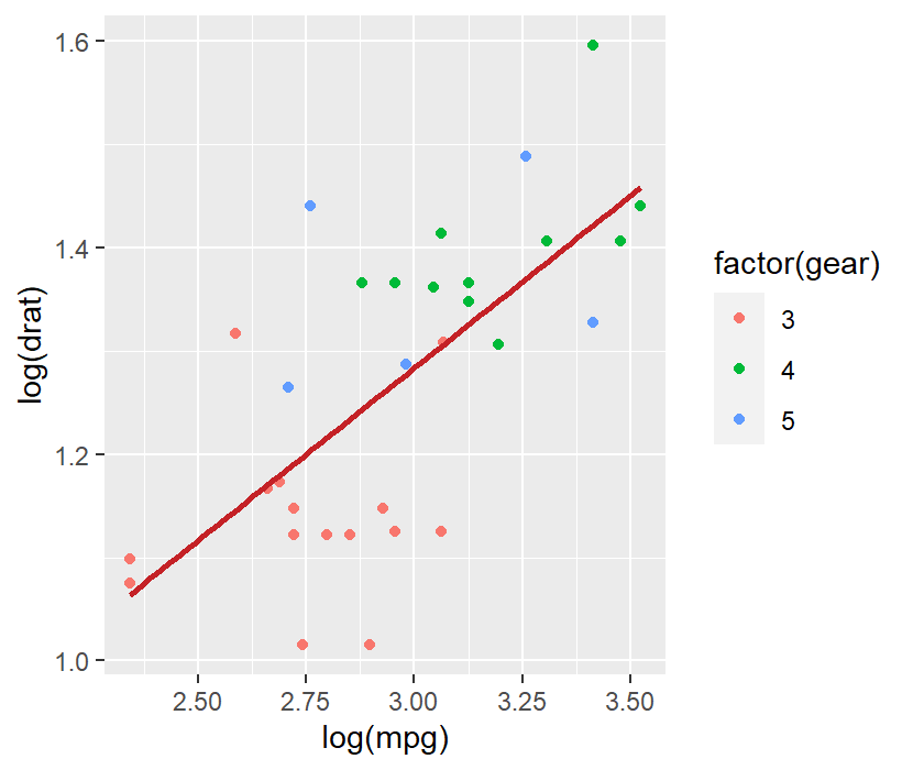
Let’s take another example of a scatterplot with fitted values.
# In this example, we are creating a scatterplot with fitted values.
# The first step is to load the ggplot2 package.


library(ggplot2)


# Another function named stst_smooth is used for the linear regression.


ggplot(mtcars, aes(x = log(mpg), y = log(drat))) +
  geom_point(aes(color = factor(gear))) +
  stat_smooth(method = "lm",
              col = "#C42126", se = FALSE, size = 1
  )
OUTPUT:
When we execute the above code, we get the following result.
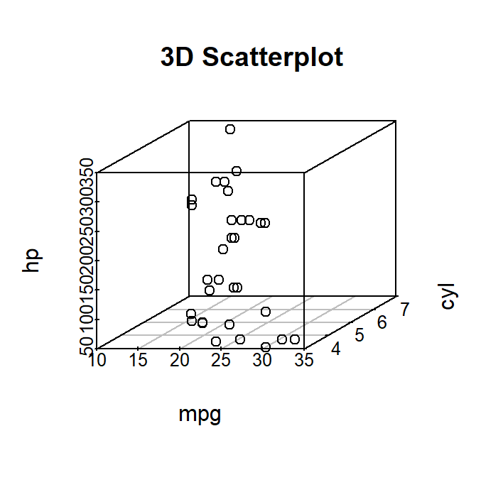
3-D Scatterplots:
Now, let’s look at what the 3-D Scatterplot matrix looks like?
To plot a 3-D Scatterplot, we will use the package scatterplot3D.
CODE:
# 3DScatterplot
# The first step is to install the package scatterplot3D.
# Once we are done with installing the package, we will attach the mtcars dataset.


library(scatterplot3d)
attach(mtcars)


scatterplot3d(mpg, cyl, hp,
              main = "3D Scatterplot")
OUTPUT:
When we execute the above code, we get the following result:
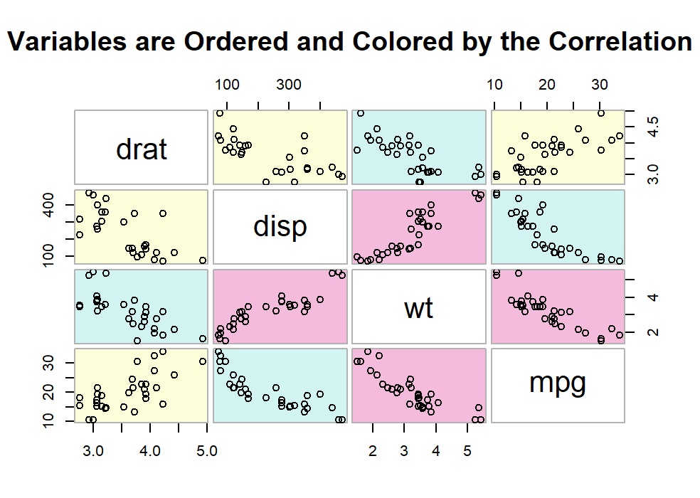
Scatterplot using glcus package
This package allows us to rearrange variables so that the ones with higher correlation is closer to the principal diagonal and those with low correlation are far away from the principal diagonal.
CODE:
# Scatterplot Matrices using the glcus Package
# The First step is to install the glcus package if not installed in your rstudio.
# In this example too, we are using mtcars dataset.
# Then we will get the data and we will


library(gclus)
dta <- mtcars[c(1,3,5,6)]
dta.r <- abs(cor(dta))


# data.col will get colors.
dta.col <- dmat.color(dta.r)


# This will reorder the variables so that the one with the highest correlation are closest to the diagonal
dta.o <- order.single(dta.r)
cpairs(dta, dta.o, panel.colors=dta.col, gap=.3,
       main="Variables are Ordered and Colored by the Correlation" )
OUTPUT:
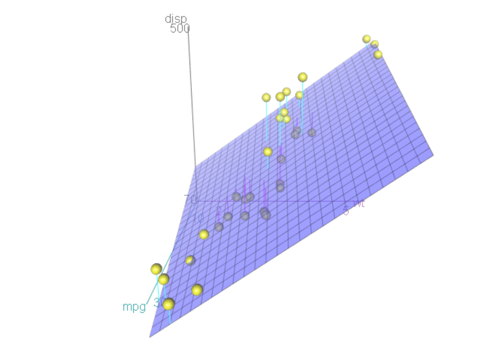
Spinning Scatterplot:
Using the Rcmdr package, we can create an interactive spinning scatterplot using the function plot3D(x,y,z).
CODE:
# Spinning 3d Scatterplot
# To get spinning 3D Scatterplot we have to install Rcmdr package.
# Then we will attach mtcars dataset.
# By using the syntax of 3D Scatterplot we can plot our spinning 3-dimensional scatterplot.


library(Rcmdr)
attach(mtcars)
scatter3d(wt, disp, mpg)
OUTPUT: