Various types of Charts in R Programming
As we know, R Language is mostly used for analyzing the data and statistics purposes to represent our data graphically & pictorially in R studio.
Charts and graphs are plotted in the R studio to represent those data pictorially.
Types of R – Charts:
- Bar Chart
- Pie Chart
- Line Chart
- Donut Chart
- Area Chart
- Dot Chart
- Pareto Chart
- X Bar & R Chart
and so on…
We will discuss some charts in this article in detail.
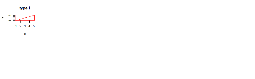
1. Line Chart:
- A line chart is a type of chart that can be used to display all the information in the form of a series of data points.
- Line charts are generally used when we have to identify the trends in our dataset.
- The data points are ordered in one of their coordinate value (mostly it is x - coordinate).
Syntax:
plot(v,type,col,xlab,ylab)Where, v = vector
type = type “p” values to draw points only, type “l” values to draw lines only and type “o” is used to draw both the points and lines.
col = it gives colors to both the lines and points
xlab = label for x-axis
ylab = label for y-axis
main = main stands for the title of the line chart
For example,
CODE:
x <- c(1:5)
y <- x


par(pch=19, col="red")


par(mfrow=c(2,6))


op = c("l")


for(i in 1:length(op))
{
  heading = paste("type",op[i])
  plot(x,y, type="n", main=heading)
  lines(x, y, type=op[i])
}
OUTPUT:
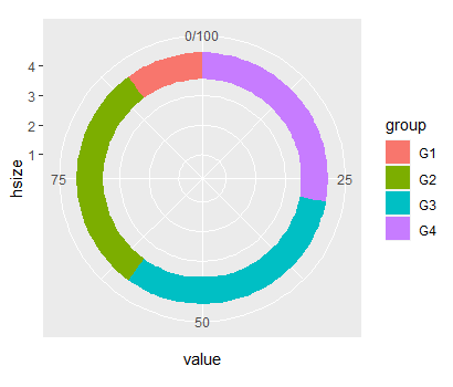
2. Donut Chart:
- A donut or Doughnut charts are also known as ring charts. It is just an alternative to a pie chart which can be created in ggplot2.
- Donut chart is a ring that is divided into sectors, and each sector represents a proportion of the whole.
- As it is very similar to a pie chart. Thus, it suffers the same problem.
- Donut charts & Pie charts both charts can be plotted using a very similar process in R programming.
CODE:
# The first step is to install the following packages.
# install.packages("ggplot2")
# install.packages("dplyr")


library(ggplot2)
library(dplyr)


# We will Increase the value to make the hole bigger
# We will Decrease the value to make the hole smaller


hsize <- 4


df <- df %>%
  mutate(x = hsize)


ggplot(df, aes(x = hsize, y = value, fill = group)) +
  geom_col() +
  coord_polar(theta = "y") +
  xlim(c(0.2, hsize + 0.5))
OUTPUT:
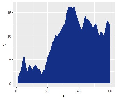
3. Area Chart:
- Area charts are really useful when we have to visualize one or more variables over some time.
- An area chart is a kind of line plot which represents the distribution of quantitative type of data.
- Even that area chart is plotted using the package ggplot2.
CODE:
#imports the ggplot2 library
library(ggplot2)


#creates the dataframe having the normal distribution values (rnorm)
x<-1:60
y<-cumsum(rnorm(60))
data1<-data.frame(x,y)


#plots the area chart
ggplot(data1, aes(x=x, y=y))+geom_area(fill='#142F86',alpha=2)
OUTPUT:
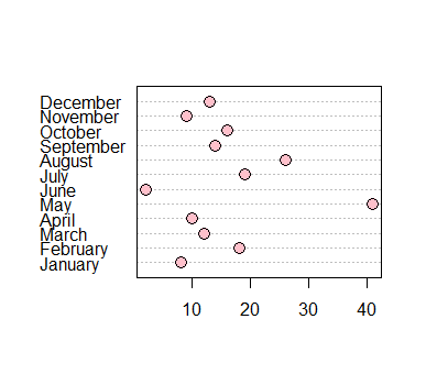
4. Dot Chart:
- A dot chart is used to create a dotted chart of the specific data.
- A dot chart can be defined as a plot used to plot a Cleveland dot plot.
- A dot chart is very similar to a scatter plot.
- The only difference between a dot plot and a scatter plot is that it displays the index on the vertical axis and the corresponding value on the horizontal axis.
So, this helps us see each observation's values by following a horizontal line from the label.
Syntax:
Dotchart(x, labels = NULL, groups = NULL, gcolor = par(“fg”), color = par(“fg”))Where,
x = matrix
labels: labels of vector for each and every data point
groups: It indicates how x variables are grouped. It is a grouping variable
gcolor: gcolor is a color that is used for group labels and values
color: color is used for points and labels
CODE:
set.seed(1)


month <- month.name
expected sale<- c(15, 16, 20, 31, 11, 6,
                  17, 22, 32, 12, 19, 20)
sold <- c(8, 18, 12, 10, 41, 2,
          19, 26, 14, 16, 9, 13)
quarter <- c(rep(1, 3), rep(2, 3), rep(3, 3), rep(4, 3))


data <- data.frame(month, expected sale, sold, quarter)
data


dotchart(data$sold, labels = data$month, pch = 21, bg = "pink", pt.cex = 1.5)
OUTPUT:
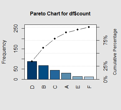
5. Pareto Chart:
- Pareto Chart is a combination of a bar chart and a line chart that can be used for visualization.
- A pareto chart or graph is a type of graph that displays the frequencies of different categories with the cumulated frequencies of the categories.
- The right vertical axis is used for cumulative frequency, and the left vertical axis represents the frequency.
- This graph uses the Pareto principle. Pareto’s principle states that 80% of effects are produced from 20% of causes of systems.
Syntax:
pareto.chart(x, ylab = “Frequency”, ylab2 = “Cumulative Percentage”, xlab, cumperc = seq(0, 100, by = 10), ylim, main, col = heat.colors(length(x)))CODE:
library(qcc)


df <- data.frame(product=c('A', 'B', 'C', 'D', 'E', 'F'),
                 count=c(30, 67, 45, 88, 14, 12))
print(df)


pareto.chart(df$count)
OUTPUT: