How to make Boxplots in R
R Boxplots
Boxplot is a measure of how well the data is distributed in a data set. It is used to give a summary of one or several numeric variables. The line that divides the box into two parts represents the median of the data. The end of the box shows the lower and upper quartiles. The extreme lines define the highest and lowest value excluding outliers. Note that, it hides the number of values existing behind the variable. Boxplots can be created for individual variables or group of variables. We can create Boxplot in R through the boxplot() function.Syntax:
boxplot(x, data, notch, varwidth, names, main)Here, x is a vector data is the data frame notch is a logical value. To draw a notch, it must be TRUE. varwidth is a logical value. It must be true to make box plot widths proportional to the square root of the sample sizes. names are the labels of the group which will be printed under each boxplot. main is the title of the graph. Simple boxplot Let's create a vector and assign this vector to the boxplot() function:
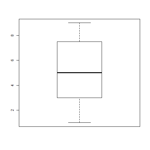
Example 1:
# Give the chart file a name.
png(file = "boxplot_simple.png")
A <- c(4, 7, 5, 2, 5, 2, 9, 1, 9, 8, 4)
boxplot(A)
# Save the file.
dev.off()
Output:

Example 2:
We will use the data set “mtcars” which is already available in the R environment to create a basic boxplot.
Let's see the columns “mpg” (miles per gallon) and “cyl” (number of cylinders) in mtcars.
Output:
input <- mtcars[,c('mpg','cyl')]
print(head(input))
                                     mpg                   cyl
Mazda RX4                            21.0                  6
Mazda RX4 Wag                        21.0                  6
Datsun 710                           22.8                  4
Hornet 4 Drive                       21.4                  6
Hornet Sportabout                    18.7                  8
Valiant                              18.1                  6
Creating the Boxplot
Let's see an example to create a box plot graph for the relation between mpg and cyl. Example:# Give the chart file a name. png(file = "boxplot.png") # Plot the chart. boxplot(mpg ~ cyl, data = mtcars, xlab = "Number of Cylinders", ylab = "Miles Per Gallon", main = "Mileage Data") # Save the file. dev.off()Output:
Boxplot with Notch
We can draw boxplot with the notch to find out how the medians of different data groups match with each other. Let's see an example to create a boxplot with the notch for each of the data group.Example:
# Give the chart file a name.
png(file = "boxplot_with_notch.png")
# Plot the chart.
boxplot(mpg ~ cyl, data = mtcars,
xlab = "Number of Cylinders",
ylab = "Miles Per Gallon",
main = "Mileage Data",
notch = TRUE,
varwidth = TRUE,
col = c("Red","yellow","blue"),
names = c("High","Medium","Low")
)
# Save the file.
dev.off()
Output: 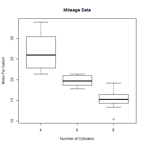
Horizontal box plot with the notch
We can plot the horizontal box plot with the notch. It means we can add a notch to the box.Example:
# Give the chart file a name.
png(file = "boxplot_horizon.png")
# Plot the chart.
boxplot( mpg ~ cyl, data = mtcars,
xlab = "Number of Cylinders",
ylab = "Miles Per Gallon",
main = "Mileage Data",
notch = TRUE,
col = "green",
border = "red",
horizontal = TRUE
)
# Save the file.
dev.off()
Output:
