Ionic Checkbox
Ionic Checkbox
Ionic Checkbox is nearly the same as a toggle. It can be placed in an ionic element or used as a separate checkbox. It is designed differently for every platform, such as other ionic components. You can use the <ion-checkbox> attribute to set the default value and the disabled quality to prevent the user from changing the value.
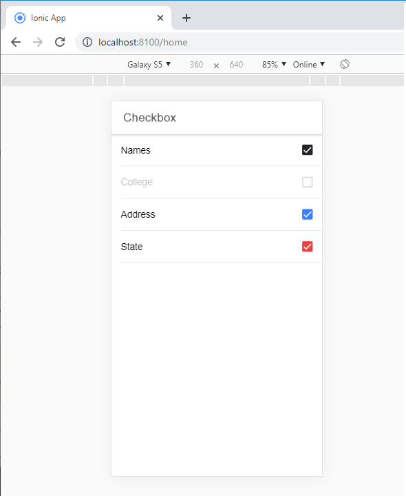
Example: The given below example shows several types of checkboxes used in an ionic application.
    Checkbox


  Names


  College


  Address


   State
When you execute this code in your localhost, then you will get an output, which is shown in the given below screenshot.
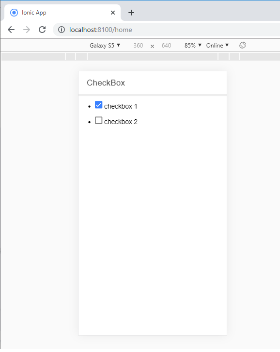
Adding Checkbox
To create a Checkbox form, you require to add the checkbox class name to both design and the input elements. The following example displays how to add two simple checkboxes, one is checked, and the other is not.
Example:
  CheckBox


  checkbox 1


  checkbox 2
After the execution of this code in your localhost, then you will get an output, which is shown in the given below screenshot.
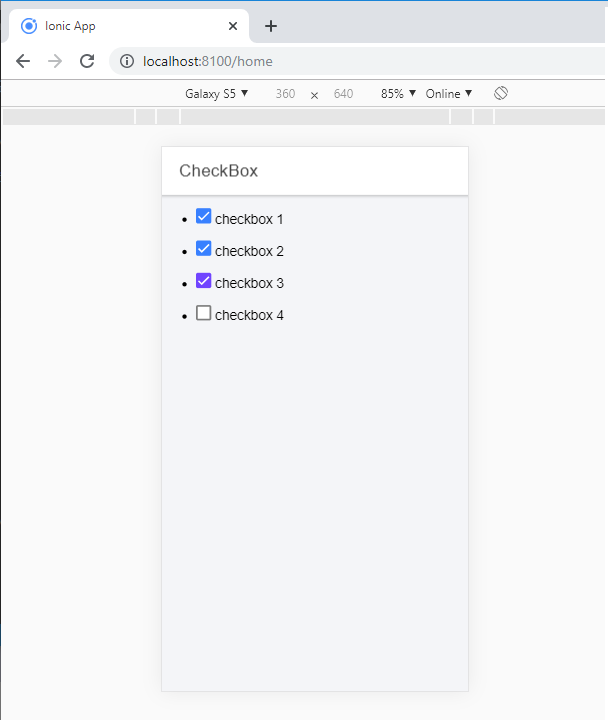
Multiple Checkboxes
In multiple checkboxes, you can create various checkboxes or select several checkboxes. Now we will show how to create or choose multiple checkboxes from the following code.
Example:
  CheckBox


  checkbox 1


  checkbox 2


  checkbox 3


  checkbox 4
After the execution of this code in your localhost, then you will get an output, which is shown in the given below screenshot.
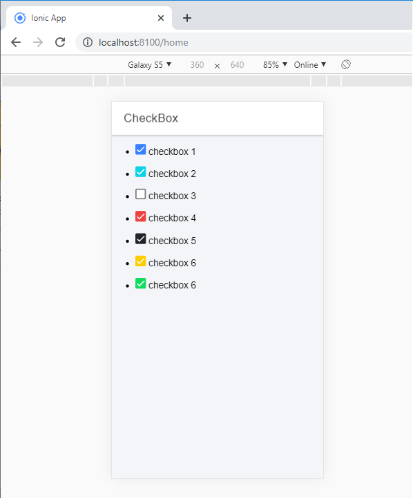
Styling checkbox
If you want to style a checkbox, you can use the Ionic color attribute with the checkbox prefix. The following example shows how to design checkboxes from the ionic color attributes with the checkbox component.
Example:
  CheckBox


  checkbox 1


  checkbox 2


  checkbox 3


  checkbox 4


  checkbox 5


  checkbox 6


  checkbox 6
After the execution of this code in your localhost, then you will get an output, which is shown in the given below screenshot.