D3 Dashboard Examples
A JavaScript package called D3.js allows users to manipulate webpages using data. Utilizing HTML, SVG, and CSS, D3 enables you to fetch data to life. Considering its focus on web standards, D3 combines strong graphical aspects with a data-driven method for DOM manipulation, giving you access to all the features of contemporary browsers without shackling you to a particular framework.
D3 is based on JavaScript and uses HTML, CSS, and SVG files, allowing you to effortlessly include any graphic into a dashboard or website. It is helpful not only for viewing reasons but also for programming since it makes it easier to optimize performance on many browsers, especially for activities like mouse interaction.
Construction of a Frontend Dashboard
We are finally prepared to create our frontend web page. Cube Templates, a framework tool for rapidly building frontend apps set up to interface using the Cube API, will be used in this instance. It offers a variety of various UI kits, graphing libraries, and frontend technologies that may be combined.
The process of creating an app and installing each of its requirements may take some time. Once finished, your Cube project file will contain a dashboard-app subfolder. You may either click "Start" just on the "Dashboard App" section in the environment to launch a frontend interface or use the following syntax within the dashboard-app subfolder to launch one:
npm start at $
A chart may be built in the workshop and added to the dashboard by clicking the "add to dashboard" icon, or it could be edited by making changes to the src/pages/DashboardPage.js file located in the dashboard-app subfolder. Choose the second course of action. This file also defines the DashboardItems object, which is an array of graphic query expressions.
Charts may be added to the dashboard by editing dashboard-app/src/pages/DashboardPage.js.
-const DashboardItems = [];
const DashboardItems = [
{
id: 0,
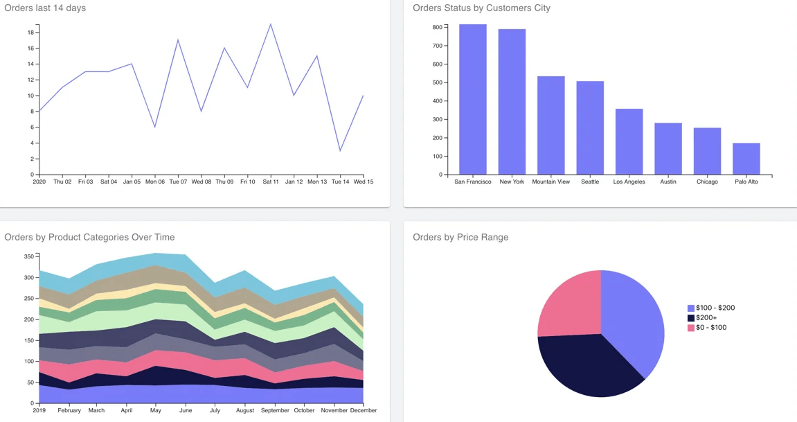
name: "Orders last 14 days",
vizState: {
query: {
measures: ["Orders.count"],
timeDimensions: [
{
dimension: "Orders.createdAt",
granularity: "day",
dateRange: "last 14 days"
}
],
filters: []
},
chartType: "line"
}
},
{
id: 1,
name: "Orders Status by Customers City",
vizState: {
query: {
measures: ["Orders.count"],
dimensions: ["Users.city", "Orders.status"],
timeDimensions: [
{
dimension: "Orders.createdAt",
dateRange: "last year"
}
]
},
chartType: "bar",
pivotConfig: {
x: ["Users.city"],
y: ["Orders.status", "measures"]
}
}
},
{
id: 3,
name: "Orders by Product Categories Over Time",
vizState: {
query: {
measures: ["Orders.count"],
timeDimensions: [
{
dimension: "Orders.createdAt",
granularity: "month",
dateRange: "last year"
}
],
dimensions: ["ProductCategories.name"]
},
chartType: "area"
}
},
{
id: 3,
name: "Orders by Price Range",
vizState: {
query: {
measures: ["Orders.count"],
filters: [
{
"member": "Orders. price",
"operator": "set"
}
],
dimensions: ["Orders.priceRange"]
},
chartType: "pie"
}
}
];
We recently introduced an array of Cube query items, as you'll notice above.
These graphs ought to be visible if you reload the dashboard!
As you'll see, perhaps one of our searches does have the pivotConfig set to the information below.
pivotConfig: {
   x: ["Users. city"],
 y: ["Orders.status", "measures"] }
The default output for the pivotConfig normally works great, but in certain circumstances, including this one, users will have to modify it in order to achieve the ideal outcome.
Now, we would like to draw a graph with the towns/city on the X-axis and the number of requests categorized by the requests' categories on the Y-axis. Inside the pivotConfig, it is precisely what we're passing: To obtain the aggregated result, plot Users.city on the X-axis as well as Orders.status on the Y-axis.
Adding Interactivity
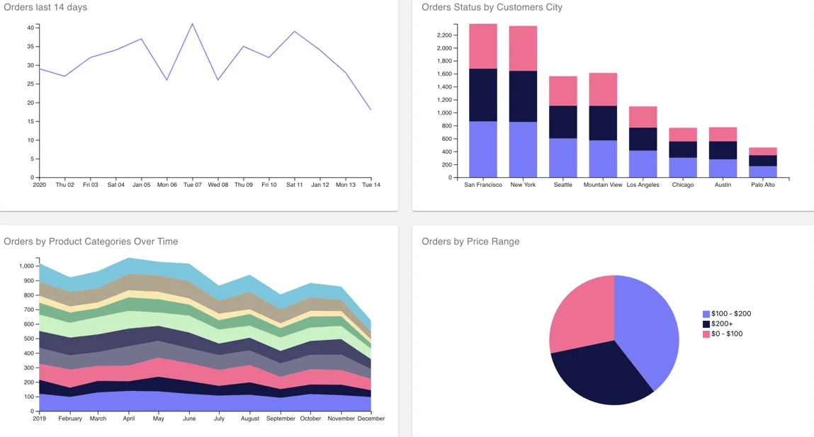
Here, in order to enhance this dashboard's highly dynamic, we'll add a filter. Customers will be able to see certain groupings of items depending on current status—processing, finished, or shipped—using the filter.
Since we are not required to make any modifications to our data format, Cube makes it simple to implement such dynamic functionality. By adding filter attributes to our JSON request, one can easily sort by the attribute Orders.status, which we already own.
Let's say that the below inquiry is employed to create an area chart that shows the number of bookings over time broken down by category of products.
pivotConfig: {
   x: ["Users. city"],
 y: ["Orders.status", "measures"] }
We must give this request a filter attribute in order to display only finished orders.
{
  measures: ["Orders.count"],
  timeDimensions: [


    {
      dimension: "Orders.createdAt",
      granularity: "month",
      dateRange: "last year"
    }
  ],
  filters: [
    {
      member: "Orders.status",
      operator: "equals",
      values: ["completed"]
    }
  ],
  dimensions: ["ProductCategories.name"]
}
The request format documentation includes information on each filter controller.
The only thing left to do is selectively add this filtering attribute to all of our dashboard requests in order for the sort to function. Let us just discuss the dashboardItemsWithFilter function in dashboard-app/src/pages/DashboardPage.js in order to accomplish this. Through this approach, we examine if the filter item is different from "all" before injecting the relevant filter value into each and every query.
const dashboardItemsWithFilter = (dashboardItems, statusFilter) => {
  if (statusFilter === "all") {
    return dashboardItems;


  }


  const statusFilterObj = {
    member: "Orders.status",
    operator: "equals",
    values: [statusFilter]
  };


  return dashboardItems.map(({ vizState, ...dashboardItem }) => (
    {
      ...dashboardItem,
      vizState: {
        ...vizState,
        query: {
          ...vizState.query,
          filters: (vizState.query.filters || []).concat(statusFilterObj),
        },
      }
    }
  ))
};
The client data for the filtering now needs to be rendered. For this, you can make use of the <ButtonGroup /> element from the Material Plugin and create a click button for each potential order state in addition to the "All" Button. To save and change the filtered output, we'll make use of the useState hook in React.
Keep in mind to install useState and the necessary Material UI elements first.
import React from "react";
import React, { useState } from "react";
import Button from '@material-ui/core/Button';


import ButtonGroup from '@material-ui/core/ButtonGroup';
We then display the collection of icons and, in response to a button click, modify the number of the statusFilter. Keep in mind that you display dashboard elements by iterating over them using the newly built dashboardItemsWithFilter function.
 return DashboardItems.length ? (

<Dashboard>{DashboardItems.map(dashboardItem)}</Dashboard>
  ) : (


 const [statusFilter, setStatusFilter] = useState("all");
 return DashboardItems.length ? ([
  <ButtonGroup style={{ padding: "24px 24px 0 24px" }} color="primary">
    {["all", "processing", "completed", "shipped"].map(value => (
     < Button
        variant={value === statusFilter ? "contained" : "}
        onClick={() =>setStatusFilter(value)}>

{value.toUpperCase()}
       </Button>
    ))}

</ButtonGroup>,
  <Dashboard>

{dashboardItemsWithFilter(DashboardItems, statusFilter).map(dashboardItem)}
  </Dashboard>
 ]) : (
To develop straightforward filtering as well as create the D3 dashboard vibrant and responsive, we just need that.