Tableau Pie Chart
A pie chart is a type of graph in which a circle is divided into sectors to represent the data with different sizes and colors. In Tableau, the slices of the pie chart can be labeled, and the numbers are corresponding to each slice can also be represented in the diagram. You can select the pie chart option either from the Show Me or Marks card to create a pie chart.
Simple Pie Chart
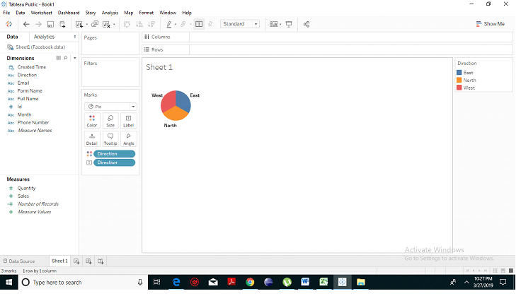
- From the Microsoft Excel option, choose your excel file. Unlike here, we have chosen ‘Facebook’ data.
- Select the chart type as Pie. Choose the dimension, drag it (we have taken direction) to the colors and label option under the marks chart. You will notice that a pie chart has been created with.
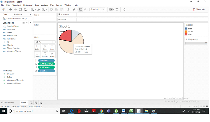
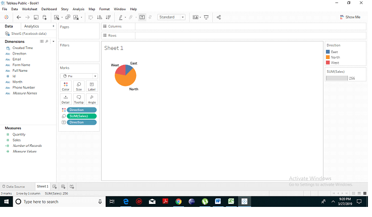
- Choose one measure (we have taken sales), drop it into the size option. You will see the following result which will show three directions in different colors where the slices of the pie chart are labeled, and the numbers corresponding to each slice is also represented in the chart.
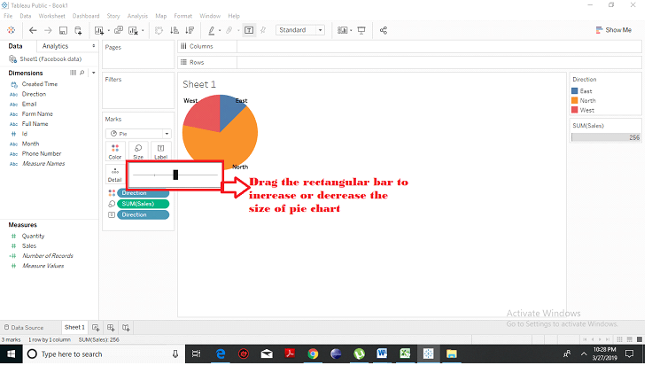
- You can increase and decrease the size of your pie chart by dragging the rectangular bar left or right.
- When you hover on any slice, you will get the complete detail of that slice as described below.