×

Tableau TreeMap

The treemap is a kind of chart that displays the data in nested rectangles and provides simple data visualization. In a treemap, the values of the dimension describe the structure and the values of the measures define the color or size of the distinct rectangle. The rectangles offer insight in a visually attractive format. It is usually created using one or more dimension with one or two measures. It can accommodate any number of dimensions, including one or even two on Color. The treemap is used to show aggregated sales totals across a range of product categories.
Creating a TreeMap

To create a treemap, the following are the steps:
  • Open the Tableau Desktop and connect to your data source.
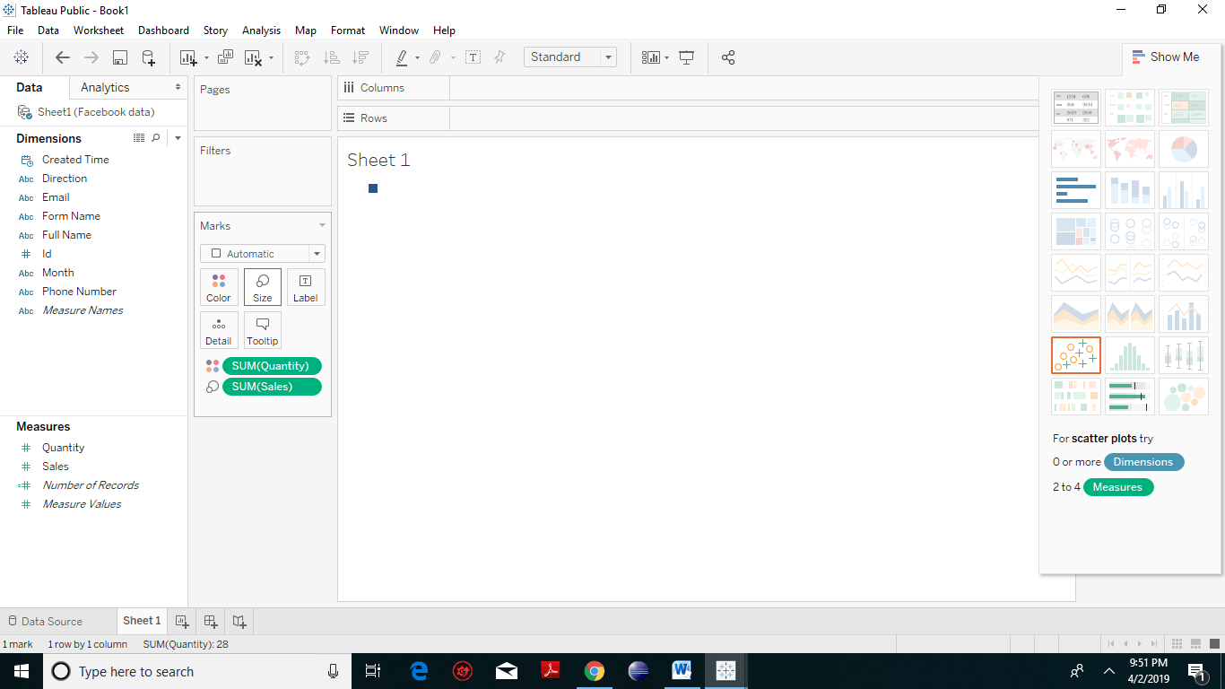
  • You need to pull and drop two measure to the Marks Card. Drop One measure (here we have taken sales) to the Size shelf and again the next measure (we have taken quantity) to the Color shelf. A small rectangular box will appear, which shows product categories.
Tableau TreeMap 1
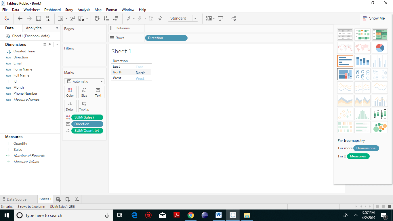
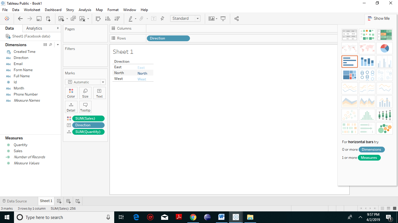
  • Drag and drop the dimension (we have taken direction) to the Label shelf under the marks card. The following chart appears.
Tableau TreeMap 2
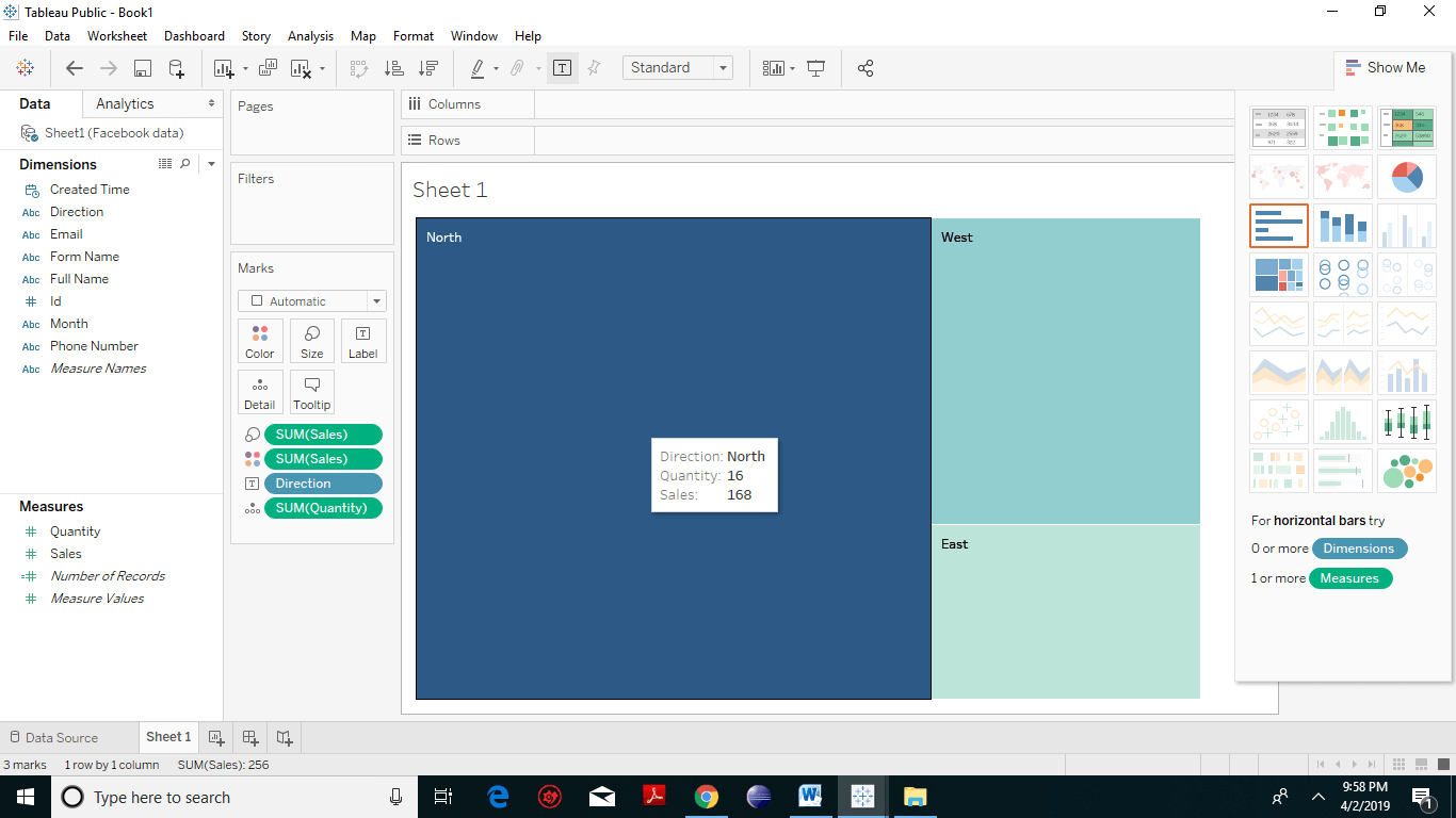
  • Click Show Me on the toolbar, then select the treemap chart type.
Tableau TreeMap 3
  • Tableau will create the following treemap with labels as that of the dimensions. You will notice greater the value of the dimension, larger is the shape of the rectangle.
Tableau TreeMap 4

TreeMap with distinct Color Shades

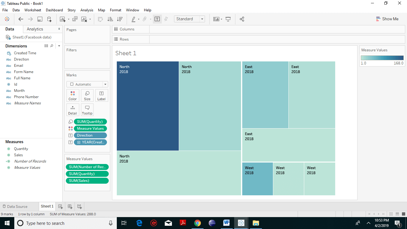
Now we will pick up other measure and drop it into the color field under marks card. You will notice different shades of blue color. On the right-hand side, you will see the measure value rectangular bar where the bluer color means the higher measure value and lighter the blue shade means lower the measured value. So, from the following screenshot, one can quickly figure out which direction has a higher measure value. Tableau TreeMap 5

Colored Tree Map

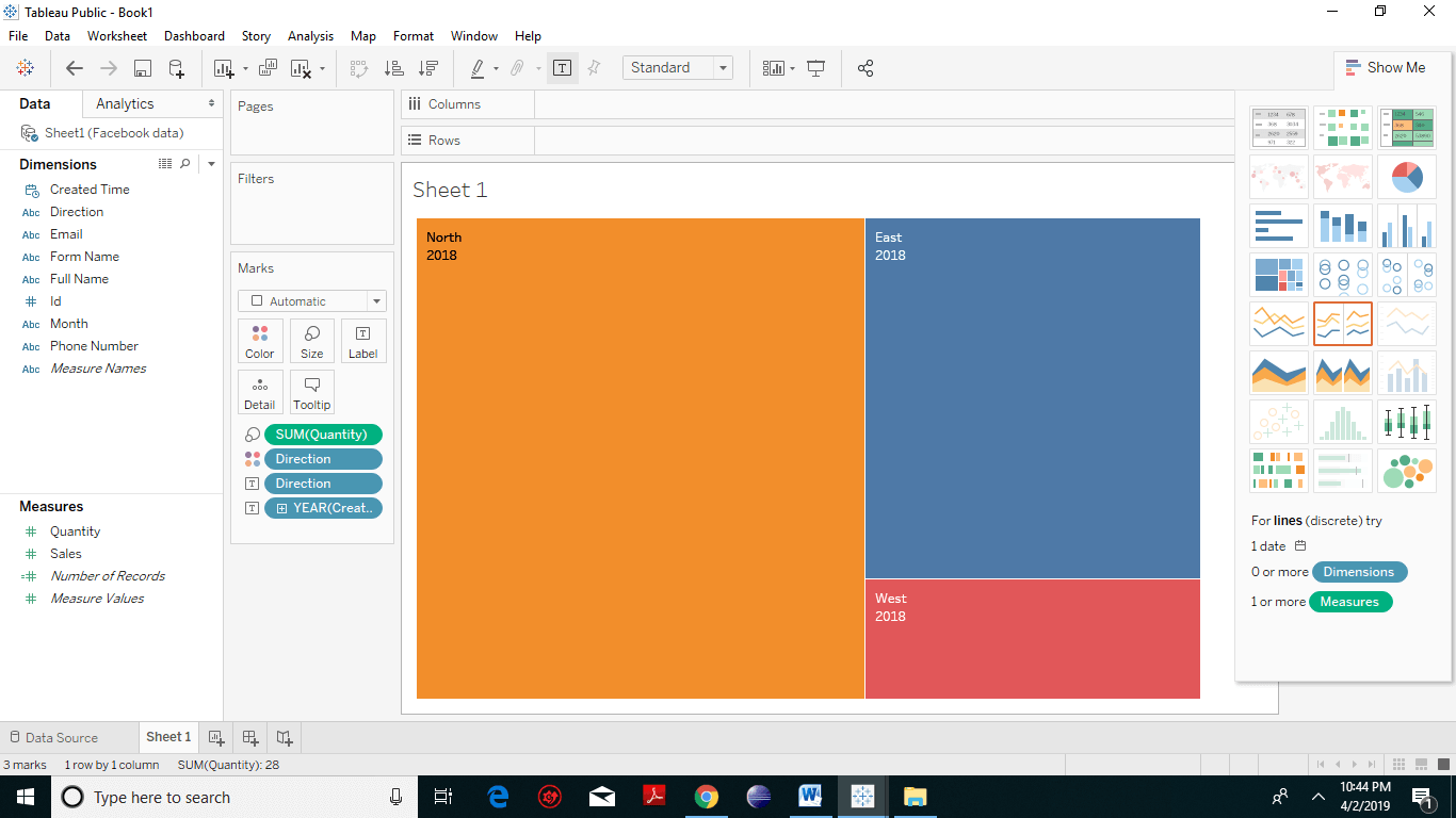
The above screenshot represents the simple Treemap. But to make the treemaps visually more attractive and appealing, we need to create a colored treemap. Pick up any dimension (here we have taken Dimension) and drop it to the color spot under marks card. You will observer everything is colored at all the places where every color represents one particular dimension. Tableau TreeMap 6

Related Topics

Tableau Histogram Chart

Histogram chart in Tableau A histogram is a chart that represents the accurate distribution of numerical data. A histogram represents the actual frequencies of values of a variable bucketed into ranges....

2 minutes read.

Tableau Motion Chart

Motion charts are a type of chart that allows you to visualize in action displaying the changes of your data over time by indicating the movement of data points within...

2 minutes read.

Tableau Server Architecture Components

Tableau Architecture Explanation Tableau provides a scalable solution for the delivery and creation of web, mobile and desktop analytics. Tableau Server is an analytics platform that is used to level up thousands...

2 minutes read.

Tableau Calculated Field

An Introduction to Calculated Fields in Tableau Calculated fields create new data field from the data that already exists in your data source. When you create a calculated field, you are...

2 minutes read.

Introduction to Tableau

 What is Business Intelligence? Companies use business intelligence technologies to collect, analyze and present data to create actionable information. Today’s businesses are always seeking insights about their customers, products, and services. So...

3 minutes read.

Tableau Box Plot

How to Create Tableau Box Plot? The box plot is the type of chart that shows the distribution of values along an axis. It is also known as a box-and-whisker plot....

2 minutes read.

How to download and install tableau setup for free?

Tableau Environmental setup In this section, we will learn how to download and install tableau for free. After downloading tableau setup, the installation is a very easy process. The following steps and screenshots...

1 minute read.

Tableau Bubble Chart

How to Create Tableau Bubble Chart? A bubble chart is a kind of chart that displays the three dimensions of data as a cluster of circles. It is considered as a...

2 minutes read.

Tableau Opening Page

Let’s have a look at the content of the tableau opening page: Step: 1 On your left you have the different things and you can connect to it. This is more...

1 minute read.

Tableau LOD Expressions

LOD Expressions LOD or Level of Detail expressions computes values at the data source and the visualization level instead of bringing all the data to the Tableau interface. However, LOD expressions...

3 minutes read.

Tableau Numeric Calculations

Introduction to Tableau Numeric Calculations In Tableau, the Numeric calculations are done by using an extensive range of inbuilt functions available in the formula editor. Numeric calculations allow you to perform...

2 minutes read.

Tableau Quick Filters

Tableau Filters help to have enough functionality to solve most of the common filtering needs. Quick filters are simply a filter that has been exposed in a view. But, it...

2 minutes read.

Tableau Filter Introduction

Filtering is an essential aspect of analyzing data. It is the process of eliminating values from a range of result set. Tableau provides a filtering feature to filter data from...

2 minutes read.

Tableau TreeMap

The treemap is a kind of chart that displays the data in nested rectangles and provides simple data visualization. In a treemap, the values of the dimension describe the structure...

2 minutes read.

Tableau Bar Chart

How to Create Tableau Bar Chart? In Tableau, different kinds of bar charts can be produced by using dimensions and measures. A bar chart represents your data in rectangular bars with the...

2 minutes read.

Tableau Crosstab Chart

How to Create Tableau Crosstab Chart? A crosstab chart also knows as Text table. It is a type of chart which shows the data in a textual form. One or more...

1 minute read.

Tableau Data Terminology

Learn Tableau Data Terminology Tableau Tool drives a lot of visualizations. It is one of the dominant components for Data Analysis. It has many exclusive terms and descriptions. One needs to get...

4 minutes read.

Tableau Scatter Plot

Tableau Scatter plot with Dimensions The scatter plot represents the data in which many points are scattered in the Cartesian plane according to the given figures. It is generated by plotting...

2 minutes read.

Tableau file Extensions

Tableau data file Extensions The output of Tableau’s data analysis can be saved in different formats, which further can be distributed on different platforms. The various forms are reflected as different...

2 minutes read.

Tableau Bullet Chart

How to Create Tableau Bullet Chart? A bullet chart is a type of chart that is used to compare the value of one measure with another measure. It is a variation...

2 minutes read.