Student Performance Prediction Using Machine Learning
Machine learning is a powerful tool that can be used to analyze and make predictions about student performance. One of the key advantages of using machine learning for student performance prediction is its ability to analyze large amounts of data and identify patterns that might be difficult for humans to discern. By leveraging these patterns, machine learning algorithms can predict student performance with a high degree of accuracy.

One common application of machine learning for student performance prediction is to use it to forecast a student's future academic performance based on their past performance and other relevant factors. For example, a machine learning model might be trained to predict a student's final grade in a course based on their grades on previous exams and assignments, as well as their attendance record and demographic information.
Another use of machine learning for student performance prediction is to identify students who are at risk of falling behind in their studies. By analyzing data on a student's past performance, as well as other relevant factors such as absenteeism and socioeconomic status, a machine learning model can identify students who are most likely to struggle in school. This information can then be used to provide targeted support and interventions to help these students succeed.
Making sure the model is impartial and fair is a crucial factor to take into account when utilizing machine learning to predict student achievement. This can be difficult because machine learning algorithms may unintentionally reinforce biases that already exist in the data they are trained on. To prevent this, it's crucial to carefully examine the data used to train the model and to utilize strategies like regularisation and cross-validation to make sure the model is solid and applicable in a wide range of situations.
Now we will try to predict student performance using machine learning techniques.
Data Fields and Their Description
A data field refers to a specific feature or attribute of the data
- gender: Gender of the student.
- NationalITy: Nationality of the student.
- PlaceofBirth: Country of birth of student.
- StageID: Student’s Education level(Elementary, Middle, or High School).
- GradeID: Student’s grade year.
- SectionID: Classroom of the student in which they have been allotted.
- Topic: Course’s topic.
- Semester: The semester of the school year. (F for Fall, S for Spring)
- Relation: The parent is responsible for the student.
- raisedhands: How often does a kid raise their hand in class?
- VisITedResources: How often a student accesses course material
- AnnouncementsView: How often does the student look at the most recent announcements?
- Discussion: How frequently a student takes part in discussion groups
- ParentAnsweringSurvey: Parent(s) responded to questionnaires supplied by the school or not
- ParentschoolSatisfaction: Whether the parents were happy or not. "Bad" or "Good." It's odd that this wasn't null for parents who chose not to respond to the survey. How this figure was entered is not evident.
- StudentAbsenceDays: Whether or not a kid missed more than seven days of school
- Class: Our area for categorization. The letters "L" stand for students who received a failing grade (less than 69%), "M" for students who received a passing grade that was below average (between 70 and 89%), and "H" for students who received good grades in their course (90 to 100%).
Importing Libraries
import smtplib
from matplotlib import style
import seaborn as sns
sns.set(style='ticks', palette='RdBu')
#sns.set(style='ticks', palette='Set2')
import pandas as pd
import numpy as np
import time
import datetime
%matplotlib inline
import matplotlib.pyplot as plt
from subprocess import check_output
pd.options.display.max_colwidth = 1000
from time import gmtime, strftime
Time_now = strftime("%Y-%m-%d %H:%M:%S", gmtime())
import timeit
start = timeit.default_timer()
pd.options.display.max_rows = 100


from sklearn.decomposition import PCA
from sklearn.model_selection import cross_val_score
from sklearn.feature_selection import RFECV, SelectKBest
from sklearn.ensemble import RandomForestClassifier, AdaBoostClassifier, ExtraTreesClassifier
from sklearn.tree import DecisionTreeClassifier, ExtraTreeClassifier
from sklearn.linear_model import LogisticRegression
from sklearn.naive_bayes import GaussianNB, BernoulliNB
from sklearn.neighbors import KNeighborsClassifier
from sklearn.linear_model import SGDClassifier
from sklearn.preprocessing import LabelEncoder
from sklearn.model_selection import train_test_split
from sklearn.ensemble import RandomForestClassifier
from sklearn.calibration import CalibratedClassifierCV
from sklearn.model_selection import GridSearchCV
from sklearn.model_selection import StratifiedKFold
from sklearn.feature_selection import SelectFromModel
from sklearn import svm
from scipy.stats import skew
from scipy.stats.stats import pearsonr
from sklearn.linear_model import Ridge, RidgeCV, ElasticNet, LassoCV, LassoLarsCV
from sklearn.model_selection import cross_val_score
Loading the Dataset
data_=pd.read_csv("xAPI-Edu-Data.csv")
af = data_
Note: You can download the dataset from the following link:https://www.kaggle.com/code/rmalshe/student-performance-prediction/data
Dataset Describing
Understanding a dataset's features, such as the number of observations, variables, and their kinds, is necessary for machine learning. This procedure aids in understanding the data and locating any potential problems or difficulties that could appear during analysis or modeling.
Here, we will understand the dataset accordingly.
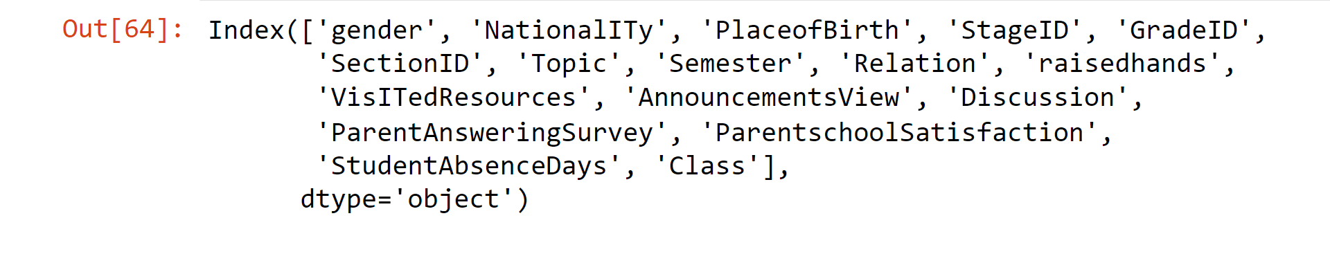
data_.columns
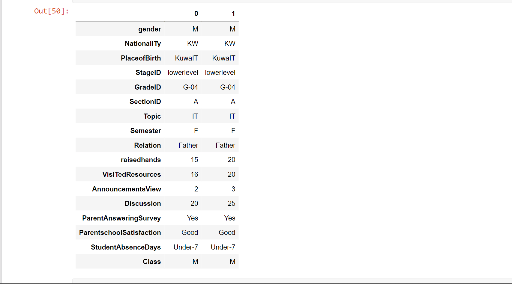
Output:

data_.head(n=2).T
Output:
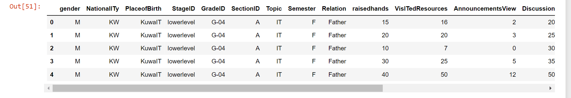
data_.head()
Output:
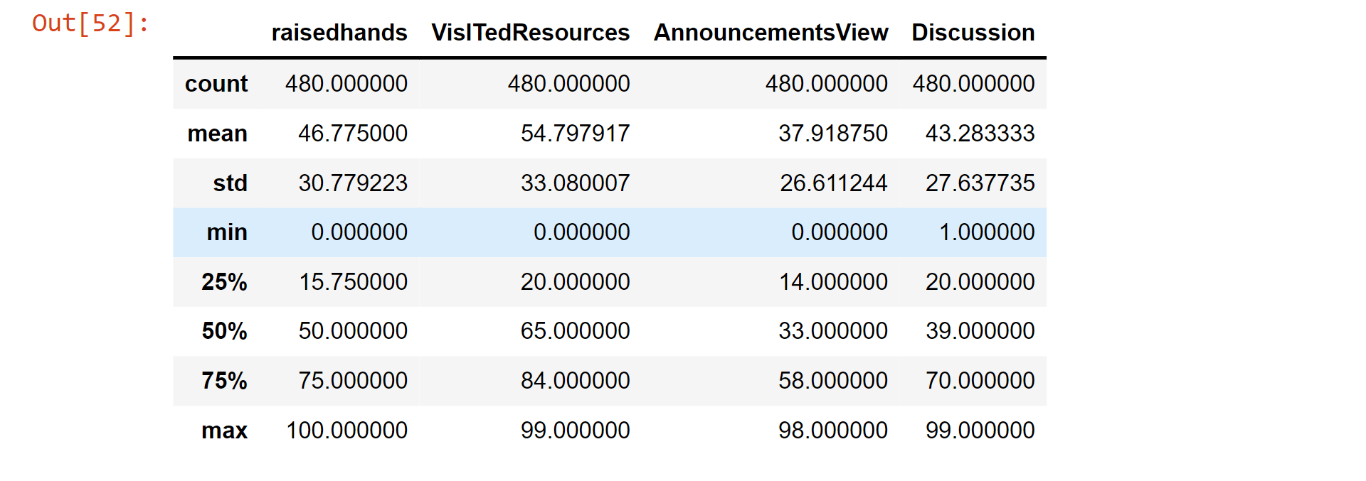
data_.describe()
Output:
Categorical Features
Features that only have a few potential values, or categories, are referred to as categorical features. These variables are frequently employed in classification and clustering tasks and are frequently non-numeric, such as texts or labels.
Here, we will store the categorical features in a variable.
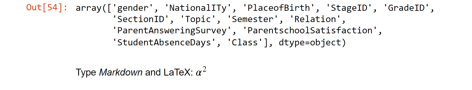
categorical_ftrs=(data_.select_dtypes(include=[object]).columns.values)
categorical_ftrs
Output:
Numerical Features
Variables with numerical representations, known as numerical features, can have a wide range of continuous or discrete values. These characteristics are frequently combined with categorical features and utilized in regression and grouping applications.
Here, we will store the numerical features in a variable.
numerical_ftrs=(data_.select_dtypes(include=['int64,', 'float64']).columns.values)
numerical_ftrs
Output:

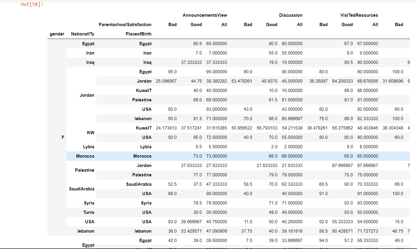
Pivot Tables
The use of pivot tables allows for the tabular organization and summary of massive volumes of data. They are frequently used in data analysis and reporting to combine data and show it in a more interesting and practical manner.
pivot = pd.pivot_table(af,
            values = ['raisedhands', 'VisITedResources', 'AnnouncementsView', 'Discussion'],
            index = ['gender', 'NationalITy', 'PlaceofBirth'],
                       columns= ['ParentschoolSatisfaction'],
                       aggfunc=[np.mean],
                       margins=True).fillna('')
pivot
Output:
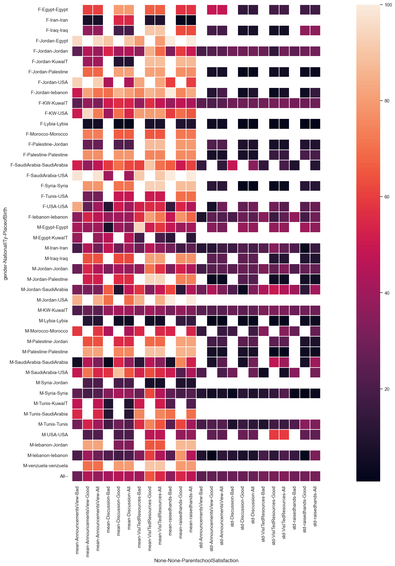
pivot = pd.pivot_table(af,
            values = ['raisedhands', 'VisITedResources', 'AnnouncementsView', 'Discussion'],
            index = ['gender', 'NationalITy', 'PlaceofBirth'],
                       columns= ['ParentschoolSatisfaction'],
                       aggfunc=[np.mean, np.std],
                       margins=True)
cmap = sns.cubehelix_palette(start = 1.5, rot = 1.5, as_cmap = True)
plt.subplots(figsize = (30, 20))
sns.heatmap(pivot,linewidths=0.2,square=True )
Output:
<AxesSubplot:xlabel='None-None-ParentschoolSatisfaction', ylabel='gender-NationalITy-PlaceofBirth'>
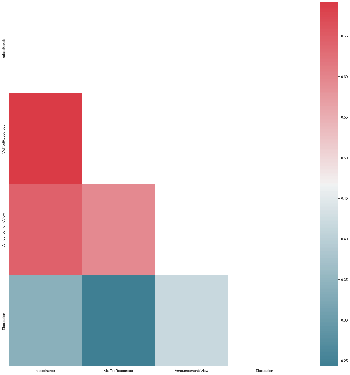
Simple Plots
Simple plots are an effective tool for machine learning data visualization and comprehension. They make it simple and quick to examine the distribution and connections between your variables, which is beneficial for feature selection, preprocessing, and data exploration.
def heat_map(corrs_matrix):
    sns.set(style="white")
    f, ax = plt.subplots(figsize=(20, 20))
    mask = np.zeros_like(corrs_matrix, dtype=np.bool)
    mask[np.triu_indices_from(mask)] = True
    # Here We will generate custom Diverging colormap
    cmap = sns.diverging_palette(220, 10, as_cmap=True)
    sns.heatmap(corrs_mat, mask=mask, cmap=cmap, ax=ax)


variable_corrs= af.corr()


heat_map(variable_corrs)
Output:
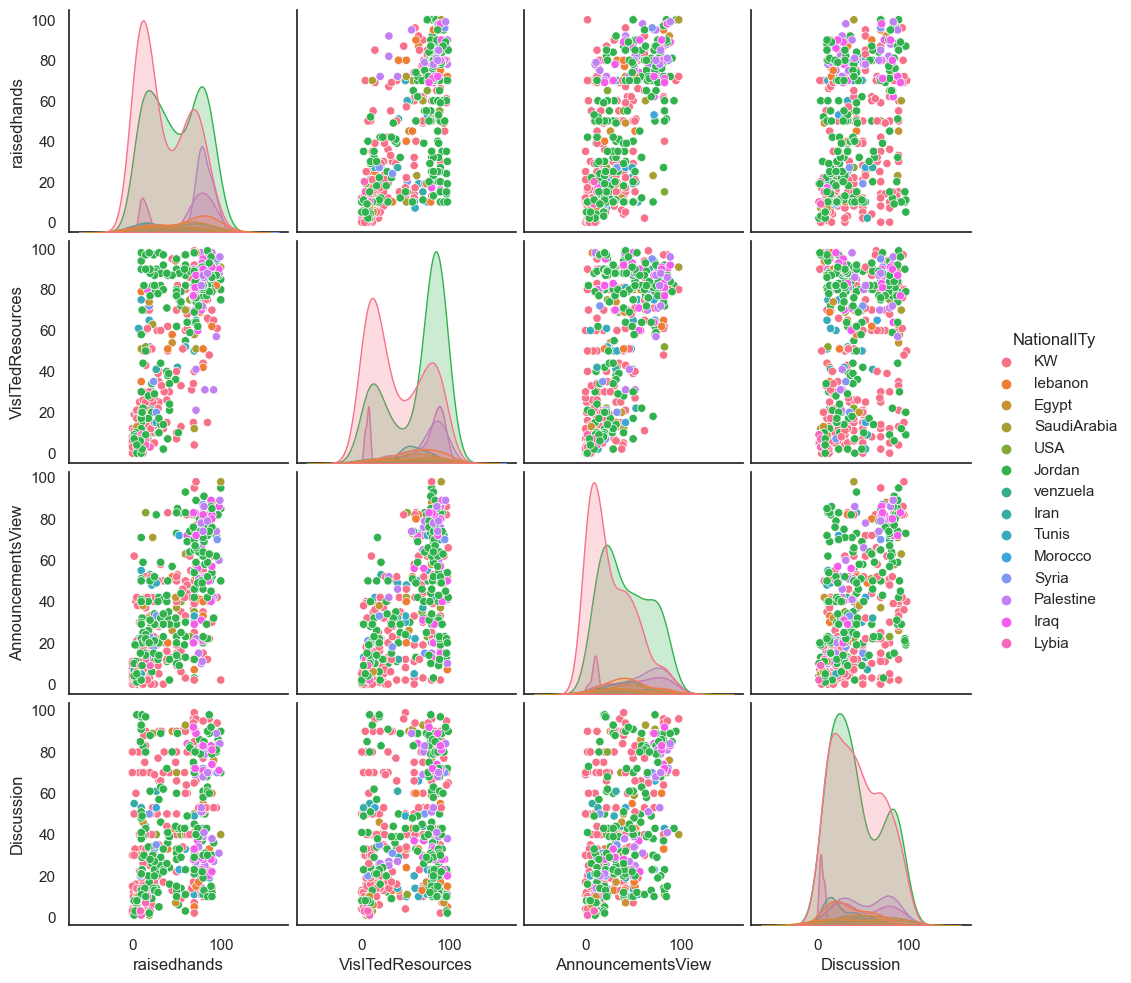
af_small = af[['raisedhands', 'VisITedResources', 'AnnouncementsView', 'Discussion', 'NationalITy']]
sns.pairplot(af_small, hue='NationalITy')
Output:
<seaborn.axisgrid.PairGrid at 0x2162ffd6280>
af.columns
Output:
Complex Plots
More complicated charts can be used in machine learning in addition to simple graphs to better interpret and comprehend data. When examining correlations between several variables and seeing patterns in higher-dimensional data, these graphs can be helpful.
Modify the original dataframe itself to make variables as numbers.
data_=pd.read_csv("xAPI-Edu-Data.csv")
mod_af = af


map_of_gender = {'M':1,
              'F':2}


map_of_NationalITy = {  'Iran': 1,
                     'SaudiArabia': 2,
                     'USA': 3,
                     'Egypt': 4,
                     'Lybia': 5,
                     'lebanon': 6,
                     'Morocco': 7,
                     'Jordan': 8,
                     'Palestine': 9,
                     'Syria': 10,
                     'Tunis': 11,
                     'KW': 12,
                     'KuwaIT': 12,
                     'Iraq': 13,
                     'venzuela': 14}


map_of_PlaceofBirth =  {'Iran': 1,
                     'SaudiArabia': 2,
                     'USA': 3,
                     'Egypt': 4,
                     'Lybia': 5,
                     'lebanon': 6,
                     'Morocco': 7,
                     'Jordan': 8,
                     'Palestine': 9,
                     'Syria': 10,
                     'Tunis': 11,
                     'KW': 12,
                     'KuwaIT': 12,
                     'Iraq': 13,
                     'venzuela': 14}


map_of_StageID = {'HighSchool':1,
               'lowerlevel':2,
               'MiddleSchool':3}


map_of_GradeID =   {'G-02':2,
                 'G-08':8,
                 'G-09':9,
                 'G-04':4,
                 'G-05':5,
                 'G-06':6,
                 'G-07':7,
                 'G-12':12,
                 'G-11':11,
                 'G-10':10}


map_of_SectionID = {'A':1,
                 'C':2,
                 'B':3}


map_of_Topic  =    {'Biology' : 1,
                 'Geology' : 2,
                 'Quran' : 3,
                 'Science' : 4,
                 'Spanish' : 5,
                 'IT' : 6,
                 'French' : 7,
                 'English' :8,
                 'Arabic' :9,
                 'Chemistry' :10,
                 'Math' :11,
                 'History' : 12}
map_of_Semester = {'S':1,
                'F':2}


map_of_Relation = {'Mum':2,
                'Father':1}


map_of_ParentAnsweringSurvey = {'Yes':1,
                             'No':0}


map_of_ParentschoolSatisfaction = {'Bad':0,
                                'Good':1}


map_of_StudentAbsenceDays = {'Under-7':0,
                          'Above-7':1}


map_of_Class = {'H':10,
             'M':5,
             'L':2}


mod_af.gender  = mod_af.gender.map(map_of_gender)
mod_af.NationalITy     = mod_af.NationalITy.map(map_of_NationalITy)
mod_af.PlaceofBirth     = mod_af.PlaceofBirth.map(map_of_PlaceofBirth)
mod_af.StageID       = mod_af.StageID.map(map_of_StageID)
mod_af.GradeID = mod_af.GradeID.map(map_of_GradeID)
mod_af.SectionID    = mod_af.SectionID.map(map_of_SectionID)
mod_af.Topic     = mod_af.Topic.map(map_of_Topic)
mod_af.Semester   = mod_af.Semester.map(map_of_Semester)
mod_af.Relation   = mod_af.Relation.map(map_of_Relation)
mod_af.ParentAnsweringSurvey   = mod_af.ParentAnsweringSurvey.map(map_of_ParentAnsweringSurvey)
mod_af.ParentschoolSatisfaction   = mod_af.ParentschoolSatisfaction.map(map_of_ParentschoolSatisfaction)
mod_af.StudentAbsenceDays   = mod_af.StudentAbsenceDays.map(map_of_StudentAbsenceDays)
mod_af.Class  = mod_af.Class.map(map_of_Class)
#mod_af.to_csv(path + 'mod_af.csv')
#data = af
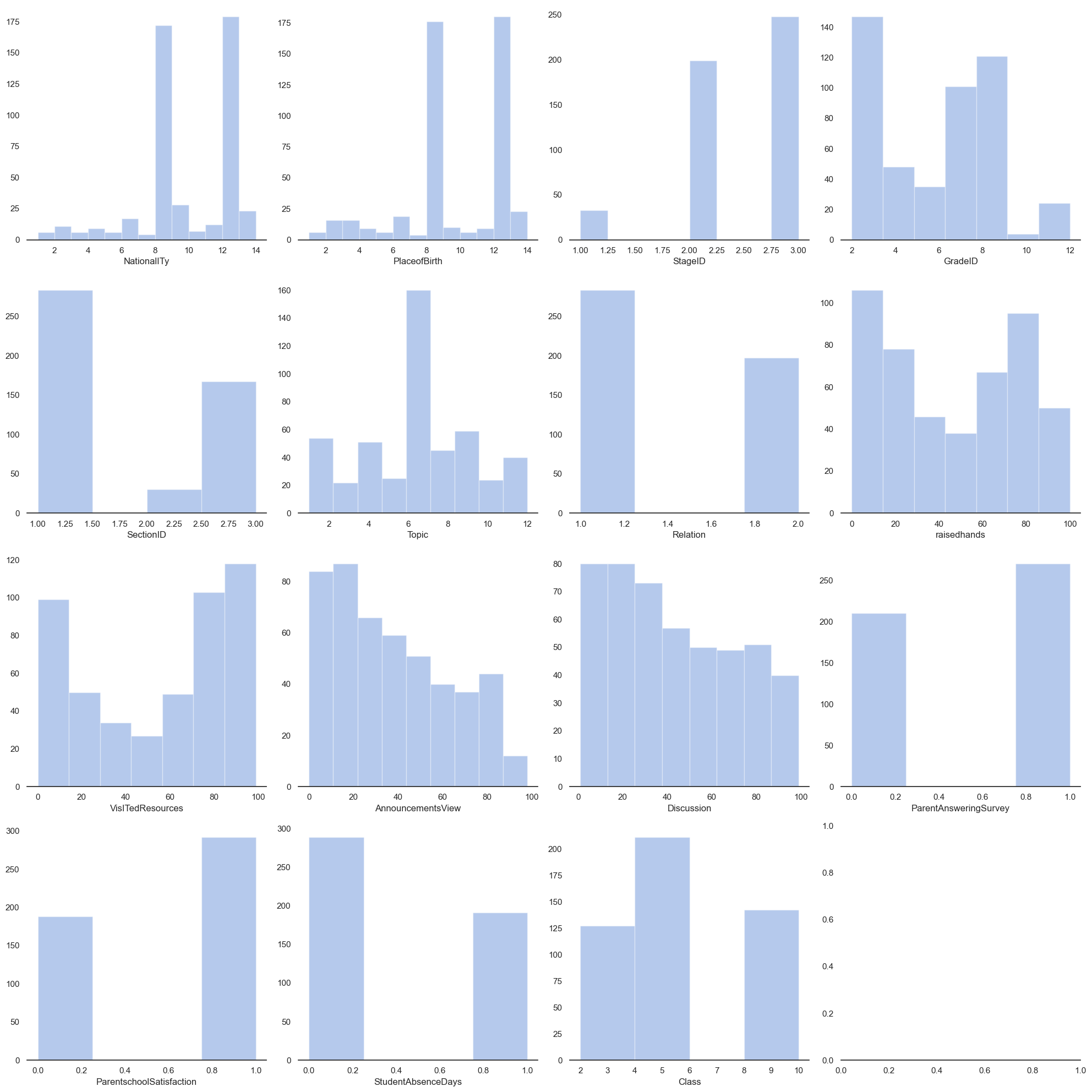
sns.set(style="white", palette="muted", color_codes=True)
f, axes = plt.subplots(4, 4, figsize=(20,20))
sns.despine(left=True)
sns.distplot(af['NationalITy'], kde=False, color="b", ax=axes[0, 0])
sns.distplot(af['PlaceofBirth'], kde=False, color="b", ax=axes[0, 1])
sns.distplot(af['StageID'], kde=False, color="b", ax=axes[0, 2])
sns.distplot(af['GradeID'], kde=False, color="b", ax=axes[0, 3])
sns.distplot(af['SectionID'], kde=False, color="b", ax=axes[1, 0])
sns.distplot(af['Topic'], kde=False, color="b", ax=axes[1, 1])
sns.distplot(af['Relation'], kde=False, color="b", ax=axes[1, 2])
sns.distplot(af['raisedhands'], kde=False, color="b", ax=axes[1, 3])
sns.distplot(af['VisITedResources'], kde=False, color="b", ax=axes[2, 0])
sns.distplot(af['AnnouncementsView'], kde=False, color="b", ax=axes[2, 1])
sns.distplot(af['Discussion'], kde=False, color="b", ax=axes[2, 2])
sns.distplot(af['ParentAnsweringSurvey'], kde=False, color="b", ax=axes[2, 3])
sns.distplot(af['ParentschoolSatisfaction'],kde=False, color="b", ax=axes[3, 0])
sns.distplot(af['StudentAbsenceDays'], kde=False, color="b", ax=axes[3, 1])
sns.distplot(af['Class'], kde=False, color="b", ax=axes[3, 2])
#sns.distplot(af['Fedu'], kde=False, color="b", ax=axes[3, 3])
plt.tight_layout()
Output:
categorical_ftrs= (mod_af.select_dtypes(include=['object']).columns.values)
categorical_ftrs
Output:

mod_af_variable_correlations = mod_af.corr()
#variable_correlations
heat_map(mod_af_variable_correlations)
Output:
Modeling
Making a mathematical representation of a system or process is referred to as modeling in the context of machine learning. This often entails training a model on a dataset of input-output pairs in the context of supervised learning in order to generate predictions on fresh inputs. For machine learning, a variety of models, such as neural networks, decision trees, and linear regression models, can be utilized.
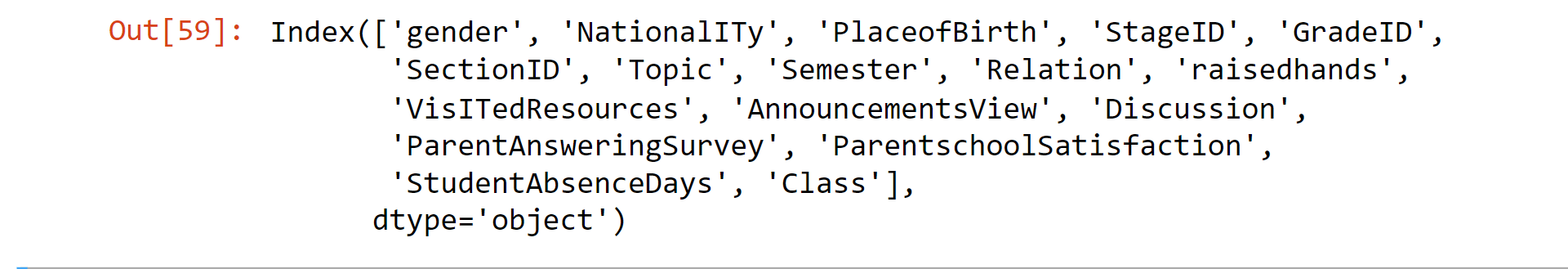
af.columns
Output:
from sklearn.linear_model import SGDClassifier
from sklearn.preprocessing import LabelEncoder
from sklearn.model_selection import train_test_split
from sklearn.ensemble import RandomForestClassifier
from sklearn.calibration import CalibratedClassifierCV
#import xgboost as xgb
from sklearn.model_selection import GridSearchCV
from sklearn.model_selection import StratifiedKFold
from sklearn.feature_selection import SelectFromModel
from sklearn.linear_model import LogisticRegression
from sklearn import svm
af_copy = pd.get_dummies(mod_af)
af1 = af_copy
y = np.asarray(af1['ParentschoolSatisfaction'], dtype="|S6")
af1 = af1.drop(['ParentschoolSatisfaction'],axis=1)
X = af1.values
Xtrain, Xtest, ytrain, ytest = train_test_split(X, y, test_size=0.50)
radm = RandomForestClassifier()
radm.fit(Xtrain, ytrain)
clf = radm
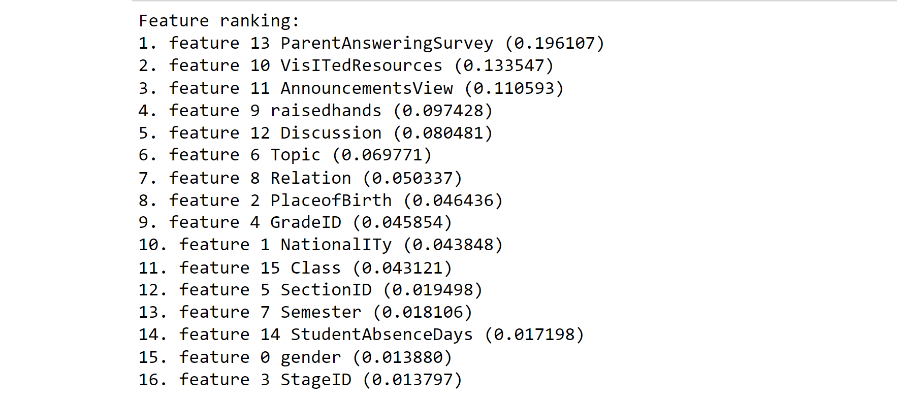
indices = np.argsort(radm.feature_importances_)[::-1]
# Print the feature ranking
print('Feature ranking:')
for a in range(af1.shape[1]):
print('%d. feature %d %s (%f)' % (a+1 ,
indices[a],
af1.columns[indices[a]],
radm.feature_importances_[indices[a]]))
Output:
from sklearn.decomposition import PCA
from sklearn.model_selection import cross_val_score
from sklearn.feature_selection import RFECV, SelectKBest
from sklearn.tree import DecisionTreeRegressor
from sklearn.linear_model import LinearRegression, Lasso
from sklearn.ensemble import RandomForestClassifier, AdaBoostClassifier, ExtraTreesClassifier
from sklearn.tree import DecisionTreeClassifier, ExtraTreeClassifier
from sklearn.linear_model import LogisticRegression
from sklearn.naive_bayes import GaussianNB, BernoulliNB
from sklearn.neighbors import KNeighborsClassifier


classifiers = [('RandomForestClassifierGini:', RandomForestClassifier(n_jobs=-1, criterion='gini')),
               ('RandomForestClassifierEntropy:', RandomForestClassifier(n_jobs=-1, criterion='entropy')),
               ('AdaBoostClassifier:', AdaBoostClassifier()),
               ('ExtraTreesClassifier:', ExtraTreesClassifier(n_jobs=-1)),
               ('KNeighborsClassifier:', KNeighborsClassifier(n_jobs=-1)),
               ('DecisionTreeClassifier:', DecisionTreeClassifier()),
               ('ExtraTreeClassifier:', ExtraTreeClassifier()),
               ('LogisticRegression:', LogisticRegression()),
               ('GaussianNB:', GaussianNB()),
               ('BernoulliNB:', BernoulliNB())
              ]
all_scores = []


x, Y = mod_af.drop('ParentschoolSatisfaction', axis=1), np.asarray(mod_af['ParentschoolSatisfaction'], dtype="|S6")


for name, classifier in classifiers:
    scores = []
    for i in range(20): # 20 runs
        roc = cross_val_score(classifier, x, Y)
        scores.extend(list(roc))
    scores = np.array(scores)
    print(name, scores.mean())
    new_data = [(name, score) for score in scores]
    allscores.extend(new_data)
Output:
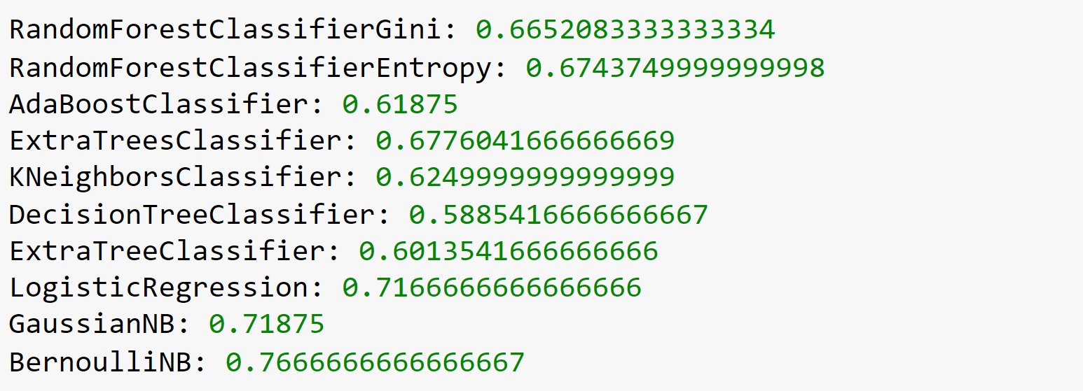
Note: In the above code, the mapping is done manually.
temp = pd.DataFrame(all_scores, columns=['classifier', 'score'])
#sns.violinplot('classifier', 'score', data=temp, inner=None, linewidth=0.3)
plt.figure(figsize=(15,10))
sns.factorplot(x='classifier',
               y="score",
               data=temp,
               saturation=1,
               kind="box",
               ci=None,
               aspect=1,
               linewidth=1,
               size = 10)
locs, labels = plt.xticks()
plt.setp(labels, rotation=90)
Output:
data_ = pd.read_csv('xAPI-Edu-Data.csv')
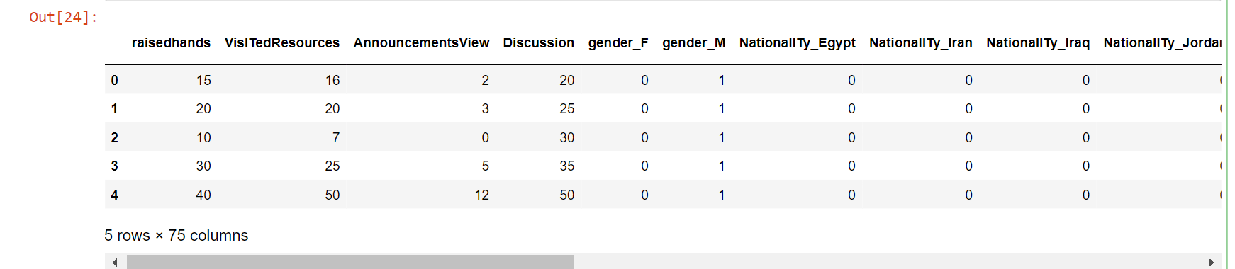
af_copy = pd.get_dummies(data)
af_copy.head()
Output:
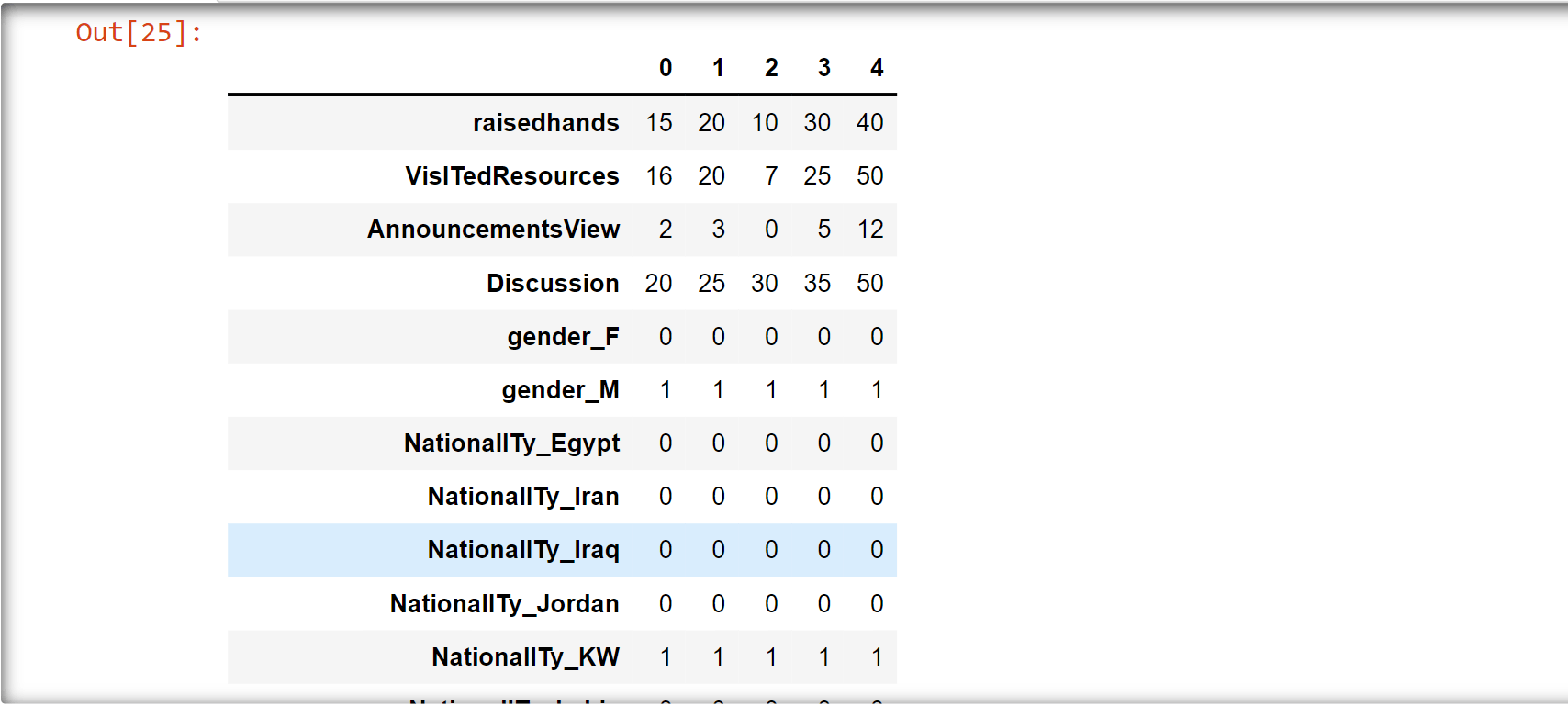
af_copy.head().T
Output:
af1 = af_copy
Y = af1['ParentschoolSatisfaction_Good'].values
af1 = af1.drop(['ParentschoolSatisfaction_Good'],axis=1)
x = af1.values
Xtrain, Xtest, ytrain, ytest = train_test_split(x, Y, test_size=0.50)
from sklearn.decomposition import PCA
from sklearn.model_selection import cross_val_score
from sklearn.feature_selection import RFECV, SelectKBest
from sklearn.tree import DecisionTreeRegressor
from sklearn.linear_model import LinearRegression, Lasso
from sklearn.ensemble import RandomForestClassifier, AdaBoostClassifier, ExtraTreesClassifier
from sklearn.tree import DecisionTreeClassifier, ExtraTreeClassifier
from sklearn.linear_model import LogisticRegression
from sklearn.naive_bayes import GaussianNB, BernoulliNB
from sklearn.neighbors import KNeighborsClassifier
classifiers = [('RandomForestClassifierGini:', RandomForestClassifier(n_jobs=-1, criterion='gini')),
('RandomForestClassifierEntropy:', RandomForestClassifier(n_jobs=-1, criterion='entropy')),
('AdaBoostClassifier:', AdaBoostClassifier()),
('ExtraTreesClassifier:', ExtraTreesClassifier(n_jobs=-1)),
('KNeighborsClassifier:', KNeighborsClassifier(n_jobs=-1)),
('DecisionTreeClassifier:', DecisionTreeClassifier()),
('ExtraTreeClassifier:', ExtraTreeClassifier()),
('LogisticRegression:', LogisticRegression()),
('GaussianNB:', GaussianNB()),
('BernoulliNB:', BernoulliNB())
]
all_scores = []
#x, Y = mod_af.drop('ParentschoolSatisfaction', axis=1), np.asarray(mod_af['ParentschoolSatisfaction'], dtype="|S6")
for name, classifier in classifiers:
scores = []
for i in range(20): # 20 runs
roc = cross_val_score(classifier, x, Y)
scores.extend(list(roc))
scores = np.array(scores)
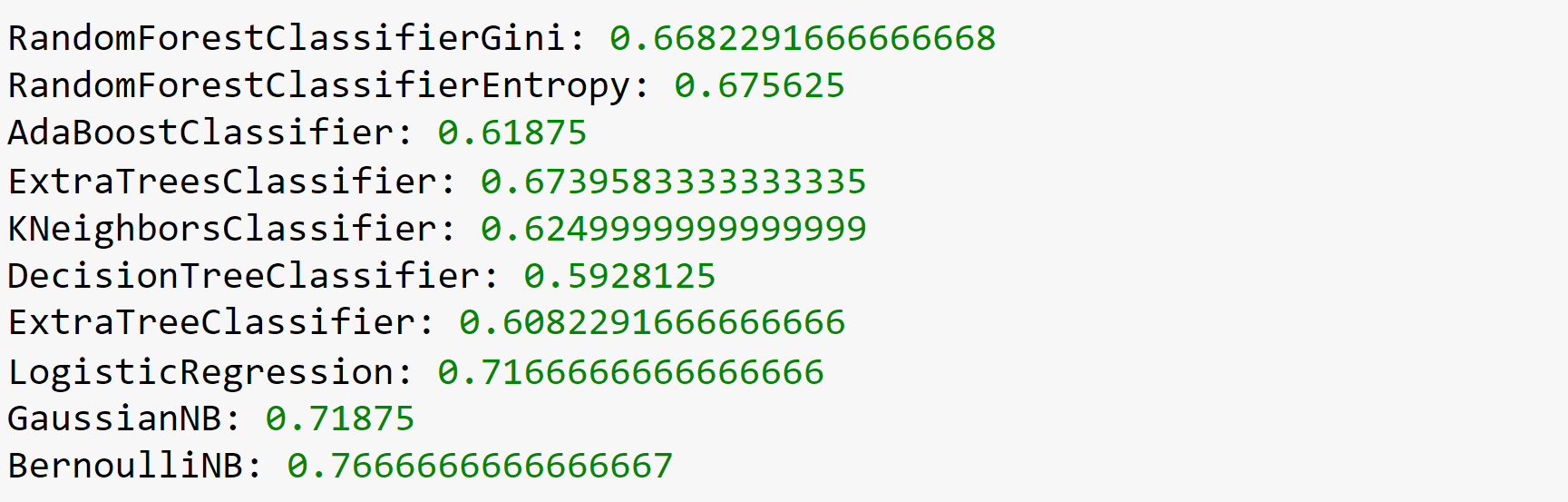
print(name, scores.mean())
new_data = [(name, score) for score in scores]
all_scores.extend(new_data)
Output:
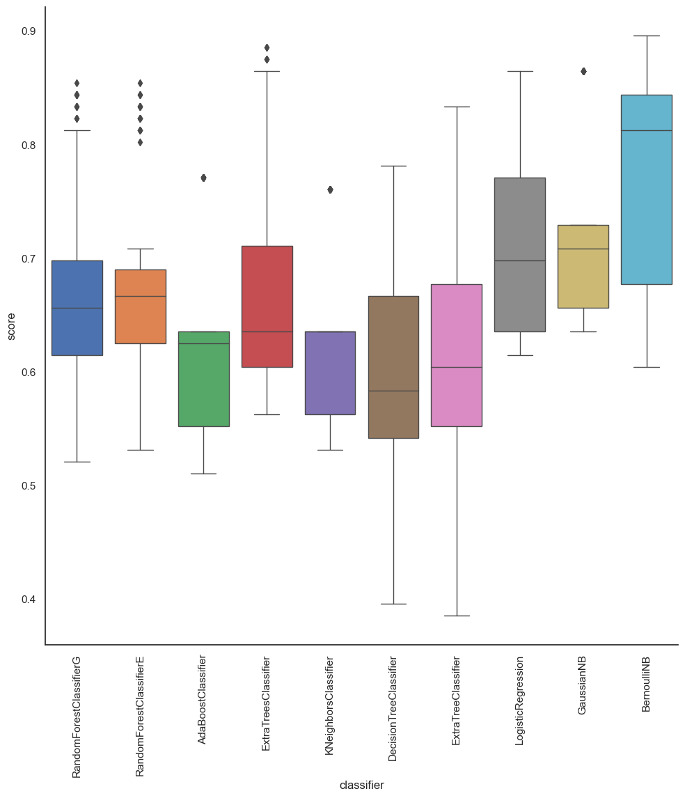
Take note of how our scores have increased significantly since using onehotencoder or pd.get dummies.
temp = pd.DataFrame(all_scores, columns=['classifier', 'score'])
#sns.violinplot('classifier', 'score', data=temp, inner=None, linewidth=0.3)
plt.figure(figsize=(15,10))
sns.factorplot(x='classifier',
               y="score",
               data=temp,
               saturation=1,
               kind="box",
               ci=None,
               aspect=1,
               linewidth=1,
               size = 10)
locs, labels = plt.xticks()
plt.setp(labels, rotation=90)
Output:
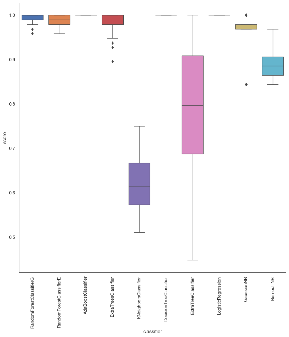
As we can see from the above section, the accuracy of BernoulliNB is the highest, which is
76.6%, while the accuracy of ExtraTreeClassifier is the lowest.
As we look at the other metrics of measure, we see that we can predict the performance of the students.
In conclusion, machine learning is a powerful tool that can be used to predict student performance with a high degree of accuracy. By analyzing large amounts of data and identifying patterns that might be difficult for humans to discern, machine learning algorithms can forecast a student's future academic performance and help identify students who are at risk of falling behind in their studies. However, it's important to ensure the models are fair and unbiased and the data used is properly handled.