How to Create Tableau Box Plot?
The box plot is the type of chart that shows the distribution of values along an axis. It is also known as a box-and-whisker plot. In the box plot, the Boxes represent the middle two quartiles or 50 percent of the data's distribution. The rest 50 percent of data on either side are denoted by lines that are also known as whiskers, to indicate all points within 1.5 times the interquartile range, which is all aspects within 1.5 times the width of the adjoining box, or all positions at the maximum extent of the data.
Creating a Box Plot
To create a box plot, the following are the steps.
- Connect to the excel data source.
- Drag and drop the dimension (here we have taken direction), to the Columns shelf.
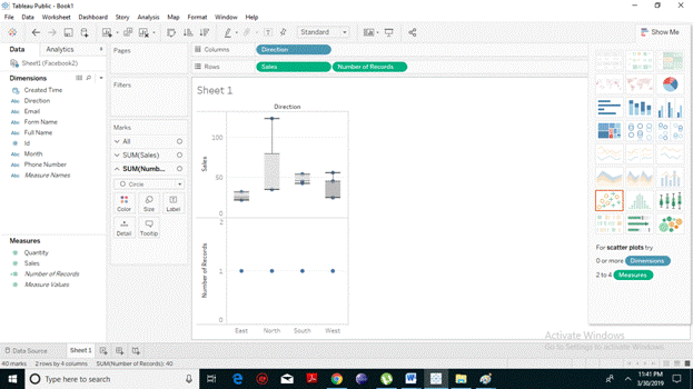
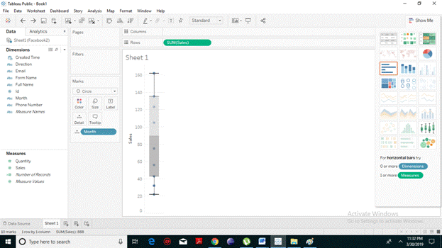
- Similarly, drag and drop the Discount measure to Rows Shelf. You will notice that Tableau has automatically created a vertical axis and displays a bar chart which is the default chart type.
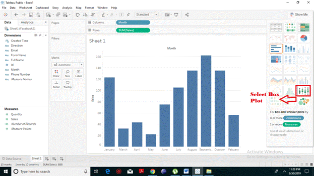
- For creating a box plot, click on Show Me toolbar present on the right-hand side of the pane, then select the box-and-whisker plot chart type.
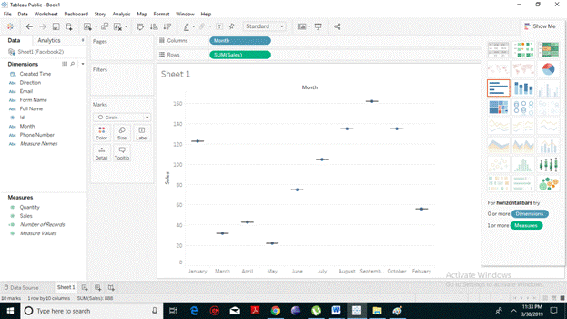
- From the following screenshot, you will notice that Tableau has automatically reassigned the Direction dimension from the Columns shelf to the Marks card. When you changed the chart type to a box plot, Tableau itself determines what the individual marks in the plot should represent.But you can easily drag the dimension to the column shelf.
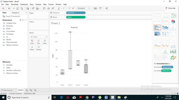
- Now, Drag the dimension Direction from the Marks card back to Columns shelf. You will notice the chart has changed to flattened horizontal lines box plots. This happens when the box plots are based only on a single mark.
Disaggregate the Data
To disaggregate the data, you need to turn off the aggregation command because data is aggregated by default in Tableau. When you disaggregate the data, then instead of a single mark for each column in the view, you can see a range of marks, one for each row in your data source. The following are the steps to disaggregate the data:
- Select the Analysis toolbar present at the top.
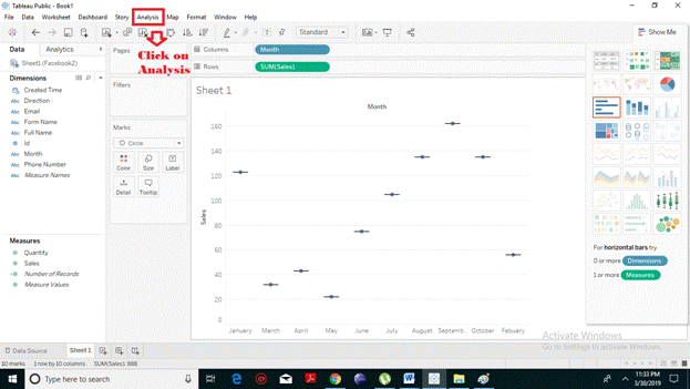
- A drop-down menu will appear. Click on Aggregate Measures. The first time you select this command, it disaggregates the data.
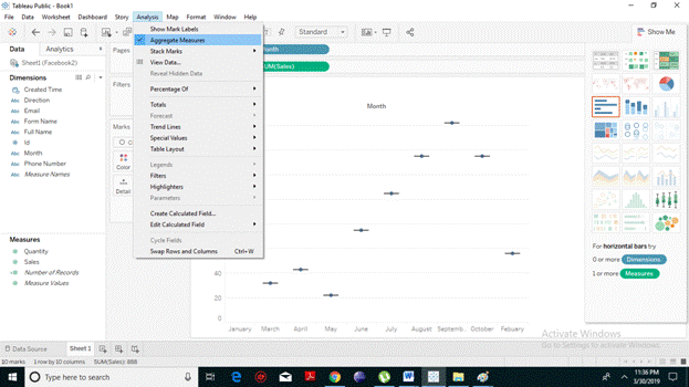
- From the resulting screenshot, you can notice that instead of representing a single mark for each there is range of marks.
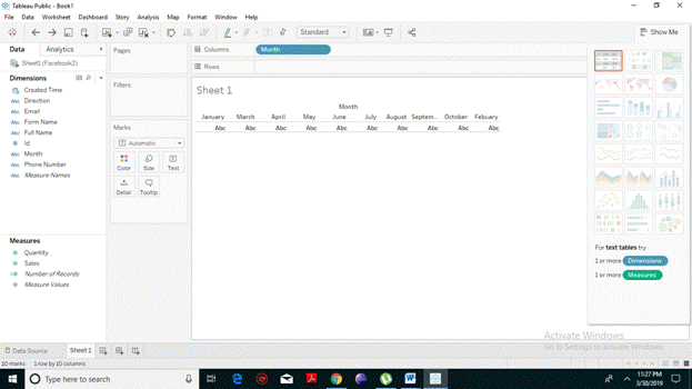
Box Plot with Two Dimensions
To create two dimensional Box Plot you need to drag, take one measure with two dimensions. By pulling and adding another dimension to the Column shelf, you will find the following result representing a chart which shows the box plots for each region.