×

Tableau Numeric Calculations

Introduction to Tableau Numeric Calculations

In Tableau, the Numeric calculations are done by using an extensive range of inbuilt functions available in the formula editor. Numeric calculations allow you to perform various computations on the data values present in your fields. Create Calculated Field
  1. In the Tableau Desktop, connect to the Excel file named FacebookData which is saved in the data source.             Tableau Numeric Calculations
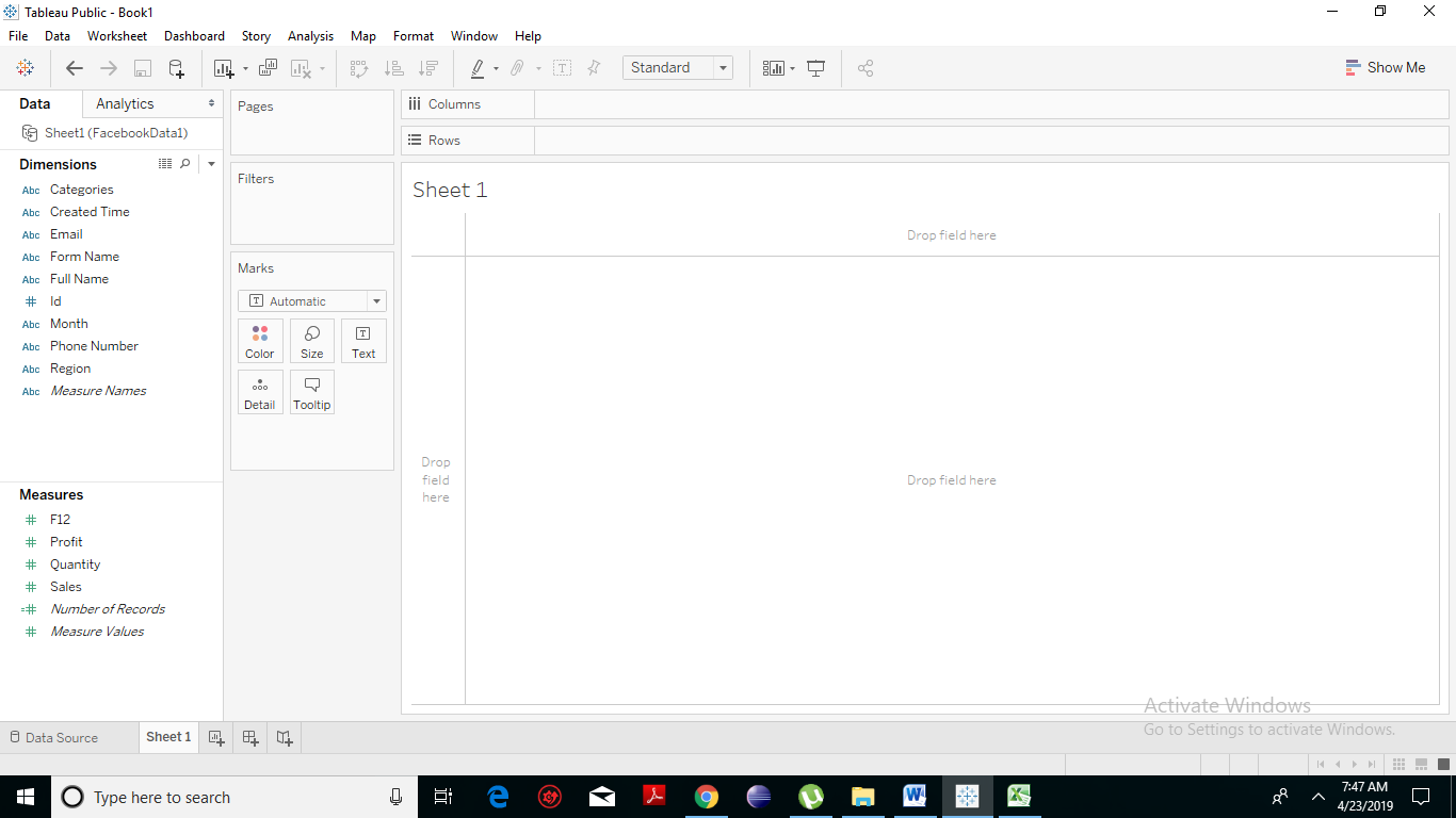
  2. Navigate to the worksheet pane and click on Analysis > Create Calculated Field as shown below:
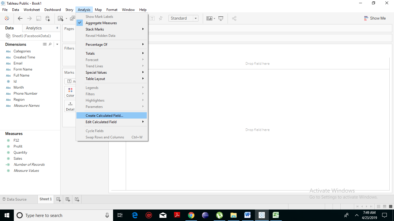
Tableau Numeric Calculations
  1. You will notice that a new dialogue box has appeared. Click on the icon present on the rightmost side of the box.
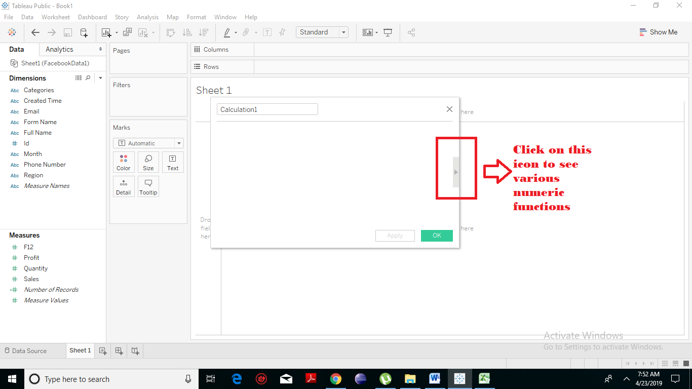
Tableau Numeric Calculations
  1. You can see a tab linked with the previous one which lists all the functions that are available in Tableau.
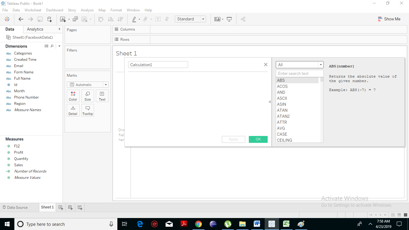
Tableau Numeric Calculations
  1. Further, you can change the dropdown value and choose only the functions that are related to numbers.
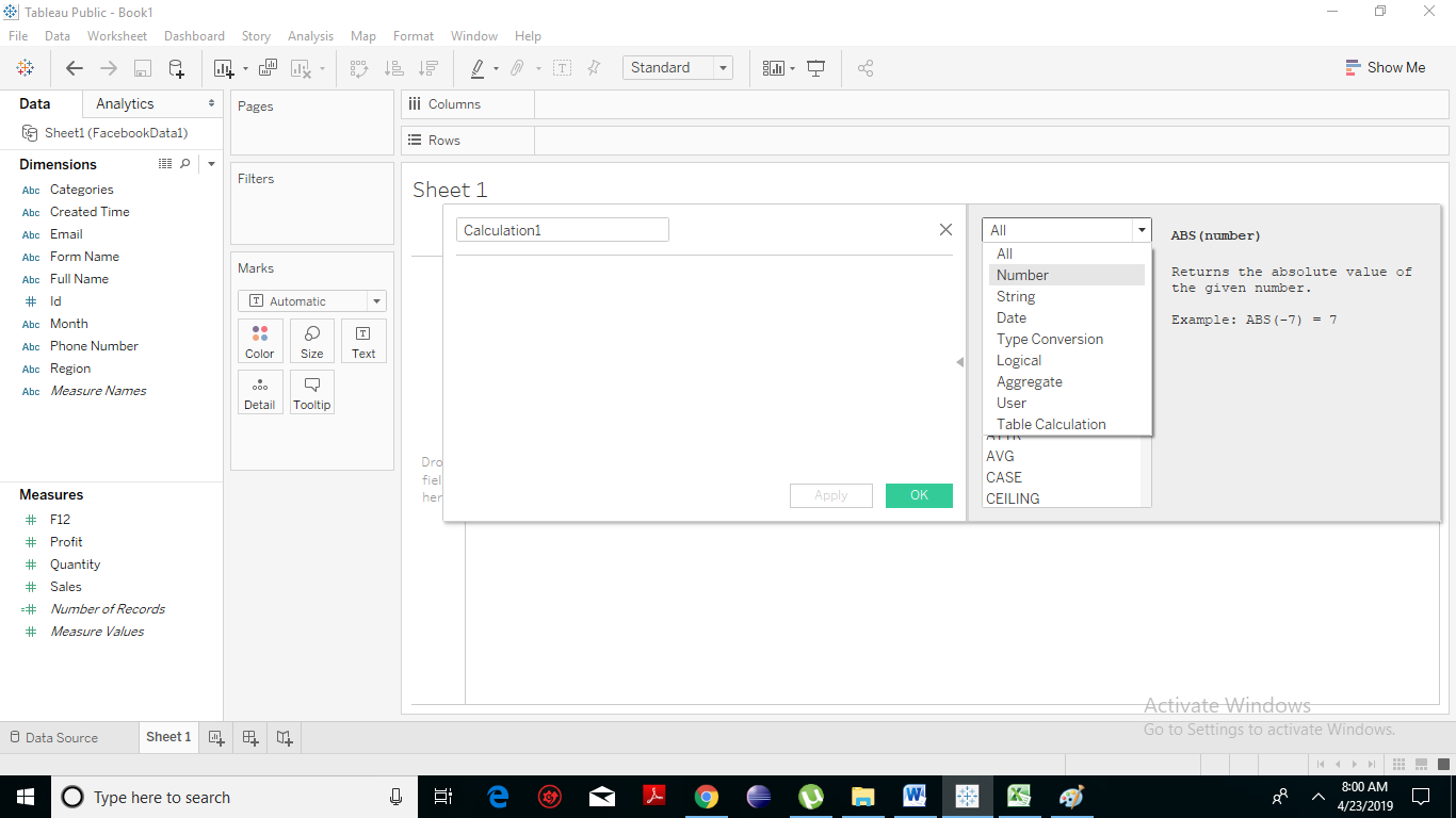
Tableau Numeric Calculations
  1. On the rightmost side of the pane, you will notice that Tableau is briefing us with the formula and small explanation for the selected functions.
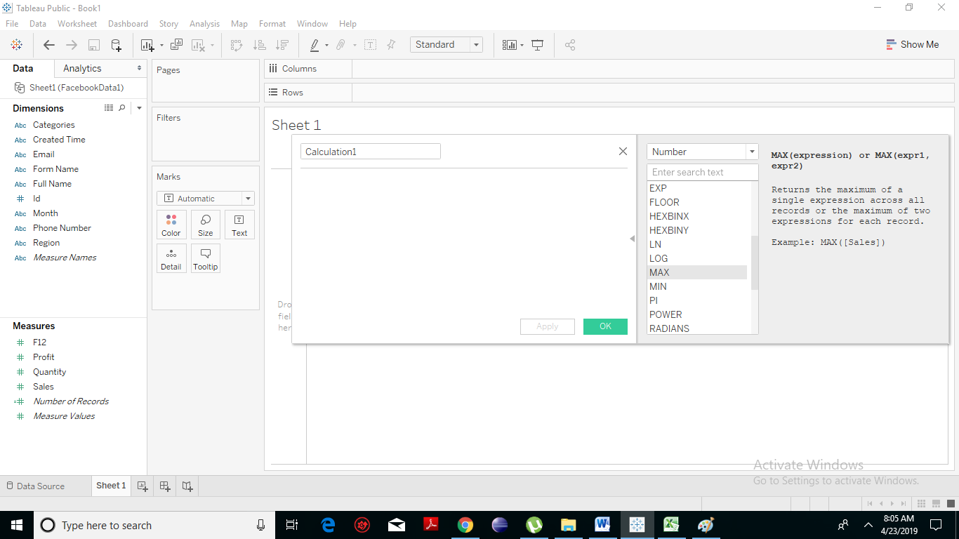
Tableau Numeric Calculations

Create a Formula

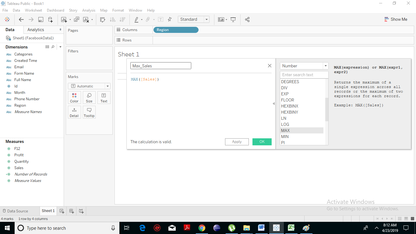
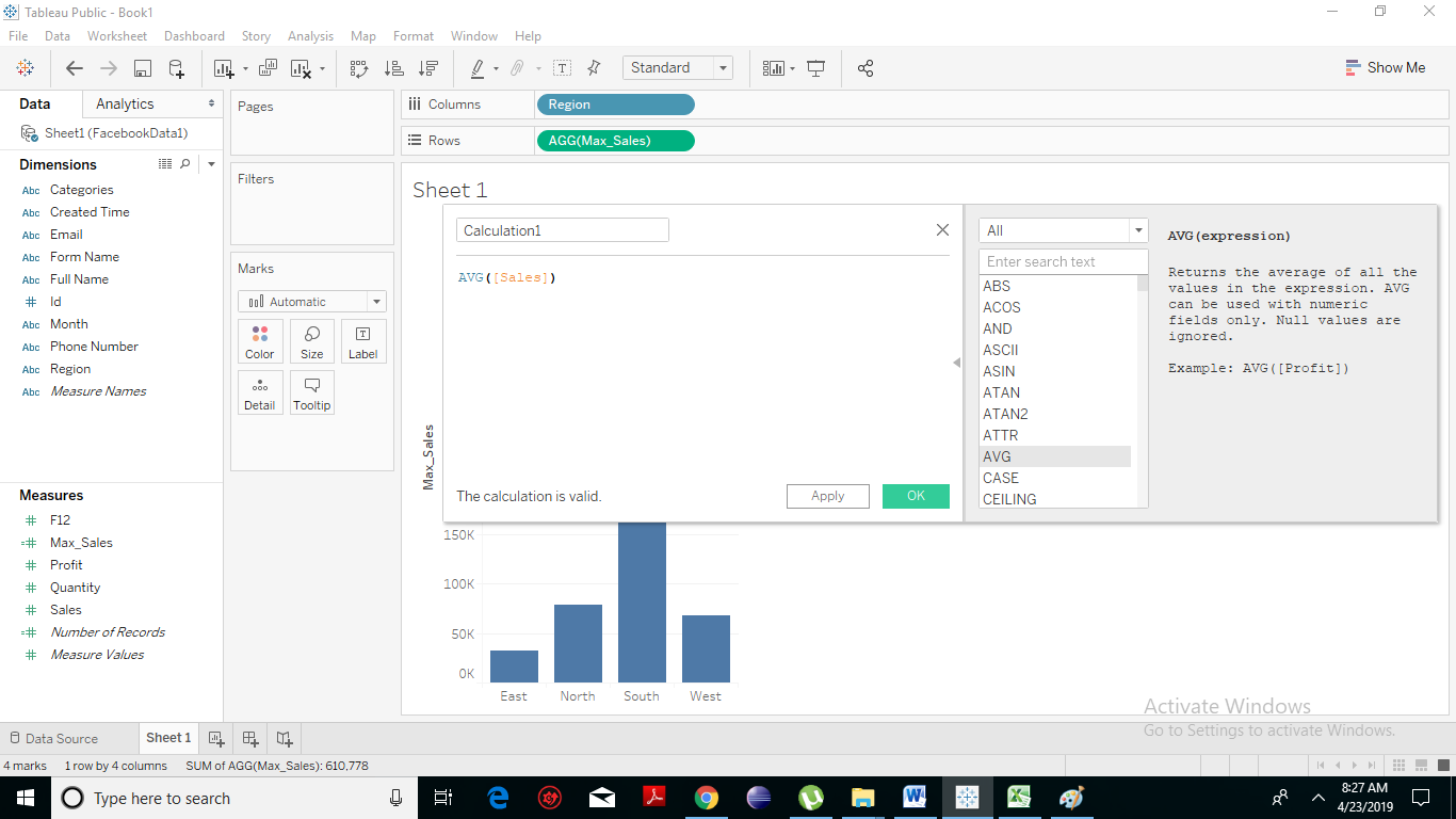
To study the maximum number of sales for the different region in the Facebook data, we will create a formula of finding the max sales from the whole range of data as shown in the following screenshot. Also, name this field as Max_Sales. And click on Ok. Tableau Numeric Calculations You will find that a new field named Max_Sales has been created in the measure column.
Applying the Calculated Field

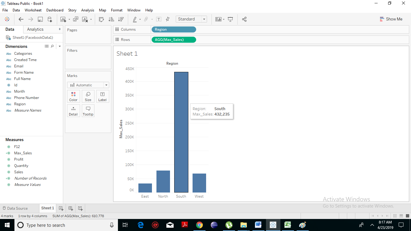
The above-calculated field can be applied in the view by dragging it to the Rows shelf as displayed in the following screenshot. It produces a bar chart showing the maximum number of sales held for the different regions. Tableau Numeric Calculations
Applying Aggregate Calculations

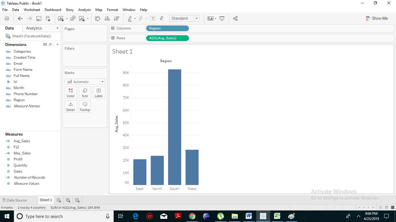
We can create different calculations in the same manner as above. Next, we will create a calculated field using an aggregate function. Follow the same steps: Open the calculated field and create AVG(sales) values for Regions. Write the numeric formula for the AVG(sales)in the calculation editor as shown in the following screenshot. Tableau Numeric Calculations Change the name to Avg_Sales. Click on the ok option. You will notice that a field named with Avg_Sales has been created under the measures. Drag that field to the rows shelf and dimension Region to the column shelf.  The following screenshot appears showing the bar charts for average sales occurred in different regions. Tableau Numeric Calculations
Related Topics

Tableau Gantt Chart

How to create a Gantt Chart in Tableau A Gantt chart is a type of chart that shows the development and duration of the event or resource over a period of...

2 minutes read.

Advantages and Disadvantages of Tableau

Advantages of Tableau Speed In the early stages, the Tableau software becomes popular because of its momentum with which it can analyze hundreds or even millions of rows and also gives...

3 minutes read.

Tableau Filter card

Tableau add Filter Card to Dashboard Tableau provides a very significant feature of filtering of data for the ease of data analysis. Tableau allows the filtering of data of the fields,...

3 minutes read.

Tableau Calculated Field

An Introduction to Calculated Fields in Tableau Calculated fields create new data field from the data that already exists in your data source. When you create a calculated field, you are...

2 minutes read.

Tableau Quick Filters

Tableau Filters help to have enough functionality to solve most of the common filtering needs. Quick filters are simply a filter that has been exposed in a view. But, it...

2 minutes read.

Tableau Data Types

Data Types in Tableau Tableau is a fastest growing and powerful data visualization tool which is primarily used in the Business Intelligence. Since every tool stores its data into some memory...

2 minutes read.

Tableau Data Sources Excel

Tableau- Data Sources Tableau software connects to all types of popular data sources. It can link to text files, excel files, PDF files, etc. Tableau has the ability to connect to...

2 minutes read.

Tableau TreeMap

The treemap is a kind of chart that displays the data in nested rectangles and provides simple data visualization. In a treemap, the values of the dimension describe the structure...

2 minutes read.

Tableau Waterfall Chart

How to Create Tableau Waterfall Chart? The waterfall chart is a type of chart that effectively displays how an initial value is incremented and decremented by a series of intermediate values,...

2 minutes read.

Tableau Line Chart

In a line chart, measures and dimensions are taken along the two axes of the chart area. Line Chart is used to understand the moment of the data and analysis...

2 minutes read.

Tableau Marks

Tableau Marks Tableau is an excellent tool to depict your data in the most attractive way. There is a particular part of the tableau workspace that’s specific to Mark’s called the...

3 minutes read.

Tableau Motion Chart

Motion charts are a type of chart that allows you to visualize in action displaying the changes of your data over time by indicating the movement of data points within...

2 minutes read.

Tableau Connectivity with Excel

Connect Excel to Tableau server Step by Step Let’s get started by connecting tableau to a data source:   Step: 1 Click on Microsoft Excel   Step: 2 Choose your excel file and open it...

1 minute read.

Tableau Data Blending

Introduction to Tableau Data Blending Data Blending is a very advantageous feature in Tableau. Data blending is referred to as a technique where on a single worksheet, the data is blended...

3 minutes read.

Tableau Dimensions and Measures

How to Use Tableau Dimensions and Measures? Tableau is very built on the premises of drag and drops so let’s developed a simple visualization and talk about what each of these...

3 minutes read.

Tableau Filter Introduction

Filtering is an essential aspect of analyzing data. It is the process of eliminating values from a range of result set. Tableau provides a filtering feature to filter data from...

2 minutes read.

Tableau Box Plot

How to Create Tableau Box Plot? The box plot is the type of chart that shows the distribution of values along an axis. It is also known as a box-and-whisker plot....

2 minutes read.

Tableau Histogram Chart

Histogram chart in Tableau A histogram is a chart that represents the accurate distribution of numerical data. A histogram represents the actual frequencies of values of a variable bucketed into ranges....

2 minutes read.

Components of Tableau Server

Core Components of Tableau Server Tableau Server's work is directed primarily with the following four server processes: Application Server VizOL Server Data Server Gateway Application Server: It controls hold browsing and various...

2 minutes read.

Tableau Products Comparison

Tableau Products Explained In this tutorial, you will have a look at an overview of the products offered by the tableau: Tableau Desktop So we have a tableau desktop, which is where...

1 minute read.
