How to Create Tableau Bubble Chart?
A bubble chart is a kind of chart that displays the three dimensions of data as a cluster of circles. It is considered as a variation of the scatter plot, in which the data points are replaced with bubbles. The values listed in the dimension field represent a circle whereas the values of measure represent the size of those circles. One can create a bubble chart in Tableau software by dragging a measure on the Size shelf and a dimension to the Labels shelf under Marks card. Tableau also offers the bubble chart option in the Show Me card. Bubble charts are highly useful in the precise understanding of economic, medical, social, and other scientific relationships.
Simple Bubble Chart
. To create a simple Bubble Chart, the following are the steps.
- From the Microsoft Excel option, choose your excel file. Unlike here, we have chosen Facebook 2019 data.
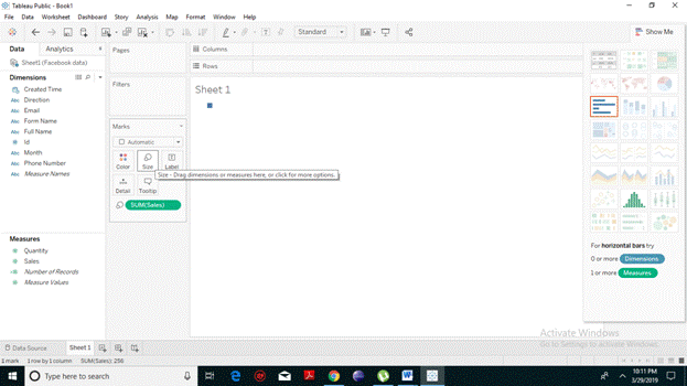
- Choose the measure, drag and drop it (we have taken sales) into the Size shelf under the Marks card. It will decide the size of your circle.
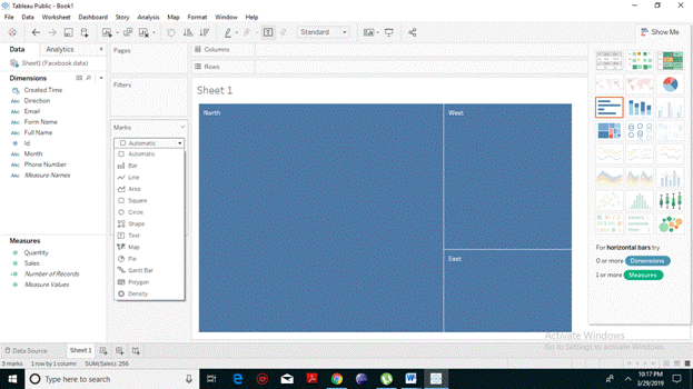
- Choose the dimension, drag and drop it into the Labels shelf under the Marks card.
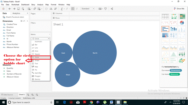
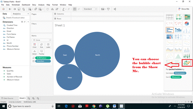
- From the marks card, click on the drop-down menu and select the Circle option. The following bubble chart will appear.
- You can also choose the bubble chart, from the Show me Tab presented on the Right Hand Side.
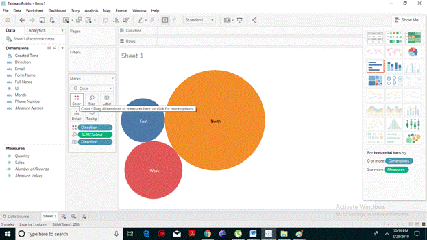
Bubble Chart with Different Colors
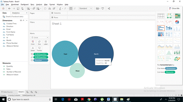
You can attractively present each circle with a different color. To implement this, drag and drop the dimension field (here we have taken Direction ) into the color shelf under the marks card. You will notice that all the circles have different colors.
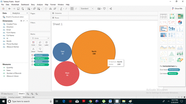
Bubble Chart with Measure Values
You can also display the values of the measured field which will also select the size of the bubble chart. To implement this, pull the sales measure into the Labels shelf. The resulting chart appears.
 Bubble Chart with Measure Colors
Instead of coloring the circles with a different color as per their particular dimension, you can use a single color with varying shades of color. To do this, pull the measured field (here we have taken sales) into the color shelf. The higher the values, the darker will be the shade and the smaller, the lighter will be the shade. From the following screenshot, it is evident that the circles have different shades of blue as per their sizes.