Angular 8 Animation
What is Animation?
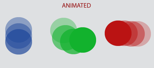
The animation is a process of drawing, designing, making layouts, and preparation of photographic sequences which are integrated into the multimedia and gaming products.
A reflection of movement created for displaying a series of frames, or pictures. Cartoons on television are one of the examples of animation.
Angular Animation
Animation provides the illusion of motion. HTML elements change styling over time. A well-designed animation can make our application more fun and easier to use, but they are not just cosmetic. Animation can improve our app and user experience in many ways:
- Without animation, web page transitions can seem dull and fade.
- Motion dramatically enhances the user experience, so animations give users a chance to detect the application's response to their actions.
- Good animations directly call the user’s attention to where it is needed.
Typically, animation involves multiple style transformation over time. An HTML element can change color, move, grow, shrink, fade or slide off the page. These changes can happen simultaneously and sequentially. We also control the timing of every transformation.
Angular's animation system is built on the CSS functionality, that means we can animate any property that the browser considers animatable easily. It includes positions, sizes, transforms, colors, borders, and many more. The W3C maintains a list of animatable features on its CSS transitions page.
Set-up of Animation in Angular 8
- Previously, we have to import new animation package through the command “npm install –save@angular/animations."
- Then, add the BrowserAnimationsModule to our imports[] array in AppModule.
- The module needs to be imported from @angular/platform-browser/animations’ => import { BrowserAnimationsModule } from ‘@angular/platform-browser/animations’( in AppModule).
- After that, we import trigger, state, style, etc. from @angular/animations instead of @angular/core.
Step 1: Enabling the animations module
Import BrowserAnimationsModule, which introduces the animation capabilities in our angular root application module.
src/aap/app.module.ts
 import { NgModule } from '@angular/core';
import { BrowserModule } from '@angular/platform-browser';
import { BrowserAnimationsModule } from '@angular/platform-browser/animations';
@NgModule({
imports: [
BrowserModule,
BrowserAnimationsModule
],
declarations: [ ],
bootstrap: [ ]
})
export class AppModule { }
Step 2: Importing animation functions into component file
If we plan to use specific animation functions in component files, import those functions from @angular/animations.
src/app/app.component.ts
import { Component, HostBinding } from '@angular/core';
import {
trigger,
state,
style,
animate,
transition,
// ...
} from '@angular/animations';
Step 3: Adding the animation metadata property
In the component file, add a metadata properly called animations in the @Component () decorator. We put the trigger which defines an animation within the animations metadata property.
src/app/app.component.ts
@Component({
selector: 'app-root',
templateUrl: 'app.component.html',
styleUrls: ['app.component.css'],
animations: [
// animation triggers go here
]
})
For Example:
Animating a simple transition in Angular
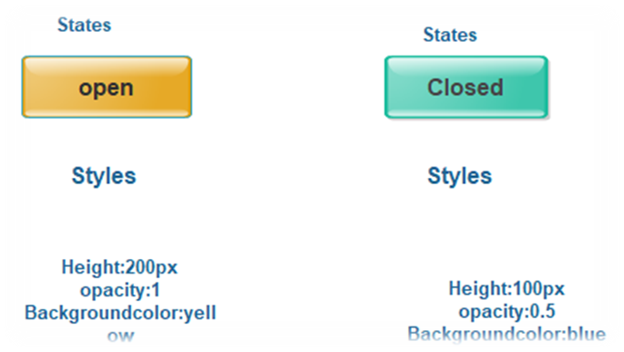
We can specify that a button displays either open or closed based on the user's last action. When the button is in the free state, it's visible and yellow. When it is the closed state, it's transparent and green.
In HTML, these attributes are set using common CSS styles such as color and opacity. In Angular, use the style () functions to specify a set of CSS styles for use with animations.
Animation state and styles
We can use Angular's state() function to define different states to call at the end of each transition. This function has two arguments: a unique name such as open, closed, and style( ) function.
Use style() function to define a set of style to associate with a given state name.
In open state, the button has a height of 200 pixels, an opacity of 1, and a background color of yellow.
src/app/open-close.component.ts
// ...
state('open', style({
height: '200px',
opacity: 1,
backgroundColor: 'yellow'
})),
In the closed state, the button has height of 100 pixels, an opacity of 0.5, and a background color of green.
src/app/open-close.component.ts
state('closed', style({
height: '100px',
opacity: 0.5,
backgroundColor: 'green'
})),
Triggering the animation in Angular
An animation needs a trigger, so that it knows when to start it. The trigger () function collect the states and transitions, and gives the animation a name, so we can attach to the triggering element in HTML template.
The trigger() function describes the property name to watch for the changes. When a change occurs, the trigger commences the action included in its definition.
Attaching animation to HTML template in Angular
The animation is defined in the metadata of the component which controls the HTML element, which is animated. Put the code that defines our animation under the animations: property within the @Component () decorator.
src/app/open-close.component.ts
@Component(
selector: 'app-open-close',
animations: [
trigger('openClose', [
// ...
state('open', style({
height: '200px',
opacity: 1,
backgroundColor: 'yellow'
})),
state('closed', style({
height: '100px',
opacity: 0.5,
backgroundColor: 'green'
})),
transition('open => closed', [
animate('1s')
]),
transition('closed => open', [
animate('0.5s')
]),
]),
],
templateUrl: 'open-close.component.html',
styleUrls: ['open-close.component.css']
})
export class OpenCloseComponent {
isOpen = true;
toggle() {
this.isOpen = !this.isOpen;
}
}
When we have defined an animation trigger for a component, we can attach it to an element in the component's template by wrapping the trigger name in the bracket and introduce it with an @symbol.
When triggerName is the name of the trigger, and expression evaluates to a defined animation state.
<div[@triggerName]="expression">...</div>;
The animation will be executed or triggered when the expression value changes into a new state.
The given code binds the trigger to the value of the is open property.
src/app/open-close.component.html
<div [@openClose]="isOpen ? 'open' : 'closed'" class="open-close-container">
<p>The box is now {{ isOpen ? 'Open' : 'Closed' }}!</p>
</div>
Animation API core functions in Angular 8
The functional API is provided by the @angular/animations module. This module provides a domain-specific language (DSL) for creating and controlling animations in Angular applications.
So core functions and its related data structures.
| Function name | Features |
| trigger( ) | This method starts the animation and will be served as a container for all other animation function calls. The HTML template binds to triggerName, and its first argument is used to declare a unique trigger name. |
| style( ) | It defines one or more CSS styles to use in animations. Control the visual appearance of HTML elements during the animation. |
| state( ) | The state creates a named set of CSS styles that should be applied on a successful transition to a state. The state can be referenced by name with other animation functions. |
| keyframe( ) | It allows a sequence change between styles with an animate ( ). |
| animate( ) | It specifies the timing information for a transition. |
| transition( ) | This method defines the animation sequence between two named states. It also uses array syntax. |
| group( ) | It specifies a group of animation steps to run in parallel. The animation continues only when all inner animation steps have completed. |
| query( ) | Use to find or more inner HTML element within the current element. |
| stagger( ) | Staggers the starting time for animation for multiple elements. |
| sequence( ) | It specifies a list of animation steps that run sequentially one by one. |
| animation( ) | It produces a reusable animation which can be invoked form useAnimation(). |
| useAnimate() | It activates a reusable animation. |
| animateChild() | Allows animations on child components which run with the same timeframe as the parent. |