
Tableau Marks
Tableau Marks
Tableau is an excellent tool to depict your data in the most attractive way. There is a particular part of the tableau workspace that’s specific to Mark’s called the marks card. Here, one can set all kind of different properties for marks on your chart. The Marks card helps you in enhancing your data and in making it visually more attractive. It has undergone a lot of changes in tableau. Inside Marks card, there are various elements including color, size, label, detail, and tooltip.
Mark type drop-down list
The first thing which you can see in the Mark card is a mark type drop-down list. Marks provide you the option to select you filed as per your requirement and convenience. It is a very useful section as there we have a different kind of bar, line, and area and many different ways through which this little data point can be represented.
Click on the icon.
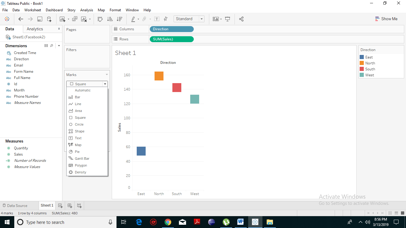
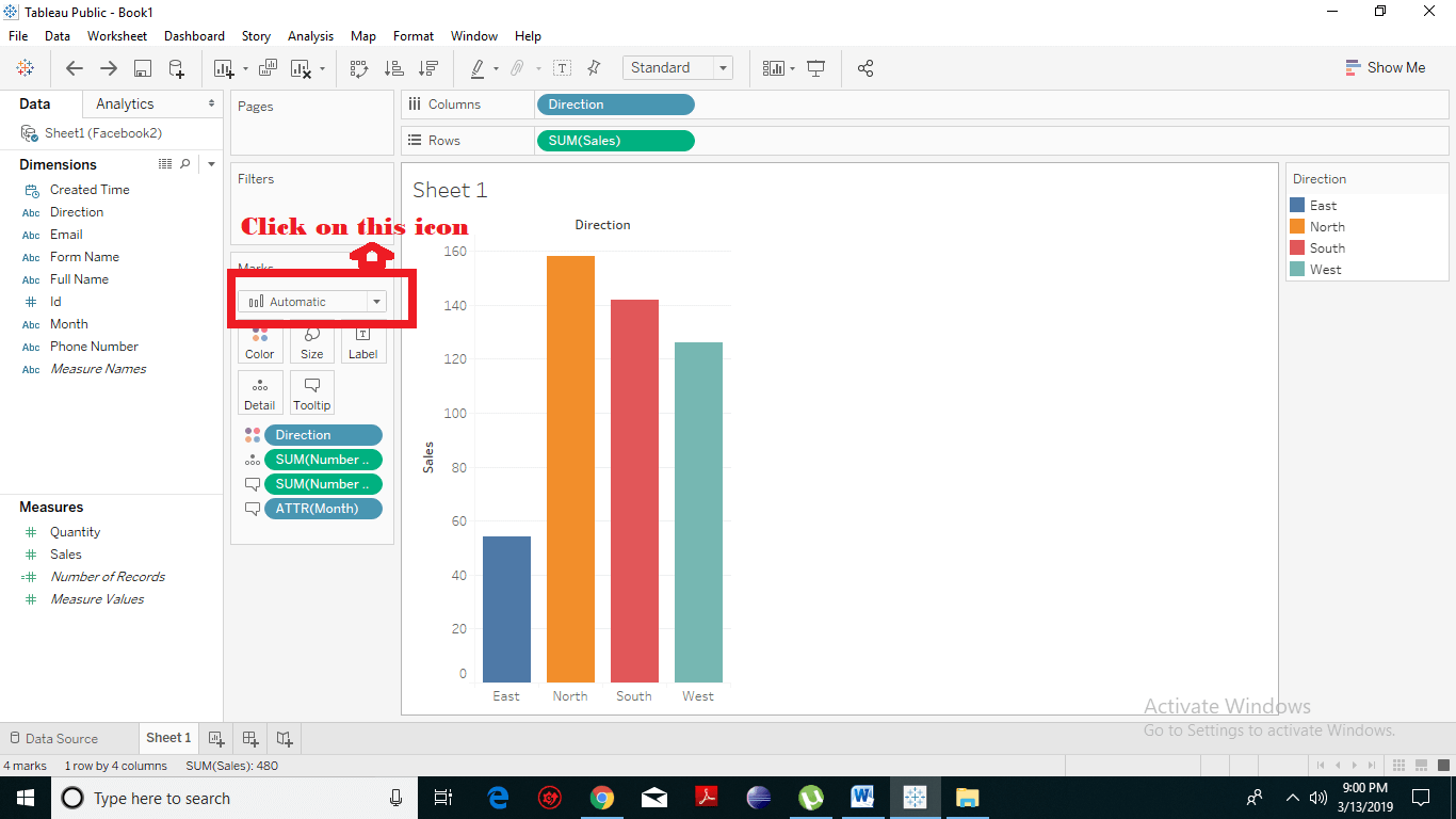 A drop-down menu will appear listing all the fields unlike line, area, square, circle, shape, text, etc. as stated below.
 Choose any field according to your preference and choices. Suppose, we choose Square field. Then the bar with get changed with that of a square field.
 Color
When you use colors, your graphs or your analysis is much better as compared to without colors. You can work on the color of the above bars, graphs, and charts. To create the colors follow the following steps:
Click on a color. You will get a wide range of colors option. You can select any of them.
Color
When you use colors, your graphs or your analysis is much better as compared to without colors. You can work on the color of the above bars, graphs, and charts. To create the colors follow the following steps:
Click on a color. You will get a wide range of colors option. You can select any of them.
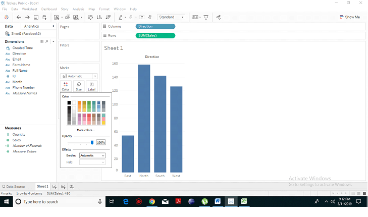 After selecting you will see that the color of the bars has changed.
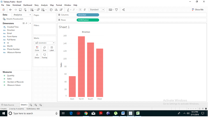 That’s how you can determine the color, but if you want something else to identify, you can take dimension or any other field and drag it on to the color and now you have one tone per region.
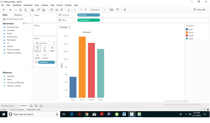 Similarly, if we want them to be a different color based on sales, then, we have drag sales onto the shade. From the given-below picture, you have evaluate that the color has become darker where there’s higher sales and lighter where there are lower sales.
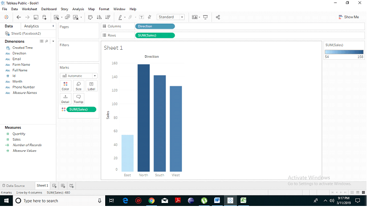 We can say that it’s continuous from light to dark. There are distinct colors and it’s not constant.
Size
We can also manage the size of them and can adjust the volume manually. We can click on the below-given icon and drag it. Hence, we can increase or decrease the size of the bars.
We can say that it’s continuous from light to dark. There are distinct colors and it’s not constant.
Size
We can also manage the size of them and can adjust the volume manually. We can click on the below-given icon and drag it. Hence, we can increase or decrease the size of the bars.
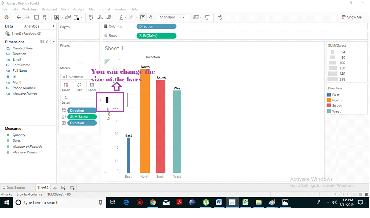 But if we want the size to be based on something else, then we have to choose a measure for the size. We can also wider our bars based on sales, and we need to drag sales on to size.
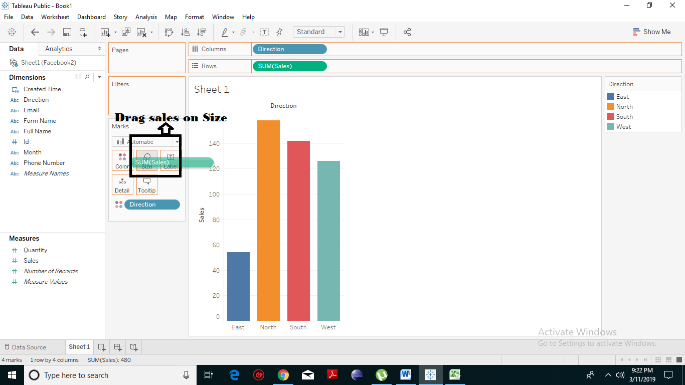 In the given picture, we can clearly see that the bars get more significant and have adapted their sizes according to their values.
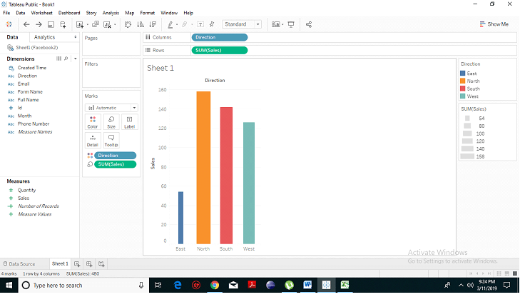 Label
The label indicates the total values on the bars. Let’s drag the sales on the label.
Label
The label indicates the total values on the bars. Let’s drag the sales on the label.
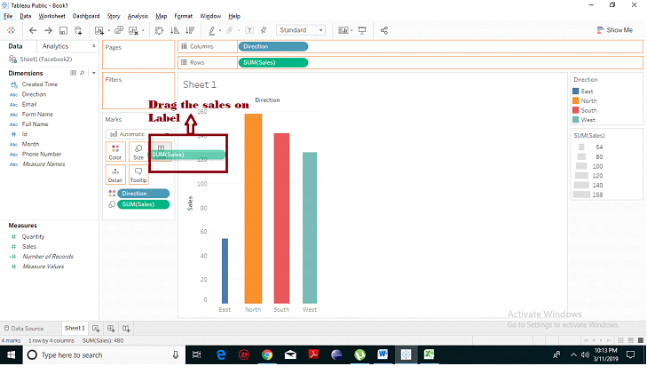 In the given-below picture, we can see the exact sales number for each dimension.
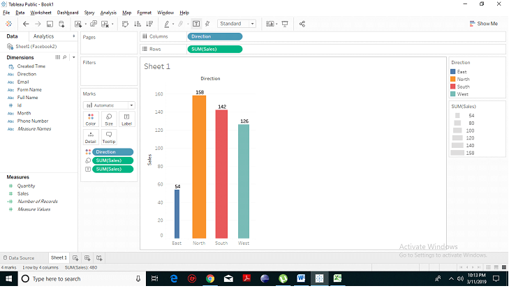 If we want the name of the dimension as, we will drag dimension on the label and we can see sales for the east, west, north and south dimension.
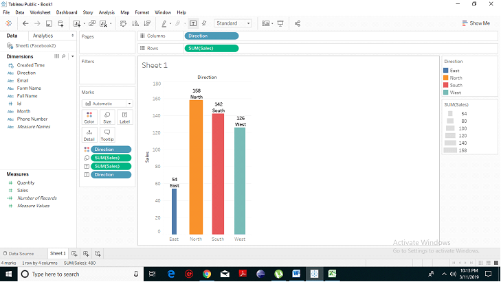 Detail
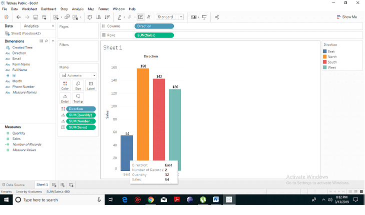
 briefs you about your bars. When you hover on any of the bars, it will show you the complete detail about that particular one.
Firstly drag the measure or dimension whose detail you want to show.
Detail
Detail briefs you about your bars. When you hover on any of the bars, it will show you the complete detail about that particular one.
Firstly drag the measure or dimension whose detail you want to show.
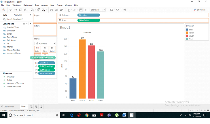 Now, hover on any bar, a box will appear showing all the details.
 Tooltip
When we click on tooltip, it will show you what’s going to happen.
Tooltip
When we click on tooltip, it will show you what’s going to happen.
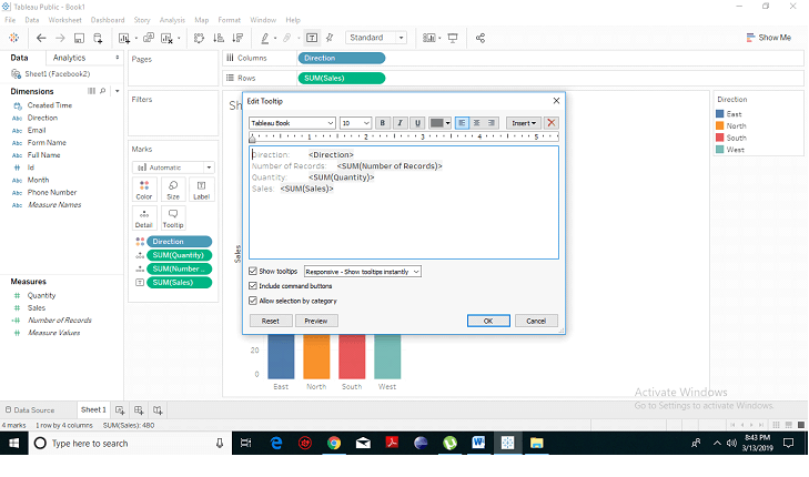 Hence, the Marks provide immense features including colors, size, labels, and field choices to enhance and beautify our data and information and to represent it in a presentable form.
A drop-down menu will appear listing all the fields unlike line, area, square, circle, shape, text, etc. as stated below.
Choose any field according to your preference and choices. Suppose, we choose Square field. Then the bar with get changed with that of a square field.
Color
When you use colors, your graphs or your analysis is much better as compared to without colors. You can work on the color of the above bars, graphs, and charts. To create the colors follow the following steps:
Click on a color. You will get a wide range of colors option. You can select any of them.
After selecting you will see that the color of the bars has changed.
That’s how you can determine the color, but if you want something else to identify, you can take dimension or any other field and drag it on to the color and now you have one tone per region.
Similarly, if we want them to be a different color based on sales, then, we have drag sales onto the shade. From the given-below picture, you have evaluate that the color has become darker where there’s higher sales and lighter where there are lower sales.
We can say that it’s continuous from light to dark. There are distinct colors and it’s not constant.
Size
We can also manage the size of them and can adjust the volume manually. We can click on the below-given icon and drag it. Hence, we can increase or decrease the size of the bars.
But if we want the size to be based on something else, then we have to choose a measure for the size. We can also wider our bars based on sales, and we need to drag sales on to size.
In the given picture, we can clearly see that the bars get more significant and have adapted their sizes according to their values.
Label
The label indicates the total values on the bars. Let’s drag the sales on the label.
In the given-below picture, we can see the exact sales number for each dimension.
If we want the name of the dimension as, we will drag dimension on the label and we can see sales for the east, west, north and south dimension.
Detail
Detail briefs you about your bars. When you hover on any of the bars, it will show you the complete detail about that particular one.
Firstly drag the measure or dimension whose detail you want to show.
Now, hover on any bar, a box will appear showing all the details.
Tooltip
When we click on tooltip, it will show you what’s going to happen.
Hence, the Marks provide immense features including colors, size, labels, and field choices to enhance and beautify our data and information and to represent it in a presentable form.