×

Tableau Line Chart

In a line chart, measures and dimensions are taken along the two axes of the chart area. Line Chart is used to understand the moment of the data and analysis its movement from one value to the other. In bars, we have seen that the length was the measure of communication. We can differentiate the line chart with size thick line, thin line and also with colors. The pair of values for each data becomes a point that joins to create a line which shows the disparity or connection between the selected dimensions and measures. The widespread application of a line chart is generally with time series data as it has values which are moving over time so though you can do it for almost every data, but they are usually acting as a good practice for time-series data.
Simple Line Chart

A simple line chart is very easy to create. The following steps depict the way to create a simple bar chart:
  • From the Microsoft Excel option, choose your excel file. Unlike here, we have chosen Facebook 2019 data.
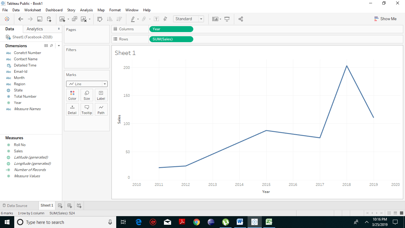
  • Now you have to select one dimension and measure. Choose the dimension, drag it (we have taken Years) to the columns shelf. And the measures (we have taken sales) to the rows shelf.
Tableau Line Chart 1
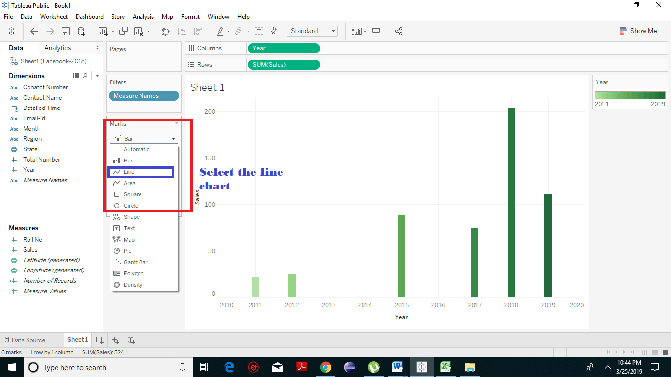
  • Under the marks card, select the line chart.
Tableau Line Chart 2
  • You will get the resulting line chart, which shows the variation of Sales over distinct years.
Tableau Line Chart 3
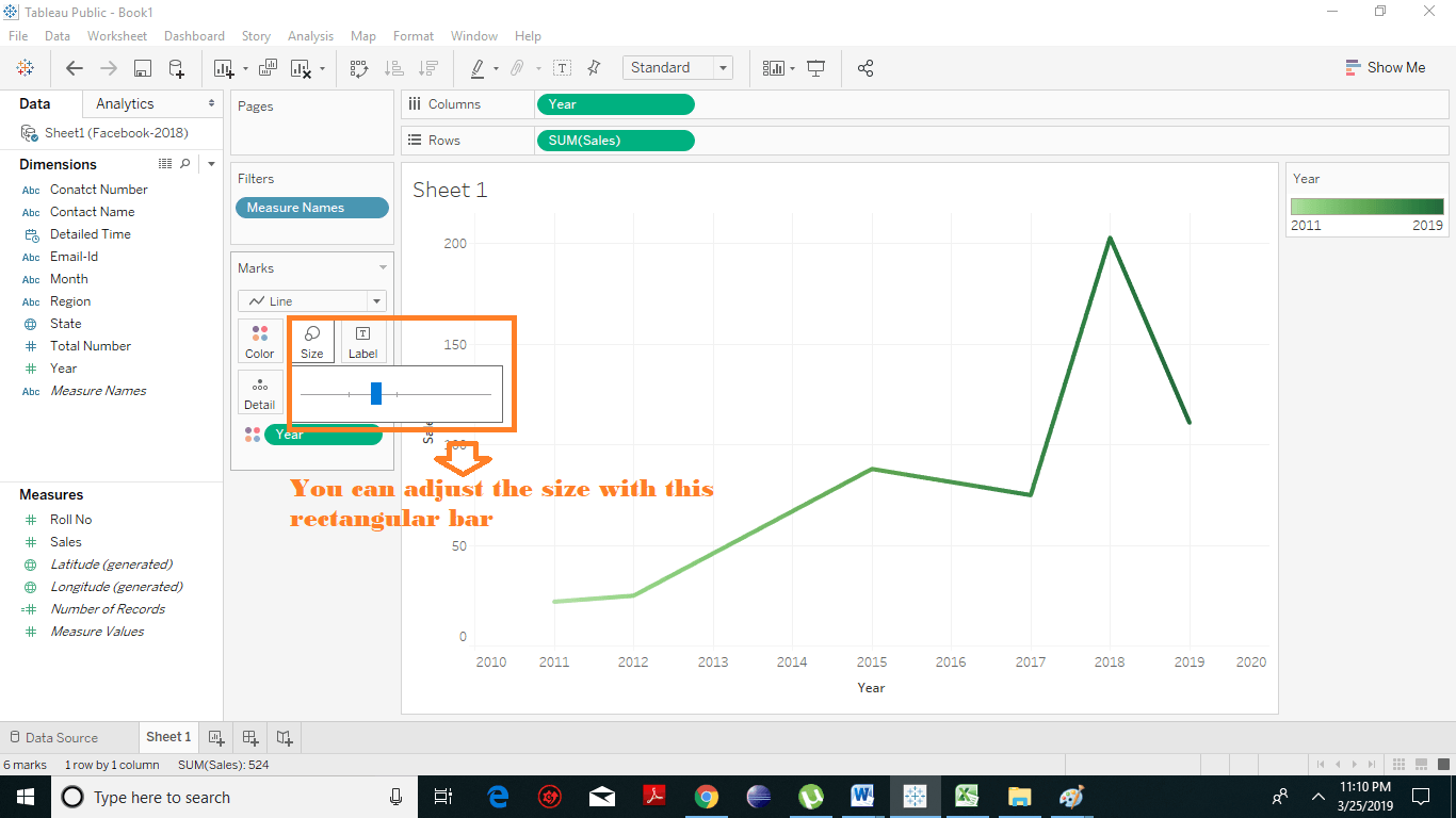
  • You can also manage the size and thickness of the line chart by selecting the size option under the marks card.
Tableau Line Chart 4
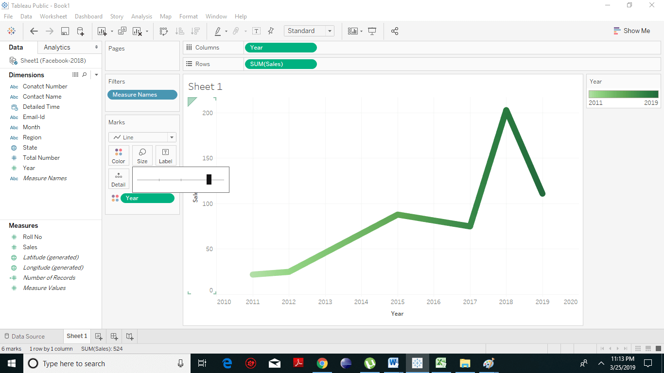
  • By dragging the rectangular bar left or right, you can increase or decrease the thickness of your line. In the resulting screenshot, we have dragged it to its right in order to increase its thickness.
Tableau Line Chart 5

Multiple Line Charts

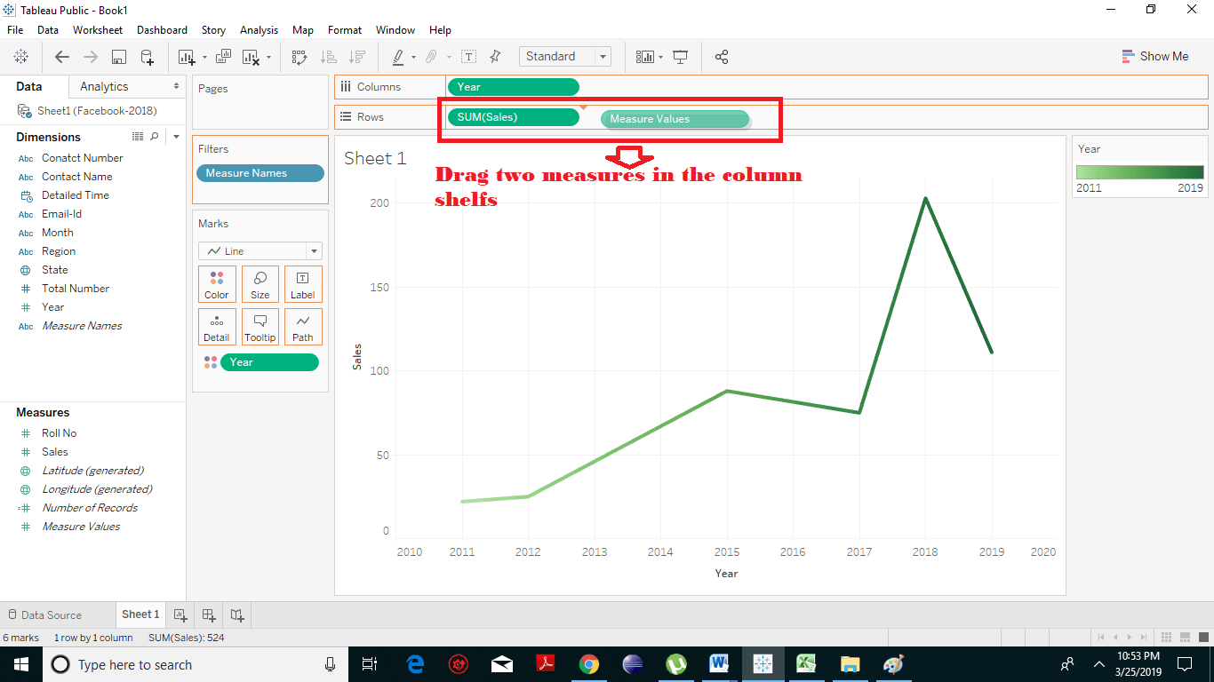
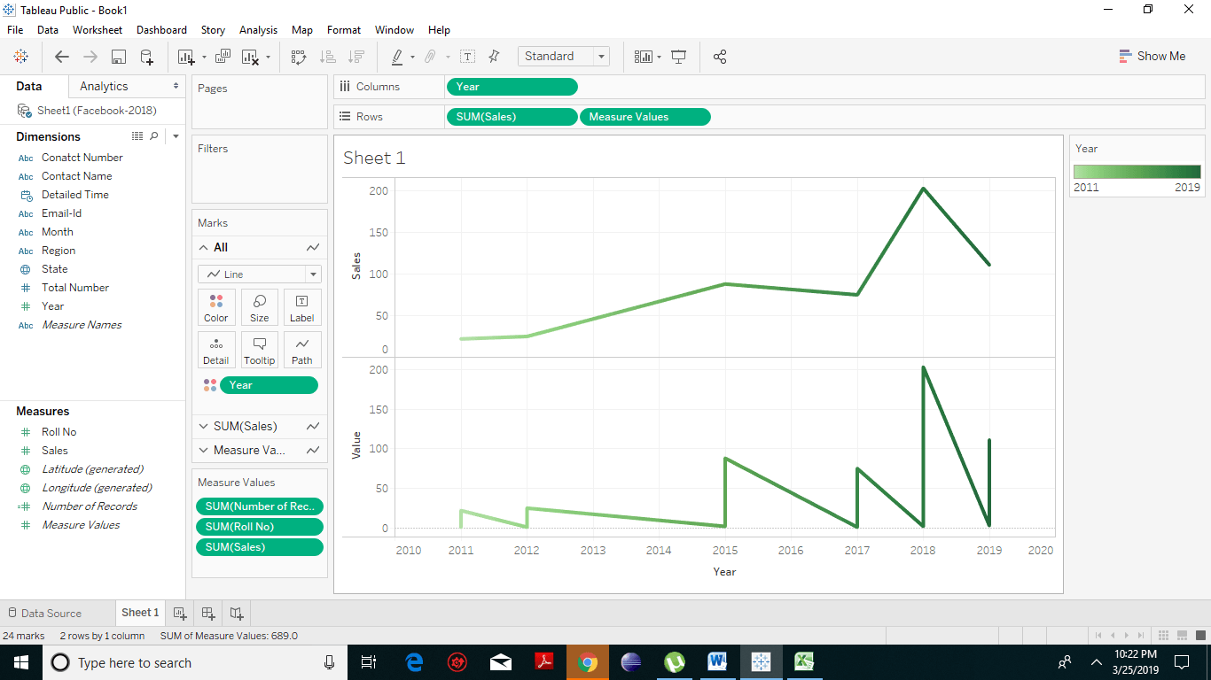
Tableau allows you to add other measures on the rows shelf to generate multiple line chart on the same sheet pane. Drag one dimension to columns shelf and two or more measures on the rows shelf. Tableau Line Chart 6 This will produce two line charts, each in one pane as shown in the resulting screenshot. Each pane represents the distinction of the dimension with one of the specified measures. Tableau Line Chart 7
Line Chart with Distinct Paths

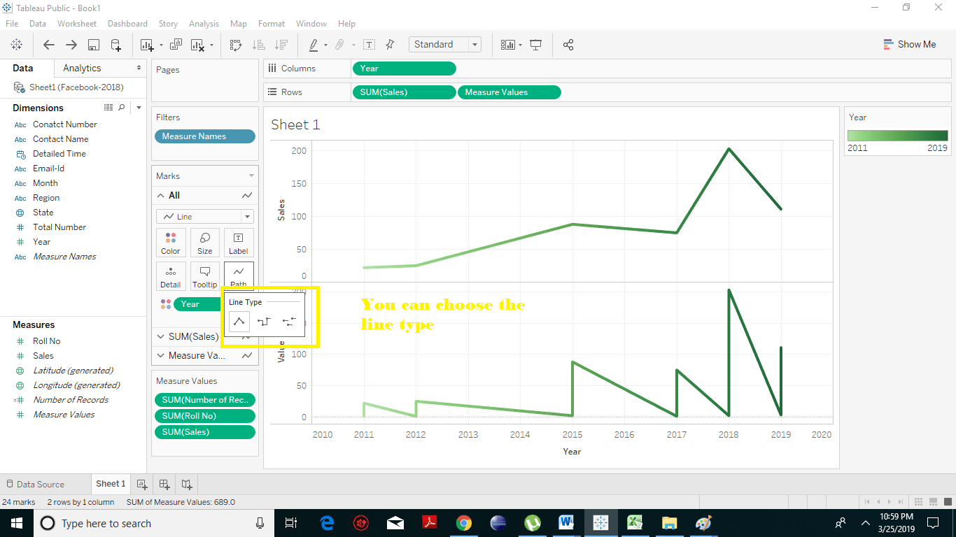
In Tableau, under marks card, there is a Path option which allows you to choose your Line path. It supports the following three Line Type paths. Tableau Line Chart 8
  1. Linear Line Path
It is the straight line which is formed by joining the two points as shown above.
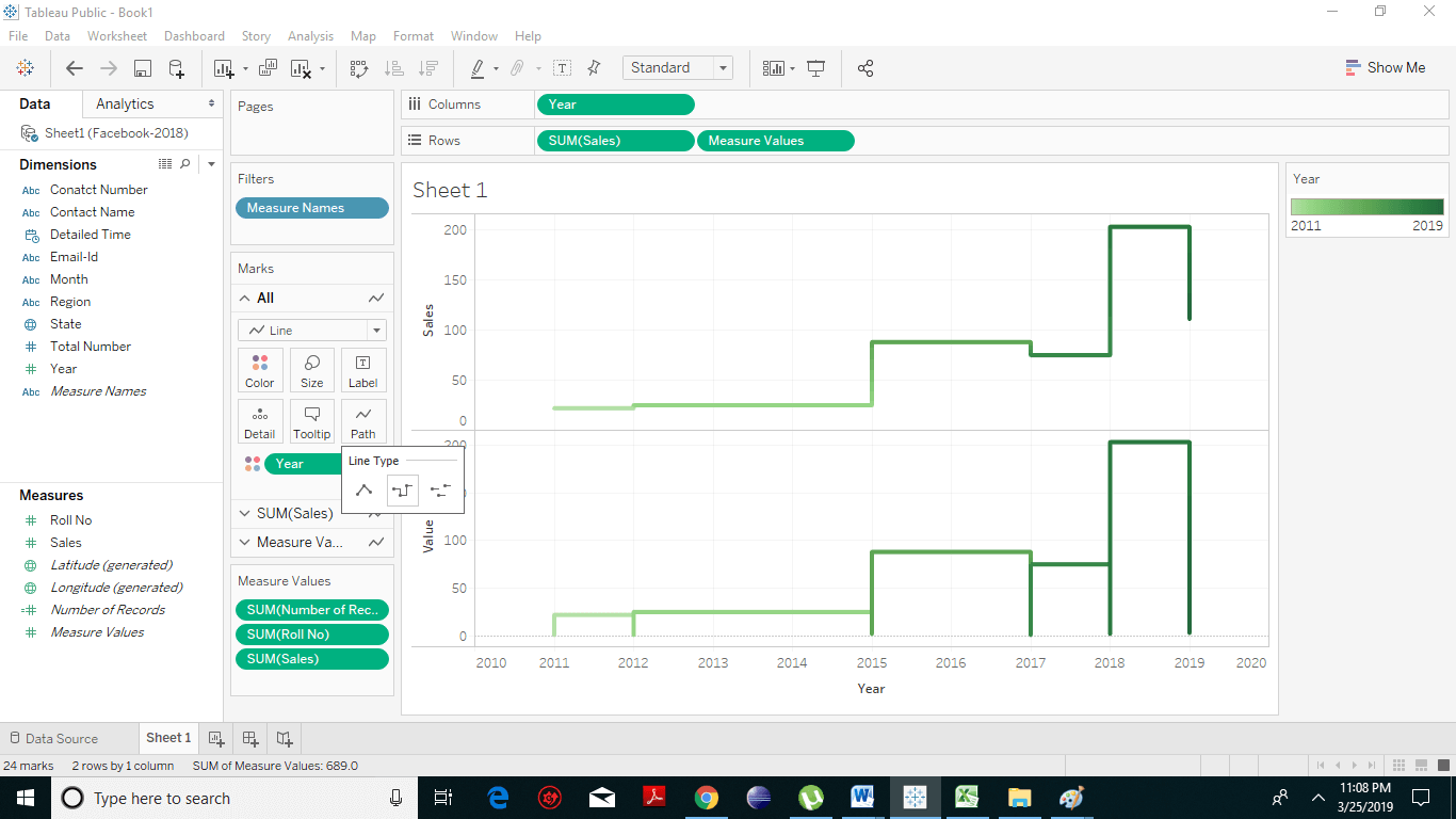
  1. Step Line Path
In this, the line path will be represented in steps as shown in the following screenshot. Tableau Line Chart 9
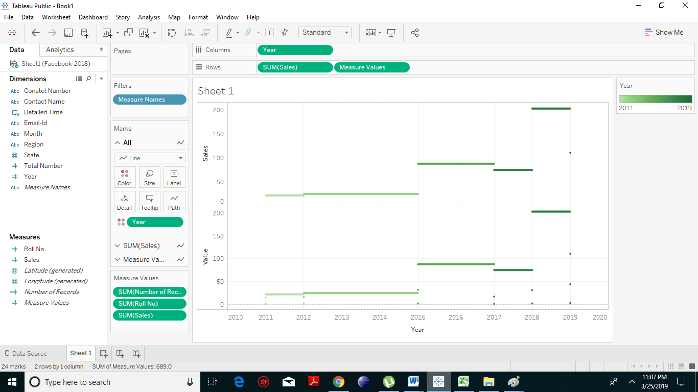
  1. Jump Line Path
In line path, we have horizontal nuclear lines which are segregated from each other. Tableau Line Chart 10

Related Topics

Tableau Numeric Calculations

Introduction to Tableau Numeric Calculations In Tableau, the Numeric calculations are done by using an extensive range of inbuilt functions available in the formula editor. Numeric calculations allow you to perform...

2 minutes read.

Tableau Line Chart

In a line chart, measures and dimensions are taken along the two axes of the chart area. Line Chart is used to understand the moment of the data and analysis...

2 minutes read.

Tableau Bubble Chart

How to Create Tableau Bubble Chart? A bubble chart is a kind of chart that displays the three dimensions of data as a cluster of circles. It is considered as a...

2 minutes read.

Tableau String Functions

Tableau Calculation string functions with Examples Tableau has many inbuilt string functions, which allow you to manipulate string data. They are used to for comparing, concatenating and for replacing few characters...

2 minutes read.

Tableau TreeMap

The treemap is a kind of chart that displays the data in nested rectangles and provides simple data visualization. In a treemap, the values of the dimension describe the structure...

2 minutes read.

Tableau Opening Page

Let’s have a look at the content of the tableau opening page: Step: 1 On your left you have the different things and you can connect to it. This is more...

1 minute read.

Tableau Filter Introduction

Filtering is an essential aspect of analyzing data. It is the process of eliminating values from a range of result set. Tableau provides a filtering feature to filter data from...

2 minutes read.

Tableau Histogram Chart

Histogram chart in Tableau A histogram is a chart that represents the accurate distribution of numerical data. A histogram represents the actual frequencies of values of a variable bucketed into ranges....

2 minutes read.

Tableau Server Architecture Components

Tableau Architecture Explanation Tableau provides a scalable solution for the delivery and creation of web, mobile and desktop analytics. Tableau Server is an analytics platform that is used to level up thousands...

2 minutes read.

Tableau Pie Chart

A pie chart is a type of graph in which a circle is divided into sectors to represent the data with different sizes and colors. In Tableau, the slices of...

1 minute read.

Tableau Bump Chart Tutorial

How to Create Tableau Bump Chart? A Bump Chart shows a comparison between two dimensions using a measure of your choice. It is a line chart which is used when we...

2 minutes read.

Tableau Data Sources Excel

Tableau- Data Sources Tableau software connects to all types of popular data sources. It can link to text files, excel files, PDF files, etc. Tableau has the ability to connect to...

2 minutes read.

How to download and install tableau setup for free?

Tableau Environmental setup In this section, we will learn how to download and install tableau for free. After downloading tableau setup, the installation is a very easy process. The following steps and screenshots...

1 minute read.

Tableau file Extensions

Tableau data file Extensions The output of Tableau’s data analysis can be saved in different formats, which further can be distributed on different platforms. The various forms are reflected as different...

2 minutes read.

Tableau Dimensions and Measures

How to Use Tableau Dimensions and Measures? Tableau is very built on the premises of drag and drops so let’s developed a simple visualization and talk about what each of these...

3 minutes read.

Tableau Filter card

Tableau add Filter Card to Dashboard Tableau provides a very significant feature of filtering of data for the ease of data analysis. Tableau allows the filtering of data of the fields,...

3 minutes read.

Tableau Waterfall Chart

How to Create Tableau Waterfall Chart? The waterfall chart is a type of chart that effectively displays how an initial value is incremented and decremented by a series of intermediate values,...

2 minutes read.

Tableau Operator

Operator in Tableau An operator is referred to as a symbol that often tells the compiler to execute certain mathematical or logical operations. Tableau accepts the same operators which are used...

4 minutes read.

Tableau Box Plot

How to Create Tableau Box Plot? The box plot is the type of chart that shows the distribution of values along an axis. It is also known as a box-and-whisker plot....

2 minutes read.

Tableau Tutorial

Introduction to Tableau: Intellectual, strategic, smart and real-time decision making is a must for the development of any organization. Previous years, all those decisions made by revising, analyzing documented reports...

9 minutes read.