
×

Tableau Waterfall Chart

How to Create Tableau Waterfall Chart?

The waterfall chart is a type of chart that effectively displays how an initial value is incremented and decremented by a series of intermediate values, leading to a final value. It shows how you arrived at a net value (from where your initial value starts and ends) and how it gets there incrementally. One Dimension and Measure is needed to create a Waterfall chart. So, we can see both the size of changes and difference in costs between consecutive data points. The waterfall chart is an evolved form of the Gantt Chart. Creating a Waterfall Chart To create a simple Motion Chart, the following are the steps:
  • Open the Tableau Desktop and connect to your data source.
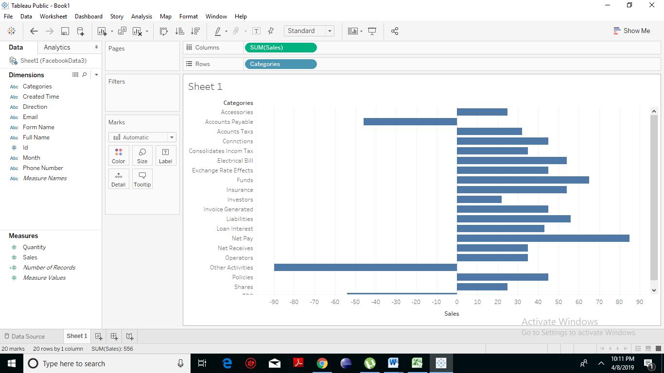
  • Drag and drop the Dimension Category to the Columns shelf and Measure (we have taken Sales) to the Rows shelf. You will see the simple bar chart.
Creating a Waterfall Chart 1
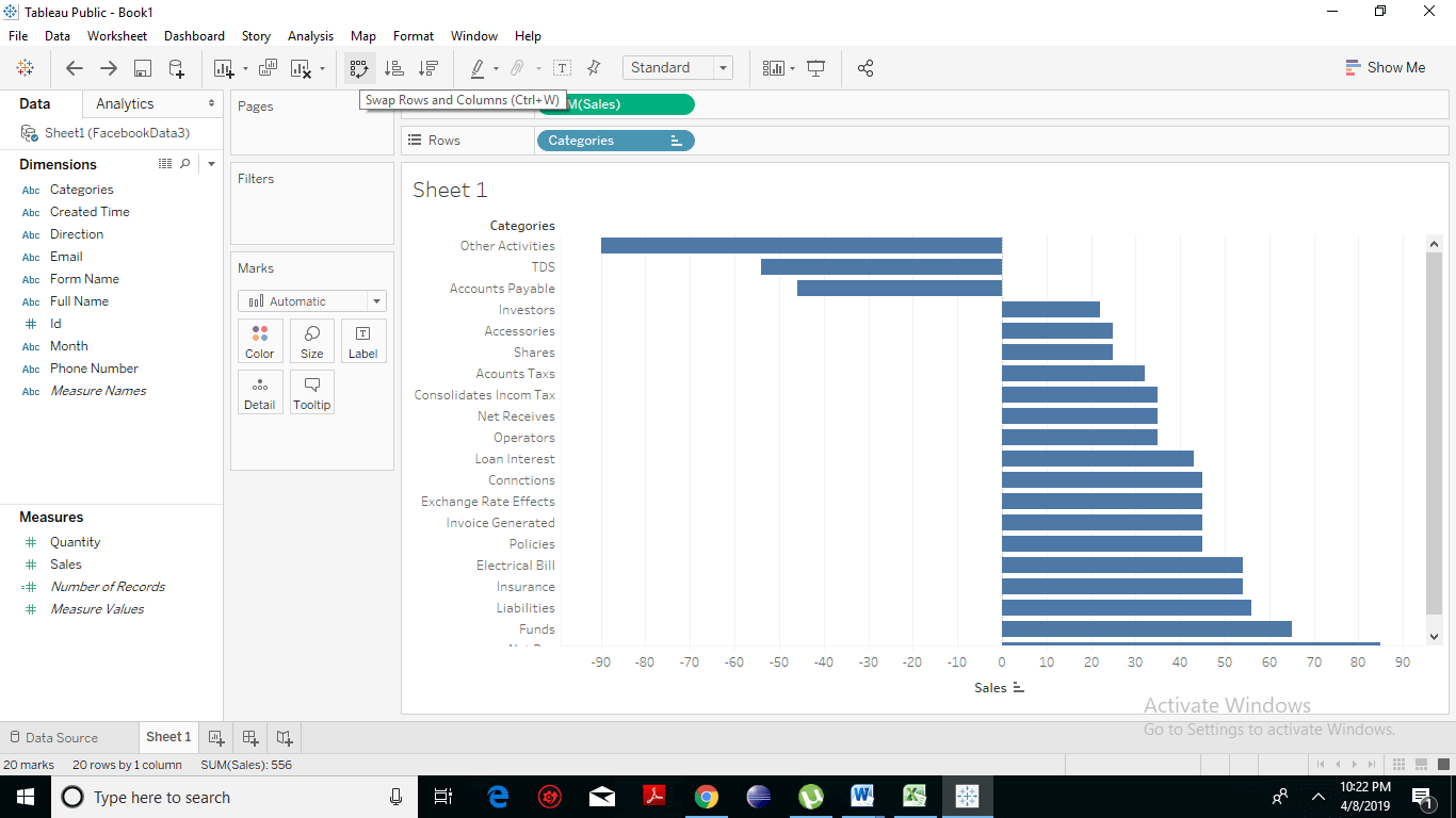
  • You can swap or change the order of the rows and column by clicking on the icon present in the middle of the vertical axis. It also shows the naming when you linger the mouse over it.
Creating a Waterfall Chart 2
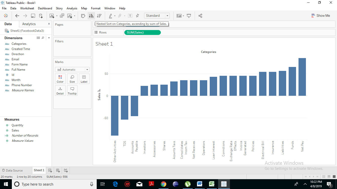
  • Sort the data in any order of sales value. Here we have sorted in the ascending order. The following chart appears.
Creating a Waterfall Chart 3
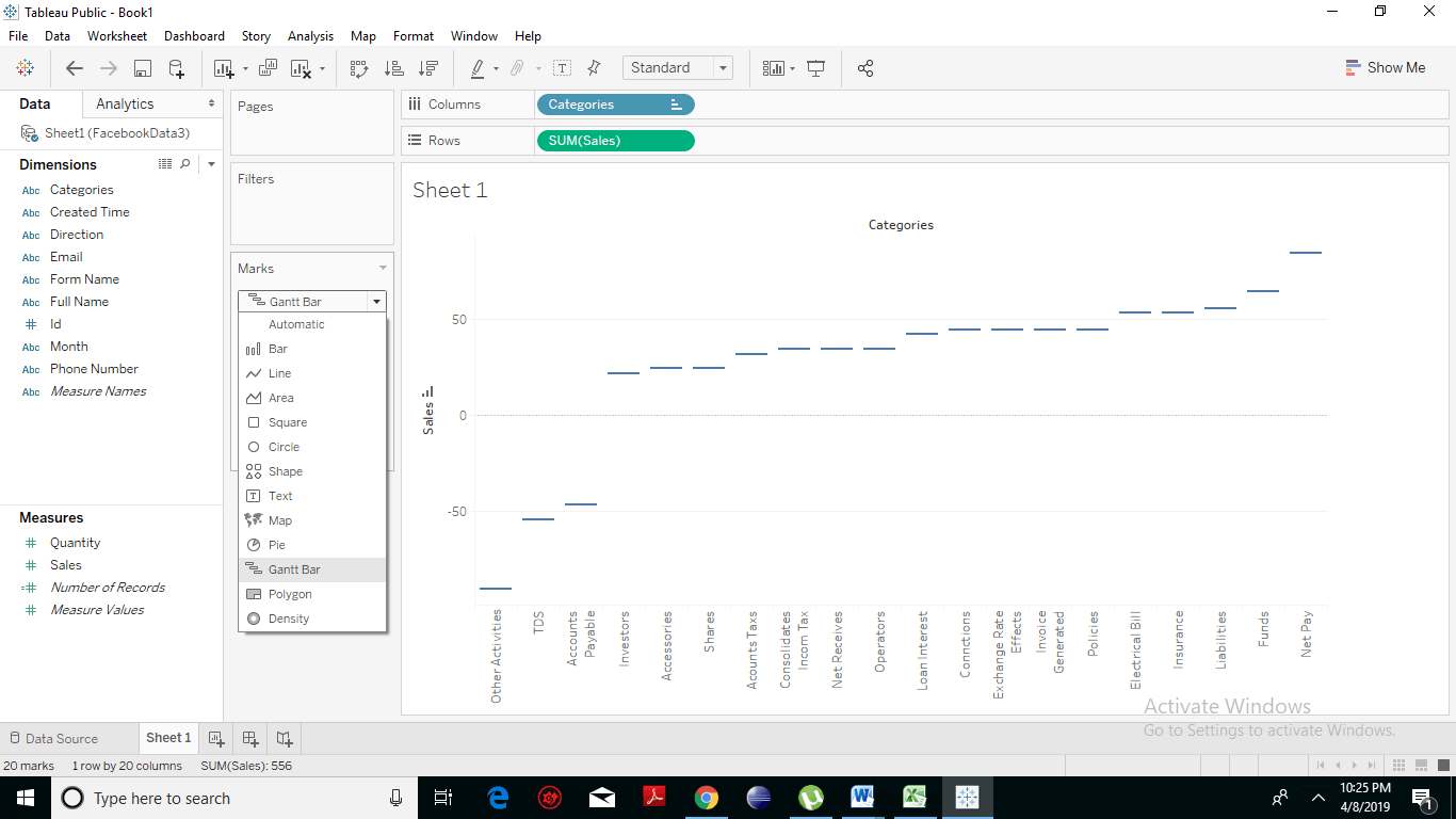
  • Under the marks tab, change the chart type to Gantt Bar. The following chart appears.
Creating a Waterfall Chart 4
  • Drag and drop the sales measure in the size option under marks cards. The chart below changes to produce the following chart which is a Waterfall chart.
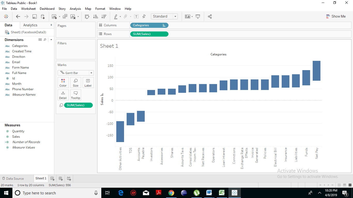
Creating a Waterfall Chart 5
  • Create a calculated field named negative sales. Click on Analysis -> Create Calculated Field.
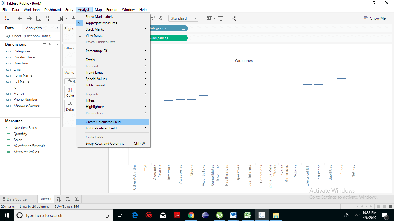
Creating a Waterfall Chart 6
  • A drop box will appear to change the name to negative sales. And in the central box write –[sales]. Click on Ok.
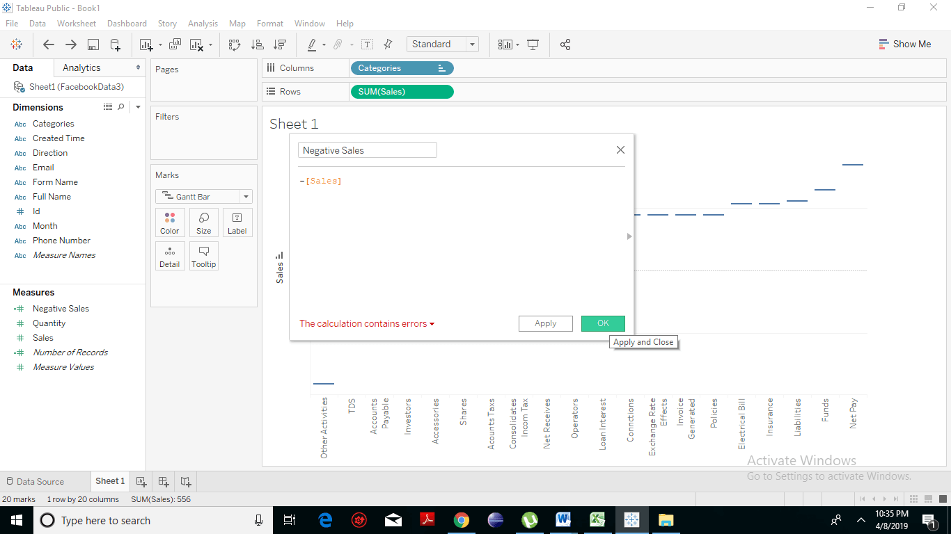
Creating a Waterfall Chart 7
  • Drag the newly created calculated field negative sales to the size shelf under Marks Card. The chart below now changes to produce the following Waterfall chart.
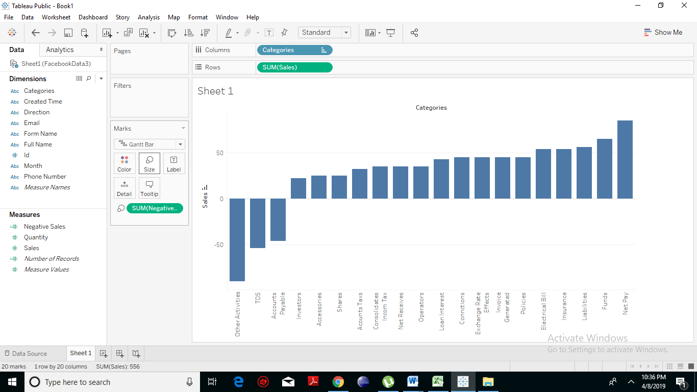
Creating a Waterfall Chart 8

Waterfall Chart with Color

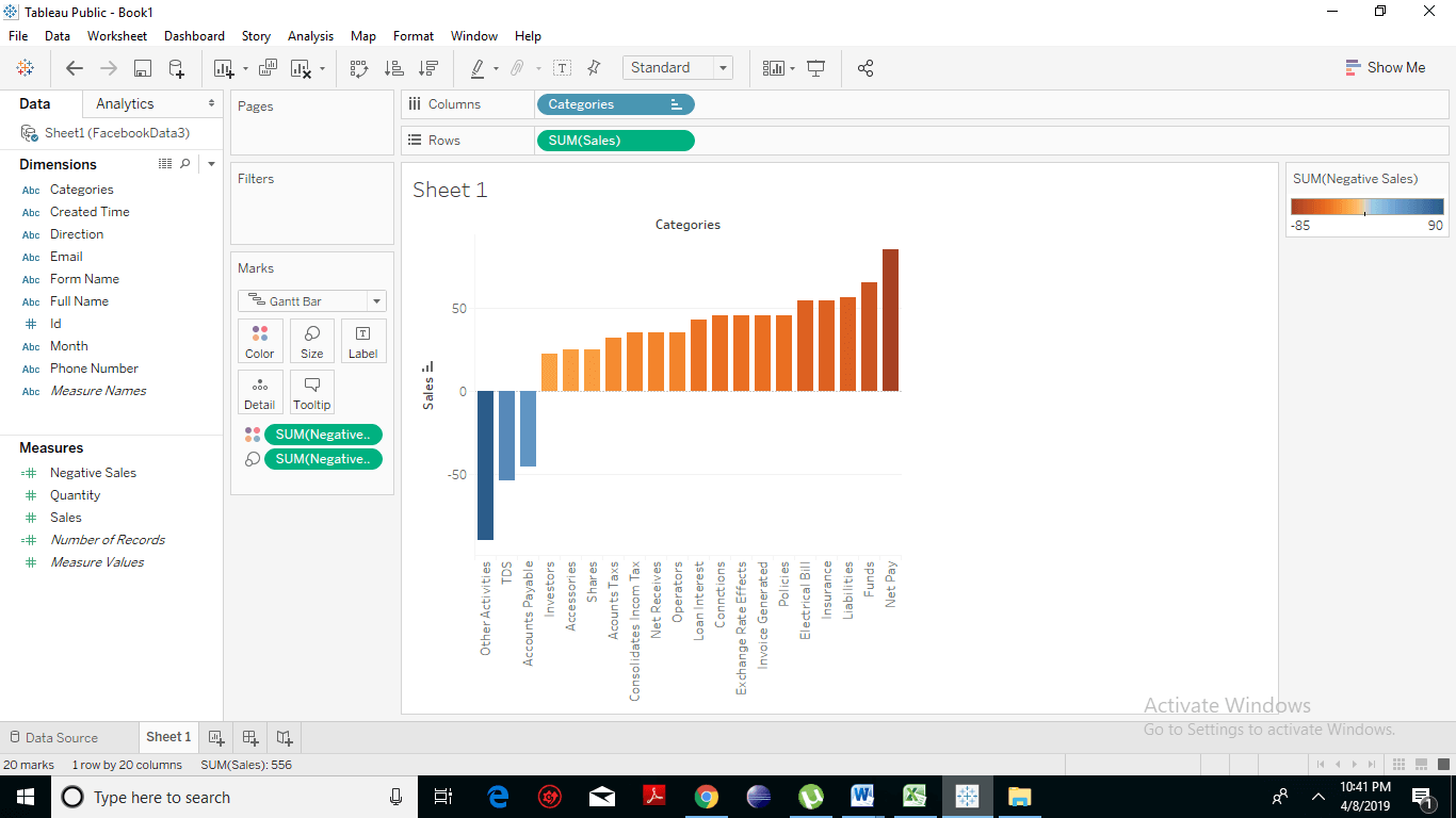
We can even give different color gradients to the bars to make it look more attractive. For this, drag the Sales measure to the Color shelf under the Marks Card. By default, positive value changes are indicated by an orange color and negative value changes by a blue color. If you want, you can also specify another coloring according to your choice.  You get the given below waterfall chart with a different color. Creating a Waterfall Chart 9
Waterfall Chart with Label

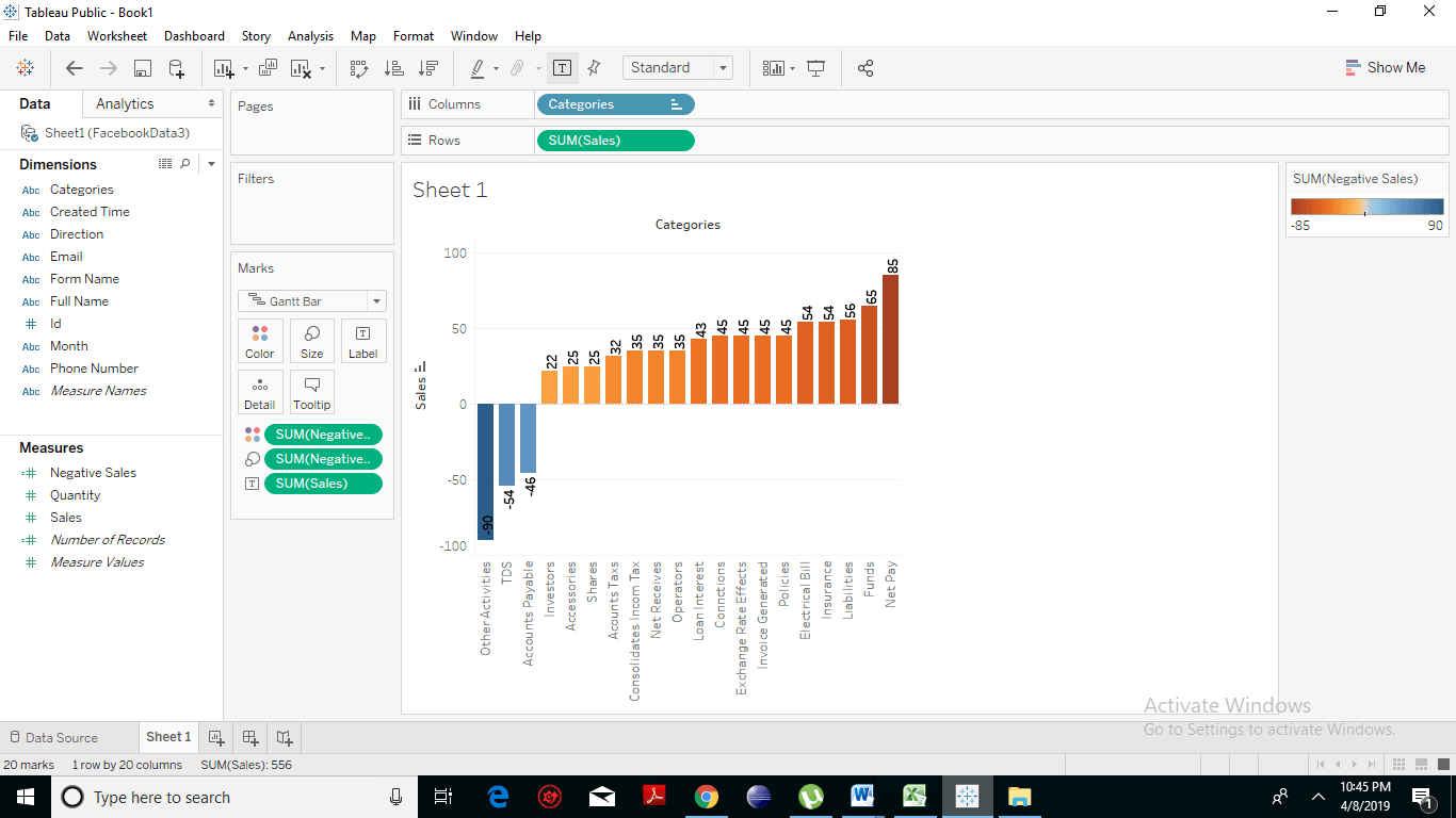
We can show the detailed value of sales on the top of the bars. For this, drag the Sales measure to the Label shelf under the Marks Card.  You can get the given below waterfall chart with the specific label. Creating a Waterfall Chart 10
Related Topics

Application of Tableau

Tableau is a powerful data visualization tool used in the Business Intelligence Industry. It is used for many online training modules and data sets relevant to business or marketing. Tableau...

2 minutes read.

Tableau Histogram Chart

Histogram chart in Tableau A histogram is a chart that represents the accurate distribution of numerical data. A histogram represents the actual frequencies of values of a variable bucketed into ranges....

2 minutes read.

Tableau Bullet Chart

How to Create Tableau Bullet Chart? A bullet chart is a type of chart that is used to compare the value of one measure with another measure. It is a variation...

2 minutes read.

Tableau Products Comparison

Tableau Products Explained In this tutorial, you will have a look at an overview of the products offered by the tableau: Tableau Desktop So we have a tableau desktop, which is where...

1 minute read.

Tableau Crosstab Chart

How to Create Tableau Crosstab Chart? A crosstab chart also knows as Text table. It is a type of chart which shows the data in a textual form. One or more...

1 minute read.

Tableau Bump Chart Tutorial

How to Create Tableau Bump Chart? A Bump Chart shows a comparison between two dimensions using a measure of your choice. It is a line chart which is used when we...

2 minutes read.

Tableau Data Terminology

Learn Tableau Data Terminology Tableau Tool drives a lot of visualizations. It is one of the dominant components for Data Analysis. It has many exclusive terms and descriptions. One needs to get...

4 minutes read.

Tableau Marks

Tableau Marks Tableau is an excellent tool to depict your data in the most attractive way. There is a particular part of the tableau workspace that’s specific to Mark’s called the...

3 minutes read.

Tableau Dimensions and Measures

How to Use Tableau Dimensions and Measures? Tableau is very built on the premises of drag and drops so let’s developed a simple visualization and talk about what each of these...

3 minutes read.

Tableau Visualization

Data Visualization Using Tableau In this chapter, we will learn about visualization. We will come across and click the ‘Sheet’ which is where you start to build our visualization. Let’s take a look...

5 minutes read.

Advantages and Disadvantages of Tableau

Advantages of Tableau Speed In the early stages, the Tableau software becomes popular because of its momentum with which it can analyze hundreds or even millions of rows and also gives...

3 minutes read.

Tableau Opening Page

Let’s have a look at the content of the tableau opening page: Step: 1 On your left you have the different things and you can connect to it. This is more...

1 minute read.

Tableau LOD Expressions

LOD Expressions LOD or Level of Detail expressions computes values at the data source and the visualization level instead of bringing all the data to the Tableau interface. However, LOD expressions...

3 minutes read.

Introduction to Tableau

 What is Business Intelligence? Companies use business intelligence technologies to collect, analyze and present data to create actionable information. Today’s businesses are always seeking insights about their customers, products, and services. So...

3 minutes read.

Tableau Server Architecture Components

Tableau Architecture Explanation Tableau provides a scalable solution for the delivery and creation of web, mobile and desktop analytics. Tableau Server is an analytics platform that is used to level up thousands...

2 minutes read.

Tableau file Extensions

Tableau data file Extensions The output of Tableau’s data analysis can be saved in different formats, which further can be distributed on different platforms. The various forms are reflected as different...

2 minutes read.

Tableau Filter card

Tableau add Filter Card to Dashboard Tableau provides a very significant feature of filtering of data for the ease of data analysis. Tableau allows the filtering of data of the fields,...

3 minutes read.

Tableau Filter Introduction

Filtering is an essential aspect of analyzing data. It is the process of eliminating values from a range of result set. Tableau provides a filtering feature to filter data from...

2 minutes read.

Tableau Gantt Chart

How to create a Gantt Chart in Tableau A Gantt chart is a type of chart that shows the development and duration of the event or resource over a period of...

2 minutes read.

Tableau Data Blending

Introduction to Tableau Data Blending Data Blending is a very advantageous feature in Tableau. Data blending is referred to as a technique where on a single worksheet, the data is blended...

3 minutes read.