
×

Tableau Gantt Chart

How to create a Gantt Chart in Tableau

A Gantt chart is a type of chart that shows the development and duration of the event or resource over a period of time. Gantt chart is used to display average delivery time for a range of products in project management and other kinds of variation study over a period of time. One or more dimension with a measure in addition to the time dimension is needed to create a Gantt Chart. Thus, in the Gantt chart, the time dimension is an essential field.

Creating a Gantt Chart

To create a simple Motion Chart, the following steps are used:
  • Open the Tableau Desktop and connect to your data source.
  • Drag and drop your dimension ‘created date’ to the Columns shelf and your measure ‘Number of Records’ to the Rows shelf.
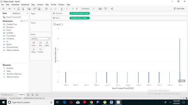
Drag and drop your dimension
  • Next, select the Gantt chart from the drop-down list under the marks cards.
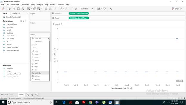
select the Gantt chart from the drop-down
  • Drag and drop the measure field ‘Number of Records’ to the size shelf. You will notice that the resulting Gantt chart as shown in the following screenshot.
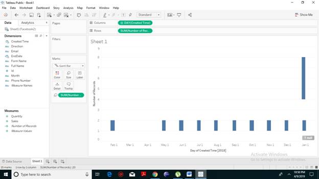
Drag and drop the measure field
  • We will create a calculated field named ‘EndDate’. Click on Analysis -> Create Calculated Field.
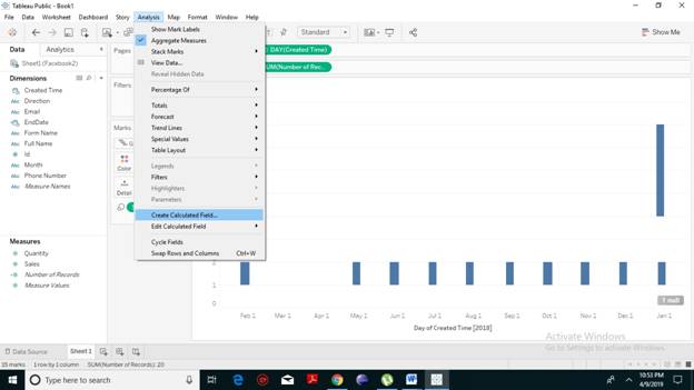
create a calculated field named ‘EndDate
  • A drop box will appear. In the below field, we will write the calculation shown in the following screenshot. We will use DateAdd function to add a day write the ‘Number of Records’ which is essentially required. Also, we will add ‘created time’. Click on Ok.
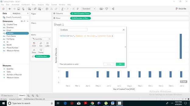
write the calculation shown in the following screenshot
  • You will notice that n dimension has been created with the name ‘EndDate’. Drag the EndDate dimension to the Label shelf present under the marks card. You will have the values as shown in the following screenshot.
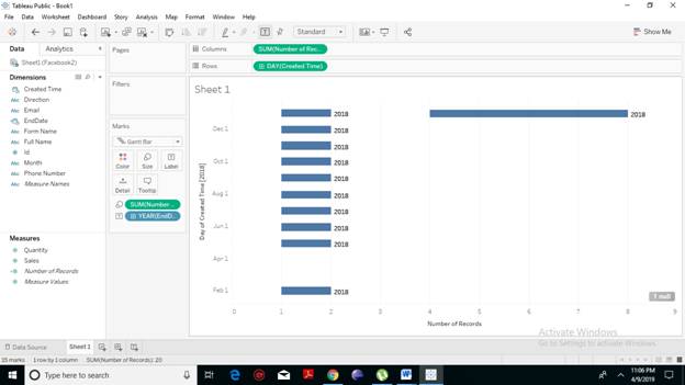
created with the name ‘EndDate’

Color Variation in Gantt Chart

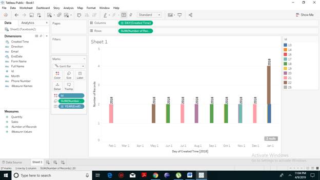
We can even give different color gradients to the bars to make it look more attractive. Colors also show the difference and highlight those differences in the bars. We can drag the dimension ‘ID’ to color our Gantt bar to make it visually more attractive. You get the below Gantt chart with a different color. Color Variation in Gantt Chart  
Related Topics

Tableau Motion Chart

Motion charts are a type of chart that allows you to visualize in action displaying the changes of your data over time by indicating the movement of data points within...

2 minutes read.

Tableau Line Chart

In a line chart, measures and dimensions are taken along the two axes of the chart area. Line Chart is used to understand the moment of the data and analysis...

2 minutes read.

Tableau Data Blending

Introduction to Tableau Data Blending Data Blending is a very advantageous feature in Tableau. Data blending is referred to as a technique where on a single worksheet, the data is blended...

3 minutes read.

Tableau Opening Page

Let’s have a look at the content of the tableau opening page: Step: 1 On your left you have the different things and you can connect to it. This is more...

1 minute read.

Introduction to Tableau

 What is Business Intelligence? Companies use business intelligence technologies to collect, analyze and present data to create actionable information. Today’s businesses are always seeking insights about their customers, products, and services. So...

3 minutes read.

Tableau Data Terminology

Learn Tableau Data Terminology Tableau Tool drives a lot of visualizations. It is one of the dominant components for Data Analysis. It has many exclusive terms and descriptions. One needs to get...

4 minutes read.

Tableau Filter card

Tableau add Filter Card to Dashboard Tableau provides a very significant feature of filtering of data for the ease of data analysis. Tableau allows the filtering of data of the fields,...

3 minutes read.

Tableau Histogram Chart

Histogram chart in Tableau A histogram is a chart that represents the accurate distribution of numerical data. A histogram represents the actual frequencies of values of a variable bucketed into ranges....

2 minutes read.

Tableau Gantt Chart

How to create a Gantt Chart in Tableau A Gantt chart is a type of chart that shows the development and duration of the event or resource over a period of...

2 minutes read.

Advantages and Disadvantages of Tableau

Advantages of Tableau Speed In the early stages, the Tableau software becomes popular because of its momentum with which it can analyze hundreds or even millions of rows and also gives...

3 minutes read.

How to download and install tableau setup for free?

Tableau Environmental setup In this section, we will learn how to download and install tableau for free. After downloading tableau setup, the installation is a very easy process. The following steps and screenshots...

1 minute read.

Tableau String Functions

Tableau Calculation string functions with Examples Tableau has many inbuilt string functions, which allow you to manipulate string data. They are used to for comparing, concatenating and for replacing few characters...

2 minutes read.

Tableau Date Functions

Tableau Date Functions with Examples Dates are crucial fields which are widely used in data analysis. Hence, Tableau provides a large number of inbuilt date functions that allows you to manipulate...

2 minutes read.

Tableau Tutorial

Introduction to Tableau: Intellectual, strategic, smart and real-time decision making is a must for the development of any organization. Previous years, all those decisions made by revising, analyzing documented reports...

9 minutes read.

Application of Tableau

Tableau is a powerful data visualization tool used in the Business Intelligence Industry. It is used for many online training modules and data sets relevant to business or marketing. Tableau...

2 minutes read.

Tableau Dimensions and Measures

How to Use Tableau Dimensions and Measures? Tableau is very built on the premises of drag and drops so let’s developed a simple visualization and talk about what each of these...

3 minutes read.

Tableau Scatter Plot

Tableau Scatter plot with Dimensions The scatter plot represents the data in which many points are scattered in the Cartesian plane according to the given figures. It is generated by plotting...

2 minutes read.

Tableau LOD Expressions

LOD Expressions LOD or Level of Detail expressions computes values at the data source and the visualization level instead of bringing all the data to the Tableau interface. However, LOD expressions...

3 minutes read.

Tableau Operator

Operator in Tableau An operator is referred to as a symbol that often tells the compiler to execute certain mathematical or logical operations. Tableau accepts the same operators which are used...

4 minutes read.

Tableau Products Comparison

Tableau Products Explained In this tutorial, you will have a look at an overview of the products offered by the tableau: Tableau Desktop So we have a tableau desktop, which is where...

1 minute read.