How to change font size in CSS
How to change font size in CSS?
Font Size: -
Users may attract attention to content on a website page in various ways. One element in a sentence can be highlighted. You could, for example, make it orange. It might be bolded or underlined.
One can also vary the font and size of content to draw the reader's eye and generate a visual hierarchy in addition to these formatting options.
We don't have to use HTML headings to modify the size of the text on the website. Let's imagine we wish to adjust the size of the text of other items on the page or downsize or increase the default header sizes. In that situation, you can use CSS to modify the font size. Let's go over the steps in detail.
The font-size property determines the text's size.
In web design, the ability to control font size is crucial. Font size alterations should not be used to create sections that look like headings or headers that look like paragraphs.
Always use HTML tags for headers and paragraphs, such as h1> - h6>.
The font-size parameter can be either absolute or relative.
The type size The CSS attribute controls the font size. The font size can be specified in various methods, including using terms or numeric data for pixels or ems. Based on the requirements of the specific web page, select a suitable solution.
The font-size property provides many techniques for changing the text size on the website. The site's demands and objectives will determine each one we choose.
Absolute dimensions:
Sets the text size to a specific value.
In some browsers, the user cannot modify the text size (bad for accessibility reasons)
Whenever the basic details of the output are known, absolute size is useful.
Relative dimensions:
Sets the size concerning the items around it.
In browsers, this feature allows users to modify the font size.
Syntax: -
font-size: medium|large|x-large|xx-large|xx-small|x-small|small|;
If no font size is specified, the default size for typical text, such as paragraphs, is 16px, equivalent to 1em.
Using Absolute dimensions:
The default font size is used for absolute-size keywords. The default font size is usually medium (equating to 16 pixels or 1em), though this might vary depending on the browser and font family. The standard font size in HTML is 16 pixels.
The following are absolute-size keywords:
- xx-small
- sx-small
- ssmall
- smedium
- slarge
- sx-large
- sxx-large
- sxxx-large
Example: -
<!DOCTYPE html>
<html>
<head>
<style>
div.xxs { font-size: xx-small; }
div.xs { font-size: x-small; }
div.s { font-size: small; }
div.m { font-size: medium; }
div.l { font-size: large; }
div.xl { font-size: x-large; }
div.xxl { font-size: xx-large; }
div.xxxl { font-size: xxx-large; }
</style>
</head>
<body>
<h1>The Example of font-size Property</h1>
<div class="xxs">Showing behaviour of xx-small</div>
<div class="xs">Showing behaviour of x-small</div>
<div class="s">Showing behaviour of small</div>
<div class="m"> Showing behaviour of medium</div>
<div class="l">Showing behaviour of large</div>
<div class="xl">Showing behaviour of x-large</div>
<div class="xxl">Showing behaviour of xx-large</div>
<div class="xxxl">Showing behaviour of xxx-large</div>
</body>
</html>
Output: -
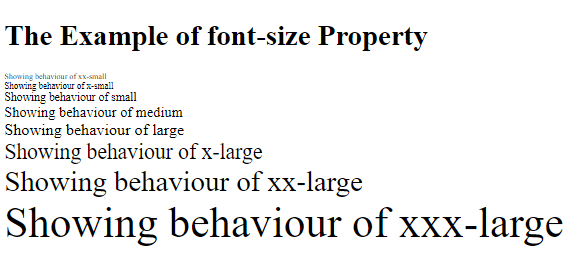
Absolute dimensions simplify resizing text and construct a font hierarchy on your page. However, not all browsers allow users to modify the text size, making this a poor choice for inclusive design.
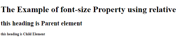
Using relative dimensions:-
The relative-size keywords make the text larger or smaller concerning the parent element's font size. The proportion of the absolute dimension is used to calculate this relative dimension
A child element with a stated relative dimension of lower will have a medium text size if the primary component has a large text size.
Example: -
<!DOCTYPE html>
<html>
<head>
<style>
.eg_relative { font-size: smaller; }
</style>
</head>
<body>
<h1>The Example of font-size Property using relative </h1>
<div style="font size: large">
  <h2>this heading is Parent element</h2>
  <h2 class="eg_relative">this heading is Child Element</h2>
</div>
</body>
</html>
Output: -
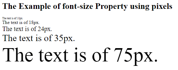
Font-size using pixels: -
Setting pixels (px) for your size value allows you to determine the font size regardless of the visitor's browser. You can give the exact number of pixels in height for which we want your text to be rendered in a browser.
Example: -
<!DOCTYPE html>
<html>
<head>
<style>
div.x { font-size: 10px; }
div.y { font-size: 18px; }
div.z { font-size: 24px; }
div.w { font-size: 35px; }
div.r { font-size: 75px; }
</style>
</head>
<body>
<h1>The Example of font-size Property using pixels </h1>
<div class="x">The text is of 10px.</div>
<div class="y">The text is of 18px.</div>
<div class="z">The text is of 24px.</div>
<div class="w">The text is of 35px.</div>
<div class="r">The text is of 75px.</div></body></html>
Output: -
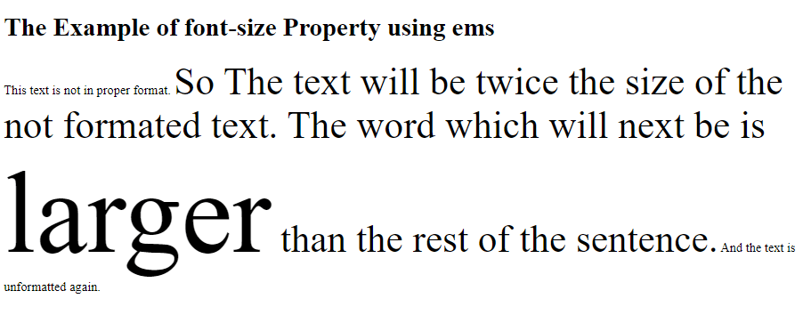
Font-size using ems: -
The em unit adjusts the font size concerning the parent element's font size. Setting content to a text size of 2em would make it twice as large as the surrounding text.
For an inclusive design, selecting text size in em units is essential. Users can alter the size of the text in all browsers because ems are a relative measurement.
The ems compound is the only disadvantage. Let's assume a 2em font size span> element contains another span> element. The size of the nested< span> element would be doubled, or 4em.
Example: -
<!DOCTYPE html>
<html>
<head>
<style>
span { font-size: 3em; }
</style>
</head>
<body>
<h1>The Example of font-size Property using ems </h1>
<div>This text is not in proper format. <span>So The text will be twice the size of the not formated text. The word which will next be is <span>larger</span> than the rest of the sentence.</span> And the text is unformatted again.</div>
</body>
</html>
Output: -