How to Set Space between the Flexbox
For managing layout on the Web, CSS Flexbox and CSS Grid are two excellent tools. Flexbox handles one-dimensional layouts quite well, whereas CSS Grid manages two-dimensional layouts with columns and rows. The items in our layout frequently need more space between them. In this article, we'll go through the CSS gap property's use, how to add space between flex objects, and the necessary browser compatibility workarounds.A single-dimensional layout called Flexbox arranges objects in one dimension at a time. The Flexbox Layout's primary function is to evenly divide space between elements in a container. Even when the item size is variable or unknown, it still functions. The CSS justify-content feature makes it simple to adjust the space between flexbox components. This excerpt will demonstrate how to accomplish so. One kind of layout paradigm is the Flexible Box Module, or Flexbox. This layout's primary goal is to evenly distribute space within a container between its contents. This design is an example of a one-dimensional arrangement. Even when the size of the elements is ambiguous or changing, the flexbox layout functions.
The gap between them can be created using the code of html and CSS. At first, we need to use the HTML code and then we should add the CSS elements to the code which helps in bringing the flexbox.
Code to set space between the Flexbox
Creating HTML code
The first step is to create a HTML code in which we build the layout, and the base will be built using this code for the webpage. All the margins and other borders are created by using this code.
In this code, three elements will be created using the div.
<html>
<head>


<title>Title of the document</title>
</head>
<body>
<h1>Space between flexbox</h1>
<h2>justify-content: space-around </h2>
<div class="flex2">
<div class="flex-items">1</div>
<div class="flex-items">2</div>
<div class="flex-items">3</div>
</div>
<h2>justify-content: space-between </h2>
<div class="flex3">
<div class="flex-items">1</div>
<div class="flex-items">2</div>
<div class="flex-items">3</div>
</div>
</body>
</html>
Now, let’s move to the next step that is the CSS part.
Creating the CSS code
In the CSS code, we need to cover all the points that are mentioned below.
- For the.flex2 element, set the justify-content property to "space-around."
- For the.flex3 element, set the justify-content property to "space between."
- For both items, set the display attribute to "flex".
- Use the margin, background-color, width, height, and other parameters to add style.
.flex {
  display: flex;
  font-size: 30px;
  text-align: center;
  background-color: #7d7d7d;
  color: #000000;
  font-weight: bold;
}


.flex2 {
  justify-content: space-around;
}


.flex3 {
  justify-content: space-between;
}


.flex-items {
  background-color: #cccaca;
  width: 90px;
  height: 60px;
  margin: 10px;
  text-align: center;
  font-size: 40px;
  line-height: 1.5;
}
Alternate way without using flex function
The other way alternate way of bringing gap between the flexbox is by using the margin function and it also allows us to set the space between them as needed. By using margin function there will be difference and it also creates some extra gap between the flexbox.
Each item's top and left margins can be customized. To balance the excessive margin on the outer child components, we employ negative margins on the flex parent element. This method will produce results like CSS gap space.
<div class="emulated-flex-gap">
<div>1</div>
<div>2</div>
<div>3</div>
<div>4</div>
<div>5</div>
<div>6</div>
</div>
.emulated-flex-gap > * {
  margin: 12px 0 0 12px;
}


.emulated-flex-gap {
  display: inline-flex;
  flex-wrap: wrap;
  margin: -12px 0 0 -12px;
  width: calc(100% + 12px);
}
Example:
<html>
<head>
<title>Title of the document</title>
<style>
      .flex {
        display: flex;
        font-size: 30px;
        text-align: center;
        background-color: #7d7d7d;
        color: #000000;
        font-weight: bold;
      }
      .flex2 {
        justify-content: space-around;
      }
      .flex3 {
        justify-content: space-between;
      }
      .flex-items {
        background-color: #cccaca;
        width: 90px;
        height: 60px;
        margin: 10px.
        text-align: center;
        font-size: 40px;
        line-height: 1.5;
      }
</style>
</head>
<body>
<h1>Space between flexbox</h1>
<h2>justify-content: space-around </h2>
<div class="flex flex2">
<div class="flex-items">1</div>
<div class="flex-items">2</div>
<div class="flex-items">3</div>
</div>
<h2>justify-content: space-between </h2>
<div class="flex flex3">
<div class="flex-items">1</div>
<div class="flex-items">2</div>
<div class="flex-items">3</div>
</div>
<br>
</body>
</html>
Output:
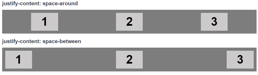
The justify-content property was used in the example with the values space-between and space-around. The elements are distributed uniformly (with space between them) along the line by using the space-between value. The start line is where the first item is, and the finish line is where the last thing is. The elements having before, between, and after spacing are shown in the space-around value.