How to create blinking text using CSS
The blinking effect is used in HTML and CSS to take the attraction towards a particular word or section. If you need such a blinking effect, we need to take the help of CSS.
CSS is the only language which is used for the creation of such type of effect without the help of JavaScript. The @keyframe rule is used for the design of such kind of blinking effect. We have to set the visibility to hidden. We are going to take the help of the extension web-kit for compatibility in all browsers.
Example 1
<!DOCTYPE html>
<html>
<head>
<title>Title of the document</title>
<style>
.blink {
animation: blink-animation 1s steps(5, start) infinite;
-webkit-animation: blink-animation 1s steps(5, start) infinite;
}
@keyframes blink-animation {
to {
visibility: hidden;
}
}
@-webkit-keyframes blink-animation {
to {
visibility: hidden;
}
}
</style>
</head>
<body>
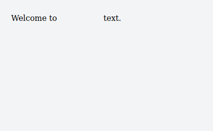
Welcome to <span class="blink">javaTpoint</span> text.
</body>
</html>
Output-
Example 2
<!DOCTYPE html>
<html>
<head>
<title>Title of the document</title>
<style>
.blink {
width: 220px;
height: 50px;
background-color: #342ab8;
padding: 10px;
text-align: center;
line-height: 50px;
}
span {
font-size: 26px;
font-family: cursive;
color: #fff;
animation: blink 2s linear infinite;
}
@keyframes blink {
0% {
opacity: 0;
}
50% {
opacity: .5;
}
100% {
opacity: 1;
}
}
</style>
</head>
<body>
<div class="blink">
<span>javaTpoint</span>
</div>
</body>
</html>
Output-

Example 3
HTML Code-
<!DOCTYPE html>
<html lang="en">
<head>
<meta charset="UTF-8">
<meta name="viewport" content=
	"width=device-width, initial-scale=1.0">
<title>Blinking Text</title>
</head>
<body>
<div>
	<h2>JavaTpoint</h2>
</div>
</body>
</html>
CSS code-
<style>
body{
margin: 0;
padding: 0;
}


div{
position: absolute;
top: 50%;
left: 50%;
transform: translate(-50%, -50%);
}


h2{
font-size: 5em;
font-family: serif;
color:#008000;
text-align: center;
animation: animate 1.5s linear infinite;
}


@keyframes animate{
0%{
	opacity: 0;
}
50%{
	opacity: 0.7;
}
100%{
	opacity: 0;
}
}
</style>
If we combine both HTML and CSS code, the final code is as follows:
<!DOCTYPE html>
<html lang="en">


<head>
	<meta charset="UTF-8">
	<meta name="viewport" content=
"width=device-width, initial-scale=1.0">


	<title>Blinking Text</title>


	<style>
body {
margin: 0;
padding: 0;
}


div {
position: absolute;
top: 50%;
left: 50%;
transform: translate(-50%, -50%);
}


h2 {
font-size: 5em;
font-family: serif;
color: #008000;
text-align: center;
animation: animate
1.5s linear infinite;
}


@keyframes animate {
0% {
opacity: 0;
}


50% {
opacity: 0.7;
}


100% {
opacity: 0;
}
}
	</style>
</head>


<body>
	<div>
<h2>javaTpoint</h2>
	</div>
</body>


</html>
Output-