Grid Vs Flexbox in CSS
Grid: -
CSS Grid Layout is a 2D grid-based matrix-based layout method with columns and rows that simplifies web pages created by eliminating the need for floats and placement. A grid layout, like tables, allows us to arrange objects in columns and rows.
CSS Grid is a powerful grid-based layout technique in Cascading Style Sheets that makes it easy to construct complicated, fully responsive designs among browsers using a two-dimensional grid. Web-based applications have become increasingly complicated over time, and developers sought a simple tool that would allow them to create advanced layouts without resorting to complex techniques like floats. The CSS Grid is a one-of-a-kind solution to this problem, allowing you to adjust the location of items using only Cascading Style Sheets rather than HTML.
To get started, define the column and row dimensions with grid-template columns and grid-template-rows, then arrange the child components into the grid with grid-column and grid-row.
Items are placed within the grid's designated cells. Grid is supported by Internet Explorer, Chrome, and Safari Firefox. Grid is not supported by Opera Mini, Blackberry Browser, QQ Browser, or Baidu Browser. It allows you to automate the creation of a layout or specify automatic placement rules for placements inside a grid.
CSS Grid divides a page into key zones while enabling developers to size, move, and stack the building block elements. It allows developers to arrange elements through and down simultaneously, which is impossible with a Flexbox container.
Flexbox: -
Flexbox is a one-dimensional layout approach that allows for more precise alignment and allocation of space between elements within a container. Because it is one-dimensional, it can only deal with the layout in one direction at a time - rows or columns. This is especially useful for tiny layouts like components.
One can construct flexible, responsive designs utilizing float or positioning due to Flexbox's robust alignment features. It is compatible with all viewing screens and devices.
The Flexbox is a layout paradigm that allows you to organize elements in a container in a simple and orderly manner. It takes into account and distributes space without changing the markup underneath. When a container's display property is set to flex, the dimension of the containers inside it flexes, but the containers' edges need not shrink with the contents' margins. There are no floats, and it is mobile-friendly and responsive.
Difference between Grid and Flexbox: -
1. Flexibility and dimensionality:
Flexbox gives you more control over item alignment and space distribution. Flexbox only works with columns or rows because it is one-dimensional.
Grid provides two-dimensional layout capabilities, allowing for variable widths as a length unit. This compensates for Flex's shortcomings.
2. Positioning:
Flex Directional enables designers to align items vertically or horizontally when creating and reversing rows or columns.
CSS Grid uses fraction measurement units for grid fluidity and auto-keyword functionality to automatically alter columns and rows.
3. Managing Items:
The parent element is Flex Container, and the children are Flex Item. By altering item dimensions, the Flex Container can assure a balanced depiction. This enables developers to create designs that adapt to changing screen widths.
Grid allows you to put material both implicitly and explicitly. Its built-in tool enables it to expand items and copy values from previous items into the new construction.
4. Control:
CSS Flexbox allows you to arrange items horizontally or vertically in one manner. The computations are performed one at a time in each row, with no consideration for the other rows, and one can alter the rationale and alignment controls within each of them.
On the other hand, CSS Grid provides layout features that function perfectly in both directions, allowing users to structure the grid cells in any way users like.
5. Usage:
Flexbox is primarily a content-based system. It adjusts to the information after listening to it. Grid is more layout-oriented and container-based, which means it essentially controls the structure.
CSS Grid is useful for defining a large-scale layout, whereas CSS Flexbox is useful for flexible elements on a smaller scale.
Scalability, one-sided aligning, and ordering items within a container are all possible using Flexbox. When there is a space between block pieces, grid could be used to build more sophisticated and delicate design layouts.
Let’s now learn it with the help of example.
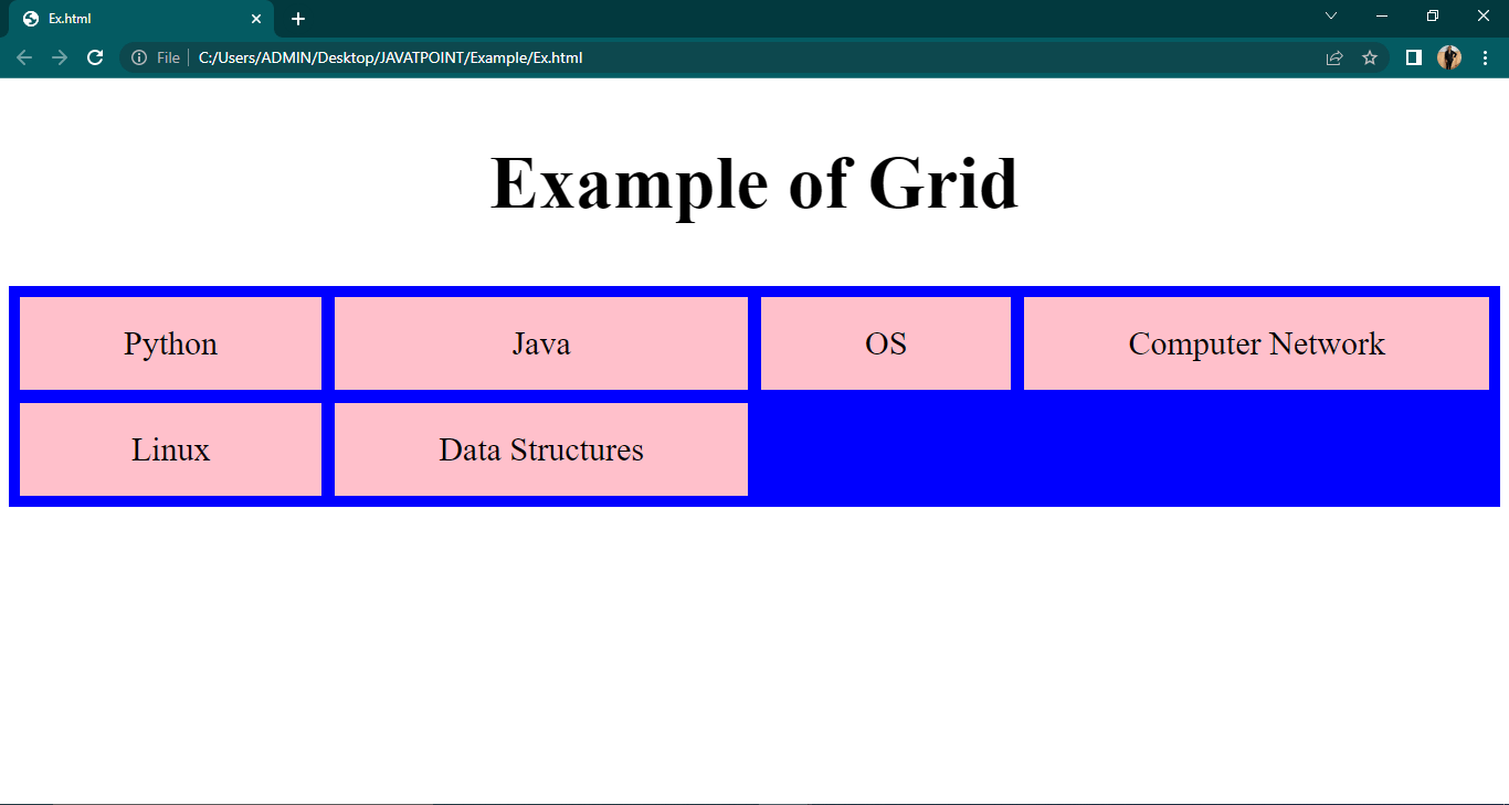
Grid Example: -
<!DOCTYPE html>
<html lang="en">
<head>
	<style>
		. container{

			display: grid;
			display: grid;
			grid: auto auto / auto auto auto auto;
			grid-gap: 12px;
			background-color: blue;
			padding: 10px;
		}
		.eg {
			background-color: pink;
			text-align: center;
			padding: 25px 0;
			font-size: 30px;
		}
		h2
		{
			text-align:center;
			font-size: 67px;
		}
	</style>
</head>
<body>
	<h2>Example of Grid </h2>
	<div class="container">
		<div class="eg">Python</div>
		<div class="eg">Java</div>
		<div class="eg">OS</div>
		<div class="eg">Computer Network</div>
		<div class="eg">Linux</div>
		<div class="eg">Data Structures</div>
	</div>
</body>
</html>
Output:-
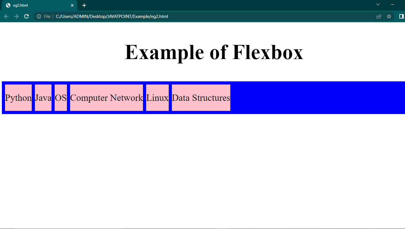
Example of Flexbox:-
<!DOCTYPE html>
<html lang="en">
<head>
	<style>
		.container{
			display: flex;
			display: flex;
			grid: auto auto / auto auto auto auto;
			grid-gap: 10px;
			background-color: blue;
			padding: 10px;
		}
		.eg {
			background-color: pink;
			text-align: center;
			padding: 25px 0;
			font-size: 30px;}
h2
{
	text-align: center;
	font-size:67px;
}</style>
</head>
<body>
	<h2 >Example of Flexbox</h2>
	<div class="container">
		<div class="eg">Python</div>
		<div class="eg">Java</div>
		<div class="eg">OS</div>
		<div class="eg">Computer Network</div>
		<div class="eg">Linux</div>
		<div class="eg">Data Structures</div>
	</div>
</body>
</html>
Output:-