Bem CSS
A standardized and properly organized approach for styling is crucial whilst operating on a big net development challenge. One properly-favored technique for doing this is the BEM (Block-Element-Modifier) naming standard. Block-Element-Modifier, or BEM, is a naming pattern for CSS class names that aids in retaining an excellent and unified shape in a project's styling. In this essay, we'll study BEM in extra elements.
The BEM conference uses double underscores (__) and hyphens (-) to separate block, detail, and modifier identifiers to create CSS class names. It is founded on segmenting a web page into smaller, reusable code chunks. Each block has additives and modifiers that may be used to make exclusive variations of that block. It is straightforward to recognize the dreams of each magnificence and the way they relate to one another using this approach. It enables builders to speedy remember the styling of a challenge's framework and implement adjustments.
Syntax:
block__element—modifie
BEM's Components
- Blocks: A block symbolizes the component's highest level of abstraction. A single word symbolizes it and denotes a distinct thing with independent meaning. A few examples are a button, a form, a header, etc.
Syntax:
.block {
...
}
- Elements: A block's components are represented by its elements. The block name, two underscores (__), and element name indicate it. For instance, if the detail's call is "label"; or "icon"; the block's call is probably "button".
Syntax:
.block__element {
...
}
- Modifiers: A modifier is a specific form of block or detail. The block or detail name, a solitary hyphen (-), and the modifier name are used to indicate it. A block or detail's look or behaviour can be altered with a modifier. 'Primary', 'Secondary', 'Disabled', and so forth. These are just examples of the several variations that a button could have.
Syntax:
.block__element--modifier {
...
}
<!-- OR -->
.block--modifier {
...
}
Why is BEM Useful?
- Clarity: BEM makes it simple to comprehend and maintain by making it plain which CSS styles apply to which sections of the HTML code.
- Reusability: BEM promotes the usage of reusable code blocks that are simple to utilize in many portions of a website or application.
- Scalability: BEM simplifies growing and maintaining large projects by assisting in consistency maintenance across a broad codebase.
- Modularity: BEM enables you to decouple a component's display from its activity, making it simple to update its appearance without compromising its functionality.
- Namespacing: BEM gives each element and modifier a distinct namespace, preventing naming conflicts and keeping track of your classes simply.
- Developer-Friendly: The class's nomenclature is simple to understand and makes it evident how the various components of the form relate to one another. This makes it easy to code and developer-friendly.
- The ability to design modular, reusable, and maintainable code with BEM can help developers be more productive and speed up development.
BEM Implementation Steps
- Start by defining the block: A block should be represented by a single CSS class and be prefixed with the block name, such as "header", "button", or "form".
- Determine the block's constituent parts: The components that make up the block are known as the elements. A single CSS class should represent each element and be prefixed with the block name, two underscores, and the element name, such as "header_logo".
- Set the modifiers forth: Modifiers should be expressed by a single CSS class and have the block or element name, two dashes, and the modifier name (for example, "button-primary") prefixed.
- Use your CSS training to enforce the BEM naming conference: After defining your blocks, factors, and modifiers, call your CSS instructions for using the BEM naming scheme.
- Put BEM training to use for your HTML: When you've finished defining your BEM instructions, use them for your HTML to provide your elements with the right styling. The block elegance must be used on the top-degree element, utilizing detail magnificence for any infant factors and modifier magnificence for any factors requiring amendment.
- Keep the organization constant: It will be simpler for other developers to comprehend and work with the codebase if you remain consistent throughout your project with the structure and conventions you have established.
- Use the classes again: To maintain consistency in the design and reduce the amount of code, reuse the classes as often as possible.
Example 1:
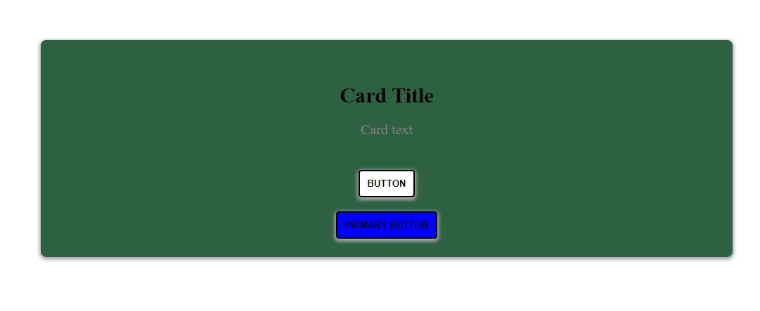
Method: Following the BEM naming rules, we will use HTML and CSS to create a card-like object.
- The block in this example is called a "card," with a content element and a button element. In addition, the button element has a "number one" variant that serves as a modifier. The HTML code specifies the card component's shape and the use of a div with the class "card" as the main box.
- The card is an image of a block. Several additional elements are inside the cardboard box, including a button and a content area. Each element has a category call that starts with "card__," indicating that they are all subelements of the "card" block. The content has the class "card__content" added to its location. The major container of the cardboard factor and all of its child components are made from the class "card."
- After the BEM naming conference, the modifier is supplied as a category to the button detail. Given that it is a subclass of the "card__button" detail, the class name "card__button-primary" indicates as much. This class is used in the CSS code to distinguish the primary button from the button by default.
Html code:
<!DOCTYPE html>
<html lang="en">
<head>
 <meta charset="UTF-8">
 <meta http-equiv="X-UA-Compatible" content="IE=edge">
 <meta name="viewport" content="width=device-width, initial-scale=1.0">
 <style>
 /* Layouting a Card Using the BEM Naming Conference //
 /* The Block has the following name scheme:.Card*/
 .card {
 background-color: rgb(42, 95, 63);
 border-radius: 8px;
 width: 50%;
 display: flex;
 flex-direction: column;
 align-items: center;
 justify-content: center;
 margin: 100px auto;
 box-shadow: 0px 2px 4px 2px #aaaaaa;
 padding: 1rem;
 }
 /* The Elements follow the naming convention
 mentioned as: .block__element */
 .card__content {
 padding: 14px;
 }
 .card__title {
 font-size: 20px;
 font-weight: bold;
 margin-bottom: 8px;
 }
 .card__text {
 font-size: 20px;
 color: gray;
 text-align: center;
 }
 .card__button {
 background-color: white;
 color: black;
 border-radius: 4px;
 padding: 10px;
 text-transform: uppercase;
 margin: 10px;
 cursor: pointer;
 box-shadow: 0px 2px 4px 2px #aaaaaa;
 font-weight: bold;
 }
 /* The Modifiers follow the naming convention
 mentioned as: .block__element--modifier */
 .card__button--primary {
 background-color: blue;
 margin: 10px;
 cursor: pointer;
 }
 </style>
</head>
<body>
 <div class="card">
 <div class="card__content">
 <h3 class="card__title">Card Title</h3>
 <p class="card__text">Card text</p>
 </div>
 <button class="card__button">Button</button>
 <button class="card__button card__button--primary">
 Primary Button
 </button>
 </div>
</body>
</html>
Output:
Example 2:
Method: Following the BEM naming rules, we will use HTML and CSS to construct a form component.
- The class "form" stands for the form block. The primary container for the form is used to apply styles that impact the entire thing.
- The classes "form__label" and "form__input" represent the labels and inputs, which are form block elements. These components apply styles that solely impact the form's labels and inputs.
- The class "form__submit" represents the submit button, another element of the form block. It is used to apply styles that solely impact the form's submit button.
- The class "form__submit-disabled" denotes the "disabled" modifier the submit button also has. When the submit button is disabled, this modifier is used to apply styles that alter how the button appears.
Html code:
<!DOCTYPE html>
<html lang="en">
<head>
 <meta charset="UTF-8">
 <meta http-equiv="X-UA-Compatible" content="IE=edge">
 <meta name="viewport" content="width=device-width, initial-scale=1.0">
 <style>
 /* Block */
 .form {
 display: flex;
 flex-wrap: wrap;
 width: 400px;
 }
 /* Element */
 .form__label {
 width: 100%;
 margin-bottom: 10px;
 font-size: 18px;
 }
 /* Element */
 .form__input {
 width: 100%;
 padding: 10px;
 font-size: 16px;
 margin-bottom: 20px;
 }
 /* Element */
 .form__submit {
 background-color: #007bff;
 color: #fff;
 padding: 10px 20px;
 border: none;
 font-size: 18px;
 }
 /* Modifier */
 .form__submit--disabled {
 background-color: #ccc;
 cursor: not-allowed;
 }
 </style>
</head>
<body>
 <form class="form">
 <label class="form__label" for="name">
 Name:
 </label>
 <input class="form__input" id="name"
 type="text" placeholder="Enter your name">
 <label class="form__label" for="email">
 Email:
 </label>
 <input class="form__input" id="email"
 type="email" placeholder="Enter your email">
 <label class="form__label" for="password">
 Password:
 </label>
 <input class="form__input" id="password"
 type="password" placeholder="Enter your password">
 <button class="form__submit form__submit--disabled"
 type="submit" disabled>Sign Up</button>
 </form>
</body>
</html>
Advantages of BEM
- Modularity: Components and their patterns become very modular due to modularity. This makes manipulating patterns and reusing code easier.
- Clear Structure: The HTML/CSS codebase's structure is simpler to understand.
- Avoids Scope Creep: Using particular elegant names prevents patterns from unintentionally superseding others.
- Scalability: BEM's organized method ensures that the CSS remains maintainable as projects increase. Without fearing approximately accidental side consequences, man or woman blocks can be introduced, changed, or removed.
- Reusability: Blocks are made to be reused throughout the mission because they are freestanding entities. As a result, there might be less needless patterns, which will bring about smaller files and less repetitive code.
- Predictability: Following BEM's naming pointers, developers might quickly ascertain the relationships and capabilities of various elements inside the HTML structure. This lessens the want for guesswork all through debugging and lowers the chance that adjustments may additionally bring about the introduction of errors.
Conclusion
BEM (Block, Element, Modifier) is a sturdy naming conference for CSS that emphasizes modularity, readability, and avoidance of unintentional fashion interference. It structures CSS magnificence names into clearly defined blocks, elements inside the one's blocks, and modifiers for versions.
By offering a steady naming scheme, BEM makes the CSS codebase more readable, maintainable, and reusable. While there is gaining knowledge of curves and the potential for verbose class names, the blessings of organized and conflict-unfastened styles make BEM a famous desire for many large-scale initiatives.