Radial-gradient() CSS function
Radial-gradient() CSS function
It defines a CSS in-built function, which produces a smooth transition among multiple colors. It is used to set any radial-gradient that is same as a background-image. This function can be the elliptical or circular shape.
It can save the usages of bandwidth and also helps to decrease the time of download. The color appears from an individual point; expand outwards in the radial-gradient. The radial-gradient can be depicted via its ending shape and center point and multiple stop.
Syntax:
background-image: radial-gradient(shape size at position, start-color, ..., last-color);
Following are some arguments:
position: This argument depicts a gradient position. ‘Center’ is its default value. It is described in units (like em, px, etc.) or keywords (such as left, bottom, etc.).
shape: It can portray the gradient’s shape, which can be elliptical or circular. When its value isn’t described, then it can set to the default value that is an ellipse.
size: It represents the size of a gradient. It has some possible values which are listed below:
- closest-side
- closest-corner
- farthest-side
- farthest-corner
It has a default value, i.e., farthest-corner.
start-color, …., last-color: This argument holds the color value pursued by a stop position (optional).
Let’s understand the CSS function radial-gradient with the use of some examples.
Example:
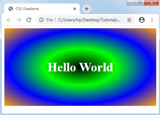
<!DOCTYPE html>
<html>
<head>
<title> CSS Gradients </title>
<style>
#main
{
background-image: radial-gradient(black, lime, blue, orange);
}
.hello
{
text-align:center;
font-size:40px;
color:white;
font-weight:bold;
padding:100px;
}
</style>
</head>
<body>
<div id="main">
<div class = "hello"> Hello World </div>
</div>
</body>
</html>
Output:
Consider the below examples:
Example:1
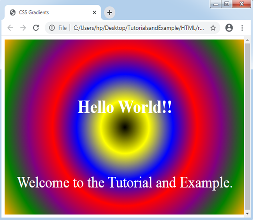
In the following illustration, we will set the radial-gradient’s shape.
<!DOCTYPE html>
<html>
<head>
<title> CSS Gradients </title>
<style>
#main
{
height: 400px;
width: 600px;
background-image: radial-gradient(circle, black, yellow, blue, red, purple, green, orange);
}
.hello
{
text-align:center;
font-size:40px;
color:white;
font-weight:bold;
padding:130px;
}
.div2
{
font-size: 35px;
color: white;
text-align: center;
}
</style>
</head>
<body>
<div id="main">
<div class = "hello"> Hello World!! </div>
<div class = "div2"> Welcome to the Tutorial and Example. </div>
</div>
</body>
</html>
Output:
Example:2
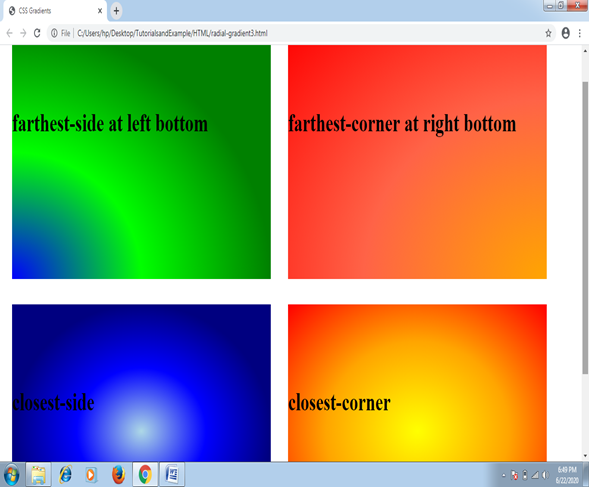
In the following illustration, we will set the radial-gradient’s size.
<!DOCTYPE html>
<html>
<head>
<title>CSS Gradients</title>
<style>
.demo div
{
float: left;
}
.demo1 div
{
float: left;
}
#main1
{
height: 400px;
width: 600px;
background-image: radial-gradient(farthest-side at left bottom, blue, lime, green);
margin:20px;
}
#main2
{
height: 400px;
width: 600px;
background-image: radial-gradient(farthest-corner at right bottom , orange, tomato, red);
margin:20px;
}
#main3
{
height: 400px;
width: 600px;
background-image: radial-gradient(closest-side , lightblue, blue, navy);
margin:20px;
}
#main4
{
height: 400px;
width: 600px;
background-image: radial-gradient(closest-corner , yellow, orange, red);
margin:20px;
}
.size
{
text-align:center;
font-size:40px;
color:black;
font-weight:bold;
padding-top :130px;
}
</style>
</head>
<body>
<div class="demo">
<div id="main1">
<div class = "size">farthest-side at left bottom</div>
</div>
<div id="main2">
<div class = "size">farthest-corner at right bottom</div>
</div>
</div>
<div class="demo1">
<div id="main3">
<div class = "size">closest-side</div>
</div>
<div id="main4">
<div class = "size">closest-corner</div>
</div>
</div>
</body>
</html>
Output: