
×

Ionic progress bar

The ionic progress bar element is a horizontal progress bar used to visualize the progression of operation and activity. You can use the <ion-progress-bar> component to create a progress bar in the ionic application.

There are two types of the ionic progress bar, which are as follows:

  • Determinate
  • Indeterminate

Determinate

When the percentage of operation is known, then you should use the determinate type. It is the default type of progress bar, and also value property represents the progress bar.

Example: This example explains how you can use the determinate progress bar in the ionic application.

Home.page.html

<ion-header>  
   <ion-toolbar color="primary">  
     <ion-title>Ionic Progress Bar</ion-title>  
   </ion-toolbar>  
 </ion-header>   
 <ion-content class="ion-padding" color="light">  
 <p>Default Progress Bar</p>  
 <ion-progress-bar></ion-progress-bar>   
 <p>Default Progress Bar at 60%</p>  
 <ion-progress-bar value="0.6"></ion-progress-bar>  
 </ion-content>   

Output: After executing this code you will get the output, which shown below:
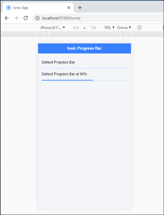
Ionic progress bar

Indeterminate

It is a type of progress bar, which shows operation in progress. This means there is no requirement to indicate how long it will take time. If you add the reversed=“true” property, then you receive a query that is used to specify the pre-loading.

Example: The following example is used to explain how you can use the indeterminate progress bar in the ionic application.

Home.page.html

<ion-header>  
   <ion-toolbar color="primary">  
     <ion-title>Ionic Progress Bar</ion-title>  
   </ion-toolbar>  
 </ion-header>  
 <ion-content class="ion-padding" color="light">   
 <p>Indeterminate Progress Bar</p>  
 <ion-progress-bar type="indeterminate"></ion-progress-bar>     
 <p>Indeterminate Reversed</p>
 <ion-progress-bar type="indeterminate" reversed="true"></ion-progress-bar>  
 </ion-content>   

Output: After executing this code you will get the output, which shown below:
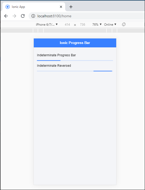
Ionic progress bar2

Buffer

The buffer displays the circle as an animation to specify some activity in the ionic application. If the buffer property value is less than one, the additional buffering progress can be shown.

Example: This example is used to explain how you can use the buffer attribute in the progress bar.

Home.page.html

<ion-header>  
   <ion-toolbar color="primary">  
     <ion-title>Ionic Progress Bar</ion-title>  
   </ion-toolbar>  
 </ion-header>     
 <ion-content class="ion-padding" color="light">  
 <p>Buffer Progress Bar</p>  
 <ion-progress-bar value="0.35" buffer="0.5"></ion-progress-bar>     
 <p>Progress Bar</p> 
 <ion-progress-bar value="0.20"></ion-progress-bar>  
 </ion-content>   

Output: After executing this code you will get the output, which is shown below:
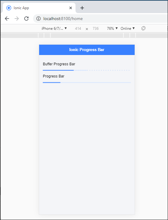
Ionic progress bar3

Colorization of the Progress bar

You can use the <ion-progress-bar> component to configure the color in the progress bar. Here, you can add the different colors in the ionic progress bar.

Example: This example is used to explain how you can use the color property in the ionic progress bar.

Home.page.html

<ion-header>  
 <ion-progress-bar value="0.20"></ion-progress-bar>  
 </ion-content>   
   <ion-toolbar color="primary">  
     <ion-title>Ionic Progress Bar</ion-title>  
   </ion-toolbar>  
 </ion-header>   
 <ion-content class="ion-padding" color="light">  
 <p>Colorize Progress Bar</p>  
 <ion-progress-bar value="0.35" color="danger"></ion-progress-bar><br>     
 <ion-progress-bar value="0.20" color="success"></ion-progress-bar><br>
 <ion-progress-bar value="0.50" color="primary"></ion-progress-bar><br>
 <ion-progress-bar value="0.40" color="warning"></ion-progress-bar><br>
 <ion-progress-bar value="0.60" color="tertiary"></ion-progress-bar>
 </ion-content>   

Output: After executing this code you will get the output, which is shown below:
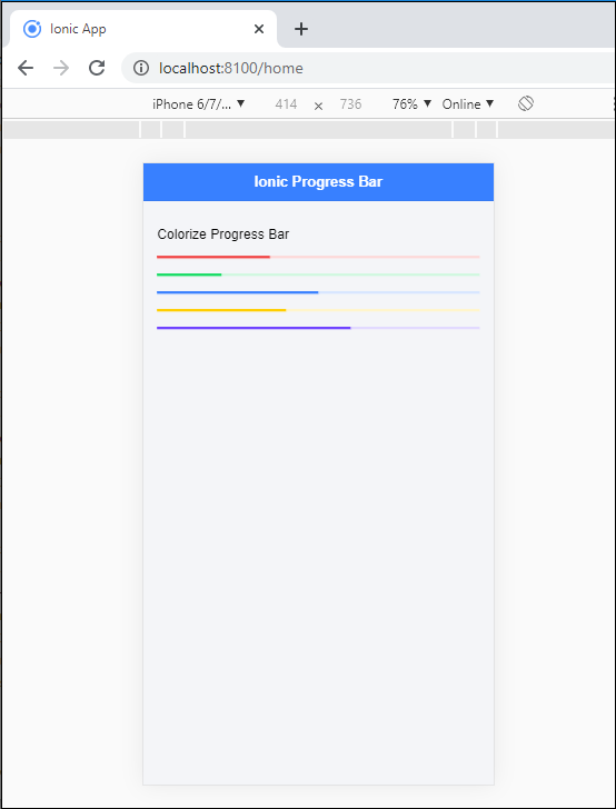
Ionic progress bar4

Bind a variable with Progress Bar

You can also bind the progress bar with the value in the ionic application. For doing this, you required to add the value in square brackets, which calls the variable that binds to this value property.

Example: This example is used to explain how you can bind a variable with the progress bar.

Home.page.html

<ion-header>  
   <ion-toolbar color="primary">  
     <ion-title>Ionic Progress Bar</ion-title>  
   </ion-toolbar>  
 </ion-header> 
 <ion-content class="ion-padding" color="light">  
 <p>Bind a variable</p>  
 <ion-progress-bar [value]="progress" color="danger"></ion-progress-bar>     
 </ion-content>  

Home.page.ts   

In the home.page.ts file, you can set the time interval to load the progress bar.

import { Component } from
'@angular/core';  
 @Component({  
   selector: 'app-home',  
   templateUrl: 'home.page.html',  
   styleUrls: ['home.page.scss'],  
 })  
 export class HomePage {  
   progress = 0.20;   
   constructor() {  
     setInterval( () => {  
       this.progress += .1;  
       }, 1000 );  
   }  
 }   

Output: After executing this code you will get the output, which is shown below:
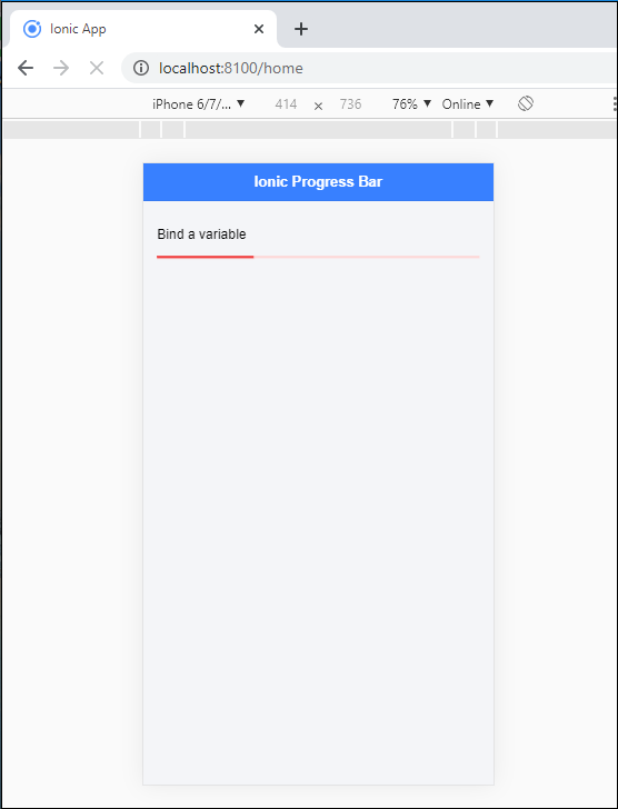
Ionic progress bar5

When the time interval is completed then it shows something like this.
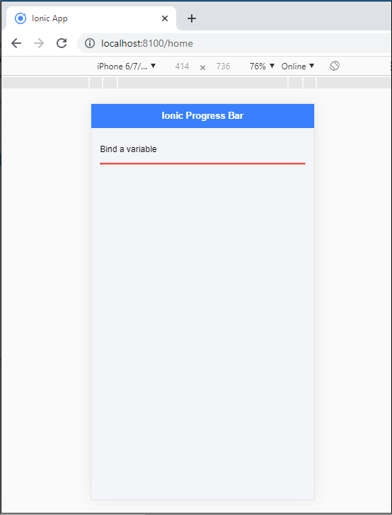
Ionic progress bar6

Related Topics

Ionic Contents

Ionic Contents The content component provides an easy-to-use content area with some useful ways to control the scrollable region. There should be only one content in one view. Content, along with several other Ionic...

2 minutes read.

Ionic framework Installation

Installation of Ionic Before proceeding with the ionic application, you'll need to install node.js and NPM (Node Package Manager), the code editor, and Ionic CLI. Installation of node.js and NPM These are the primary...

5 minutes read.

Ionic-fab Button

Ionic-fab Button The Ionic FABs (Floating Action Buttons) are standard material design compounds. It is a container element that contains one or more fab buttons. They are required to be placed in a fixed position,...

2 minutes read.

Ionic Checkbox

Ionic Checkbox Ionic Checkbox is nearly the same as a toggle. It can be placed in an ionic element or used as a separate checkbox. It is designed differently for every platform, such...

2 minutes read.

Ionic Editors

Editors are software programs that permit the users to create and edit the text files. In the development field, editors are usually used to create the source code editors that includes many specific...

3 minutes read.

Ionic Tabs

The ionic tabs mostly used for mobile navigation. It means that tabs are placed at the top of the display on android devices, while at the bottom on IOS. It does not provide...

2 minutes read.

Ionic Grid

The Ionic grid is a very powerful mobile-first flexbox system for building the custom layouts. It is a CSS feature supported by all devices that ionic supports. The Ionic grid is composed of...

11 minutes read.

Ionic Range

The Range slider lets users choose from a range of values by moving the slider knob. You can accept two knobs, but by default, one-knob controls the range value. Range labels You can put down on...

2 minutes read.

Ionic Toggle

The toggle is the same as the HTML checkbox entry, but it looks different and easier to use on a touchscreen device. It is an input component that holds the boolean value. Toggle...

2 minutes read.

Ionic Radio

Ionic Radio The radio button is the type of input component that has a Boolean value. The Ionic radio button has a different pattern on every platform, as well as other Ionic components....

2 minutes read.

Ionic vs React Native

Ionic Vs React Native Ionic and React Native are both common framework which is used to develop mobile applications. Here, you will know about the popular differences between the ionic and the React Native. Ionic Ionic...

3 minutes read.

Ionic vs Xamarin

Ionic vs Xamarin Ionic and Xamarin are both the most popular frameworks used to develop a hybrid mobile application. Both frameworks are used in large enterprises by the developers. Here, we will discuss the...

4 minutes read.

Ionic Reorder

The Ionic offers the <ion-reorder> component to reordering features. Ionic reorder component adds the Drag and Drop feature to list items, in which the user can change the order of the items. Reorder...

3 minutes read.

Ionic Spinner

The ionic spinner component provides the various SVG (Scalable Vector Graphic) spinners. Ionic spinners are the visual indicators that display the app which is loading content or performing another process that the user...

5 minutes read.

Ionic Input

Ionic Input Inputs are necessary to collect and process user inputs securely. To be easy for users to communicate, they must follow the process and communication guidelines for each platform. It is a...

3 minutes read.

Ionic Toolbar

A toolbar is a general toolbar that can be used in an application such as a header, sub-header, footer, or even a sub-footer. Because the ion-toolbar is flexbox-dependent, no matter how many toolbars...

3 minutes read.

Ionic Refresher

Refresher means updating the currently showing page so that the user can see the latest view. It is also known as re-loading in web technology. It provides a pull- to-refresh feature on a...

4 minutes read.

Ionic Actionsheet

Ionic Actionsheet The Action sheet is a dialog box that displays a group of options. It is shown on the top of the application content and must be dismissed manually before the user can resume...

3 minutes read.

Features of Ionic Framework

The Ionic Framework is based on the AngularJS framework that permits a programmer to use a combination of many other programming languages, like HTML5, CSS, and JavaScript. Some of the...

4 minutes read.

Ionic Modal

Ionic modal is displayed as a temporary UI that slides into the screen. The ionic modal is a dialog box that is displayed at the top of the app’s content, and it...

5 minutes read.