Ionic Buttons
Ionic Buttons
There are different types of buttons in the Ionic framework. These buttons are subtly animated, enhancing the user experience when using the application. Buttons are a fundamental way of interacting and navigating through an app, and they should clearly explain what will happen after the user click them. Buttons can consist of two things, which are Text and Icons, and also used both options. The main class for button types is the button. For accessibility reasons, buttons use a standard <button> element, but are enhanced with an <ion-button> directive. The different styles of buttons attributes are shown below:
- Basic Usage
- Expand
- Fill
- Round Buttons
- Button Sizes
- Icon Buttons
Basic Usage: It is the Basic Usage of buttons. The Syntax of the Basic Usage style is:
Button
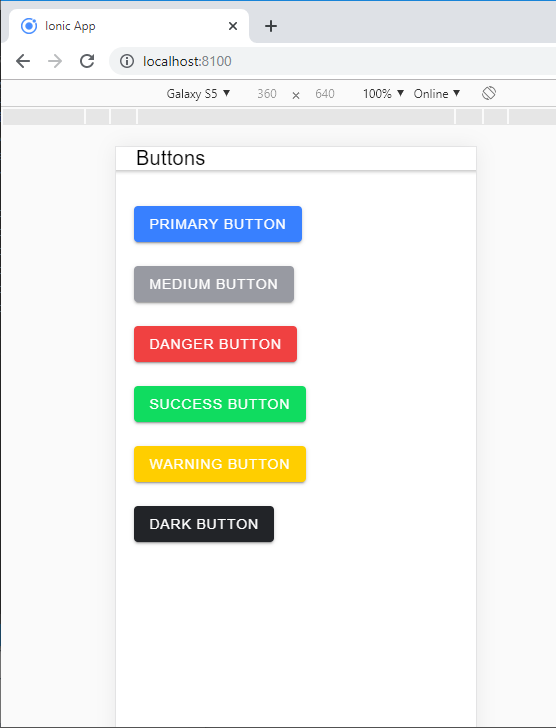
It set the color of the button by using color property. Ionic includes different default colors that can be easily overridden.
Example: The below example shows how to make basic buttons in the ionic application.
Buttons


Primary Button
medium Button
danger Button
Success Button
Warning Button
Dark Button
When you execute this code in your localhost, then you will get an output, which is shown in the given below screenshot.
Expand: This attribute lets you specify the width of the button. By default, buttons are blocks in the line, but setting this attribute will change the button to a full-width block element.
Expand is divided into two parts:
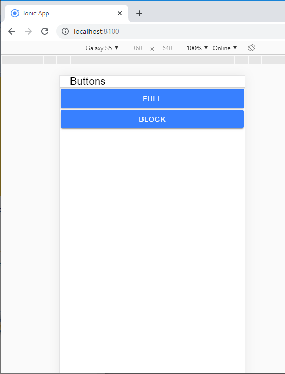
Block Buttons: Adding a block to the button will make the button take 100% of its parent's view. It is a full-width button with rounded corners.
The Syntax of the block button is:
Block Button
- Full button: The full addition to the button will make the button take 100% of its parent's width. However, it will also remove the left and right edges of the button. This style is useful when the button should be extended across the full width of the screen. The Syntax of the Full button is:
Full
Example: The below example shows how to make expand buttons in the ionic application.
Buttons


Full
Block
Output: When you execute this code in your localhost, then you will get an output, which is shown in the given below screenshot.
Fill: This attribute specifies the background and button border color. By default, buttons have a solid background unless the button is inside the toolbar, in this case they have a transparent background. Fill is divided into three parts,
- Clear
- Outline
- Solid
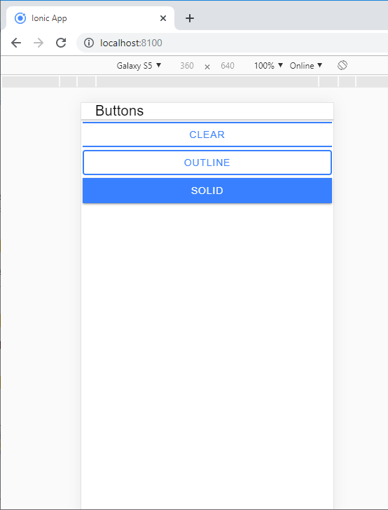
Clear Style: Clear style is used to create a button with a transparent background that resembles a flat button. You can add the clear property to use a clear style for a button.
The Syntax for clear style is:
Clear
Outline Style: Outline style is used to create a button with a transparent background and a visible border. By just adding the outline property, you can use the outline style for a button. The Syntax for outline style is:
Outline
Solid Style: Solid style is used to create a button with a filled background. It is useful for buttons in a toolbar. The Syntax for solid style is:
Solid
Example: The below example shows how to make fill buttons in the ionic application.
Buttons


Full
Block
solid
Output: When you execute this code in your localhost, then you will get an output, which is shown in the given below screenshot.
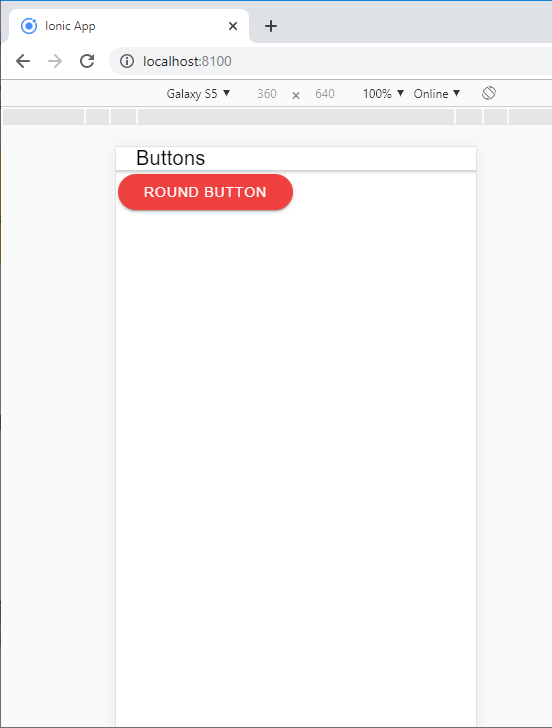
Round Buttons: It is used to make a button with rounded corners, with adding the round property. The Syntax of the round button is:
Round Button
Example: The below example shows how to make a round button in the ionic application.
Buttons


Round Button
Output: When you execute this code in your localhost, then you will get an output, which is shown in the given below screenshot.
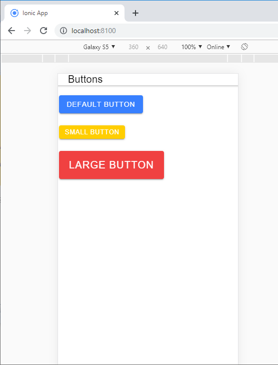
Button Sizes: The size feature specifies the size of the button. It permitted the user to change the height and padding of the button. You can use the large attribute to make a large button or small attribute to a small button. There are mainly three types of button sizes i.e.
- Default
- Small
- Large
Default Size: It is used to create a button with less height and padding. It is useful in default for the button in an item.
The Syntax of default size is:
default Button
Small Size: It is used to create a button with the default height and padding. It is useful for buttons in an item.
The Syntax of a small size is:
Small Button
Large Size: It is used to make a button with more height and padding. The Syntax of large size is:
Large Button
Example: The below example shows how to changes the sizes of buttons in the ionic application.
Buttons


Default Button
Small Button
Large Button
Output: When you execute this code in your localhost, then you will get an output, which is shown in the given below screenshot.
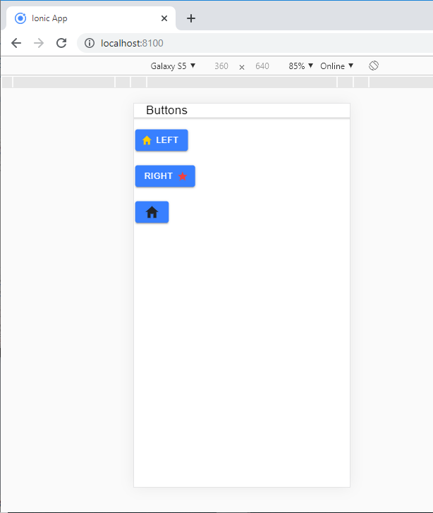
Icon Buttons: If you need to add an icon inside the button, then you have to add an icon element inside the button. By using the slot property, you can add the icon inside the button. There are three types of slot properties in the icon button.
- Start: This attribute places the content of the button text to the left side. The following Syntax shows how we can add the icon inside the button.
Left
- End: This attribute places the content of the button text to the right side. The following Syntax shows how we can add the icon inside the button.
Right
- Icon: When the button hasn't any text, then you can use the icon. The following Syntax shows how we can add the icon inside the button.
Example: The below example shows how to set the icon in the buttons.
Buttons


Left


Right
Output: When you execute this code in your localhost, then you will get an output, which is shown in the given below screenshot.