Radio Button in CSS
Using CSS to Style Radio Buttons
Users can choose one from a list of possibilities using website radio buttons. They resemble checkboxes a lot. The distinction is that checkboxes don't only offer one option. The prior selection is deselected when a user attempts to pick multiple options using radio buttons.
The phrase "radio button" was developed from actual radio buttons. When one button was pressed, another would appear on older radios.
Overview of the CSS Radio Button
When a user must choose one thing from a set of options, radio buttons can be used. They are a popular alternative for forms that need several choices but allow the user to choose only one. However, if we try to pick several alternatives, selecting one radio button would deselect the other already selected option.
Like checkboxes, radio buttons are also available. The primary distinction is that they only call for one option from many choices. A clear illustration of when radio buttons will be a good input item is when choosing a gender (Male, Female).
Syntax:
The syntax for the radio button may be written as shown below:
<input type="radio">
Another form of syntax is:
<input type="radio" name="myradio" value="radio_value" id="radio_demo" class="form-radio" checked>

<label for="radio_demo">Radio</label>
The radio button has the following characteristics:
- Type: The radio is selected as the input type control's value.
- Name: It regulates a name transmitted to the server for value recognition and retrieval.
- Value: This value may be utilized when the user clicks the radio button.
- Checked: By default, we'll utilize this property to choose the radio button.
How does CSS Radio Button Function?
Radio buttons will be utilized when there are two or more mutually incompatible alternatives, and the user must select exactly one. In other words, selecting a radio button would deactivate any others already chosen. As all possibilities are always visible and accessible for easy analysis, radio buttons have a lesser cognitive burden. Additionally, radio buttons are easier for individuals who have trouble using the mouse effectively.
Examples of CSS Radio Button Implementation
Here are a few instances, as stated below:
<!DOCTYPE html>

<html>

<head>

<meta charset="utf-8">

<title>Example of CSS Radio Button Example </title>

<style>

.container {

display: block;

position: relative;

padding-left: 20px;

margin-bottom: 20px;

cursor: pointer;

font-size: 15px;

}

.container input {

position: absolute;

opacity: 0;

}

.radio_class {

position: absolute;

top: 0;

left: 0;

height: 10px;

width: 10px;

background-color: grey;

border-radius: 15%;

}

.container:hover input ~ .radio_class {

background-color: lightblue;

}

.container input:checked ~ .radio_class {

background-color: red;

}

.container .radio_class:after {

top: 20px;

left: 20px;

width: 20px;

height: 20px;

border-radius: 70%;

background: white;

}

</style>

</head>

<body>

<h2>Example of Basic Radio Buttons </h2>

<label class="container">Button 1

<input type="radio" checked="checked" name="radio">

<span class="radio_class"></span>

</label>

<label class="container">Button 2

<input type="radio" name="radio">

<span class="radio_class"></span>

</label>

</body>

</html>
Output:
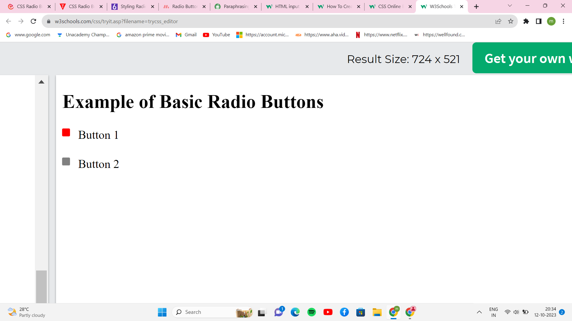
Justification: In the example above, we made our radio buttons. As a radio button is checked, the code adds a background color, and as the user hovers over the radio button, a new color is added. To add CSS styles to the radio buttons, we have created the class .radio_class. The check property specifies the default radio button. A container makes the radio buttons; we may specify CSS styles after each picked element's content.
Example 2:
<!DOCTYPE html>
<html>
<head>
<meta charset="utf-8">
<title> CSS Radio Button Example </title>
<style>
body{
background: white;
}
.container{
display: block;
position: relative;
margin: 10px auto;
height: auto;
width: 300px;
padding: 20px;
}
h2{
color: black;
}
ul li{
color: red;
display: inline;
position: relative;
}
ul li input[type=radio]{
position: absolute;
visibility: hidden;
}
ul li label{
display: block;
position: relative;
font-weight: 100;
font-size: 20px;
padding: 20px 20px 25px 80px;
margin: 5px auto;
height: 20px;
z-index: 9;
cursor: pointer;
}
ul li:hover label{
color: black;
}
ul li .radio_demo{
display: block;
position: absolute;
border: 4px solid red;
border-radius: 50%;
height: 20px;
width: 20px;
top: 25px;
left: 30px;
z-index: 5;
}
ul li .radio_demo::before {
position: absolute;
content: '';
border-radius: 80%;
height: 20px;
width: 20px;
top: 5px;
left: 5px;
margin: auto;
transition: background 0.25s linear;
}
input[type=radio]:checked ~ .radio_demo {
border: 3px solid #0DFF92;
}
input[type=radio]:checked ~ .radio_demo::before{
background: #0DFF92;
}
</style>
</head>
<body>
<div class="container">
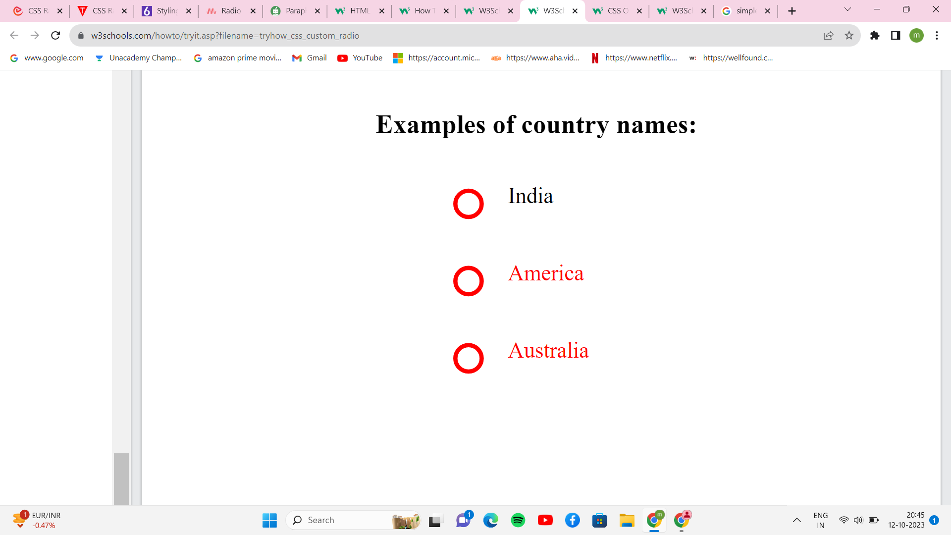
<h2>Examples of country names: </h2>
<ul>
<li>
<input type="radio" id="option_one" name="selector">
<label for="option_one"> India</label>
<div class="radio_demo"></div>
</li>
<li>
<input type="radio" id="option_two" name="selector">
<label for="option_two"> America</label>
<div class="radio_demo">
<div class="inside"></div>
</div>
</li>
<li>
<input type="radio" id="option_three" name="selector">
<label for="option_three"> Australia </label>
<div class="radio_demo">
<div class="inside"></div>
</div>
</li>
</ul>
</div>
</body>
</html>
Output
Conclusion
We have seen so far that the radio button is an essential input control that the user may utilize in various ways. The correct controls for receiving user input are crucial for enhancing the form's user experience. Because radio buttons always have one preference by definition, you shouldn't see them without one. They don't utilize action buttons to make things happen; instead, they just employ radio buttons to change settings. The settings will not take effect before the user presses the command button.