CSS Arrow
CSS Arrow
The arrow of CSS is applied to insert an array with the tooltip. It can make a tooltip as any speech bubble. Also, this arrow can be illustrated in four of the essential ways:
- Right arrow
- Left arrow
- Bottom arrow
- Top arrow
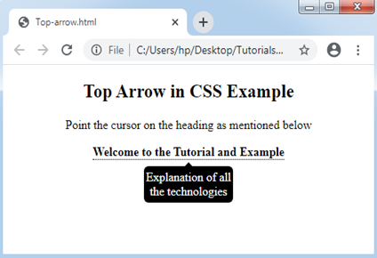
Top Arrow in CSS
The CSS top arrow can be applied to include an arrow as a structure on tooltip’s top if we point the cursor on an element. It can show a tooltip on an element’s bottom.
Let’s understand the following illustration:
Example:
<!DOCTYPE html>
<html>
<style>
.tooltip
{
position: relative;
display: inline-block;
border-bottom: 1px dotted black;
}
.tooltip .tooltiptext
{
visibility: hidden;
width: 120px;
background-color: black;
color: #fff;
text-align: center;
border-radius: 6px;
padding: 5px 0;
position: absolute;
z-index: 1;
top: 150%;
left: 50%;
margin-left: -60px;
}
.tooltip .tooltiptext::after
{
content: "";
position: absolute;
bottom: 100%;
left: 50%;
margin-left: -5px;
border-width: 5px;
border-style: solid;
border-color: transparent transparent black transparent;
}
.tooltip:hover .tooltiptext
{
visibility: visible;
}
</style>
<body style="text-align:center;">
<h2> Top Arrow in CSS Example </h2>
<p> Point the cursor on the heading as mentioned below </p>
<div class="tooltip"><strong> Welcome to the Tutorial and Example </strong>
<span class="tooltiptext"> Explanation of all the technologies </span>
</div>
</body>
</html>
Output:
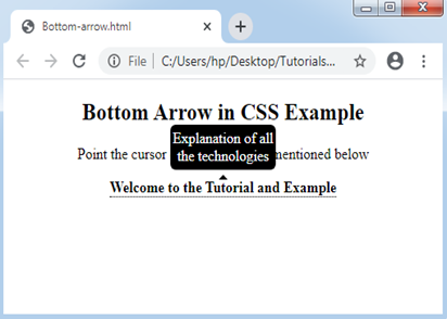
Bottom Arrow in CSS
The CSS bottom arrow can be applied to include an arrow as a structure on tooltip’s bottom if we point the cursor on an element. It can show a tooltip on an element’s top.
Let’s consider the following illustration:
Example:
<!DOCTYPE html>
<html>
<style>
.tooltip
{
position: relative;
display: inline-block;
border-bottom: 1px dotted black;
}
.tooltip .tooltiptext
{
visibility: hidden;
width: 120px;
background-color: black;
color: #fff;
text-align: center;
border-radius: 6px;
padding: 5px 0;
position: absolute;
z-index: 1;
bottom: 150%;
left: 50%;
margin-left: -60px;
}
.tooltip .tooltiptext::after
{
content: "";
position: absolute;
top: 100%;
left: 50%;
margin-left: -5px;
border-width: 5px;
border-style: solid;
border-color: transparent transparent black transparent;
}
.tooltip:hover .tooltiptext
{
visibility: visible;
}
</style>
<body style="text-align:center;">
<h2> Bottom Arrow in CSS Example </h2>
<p> Point the cursor on the heading as mentioned below </p>
<div class="tooltip"><strong> Welcome to the Tutorial and Example </strong>
<span class="tooltiptext"> Explanation of all the technologies </span>
</div>
</body>
</html>
Output:
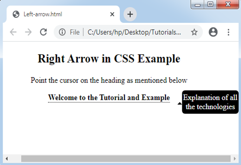
Left Arrow in CSS
The CSS left arrow can be applied to include an arrow as a structure on tooltip’s left side if we point the cursor on an element. It can show a tooltip on an element’s right side.
Let’s consider the following illustration:
Example:
<!DOCTYPE html>
<html>
<style>
.tooltip
{
position: relative;
display: inline-block;
border-bottom: 1px dotted black;
}
.tooltip .tooltiptext
{
visibility: hidden;
width: 120px;
background-color: black;
color: #fff;
text-align: center;
border-radius: 6px;
padding: 5px 0;
position: absolute;
z-index: 1;
top: -5px;
left: 110%;
}
.tooltip .tooltiptext::after
{
content: "";
position: absolute;
top: 50%;
right: 100%;
margin-top: -5px;
border-width: 5px;
border-style: solid;
border-color: transparent transparent black transparent;
}
.tooltip:hover .tooltiptext
{
visibility: visible;
}
</style>
<body style="text-align:center;">
<h2> Right Arrow in CSS Example </h2>
<p> Point the cursor on the heading as mentioned below </p>
<div class="tooltip"><strong> Welcome to the Tutorial and Example </strong>
<span class="tooltiptext"> Explanation of all the technologies </span>
</div>
</body>
</html>
Output:
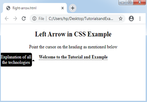
Right Arrow in CSS
The CSS right arrow can be applied to include an arrow as a structure on tooltip’s right side if we point the cursor on an element. It can show a tooltip on an element’s left side.
Let’s consider the following illustration:
Example:
<!DOCTYPE html>
<html>
<style>
.tooltip
{
position: relative;
display: inline-block;
border-bottom: 1px dotted black;
}
.tooltip .tooltiptext
{
visibility: hidden;
width: 120px;
background-color: black;
color: #fff;
text-align: center;
border-radius: 6px;
padding: 5px 0;
position: absolute;
z-index: 1;
top: -5px;
right: 110%;
}
.tooltip .tooltiptext::after
{
content: "";
position: absolute;
top: 50%;
left: 100%;
margin-top: -5px;
border-width: 5px;
border-style: solid;
border-color: transparent transparent black transparent;
}
.tooltip:hover .tooltiptext
{
visibility: visible;
}
</style>
<body style="text-align:center;">
<h2> Left Arrow in CSS Example </h2>
<p> Point the cursor on the heading as mentioned below </p>
<div class="tooltip"><strong> Welcome to the Tutorial and Example </strong>
<span class="tooltiptext"> Explanation of all the technologies </span>
</div>
</body>
</html>
Output: