CSS Animation
CSS Animation: The animation property of CSS is applied to make animation over any webpage. It is used as the animation replacement made by JavaScript and Flash.
Rules of CSS3 @keyframes
The animation can be made inside the rule of @keyframe. It can be used to handle various intermediate steps within the sequence of CSS animation.
Working of Animation
An animation enables a component change gradually through a single style to other styles. We can include the properties as much as we wish to include. Also, we can describe the modifications in percentage. 100 percent describes the animation completion, and 0 percent represents the animation start.
How it works
If animation is made within the rule of @keyframe, then it should be restrained with the selector. Otherwise, that animation will not have any effect.
An animation is restrained to a selector by describing at least the following two properties:
- The animation name
- The animation duration
Properties of Animation
| Property | Description |
| @keyframes | This property is applied to describe the animation. |
| Animation | It is the shorthand attribute, applied to set every property, excluding the animation-fill-mode and the animation-play-state attributes. |
| animation-delay | This property describes at the time of the start of an animation. |
| animation-direction | This property describes whether or not an animation must play inside alternate or reserve cycle. |
| animation-duration | This attribute describes the duration of time taken via animation for completing one cycle. |
| animation-fill-mode | This attribute depicts the component’s static style. (If an animation isn’t playing.) |
| animation-iteration-count | This attribute represents the time’s number; an animation must be played. |
| animation-play-state | This property depicts when an animation is paused o running. |
| animation-name | This property describes the @keyframes animation name. |
| animation-timing-function | This attribute depicts the animation’s speed curve. |
Consider the following examples.
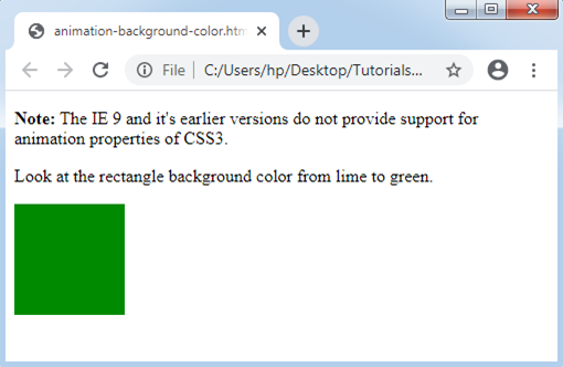
- Example: background-color changing
Let’s take a simple animation illustration that modifies the rectangle’s background color from LIME to GREEN.
<!DOCTYPE html>
<html>
<head>
<style>
div {
width: 100px;
height: 100px;
background: lime;
-webkit-animation: myfirst 6s; /* Opera, Safari, Chrome */
animation: myfirst 5s;
}
/* Opera, Safari, Chrome */
@-webkit-keyframes myfirst {
from {background: lime;}
to {background: green;}
}
/* Standard syntax */
@keyframes myfirst {
from {background: lime;}
to {background: green;}
}
</style>
</head>
<body>
<p><b>Note:</b> The IE 9 and it's earlier versions do not provide support for animation properties of CSS3. </p>
<p> Look at the rectangle background color from lime to green. </p>
<div></div>
</body>
</html>
Output:
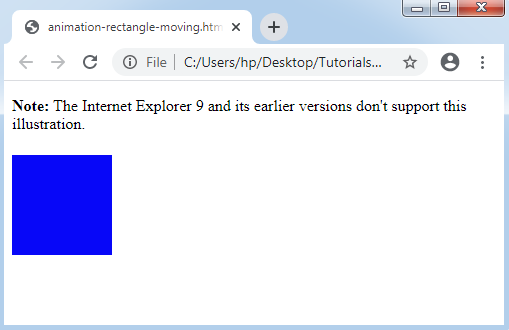
- Example: Rectangle moving
Let’s take other illustrations to show animation along with the percentage value.
<!DOCTYPE html>
<html>
<head>
<style>
div {
width: 100px;
height: 100px;
background: red;
position: relative;
-webkit-animation: myfirst 5s; /* Opera, Safari, Chrome */
animation: myfirst 5s;
}
/* Opera, Safari, Chrome */
@-webkit-keyframes myfirst {
0% {background:pink; left:0px; top:0px;}
25% {background:red; left:300px; top:0px;}
50% {background:lime; left:200px; top:300px;}
75% {background:yellow; left:0px; top:200px;}
100% {background:blue; left:0px; top:0px;}
}
/* Standard syntax */
@keyframes myfirst {
0% {background:pink; left:0px; top:0px;}
25% {background:red; left:300px; top:0px;}
50% {background:lime; left:300px; top:200px;}
75% {background:yellow; left:0px; top:200px;}
100% {background:blue; left:0px; top:0px;}
}
</style>
</head>
<body>
<p><b>Note:</b> The Internet Explorer 9 and its earlier versions don't support this illustration. </p>
<div></div>
</body>
</html>
Output: