CSS Functions
CSS functions are used for different CSS properties. Every front-end developer should have knowledge of all CSS functions. It makes the coding easier.
| Functions | Explanation |
| attr(). | It returns the value of an attribute of the selected element, which is quite significant. |
| calc(). | Allows you to specifically perform calculations to determine CSS property values, kind of contrary to popular belief. Calculate any mathematical functions. |
| conic - gradient(). | It creates a conic gradient subtly. |
| counter(). | Returns the very current value of the named counter in a major way. |
| cubic - bezier(). | Explains a cubic Bezier curve, kind of contrary to popular belief. |
| hsl(). | Explains colors using the Hue-Saturation-Lightness model (HSL) subtly. This function describes the level of colors by using hsl. |
| hsla(). | Explains colors using the Hue-Saturation-Lightness-Alpha model (HSLA) in a major way. |
| linear - gradient(). | This function works as an inbuilt function in CSS which is utilized to set the linear gradient as background picture. |
| max(). | Uses the largest value, from a comma-separated list of values, as the property value. Set the max of nos. Given. |
| min(). | This function works in css is utilized to extract the mini value from a bunch of comma-separated values. |
| repeating - conic - gradient(). | Repeats a conic gradient, which generally is quite significant. |
| repeating - linear - gradient(). | Repeats a linear gradient, definitely contrary to popular belief. |
| repeating - radial - gradient(). | Subtly repeats a radial gradient. |
| rgb(). | Explains colors using the Red-Green-Blue model (RGB) subtly. Describes the level of color. |
| rgba(). | Explains colors using the Red-Green-Blue-Alpha model (RGBA). Describes the levels of color. |
| var(). | Inserts the value of a custom property, which is fairly significant. |
| url() | Function is used to set list-style, image, cursor, mask, mask-image, background-image, content, list-style-image. |
| blur() | Blur effect is applied by this function. |
| brightness() | The brightness is adjust by this function. |
| opacity() | Opacity of the element is set . |
| not() | Apply the style to image (img) element not having .no-p class. |
Some functions for the most part are described/explained using small code(syntax) are as follows :
background: url(“image.png/image.jpg”)

height: calc(90%-50px)

      -    var( <custom-property-name> , <declaration-value>? )

      -    color: rgb(0,0,0)

color: rgba(0,0,0,1)

color: hsl(0,0,0)

.body{
          filter: blur(100px);
              }

.h2{
       filter: brightness(40%);
    }

img {
      filter: opacity(40%);
   }

img:not(.no-p){
           padding: 0;  }
Some examples with its code and output:
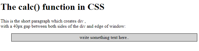
1. calc() function-
code is as follows:
<!DOCTYPE html>
           <html>
           <head>
           <style>
             #div1
              { position: absolute;
                  left: 45px;
                  width: calc(50% - 50px);
                  border: 1px solid black;
                  background-color: lightgray;
                  padding: 4px;
                  text-align: center;
               }
               </style>
               </head>
    <body>
      <h1> The calc() function  in CSS </h1>
      <p> This is the short paragraph which creates div , <br>
             with a 40px gap between both sides of
             the div and edge of window: </p>
      <div id=”div1”>write something text here..</div>
      </body>
      </html>
Output 1 for the above calc() code is:
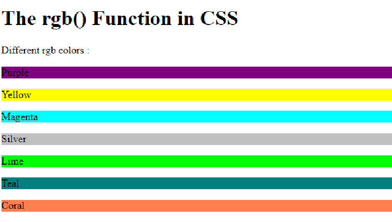
2. rgb() function-
code is as follows
<!DOCTYPE html>
                 <html>
                 <head>
<style>
#p1 { background-color: rgb(128 , 0 , 128) ; }
#p2 { background-color: rgb (255 , 255, 0) ; }
#p3 { background-color: rgb (255, 0 , 255 ) ; }
#p4 { background-color: rgb (192,192 ,192 ) ; }
#p5 { background-color: rgb (0 , 255, 0) ; }
#p6 { background-color: rgb (0 , 128, 128) ; }
#p7 { background-color: rgb ( 255, 127 , 80  ) ; }
</style>
</head>
<body>
<h1>The rgb() Function in CSS </h1>
<p> Different rgb colors : </p>
< p id=”p1”> Purple </p>
< p id=”p2”> Yellow </p>
< p id=”p3”> Blue  </p>
< p id=”p4”> Silver </p>
< p id=”p5”> Lime </p>
< p id=”p6”> Teal </p>
< p id=”p7”> Coral </p>
</body>
</html>
Output for the above rgb() code is:
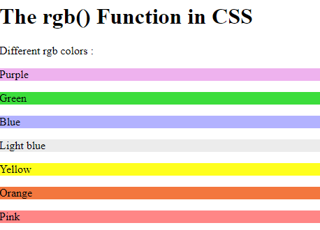
3. rgba() function
code is as follows :
<!DOCTYPE html>
<html>
<head>
<style>
#p1 { background-color: rgba(198, 0 , 198,0.3 ) ; }
#p2 { background-color: rgba(20, 214, 20, 0.836); }
#p3 { background-color: rgba(0,0,255,0.3 ); }
#p4 { background-color: rgba(192,192,192,0.3 ) ; }
#p5 { background-color: rgba(255, 255, 0, 0.884) ; }
#p6 { background-color: rgba(240, 84, 12, 0.795) ; }
#p7 { background-color: rgba(255, 0, 0, 0.473) ; }
</style>
</head>
<body>
<h1>The rgb() Function in CSS </h1>
<p> Different rgb colors : </p>
<p id="p1"> Purple </p>
<p id="p2"> Green </p>
<p id="p3"> Blue </p>
<p id="p4"> Light blue </p>
<p id="p5"> Yellow </p>
<p id="p6"> Orange </p>
<p id="p7"> Pink </p>


</body>
</html>
Output for the above rgba() code is:
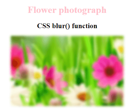
4. blur() function
code is as follows :
<!DOCTYPE html>
<html>
<head>
    <title>The blur() Function in CSS </title>
 <style>
        h1 {
            color: pink ;
             }
  body {
            text-align:center;
        }
        .blur_effect {
            filter: blur(4px);
        }
</style>
</head>
<body>
    <h1>Flower photograph </h1>
    <h2>CSS blur() function</h2>
   <img class="blur_effect" src = "flower.png"
        alt="Flower image">
</body>
</html>
Output for the above blur() code is: